

August 25, 2026
Free Timer App for Mac: Setup Pretty Progress in Minutes
Find and configure the best free timer app for Mac. Follow our Pretty Progress walkthrough to add always-on countdowns, widgets, and custom styling.
You’re halfway through an essay, coding task, or client project when you realize you’ve lost track of time. The Mac has been open for hours, but the countdown you meant to start is buried behind windows, hidden in a browser tab, or gone entirely after you changed workspaces. A timer should reduce that friction, not become another task to manage.
A practical free timer app for Mac needs to do more than count down. It should stay visible without interrupting concentration, make deadlines readable at a glance, and fit the way you move between Mac, iPhone, iPad, and other devices. That’s where a persistent widget and a low-friction setup can outperform a conventional stopwatch.
Table of Contents
- Why Most Mac Timers Fail Your Focus
- Installing Pretty Progress on Your Mac
- Creating Countdowns and Custom Widgets
- Designing Timers That Reduce Cognitive Load
- How Pretty Progress Compares to Other Free Mac Timers
- Troubleshooting and Pro Tips for Daily Use
Why Most Mac Timers Fail Your Focus
The failure usually happens before the timer even starts. You open a clock utility, search through menus, choose a duration, dismiss an ad, and then return to the document you were supposed to work on. By the time the countdown is running, the setup has already consumed attention.
macOS users also face a basic limitation: the standard Clock app experience people expect from iPhone isn’t available as a native Mac equivalent. Apple’s built-in Screen Time usage reporting shows that app and device time tracking is already a familiar productivity pattern on Mac, with app-by-app reports, device breakdowns, and views across different time periods. A timer, however, answers a different question. Screen Time tells you where time went. A countdown tells you what needs to happen before time runs out.
Visibility matters more than feature count
A timer that disappears when you switch windows creates a memory task. You have to remember that it’s running, remember when it ends, and check it repeatedly. That approach works against focus, particularly for students moving between lecture notes and research, freelancers tracking work intervals, or people with ADHD who rely on external visual anchors.
A small, persistent progress indicator solves a different problem from an alarm. It gives you a quiet reference point without forcing you to stop working. For a practical introduction to focus intervals, Simply Tech Today focus tips offers useful guidance on applying the Pomodoro method without treating it as a rigid rulebook.
Practical rule: If starting or checking a timer takes several clicks, you’ll eventually stop using it.
The cross-device gap
A Mac timer can be perfectly designed and still fail when your day moves elsewhere. You start a session at your desk, leave for a meeting with your iPhone, then have to recreate the timer manually. That break in continuity makes the tool feel optional.
The strongest workflows keep the timer close to the context where work happens. A Mac desktop widget can handle deadline visibility, while a phone or watch can support transitions away from the desk. The important distinction is not the number of features. It’s whether the timer remains dependable when your attention and device change.
Installing Pretty Progress on Your Mac
Start in the Mac App Store and search for Pretty Progress. Download the app, then open it from Applications or launch it through Spotlight. The initial setup is deliberately simple, which is useful because a timer should become available before you’ve had time to overconfigure it.
On first launch, complete the short introduction if you want an overview, or move directly to creating a countdown. When macOS asks for notification permission, allow it if you want alerts when the app isn’t in the foreground. Without notification access, a background timer may finish without your noticing.

Add the widget where you’ll actually see it
Right-click an empty area of the desktop and choose Edit Widgets. Search for Pretty Progress, select a widget size, and drag it to a position that remains visible without covering the controls you use most. If you prefer the Notification Center, add it there instead.
Keep the first widget close to the edge of your desktop, where a quick glance won’t require rearranging windows. If the gallery or placement options differ in your macOS version, use the desktop’s widget editing controls to reposition it.
Keep launch friction low
If Pretty Progress offers a launch-at-login option in its settings, enable it only if you use a timer most days. Otherwise, leave it off and launch the app through Spotlight when needed. A utility that opens automatically but rarely helps can become background clutter.
During setup, create one ordinary countdown before experimenting with themes or multiple widgets. That confirms notifications work, the widget updates, and the app fits your screen layout. You can then build a more detailed system without troubleshooting several variables at once.
Creating Countdowns and Custom Widgets
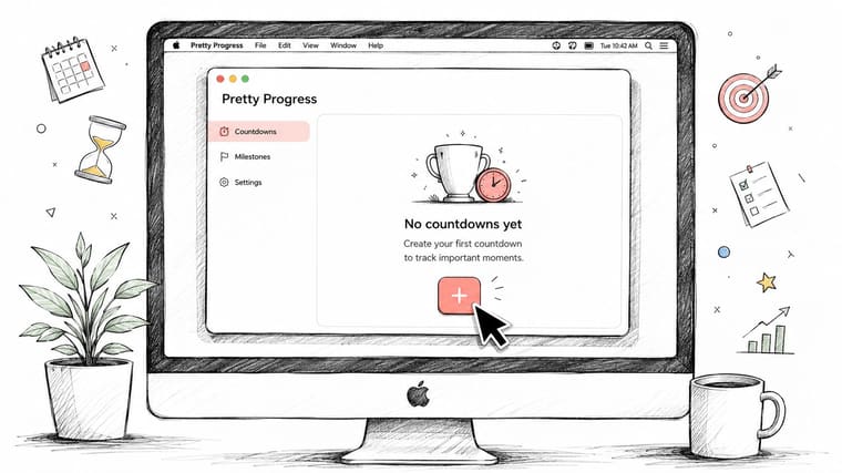
Open Pretty Progress and use the add control to create a countdown. Depending on the task, choose a duration or set a target date and time. A duration suits a focused work session. A target date works better for an essay deadline, an exam, a product launch, or another event where the endpoint matters more than the length of each session.
Name the countdown for recognition, not decoration. “Essay draft” is more useful than “Timer 1” because the label tells you what the remaining time means. For a project with several moving parts, names such as “Research,” “Client review,” and “Submission” make a larger widget easier to scan.
Choose a widget size by decision speed
Return to Edit Widgets and select the Pretty Progress widget size that matches your workload.
- Small widgets suit one active timer, such as a writing sprint or a break countdown.
- Medium widgets provide more context while keeping the desktop relatively quiet.
- Large widgets make sense when you need to track several deadlines or parallel activities.
A student might use one timer for a study block and another for an approaching assignment. A freelancer could pair a client deadline with a current work interval. The key is to display only timers that influence today’s decisions.
Style for recognition
Use the styling controls to adjust colors, transparency, progress-bar forms, and overall presentation. A circular or arc-style indicator can communicate remaining time more intuitively than a narrow line, while a linear bar may fit better in a compact desktop layout.
For study sessions, use a muted theme that stays readable without competing with the document. For accessibility or attention challenges, increase contrast and choose a color that remains distinct in both light and dark environments. Don’t assign a different visual treatment to every countdown. A small, consistent system is faster to interpret.
The Pretty Progress home-screen timer guide provides additional ideas for using persistent countdowns as part of a broader visual workflow. If you’re comparing timer products with richer automation or notification features, reviewing the full capabilities of TiedSiren can help clarify which functions you need before adding more software.
Designing Timers That Reduce Cognitive Load
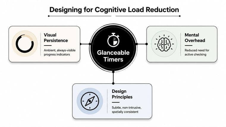
A timer reduces cognitive load when it removes checking from the task. An alarm-only timer makes you remember that the timer exists and wait for a disruptive signal. An ambient timer gives you a stable visual reference, so you can glance at progress when you naturally reach a stopping point.
That distinction matters in practical situations. A student can keep a study countdown visible while moving between lecture slides and notes. A freelancer can use a quiet interval timer while recording billable work. An ADHD user can assign one color to focused work and another to transitions, creating a visual cue for what happens next without relying entirely on memory.
Make the timer noticeable, not noisy
Place the widget in a consistent location. Spatial consistency helps you find the timer without searching, while a restrained color palette keeps it from becoming another notification. Use stronger contrast when the timer must remain readable from a distance, and lower visual intensity when the countdown is supporting deep work rather than demanding attention.
Layering timers can help, but only when each one has a distinct job. One countdown can represent the current work block. A second can represent a deadline. A third might represent a scheduled transition. Beyond that, ask whether the extra information changes what you’ll do.
A timer should externalize time, not compete with the work that time is meant to protect.
Build continuity into the routine
Cross-device continuity is especially useful when your day doesn’t stay at the Mac. Starting a session on the desktop and checking its progress on an iPhone, iPad, or Watch avoids rebuilding the same context. Pretty Progress is designed around countdowns and progress widgets across Apple devices, with Mac widgets available on the desktop and in Notification Center.
The broader Pomodoro structure remains useful here. Pomofocus describes the familiar pattern of 25 minutes of focused work followed by a 5-minute break, with a longer break after about 4 cycles, and it also supports changing intervals for different tasks. The method works best as a scaffold. If the task needs a different rhythm, adjust the timer instead of forcing the work into an unsuitable block.
How Pretty Progress Compares to Other Free Mac Timers
Most timer comparisons focus on the start button and the alarm sound. Daily use depends on less obvious questions: Can you see the timer while working? Can you understand it instantly? Does it remain useful when you change devices? Does the free version add friction at the exact moment you’re trying to focus?
The table below is a practical category comparison, not a claim that every app in each group behaves identically.
| Feature | Pretty Progress | Timer+ | Hourglass | Browser Timers |
|---|---|---|---|---|
| Visual persistence | Desktop and Notification Center widgets | Depends on window or widget support | Usually app-window focused | Visible only while the tab remains accessible |
| Countdown style | Progress-oriented, customizable widgets | Primarily countdown-focused | Straightforward timer display | Varies by website |
| macOS integration | Widget-based workflow | Varies by version and setup | App-based workflow | Limited operating-system integration |
| Cross-device continuity | Designed for Apple-device and Android workflows | Depends on the specific app | Usually centered on the Mac | Requires the browser and session to remain available |
| Distraction risk | Low when configured with one restrained widget | Can vary with prompts and controls | Usually low, but less ambient | Browser tabs and notifications can compete for attention |
| Best fit | Deadlines, visual progress, and persistent reminders | Simple timer users | Mac users who want a direct utility | Temporary sessions with no installation |
A browser timer is convenient for a quick session, but it’s fragile. Close the tab, switch profiles, lose network access, or enter full-screen work and the timer may no longer be part of your visual field. Traditional utilities can be more reliable on the Mac, but they often require deliberate window management.
The practical guidance from current timer-app listings points toward lightweight controls, adjustable focus and break durations, and cross-device support. Some tools expose configurable ranges such as 10 to 120 minutes, while others offer custom presets, as described in current timer app product guidance. More features aren’t automatically better. Social layers, planners, and gamification can make starting a session slower.
For a visual deadline workflow, the aesthetic timer approach for Mac is worth considering. For a basic stopwatch, a simpler utility may be enough. Choose based on the interruption cost you can tolerate, not on the length of the feature list.
Troubleshooting and Pro Tips for Daily Use
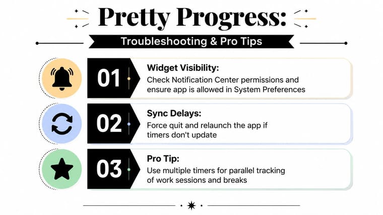
When a widget doesn’t appear, start with permissions rather than rebuilding the timer. Open System Settings, check the app’s notification access, then return to the desktop and use Edit Widgets to remove and re-add the widget. If it appears in one location but not another, test the desktop and Notification Center separately.
A stale widget can also result from the app or widget extension needing a refresh. Quit Pretty Progress, relaunch it, and check whether the countdown updates. If the Mac still shows an old state, remove the widget, restart the relevant app, and add it again.
Reduce alerts before they become noise
Use completion alerts for transitions that matter, not for every minor change. A work countdown can notify you when the block ends, while a visual progress bar handles the quieter act of showing time passing. If notifications become irritating, disable repetitive sounds and keep only the alert that changes your next action.
For sync problems, confirm that the same account and cloud settings are active on each device, then force quit and reopen the app. A brief network interruption can delay updates, so test again after reconnecting. Don’t create replacement timers immediately. That can leave duplicate countdowns running when synchronization catches up.
Keep the workflow maintainable
Create a shortcut or quick-launch routine if you start the same timer repeatedly. Use separate desktops only when the arrangement helps, such as one workspace for writing and another for administration. For ADHD-friendly use, pair a visible timer with a body-doubling session, and use simple color categories for work, breaks, and deadlines.
The current Mac timer app guidance also highlights the value of adjustable intervals and warns against feature overload. Review your widgets occasionally. Remove expired countdowns, standardize themes, and keep the desktop focused on the timers that still guide real decisions.
Pretty Progress offers customizable countdowns and progress widgets for Mac, with support for desktop and Notification Center placement alongside Apple and Android devices. If you want a persistent, glanceable timer without turning your workflow into another dashboard, visit Pretty Progress and set up one countdown for your next focused session.





