April 27, 2026
Your Home Screen Timer: A Guide to Pretty Progress Widgets
Create the perfect home screen timer with Pretty Progress. This guide shows you how to set up and customize countdown widgets on iOS, Android, and more.
You probably already have a goal that matters to you, but it lives in the wrong place. It’s buried in a calendar, hidden in a notes app, or sitting inside a reminder you only see when it’s already urgent. Meanwhile, your phone is always visible, always on hand, and usually showing everything except the thing you want to stay focused on.
That’s why a home screen timer works so well. It turns your phone, tablet, watch, or desktop into a quiet visual prompt. No digging through apps. No mental reset. Just a glance, and you know whether you’re moving toward a deadline, a habit streak, a fasting window, or a personal milestone.
Table of Contents
- Why Your Goals Deserve a Home Screen Timer
- Placing Your First Timer on Screen
- Designing a Timer That Inspires You
- Creative Use Cases for Your Countdown Widget
- Advanced Tips and Troubleshooting
- Frequently Asked Questions
Why Your Goals Deserve a Home Screen Timer
A lot of goals fail for a boring reason. They aren’t visible enough.
A student sets an exam date, feels organized for a day, then stops checking it. A designer has a launch deadline, but it only exists inside a project board. Someone training for a race logs workouts carefully, yet the finish date never appears where they’ll see it. If you like structured planning, you’ve probably also looked at resources like these top exercise goal tracking applications to make progress more concrete. The same idea applies here. Visibility drives follow-through.
The average American adult spends 7 hours and 4 minutes per day on screens, and 7 in 10 young adults want to reduce that time, according to screen time data collected here. That tension matters. Most productivity tools ask you to open one more app. A home screen timer does the opposite. It keeps your goal present without adding another browsing loop.
Visibility changes behavior
A good timer widget isn’t only a countdown. It’s a visual commitment.
When the timer sits on your Home Screen or Lock Screen, it keeps the goal in your peripheral attention. You don’t have to remember to be motivated. The device does a little of that work for you by surfacing progress all day.
Practical rule: If a goal matters for more than a week, it deserves a permanent spot on a screen you already check.
That works especially well for goals with emotional weight. Think of days until graduation, progress toward a savings milestone, time left in the year, or a fasting window you don’t want to keep recalculating. The point isn’t pressure. The point is reducing forgetfulness.
Why a glance beats an app session
For a home screen timer, design matters. It has to be readable fast, feel calm, and stay out of the way when you’re busy. If it looks noisy or requires taps to understand, people stop trusting it.
The most useful approach is a glanceable progress display with enough personality that you want it on your screen. If you want ideas for using visual progress more intentionally, the guide on visual goals and why they work is worth a read.
Placing Your First Timer on Screen
The fastest way to understand a home screen timer is to place one and live with it for a day. Don’t overthink the first setup. Pick one deadline or routine, add the widget, and see how often your eyes land on it naturally.

Start with one timer, not five
People who love customization often make the same mistake first. They try to build a full dashboard immediately.
Skip that. Start with a single timer for something real:
- A deadline: exam, trip, launch date, move, application cutoff
- A routine: fasting window, study block, reading streak, no-spend month
- A milestone: birthday, anniversary, race day, end of quarter
Smooth setup matters more than people think. Developer benchmarks for similar timer apps found 85% user retention after 7 days when widgets were deployed successfully with smooth, intuitive animations, as described in this timer app development write-up. If the first widget feels easy to place and easy to read, people keep it.
How to add it on iPhone and iPad
On iPhone and iPad, the process is simple:
- Create your timer in the app first. Set the start date, end date, or count-up style.
- Go to your Home Screen and long-press on an empty area.
- Tap the add button to open the widget gallery.
- Find the app and browse available widget sizes.
- Choose the layout that fits your screen, then tap to add it.
- Long-press the widget if needed to edit which timer it shows.
If you want a more visual walkthrough for iPhone specifically, use this guide for adding a countdown widget on your iPhone.
The useful trick on iOS is placement. Put the timer where your thumb already pauses. Typically, that’s the top half of the first Home Screen or the area above the dock on a focused page.
How to add it on Android
Android gives you a little more freedom, especially with resizing.
Open your home screen, long-press on an empty area, tap Widgets, then find the timer app in the list. Drag the widget onto the screen. After that, resize it if your launcher allows it, then link it to the timer you want displayed.
A lot of Android users pair timer widgets with habit and mindset prompts. If that’s your style, this guide to personal growth through affirmations shows how widgets can work beyond countdowns and become part of a broader motivation setup.
Here’s a quick visual walkthrough before you fine-tune the layout:
Put the first widget on your main screen, not the page you rarely swipe to. The best timer is the one you can’t help noticing.
Designing a Timer That Inspires You
Once the timer is visible, design starts doing real work. A plain countdown can be useful. A personalized one is more likely to stay on your screen for months.
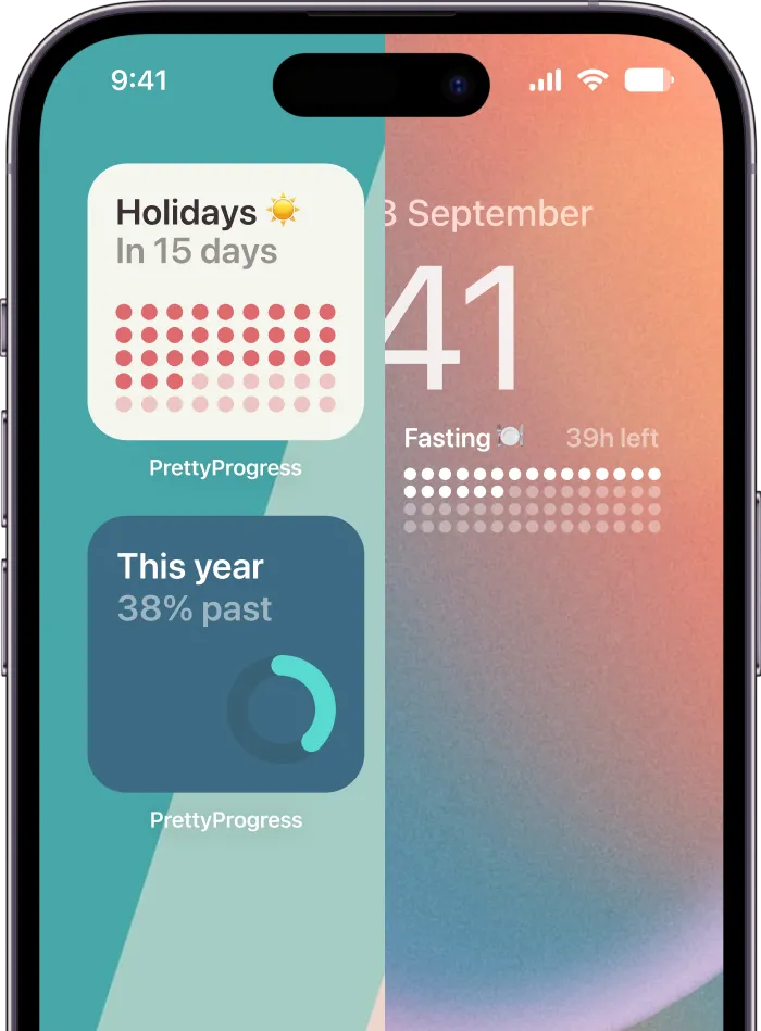
Pretty Progress supports curated styles, custom colors, gradients, bar shapes, layouts, icons, and platform-specific widgets across iPhone, iPad, Apple Watch, Mac, and Android. That flexibility matters because different goals need different moods. A serious work deadline shouldn’t feel the same as a vacation countdown or a “days left in the year” tracker.

Match the style to the goal
The biggest design mistake is choosing a look you admire instead of a look you’ll read.
A few combinations tend to work well:
| Goal type | Style direction | Why it works |
|---|---|---|
| Work deadline | Minimal or Swiss-inspired layout | Keeps the focus on progress, not decoration |
| Personal milestone | Soft gradients or warmer colors | Feels celebratory without being loud |
| Habit tracking | Simple bar or ring with high contrast | Makes daily progress obvious |
| Retro or playful goal | Retro OS style or bold icon choices | Adds personality, which helps the widget stay sticky |
If you want examples before building your own, browse this countdown timer progress bar inspiration list.
Make it readable first, decorative second
For the 2.2 billion people globally with vision impairment, high-contrast themes and large, resizable progress bars matter for accessibility, not just style, based on the accessibility gap highlighted in this low-vision widget discussion. That’s a useful rule for everyone. If a widget isn’t easy to read from arm’s length, it’s probably overdesigned.
Here’s the setup order that tends to hold up best over time:
- Choose contrast first: Dark text on light backgrounds or light text on deep backgrounds usually ages better than trendy low-contrast palettes.
- Set hierarchy next: Make the progress bar or remaining time the largest element. Supporting text should stay secondary.
- Use one accent color: Too many colors make a deadline feel like wallpaper.
- Add icons carefully: A tiny flag, star, or event symbol can help recognition. A crowded icon set does the opposite.
- Keep motivational text short: One phrase works. A full sentence usually doesn’t.
A timer should feel like furniture, not decoration. If it blends into your routine and still catches your eye, you got it right.
Some people prefer a super-clean rectangle on the Home Screen and a more expressive version on the Lock Screen or watch face. That split works well because context changes. On the phone, you want clarity. On a watch, you want immediacy. On a Mac, you want a subtle presence that doesn’t fight with real work.
Creative Use Cases for Your Countdown Widget
A classic event countdown is a typical starting point. That’s fine. The fun starts when you realize a home screen timer can track almost anything with a start point, an end point, or a visible span of progress.

Deadlines that stop slipping
The simplest use case is still one of the strongest. Put your nearest meaningful deadline on the main screen.
That could be:
- An exam date that usually only becomes real the week before
- A work launch with multiple stakeholders and too many moving parts
- A visa, tax, or application deadline that can’t be left to memory
For users with ADHD, visual timers have been shown to boost impulse control by 40%, and Pomodoro apps report a 78% completion uplift when the timer stays constantly visible, according to this visual timer and task adherence article. Even if you don’t use Pomodoro sessions, the same principle applies to long-range deadlines. Visibility reduces drift.
A nice tactic is to use two widgets for one project. One shows the full deadline. The other tracks the current sprint, review date, or next milestone. That keeps the big picture from becoming abstract.
Health and routine tracking
Not every timer needs drama. Some of the most useful ones run unobtrusively in the background.
Intermittent fasting is a perfect example. Instead of reopening an app to check your eating window, the countdown sits on your phone or watch. The same goes for hydration goals, sleep schedule resets, reading routines, or countdowns to the next workout block.
If you enjoy timepieces and mechanical timing tools, this explainer on understanding chronograph watches is a fun reminder that people have always loved seeing time made visible. A digital home screen timer is just the modern, more flexible version.
The best routine widget doesn’t nag. It answers one question instantly: “Where am I right now?”
Long-term goals that need patience
Long-term goals often disappear because progress feels too slow. A timer helps by giving shape to time that would otherwise feel vague.
Good examples include:
- Days left in the year
- Time until a big trip
- Progress toward graduation
- A savings challenge
- A creative project with a fixed finish line
- A sobriety milestone or lifestyle reset
These widgets work especially well on Apple Watch and Mac because they stay in your environment without forcing a check-in ritual. On the watch, a quick glance can keep a habit top of mind while you’re out. On the Mac, a small desktop widget can keep a quarterly goal visible during work without becoming another tab to ignore.
The common pattern is simple. If a goal matters but doesn’t demand action every minute, a persistent countdown is often better than repeated notifications.
Advanced Tips and Troubleshooting
A home screen timer becomes more useful as you layer in control. That’s where deeper styling, more widget slots, and platform-specific setups start to matter. It’s also where practical issues show up, especially refresh behavior and battery use.

When extra controls are worth it
If you only need one clean countdown, the basic setup is enough. Upgrade-style features make more sense when your screen setup is part of your workflow.
That usually means:
- Multiple simultaneous widgets: one for work, one for health, one for a personal event
- Deeper theme control: useful if you want your Home Screen and Lock Screen to feel consistent
- Platform spread: phone, tablet, watch, and desktop each showing the same goal in different contexts
- Special calculators: handy when you’re tracking business days, exact ages, or fasting schedules
The dividing line is simple. If you’re checking the timer often and rearranging it to fit your setup, extra controls can save time and friction.
If the widget isn’t updating properly
Most widget problems come from the operating system, not from the timer itself. iOS and Android both limit background activity to protect battery life.
Try this short checklist:
- Open the app once after creating or editing a timer. That often forces the latest state to sync.
- Re-add the widget if it’s showing an old event.
- Check battery restrictions on Android. Aggressive battery settings can freeze updates.
- Restart the device if a widget is visually stuck after a system update.
- Confirm the selected timer inside the widget edit menu. Wrong source, wrong display.
Battery and performance trade-offs
Battery anxiety is valid here. User reports and forum threads from late 2025 show unoptimized countdown widgets can add 10% to 20% daily battery drain, while modern APIs and refresh throttling can keep that impact below 2%. The same reporting notes that 40% of productivity app users cite battery as a top uninstall reason, as discussed in this home screen reminder and battery article.
What tends to work:
- Static or gently updating widgets instead of hyperactive animations
- Thoughtful refresh intervals rather than constant redraws
- Cleaner themes with less visual complexity
- Using watch and desktop widgets selectively for the goals you monitor all day
What usually doesn’t:
- Constantly editing widgets
- Running too many similar countdowns on one screen
- Choosing style over readability
- Expecting real-time behavior from platforms that intentionally throttle widgets
If battery life matters more than minute-by-minute precision, choose a calmer widget design and let the system breathe.
Frequently Asked Questions
Can I use a home screen timer on more than one device?
Yes. A practical setup is to keep the same goal visible in different places. Phone for everyday glances, watch for quick checks while moving, and Mac for passive visibility during work.
Does it work on Lock Screens too?
Yes, on supported platforms. Lock Screen placement is useful when you want the reminder to appear before you even access your device.
What should I track first?
Pick one deadline or routine you already care about. A trip, exam, fasting window, launch date, or “days left in the year” timer works well because it’s easy to understand at a glance.
Are progress bars better than plain countdown numbers?
Usually, yes. A progress bar gives you shape and motion, which makes long timelines feel real. Numbers are precise, but bars are often easier to absorb in a split second.
What if I want the timer to feel motivating, not stressful?
Use a softer theme, less aggressive color, and wording that feels neutral. “In progress” often works better than language that feels punitive or urgent.
If you want a clean way to keep deadlines, milestones, and routines visible across iPhone, iPad, Apple Watch, Mac, and Android, Pretty Progress is built for exactly that. You can create a timer, style it to match your screen, and keep your goal present without turning it into another noisy app you forget to open.