April 25, 2026
Visual Goals: How to Track Ambitions on Your Screens
Turn ambitions into achievements with visual goals. Learn to create custom progress bars & countdown widgets on your iPhone, Mac & Android to stay motivated.
You probably have a goal sitting in your head right now. It might be a deadline, a health target, an exam date, a reading habit, or a project that keeps following you around in the background. You know it matters. You also know how easy it is to lose sight of it once your phone fills with messages, your calendar gets noisy, and your task list turns into a wall of text.
That’s where visual goals change the game. A goal that lives only in your head feels abstract. A goal that lives on your lock screen, home screen, desktop, or watch face becomes part of your environment. You stop relying on memory and start using design. You see the thing. You feel the passage of time. You notice progress before motivation disappears.
This matters even more for people who don’t respond well to text-heavy systems. A 2023 study notes that 70% of ADHD adults report visual reminders improve task initiation by 40% compared to text-based tools, yet only 15% of productivity app tutorials adapt for dopamine-driven motivation in guidance discussed at PMC. That gap shows up everywhere. Plenty of advice tells you to “track your goals.” Very little shows you how to make that tracking beautiful enough, visible enough, and emotionally clear enough that you’ll stick with it.
Table of Contents
- From Abstract Ambition to Visible Progress
- Framing Your Goals for Visual Tracking
- Designing Your Perfect Visual Goal Widget
- Deploying Visuals Across Your Devices
- Visual Goal Templates for Every Ambition
- Pro Tips for Advanced Goal Visualization
- Frequently Asked Questions About Visual Goals
From Abstract Ambition to Visible Progress
A mental goal has a strange habit of changing shape. In the morning it feels urgent. By lunch it becomes optional. By evening it turns into vague guilt. That’s not always a discipline problem. Often, it’s a visibility problem.
When a goal stays invisible, your brain has to keep reloading it. You have to remember the deadline, remember why it matters, remember how far you’ve come, and remember what to do next. That’s a lot of friction for one objective.

A visual goal removes some of that load. It turns “finish the portfolio,” “study for the exam,” or “make it to July 1st” into something your eyes can process in a second. A bar filling up. A circle closing. A countdown shrinking. A date becoming physically nearer.
Why visible beats remembered
Text asks you to read and interpret. Visuals ask you to glance.
That difference is often underestimated. A well-made widget or visual tracker does three jobs at once:
- It anchors attention so the goal doesn’t disappear behind new tasks.
- It makes progress legible so effort feels real, not theoretical.
- It reduces decision fatigue because you can tell, quickly, whether you’re ahead, behind, or on track.
A good visual goal doesn’t nag you. It quietly keeps the promise in view.
Why aesthetics matter
This is the part generic productivity advice often misses. If your tracker is ugly, cluttered, or overly dense, you’ll start ignoring it. The design is not extra. The design is part of the behavior.
People return to interfaces that feel calm, clear, and rewarding to look at. That’s especially useful for neurodiverse users, who often benefit from cues that are easier to scan and harder to forget. A soft gradient, a single bold number, a clean progress bar, or a layout with strong contrast can turn a tracker from “one more thing on my phone” into something that pulls your attention back.
Framing Your Goals for Visual Tracking
Before you pick colors, styles, or widget sizes, define what the goal is. Most visual goal systems fail because the design is wrong for the type of progress being tracked.
A vague goal like “get healthy” or “work on my project” doesn’t translate well into a visual. You need an end state and a unit of movement. Without those two pieces, your widget becomes decoration.
Define the finish line first
Start with the clearest possible version of the result. Not perfect wording. Just enough specificity that someone else could understand it.
A few examples:
-
Too vague: Get healthier
Trackable: Run 100 miles by July 1st -
Too vague: Make progress on my thesis
Trackable: Draft 5 chapters by the submission date -
Too vague: Launch the feature
Trackable: Reach final handoff by a fixed release date
There’s strong support for making goals concrete. A Dominican University study found a 42% increase in goal accomplishment for people who wrote down their goals, as summarized in this goal-setting review. A visual tracker builds on that same principle by keeping the written goal in sight instead of buried in notes.
Choose the right unit of progress
Not every goal should use the same meter. Some goals work best as time remaining. Others work best as percentage complete.
Use a countdown when the pressure comes from a date. Use percentage when the pressure comes from output.
| Goal type | Best visual | Why it works |
|---|---|---|
| Exam date | Countdown | Time urgency is the real motivator |
| Writing a book | Percentage bar | Output matters more than calendar days |
| Product launch | Both, if possible | Teams need date pressure and completion clarity |
| Fasting window | Countdown | Time passage is the whole experience |
| Savings target | Percentage bar | Each contribution should feel visible |
Match the metric to what keeps you moving
Some people feel energized by a shrinking number of days. Others hate countdown pressure and do better when they see a bar filling up. Pick the format that helps you act, not the one that looks most serious.
Practical rule: If seeing the deadline makes you freeze, track the daily process instead of the final outcome.
Project work gets interesting. A roadmap is already a visual goal system in disguise. If you’re managing a larger build, this guide to building a product roadmap is useful because it shows how to break a broad initiative into visible stages and decisions. The same logic works for personal goals. Define the destination, split it into meaningful checkpoints, then choose what the screen should display.
For a more goal-specific framework, the guide to visual SMART goals is helpful when you’re trying to convert a broad ambition into something that can live cleanly inside a widget.
Keep the goal small enough to show
Visual goals work best when the display can answer one question instantly: “What does progress mean here?”
If the answer needs a paragraph, the goal is still too blurry. Tighten it until a single bar, date, ring, or number can represent it.
Designing Your Perfect Visual Goal Widget
A visual goal should be easy to understand in under a second. It should also be pleasant enough that you don’t tune it out after two days. Good widget design sits right at the intersection of clarity, emotion, and glanceability.

Start with style, not just data
The visual style you choose changes the mood of the goal. That mood affects whether you want to interact with it.
A few common directions work well:
- Minimal layouts fit serious goals. Think exams, savings plans, or work deadlines. Clean typography and lots of space lower visual noise.
- Swiss Style themes suit structured thinkers. Strong alignment, bold hierarchy, and strict spacing make the information feel organized.
- Retro OS looks can add playful energy. That matters for goals that need novelty, especially if you get bored by plain interfaces.
- Soft or aquatic palettes can reduce tension around goals that already carry emotional weight.
If you’re using an app with customizable widgets, choose a theme that fits the emotional tone of the goal, not just your wallpaper.
Use color like a coach
Color has a job. It should signal meaning fast.
Here’s a practical approach:
| Design choice | Good use | What it helps with |
|---|---|---|
| Green progress fill | Habit streaks, health routines | Reinforces “I’m doing it” |
| Blue background or accents | Long-term goals, study plans | Creates calm and steadiness |
| Orange or warm accents | Active projects, launch weeks | Adds momentum and urgency |
| High contrast text | Lock Screen widgets | Improves scan speed |
| Gradient fill | Process goals | Makes small movement feel alive |
Avoid random color. If every goal is neon, nothing stands out. If every widget uses the same palette, you lose category recognition. Give each goal family a visual identity.
The right color palette can lower resistance before you even read the text.
Pick shapes that match attention span
Bars, circles, and countdowns don’t feel the same.
Progress bars are direct. They work well when the goal has clear accumulation. Chapters written, sessions completed, savings added.
Circular indicators feel lighter and more elegant. They’re useful when space is tight or when you want the widget to feel less mechanical.
Countdown blocks are best when the deadline itself is the message. They create urgency without requiring interpretation.
For neurodiverse users, simpler usually wins. One strong metric in a large shape tends to outperform a crowded card with tiny labels, secondary stats, and decorative clutter.
Build a clear hierarchy
Every widget needs a first thing your eye lands on. If everything shouts, nothing leads.
A clean hierarchy usually looks like this:
- Primary metric such as days left or percent complete
- Goal label such as “Biology Exam” or “Portfolio Launch”
- Secondary context such as the date or current streak
If your widget includes icons, use them to support recognition, not to decorate empty space. A book icon for reading, a dumbbell for workouts, a briefcase for a work milestone. Keep the icon simple and consistent with the mood of the design.
Make the widget worth seeing often
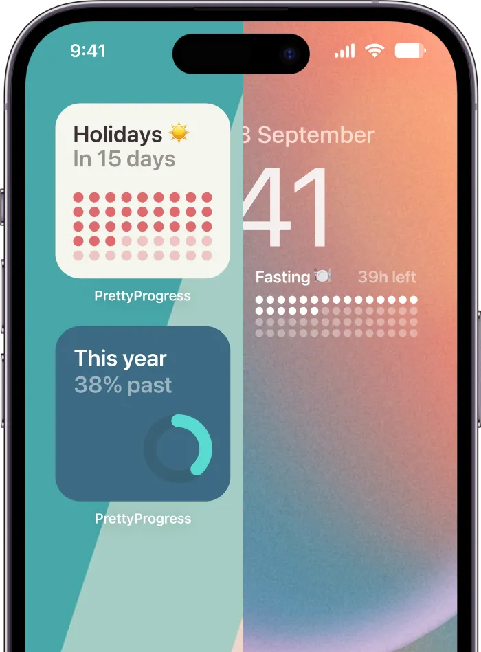
One practical setup uses a customizable tool like Pretty Progress, which lets you set start and end dates, choose themes such as Swiss Style, Minimal, Aqua, or Retro OS, and adjust colors, gradients, bar shape, layout, and icons for home and lock screen widgets. That level of control matters because a goal tracker only helps if you keep noticing it.
A few design decisions tend to hold up over time:
- Use short labels: “Q2 Launch” scans better than “Finish all launch tasks for quarter two.”
- Prefer one visual metric: Don’t mix too many signals in one small widget.
- Leave breathing room: Empty space improves readability.
- Test against your wallpaper: A beautiful widget can become unreadable on a busy background.
- Check glance distance: If it’s on a phone lock screen, make sure the main number can be read in motion.
The strongest visual goals aren’t overloaded. They’re memorable.
Deploying Visuals Across Your Devices
A visual goal only works if you see it in the moments when you’d normally drift. Placement matters almost as much as design. The trick is to match the goal to the device and the context in which that device appears.
Right near the start, it helps to see what a multi-device setup can look like in practice.

Put daily goals on the surfaces you check unconsciously
Your phone lock screen is prime real estate. It’s where short-cycle goals belong. Habits, countdowns for this week, fasting windows, a small “write for 20 minutes” prompt. You don’t need to open your phone. The goal is visible.
Your home screen works well for goals you review a few times per day. These can be medium-term projects, exam countdowns, or a progress bar for a challenge you’re in the middle of.
If you want ideas beyond one app ecosystem, this roundup of free widget apps for iPhone can help you compare different display styles and decide what format feels easiest to live with.
Match the screen to the goal type
Different devices support different kinds of pressure.
- iPhone Lock Screen: Best for immediate prompts and deadline awareness.
- iPhone or iPad Home Screen: Good for visual bars, larger labels, and project-focused widgets.
- Apple Watch: Great for urgency. Use it for today’s target or an approaching deadline.
- Mac desktop or widget area: Better for long-range goals that need repeated exposure during work hours.
- Android home screen: Ideal for larger visual layouts and category-based grouping.
If you use wallpapers as part of your motivation system, a background can reinforce the same goal you’re tracking in a widget. A lock screen wallpaper and time setup is useful when you want the whole screen to support the habit instead of just one tile.
Build an ecosystem, not a duplicate
Don’t place the exact same widget everywhere unless the goal is extremely important. Repetition can become wallpaper.
Use layered visibility instead:
| Device | Best use | Example |
|---|---|---|
| Lock Screen | Fast glance | “12 days to exam” |
| Home Screen | Main progress view | Reading challenge bar |
| Watch | Near-term reminder | Today’s writing block |
| Mac | Work context | Product milestone countdown |
One goal can appear in several places, but each placement should answer a different question.
A short walkthrough can make setup easier when you’re arranging widgets across screens:
Keep high-friction goals in the path of least resistance
If a goal is easy for you to ignore, place it where avoidance is hardest. That usually means the first screen you touch in the morning or the device you use most during your workday.
If a goal already creates anxiety, put it somewhere visible but not overwhelming. A desktop widget can be gentler than a lock screen countdown. Placement can either support consistency or create pressure that backfires.
Visual Goal Templates for Every Ambition
The easiest way to build visual goals is to start from a real scenario. Different ambitions need different displays. The same progress bar that works for a reading challenge might be terrible for an exam date.
For ADHD users in particular, visual planning methods such as color-coded timelines and progress bars can improve time management, and written or visible goals boost achievement by 42% compared to unwritten ones according to Affinity Psychology’s summary of visual planning methods. That’s why the format matters. The tracker should reduce ambiguity, not add more of it.
![]()
The exam countdown
A student has one date that matters. The test is fixed. The emotional challenge is time blindness. Weeks feel distant until they suddenly don’t.
Use a countdown widget here. Keep the text large. Add the exam name and date, but don’t clutter the design with subject notes or chapter lists.
Recommended setup:
- Best visual: Countdown
- Good style: High contrast, minimal layout
- Helpful color choice: Blue or dark neutral for calm
- Best placement: Lock Screen and study tablet home screen
A clean “18 days left” display makes the deadline concrete in a way a planner entry often doesn’t.
The habit builder
Someone is trying to walk daily, stretch after work, or read before bed. There may not be a dramatic deadline. The goal is consistency.
This works better as a count-up or streak-style visual than a countdown. Show days completed or sessions logged. Let the bar fill over a fixed period such as a month, or use a simple streak counter if you want momentum without end-date pressure.
Small visible wins are often more motivating than one distant finish line.
The project deadline
A designer, developer, or manager usually has two realities at once. There’s a final deadline, and there’s the actual body of work that needs to move.
For this case, use a percentage bar as the primary display. If space allows, pair it with a date somewhere else in your setup. Keep the widget tied to a real project stage, not a fuzzy label like “work stuff.”
If you’re juggling several deliverables, this guide to keeping track of multiple projects is useful because it helps separate parallel goals before they all compete for the same visual space.
The fasting window
This one is pure timing. The person isn’t trying to “finish” a project. They’re moving through a time-bound routine.
A countdown works best. Show time remaining in the fasting window or time until the next eating period. Keep the design simple and don’t overload it with health metrics unless you already use another app for that data.
Recommended setup:
| Template | Best visual | Best placement | Design note |
|---|---|---|---|
| Exam countdown | Countdown | Lock Screen | Make the date obvious |
| Habit builder | Streak or monthly bar | Home Screen | Reward consistency |
| Project deadline | Percentage bar | Desktop or Home Screen | Focus on completion |
| Fasting window | Countdown | Lock Screen or Watch | Prioritize readability |
The neurodiverse-friendly version
For users who struggle with executive dysfunction, the most helpful visual goals are often the least complicated. One goal per widget. Clear color separation between life areas. Strong hierarchy. No tiny text.
If initiation is the hard part, track the first step visually. Not “finish the report.” Track “20 minutes on report today.” That kind of display turns a heavy outcome into something the brain can approach.
Pro Tips for Advanced Goal Visualization
Once your basic setup works, the next upgrade is to make it more adaptive. Advanced visual goals don’t just show an end point. They help you stay engaged during the messy middle.
Switch from outcome goals to process goals
This is the biggest improvement that can be made. Outcome goals look impressive, but process goals are easier to repeat.
For complex or unfamiliar tasks, process-oriented visual goals yield higher persistence, with some studies showing up to 50% more sessions completed compared to rigid outcome goals, while rigid outcomes can lead to a 65% dropout rate for ADHD users, according to Neural Revolution’s discussion of process-oriented goal setting. That’s why “practice for 20 minutes” often works better than “master the skill” on a widget.
Stack related widgets with intention
If you track several connected goals, group them by role instead of by urgency.
For example:
- Skill stack: daily practice, weekly session count, milestone date
- Launch stack: draft completion, review deadline, release day
- Wellness stack: sleep routine, fasting window, walk streak
On iPhone, widget stacks can keep several related views in one place without turning the home screen into a dashboard. On desktop, grouping nearby widgets can create the same effect.
Use calendars that reflect real working time
A project countdown becomes more honest when it matches actual workdays, not fantasy time. If weekends don’t count for the task, use business-day logic when setting the timeline. That makes the bar more truthful and less demoralizing.
Teams use a similar principle in planning work. If you want a structured way to think about sequence, dependencies, and timing, these product roadmap best practices map well to personal and creative goals too.
Track what you can do repeatedly. Let the result emerge from the repetition.
Frequently Asked Questions About Visual Goals
A few issues come up again and again once people start using visual goals. Most of them are easy to fix once you know what the screen is supposed to do for you.
| Question | Answer |
|---|---|
| How do I track a habit that doesn’t have an end date? | Use a count-up, streak, or recurring monthly progress bar. Habits usually respond better to visible repetition than to a distant finish line. |
| Should I use a countdown or a progress bar? | Use a countdown when the date is the main source of urgency. Use a progress bar when output matters more than time passing. |
| What if a visual goal makes me anxious? | Change the metric. Track the daily process instead of the final deadline. You can also move the widget from your lock screen to a calmer surface like a home screen page or desktop. |
| How many visual goals should I track at once? | Fewer is usually better. Start with one to three goals that matter now. If every ambition gets a widget, none of them will stand out. |
| My widget isn’t updating. What should I check first? | Refresh the app, confirm the dates and progress settings are correct, and make sure widget permissions or background refresh settings aren’t blocking updates on your device. |
| Can visual goals work for ongoing projects with many steps? | Yes, but break the project into stages. Track the current phase visually instead of trying to display the whole project at once. |
| What makes a visual goal actually stick? | Visibility, simplicity, and emotional fit. The tracker has to be easy to read and pleasant enough that you keep noticing it. |
The best visual goals are not the flashiest ones. They’re the ones that stay in view, make progress feel concrete, and fit the way your brain already pays attention.
If you want a simple way to build visual goals on the screens you already check all day, Pretty Progress lets you create customizable countdowns and progress widgets for iPhone, iPad, Apple Watch, Mac, and Android. It’s useful for deadlines, habits, milestones, and any goal that becomes easier to follow once you can see it.