May 16, 2026
SMART Goals Visual: How to Track Your Goals Visually
Tired of forgotten goals? Learn to create a SMART goals visual. This guide shows you how to use progress bars, charts, and widgets to stay motivated.
You probably already have a goal written down somewhere.
It’s in Notes, a planner, a project app, or the first page of a journal you stopped opening. The wording might even be solid. It’s specific. It has a deadline. It technically counts as SMART. And yet it keeps slipping out of view, which means it also slips out of behavior.
That’s why people search for smart goals visual instead of just “SMART goals.” They don’t need another definition. They need a version of the goal that stays visible on the phone they check all day, shows movement without requiring interpretation, and feels harder to ignore than a sentence in a document.
Text is easy to write and easy to forget. A visual tracker is different. It turns a goal into a cue you keep seeing.
Table of Contents
- Beyond the To-Do List Why Visual Goals Work
- A Quick SMART Goals Refresher
- Choosing the Right Visual Tracker Format
- How to Design Your SMART Goal Visual
- Bringing Your Visual to Life with Widgets
- Pro Tips for Staying on Track and Avoiding Pitfalls
Beyond the To-Do List Why Visual Goals Work
A to-do list is good at capturing tasks. It’s not always good at holding a long-range goal in front of you day after day. That’s why people start strong in January, during a new quarter, or after a birthday, then lose contact with the goal by the second week. The goal hasn’t disappeared. It’s just no longer visible enough to compete with everything else on the screen.

Text goals fade into the background
Most SMART goal advice stops at writing the sentence well. It helps you define the target, but it doesn’t solve the daily behavior problem. Guidance around SMART goals is still mostly text-based, and there’s a clear gap for people who need a progress bar, widget, or other repeated visual prompt, especially students and neurodivergent users who benefit from external cues, as discussed in this Paths to Literacy article on SMART goals on IEPs.
That gap matters in ordinary life too. If your goal lives in a folder you open once a week, it becomes an intention instead of a system.
A goal you have to remember is weaker than a goal your environment keeps reminding you about.
A visual tracker becomes part of your environment
A visual goal changes the job of the tracker. Instead of asking you to go look for motivation, it brings the goal back into view when you open your phone, check the date, or glance at your Home Screen.
That’s why a smart goals visual works better when it’s persistent, not hidden. The best versions are simple enough to read in a second and concrete enough to answer three questions immediately:
- What am I tracking
- How far along am I
- How much time is left
When those answers are visible, the goal stops feeling abstract. It becomes an object in your day.
A Quick SMART Goals Refresher
A SMART goal still needs to be well written before it can be well designed. Tableau defines SMART as Specific, Measurable, Achievable, Realistic, and Time-bound, and makes the key point that measurable goals matter because “if you can’t measure something, you can’t tell if you’re performing well or if you’re off track” in its guide to SMART goals criteria. That’s exactly why some goals convert cleanly into progress bars and countdowns.

Take a vague goal like “run more.” It doesn’t give a tracker much to work with. Now tighten it up:
- Specific: Run a 10K
- Measurable: Complete the distance
- Achievable: Train with a schedule that fits your week
- Relevant: Improve fitness and build consistency
- Time-bound: Finish the race by a fixed date
Once a goal looks like that, the visual side becomes obvious. You can track training sessions, countdown to race day, or show progress toward total distance.
Why the visual part changes follow-through
Leadership IQ reports that people who use visuals to describe their goals are 52% more likely to love their job, based on a sample of 12,801 people. In the same discussion, it explains that when people hear information only, recall after 72 hours is about 10%, but adding a picture increases recall to 65% in its article on visual goal setting and the pictorial superiority effect. That’s the practical reason visual trackers work. They improve recall and make the goal feel present.
Practical rule: If the goal has a number and a date, it should have a visual.
If your goal is health-related, it also helps to shape the target around your actual circumstances instead of copying someone else’s plan. This roundup of personalized fitness goal setting advice is useful for turning a broad fitness intention into something measurable enough to visualize.
Choosing the Right Visual Tracker Format
The mistake I see most often is choosing a format because it looks nice, not because it fits the goal. A visual tracker should match the shape of the work. If it doesn’t, you’ll either stop updating it or start distrusting what it shows.
Match the format to the goal shape
Use a progress bar when the outcome accumulates. Money saved, books read, miles walked, lessons completed, applications sent. These all move from a clear start point toward a clear finish point.
Use a countdown when urgency matters more than accumulation. Exam dates, product launches, trips, moving day, portfolio deadlines. A countdown doesn’t tell you how much work is done. It tells you how much time is gone, which can be exactly the pressure some goals need.
A milestone timeline works better for projects with stages. If you’re redesigning a website, applying to grad school, or planning a wedding, one bar can feel misleading. You may be “on schedule” in one area and blocked in another. A timeline lets you separate phases and reduce false reassurance.
A dashboard-style tracker helps when one goal depends on several measures. Think “get ready for a half marathon” or “launch my side project.” One visual can include time left, key milestones, and one main metric without collapsing everything into a single percentage.
For more examples of what different visual goal systems can look like, this guide to visual goals is a helpful reference point.
Visual Tracker Formats Compared
| Format | Best For | Example Goal |
|---|---|---|
| Progress bar | Quantifiable accumulation | Save for a laptop |
| Countdown | Deadline pressure | Submit thesis by a fixed date |
| Milestone timeline | Multi-phase projects | Launch a personal website |
| Simple chart or dashboard | Goals with more than one indicator | Train for a race while tracking sessions and date |
A few trade-offs matter here:
- Bars are motivating early. They show movement fast, but they can oversimplify layered work.
- Countdowns create urgency. They’re powerful for deadlines, but stressful if the goal lacks a work plan.
- Timelines reduce ambiguity. They help complex projects, though they take more setup.
- Dashboards are flexible. They’re useful for serious trackers, but they can become cluttered if you add too many elements.
The right format doesn’t just display progress. It tells the truth about the goal.
How to Design Your SMART Goal Visual
A strong smart goals visual isn’t decoration. It’s a small interface that answers the core questions of the goal without extra reading. Wrike’s guidance is useful here because it translates SMART into explicit UI fields: S = the goal’s title, M = a numeric metric, A = feasibility checked by milestones, R = connection to a broader objective, and T = a deadline in its article on SMART goals and examples.

Turn each letter into a design decision
Start with Specific. This becomes the title on the widget or tracker. Keep it short enough to read instantly. “Read 24 books this year” works better than “My personal reading development objective.”
Then define Measurable as the actual number the design will track. This is the part many people skip. The tracker needs a unit: books, workouts, dollars, pages, applications, days practiced.
For Achievable, don’t put motivation quotes on the screen. Break the goal into milestones that make success believable. If you’re tracking 24 books, create mini checkpoints. If you’re saving money, set visible intervals. Feasibility should show up in the structure, not just in your hopes.
What strong visuals include
Relevant often gets ignored in visual design, but it matters. Theme, icon, and color should support the reason the goal exists. A calming palette may fit a meditation streak. A bold, sharp design may fit an exam countdown. The visual tone should match the emotional job of the goal.
Time-bound gives the visual its edge. Add a deadline, date range, or visible endpoint. Without that, your tracker can become a pretty meter with no urgency.
A good design usually includes:
- A clear title: Short, readable, and specific.
- One main metric: Not five competing numbers.
- Milestones: Small checkpoints that make progress feel real.
- A visible deadline: Date, countdown, or time window.
- A reason cue: A color, symbol, or label that reminds you why the goal matters.
If your widget looks good but doesn’t show the metric and the deadline, it’s art, not a tracker.
The best visuals are spare. Too much text turns the widget back into a document. Too little information turns it into mood board wallpaper.
Bringing Your Visual to Life with Widgets
If the tracker lives inside an app you rarely open, it won’t do much. Widgets fix that because they put the goal where your attention already goes. That’s what makes them practical. You don’t need a motivation ritual. You need a visible object on your screen that keeps resurfacing the goal.
Why widgets work better than buried apps
A Home Screen or Lock Screen widget is a built-in reminder without extra noise. It’s glanceable, which is exactly the point. You should be able to read it in a second while checking messages, weather, or calendar.
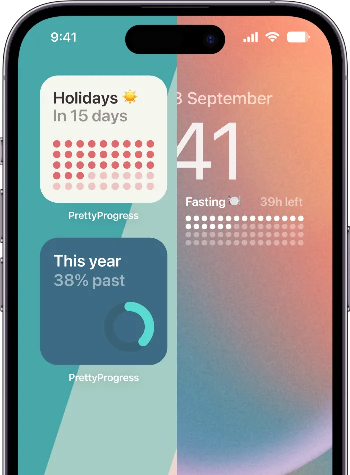
That’s where a tool like Pretty Progress’s goal progress tracker app fits. Pretty Progress lets you create countdown and progress bar widgets for phones and other devices by entering a title, choosing a date range, setting a metric, and customizing the visual style. It’s one option if you want the goal to stay visible instead of living in a notes app or spreadsheet.

A simple widget setup that people actually maintain
The setup that tends to last is simpler than people expect.
-
Name the goal clearly
Use the exact short label you want to see every day. “Spanish B1 by June” is stronger than “Language Goal.” -
Enter the metric
This could be total sessions, percentage complete, amount saved, or items finished. If you can’t decide what the number is, the goal still isn’t ready. -
Add the date range
A start and end date creates motion. This is what separates a visual goal from a vague aspiration. -
Pick a format that suits the job
Use the decision rules from earlier. Bar for accumulation. Countdown for urgency. Milestones when the work has phases. -
Customize the design enough to make it yours
Choose colors, bar shape, layout, and icon carefully. A tracker you enjoy looking at gets more attention than one that feels generic. -
Place it where your eyes already go
First Home Screen page beats page four. Lock Screen beats a folder. Visibility isn’t a cosmetic detail. It’s the whole mechanism.
A common mistake is over-designing. People spend too long choosing styles and not enough time defining what the widget should show. The cleanest setups usually win because they’re easier to scan and easier to trust.
Pro Tips for Staying on Track and Avoiding Pitfalls
A polished tracker won’t save a fuzzy goal. The biggest failure point is still unclear success criteria. Atlassian notes that teams often miss goals because there isn’t agreement on what success means, and the same discussion references a widely cited benchmark that only 8% of people who set goals meet them in its article on how to write SMART goals. The lesson is simple. Define done before you start.
Define done before motivation dips
Your tracker should make completion unmistakable. If the finish line can move every week, the visual won’t help much.
Use these checks before you place the widget:
- Lock the metric: Decide what counts. Pages read, not “reading more.” Dollars saved, not “being better with money.”
- Keep one source of truth: Update the same tracker every time instead of splitting progress across notes, habit apps, and your head.
- Break large goals down: If the goal spans months, visible milestones keep progress from feeling flat.
A visual tracker works best when the definition of success stays stable, even if your plan changes.
Protect the visual from becoming wallpaper
People stop noticing anything that never changes. The fix is regular maintenance, not more inspiration.
A few habits help:
- Update quickly: Make progress updates small and easy, so you don’t avoid them.
- Celebrate visible checkpoints: Don’t wait for the final finish line to acknowledge movement.
- Review placement: If the widget has become invisible through familiarity, move it.
- Use support: Share your visual system with someone who’ll ask about it.
If consistency is a significant struggle, this article on how to stay consistent with goals offers practical ways to keep a tracker active after the initial burst of enthusiasm fades.
The point of a smart goals visual isn’t to make your phone prettier, although that helps. It’s to reduce ambiguity, reduce forgetting, and make progress visible enough that action becomes easier.
If you want a goal to stay in sight instead of getting buried in notes, try Pretty Progress. It lets you turn a SMART goal into a visual countdown or progress widget you can place on your screen, so the metric, deadline, and momentum stay visible throughout the day.