April 22, 2026
Tools Productivity: A Visual Guide to Focus
Boost your tools productivity with our guide to visual trackers. Learn to choose, set up, and use widgets on all devices for focus and consistency.
You open your phone to get organized. There’s a task app with overdue badges, a calendar with stacked alerts, a notes app full of half-finished systems, and maybe a project board you were sure would fix everything this time. Instead of feeling clear, you feel crowded.
That’s the quiet failure of most tools productivity advice. It assumes the answer is a more powerful system, a more complete app, or a more automated workflow. In practice, many people don’t need more features. They need less friction, less noise, and one thing that stays visible long enough to matter.
The biggest gains usually come from tools you don’t have to “check.” They sit on your Lock Screen, Home Screen, watch face, or desktop and keep the right deadline, habit, or goal in view. No buzzing. No guilt-heavy reminders. Just a steady visual cue that makes it easier to begin.
Table of Contents
- Why Your Productivity Tools Are Failing You
- Choosing Your Visual Productivity Style
- Setting Up Your Unified Tracking System
- Advanced Workflows for Habits and Deadlines
- Maintaining Focus and Consistency Over Time
- Your First Step to Visual Productivity
- Frequently Asked Questions About Productivity Widgets
Why Your Productivity Tools Are Failing You
Most productivity stacks fail for a simple reason. They demand too much attention to manage themselves.
You install an all-in-one workspace, connect your calendar, build lists, add labels, set recurring reminders, and create filters. For a day or two, it feels responsible. Then the system starts generating its own work. You’re organizing tasks more than doing them.
That frustration isn’t just personal. A 2026 Pega study on team productivity tools found that 64% of workers report productivity tools slow them down, while 42% feel frustrated, 21% feel exhausted, and 12% abandon tasks altogether because of ineffective tech.
More features often mean more maintenance
Feature-rich software is useful when complexity is real. Teams running client delivery, software releases, or multi-step approvals often need structure. But many individuals copy those enterprise-style systems into daily life and end up buried in admin.
The usual signs are easy to spot:
- Too many capture points. Tasks live in your notes app, calendar, email, and project board.
- Too many reminders. The alerts become wallpaper, so your brain stops respecting them.
- Too much setup debt. Categories, tags, views, and dashboards feel productive, but they delay starting.
Practical rule: If your tool needs daily tending before real work begins, it’s probably too heavy for the job.
A better approach starts with visibility, not complexity. Instead of building a command center, put one meaningful target where you’ll see it without effort. A countdown to a proposal deadline. A progress bar for a thesis chapter. A simple habit streak for walking, journaling, or studying.
Passive cues beat active policing
The strongest systems don’t keep asking you to open them. They lower the effort required to remember what matters.
That’s why simple planning methods still work. A good day to day planner online can help you narrow the day to a few concrete actions instead of juggling an oversized digital stack. The same logic applies to visual widgets. They don’t replace planning. They keep the plan alive after you’ve made it.
When people talk about tools productivity, they often focus on automation. I’d put visual persistence ahead of automation for most day-to-day work. If you can see your top priority every time you access your phone, you need fewer reminders, fewer rescue sessions, and fewer “reset Monday” promises.
Choosing Your Visual Productivity Style
Before you pick a widget or tracker, pick the problem you want it to solve. Many fall short here, browsing app features first and then trying to force their life into whatever the app does best.
That usually creates a mismatch. A person who needs urgency picks a note-taking app. A person who needs consistency picks a project manager. A person who needs calm picks a system built around alerts.

Start with the friction, not the app
Visual tracking works because it reduces the need to remember. The visual timer discussion for ADHD users and habit builders makes this point well. Persistent, non-intrusive reminders reduce cognitive load better than complex software that needs active engagement.
If you’re not sure what suits you, a framework like Discover Your Personal Productivity Style is useful because it starts with behavior patterns, not shiny features.
A quick self-check helps:
| Your main problem | Better visual style | Why it works |
|---|---|---|
| You keep underestimating time | Deadline tracker | It turns abstract due dates into visible urgency |
| You start habits and forget them | Habit bar | It rewards repetition and makes today visible |
| You lose steam on long projects | Goal roadmap | It shows movement even when the finish line is far away |
| You want anticipation without mental clutter | Event countdown | It keeps a date present without constant reminders |
If you want examples of iPhone-friendly setups, this guide to free widget apps for iPhone can help you see how different visual formats behave on-screen.
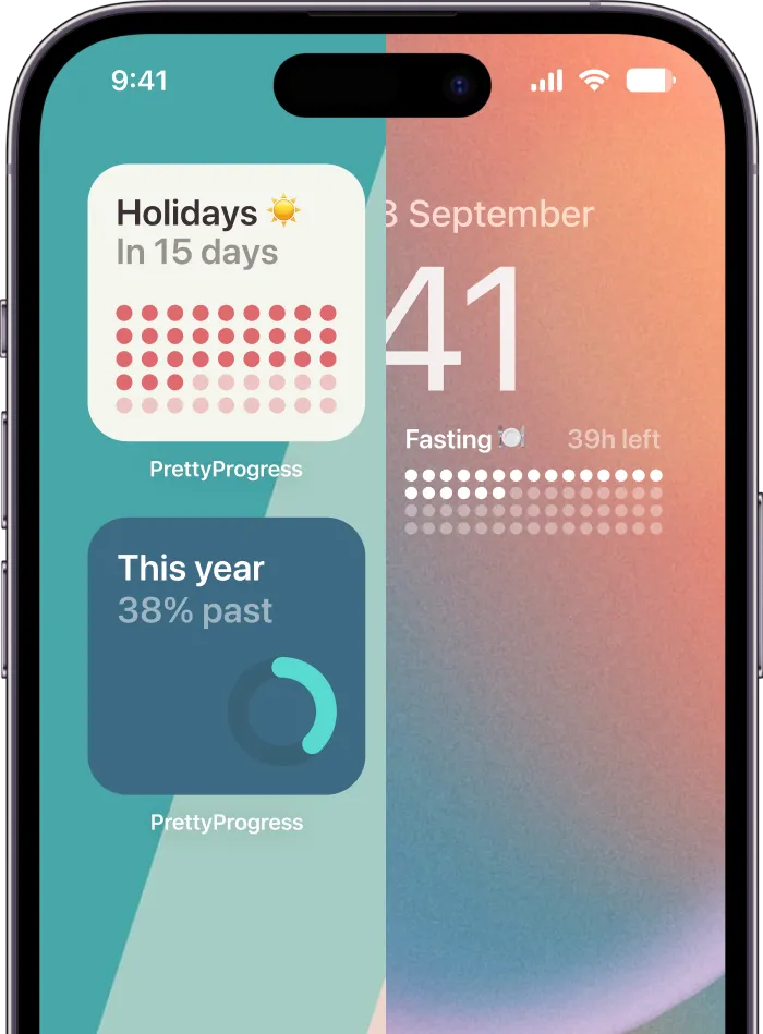
Four visual styles that work in real life
Deadline trackers work best for students, freelancers, managers, and anyone with fixed dates. Think exam week, contract renewal, launch day, tax prep, or a client deliverable. You don’t need a detailed board on your screen all day. You need to know, at a glance, how much runway is left.
Habit bars fit routines that fail because they’re easy to postpone. Reading, mobility work, stretching, hydration, meditation, language practice. These aren’t planning problems. They’re visibility problems. A bar or streak on your screen keeps the habit in your field of attention without nagging you.
A good visual cue doesn’t ask for a decision every time. It quietly removes one.
Goal roadmaps help with long arcs. Saving for a move, writing a book, training for a race, finishing a certification. These goals die when daily effort feels disconnected from progress. A visual map reconnects the small step to the larger story.
Event countdowns are the lightest option, but they matter more than people think. They can hold personal anchors in place. Trips, birthdays, launches, fasts, anniversaries, film releases, school terms. Not everything worth tracking is a “task.”
The best style is the one that keeps showing up in your life after the novelty wears off.
Setting Up Your Unified Tracking System
Many individuals sabotage a good tool by using it in one place only. They create a tracker, admire it once, and then bury it inside an app folder. If you want a visual system to change behavior, it has to live where your eyes already land.
That means building one tracker, then placing it across the screens you check naturally throughout the day.
![]()
Build one tracker around one real deadline
Start with a concrete example. Use something like “Q4 Project Launch” or “Submit thesis draft.” Avoid vague names like “Life Admin” or “Work Goals.” Visual systems work better when the target is specific.
Set it up in this order:
- Name the outcome clearly. “Client proposal due” beats “Proposal.”
- Set an accurate start date. Not the day you wish you had started.
- Set the actual end date. Use the external deadline, not a fuzzy estimate.
- Pick a design that reads fast. Strong contrast, simple label, minimal clutter.
- Choose one unit of meaning. Time remaining, percent complete, or days left.
People often stop there. That leaves a lot of value unused. Research on project metrics shows teams using only the basic functions of their software miss about 34% of potential productivity gains, which is one reason setup quality matters in tools productivity work, as explained in this review of why project management metrics often fail.
A solid setup is better than a fancy setup. But a complete setup is better than a lazy one.
Put the tracker where your eyes already go
A unified system means your tracker appears in several moments of the day without extra effort.
- Lock Screen. Best for the first glance. Urgency is effective. If a deadline is close or a habit needs daily action, put it here.
- Home Screen. Best for ambient awareness. It doesn’t interrupt you, but it keeps the goal present.
- Watch face. Best for quick checks when you’re moving between meetings, classes, or errands.
- Desktop or laptop screen. Best for work blocks, especially if the task lives on that device.
For managing several parallel deadlines, I like a separate layer for grouped project visibility. This guide on how to keep track of multiple projects shows the logic well. One main tracker keeps your biggest commitment visible, while supporting trackers handle secondary timelines.
Use more than the default setup
A lot of people install a tool and never go past the first working state. That’s a mistake. Default layouts are generic by design. Your setup should reflect how you process information.
Use themes, colors, or icon differences with a purpose:
| Screen | Best use | What to show |
|---|---|---|
| Lock Screen | Priority focus | One urgent deadline or one daily habit |
| Home Screen | Ongoing context | Medium-term goal or stacked trackers |
| Watch | Quick decision support | Time-sensitive item only |
| Desktop | Deep work anchor | Project tracker tied to current work |
Here’s a walkthrough format worth watching if you want to think in terms of practical placement and visibility instead of abstract theory:
Field note: The best widget isn’t the prettiest one. It’s the one you still notice on a tired Tuesday afternoon.
If your screen is crowded, remove two widgets before adding one. Visual productivity works when the signal is stronger than the surrounding noise.
Advanced Workflows for Habits and Deadlines
Once the basics are in place, the interesting part begins. A visual tracker stops being a single countdown and starts acting like a behavioral scaffold. Done well, it changes what you do next without requiring a pep talk.
Time management problems are expensive in any setting. Hubstaff’s workplace productivity roundup notes that poor time management erodes 20% of a company’s annual productivity, and people who consistently use tracking tools see task completion rise by 25%. That matches what shows up in real life. When progress is visible, procrastination has less room to hide.
The student semester stack
A student usually doesn’t have one deadline. They have a cluster. Midterms, a paper, a lab report, final exams. A single to-do list flattens all of that into one anxious pile.
The fix is a stacked visual system.
One widget tracks the next major exam. Another tracks the paper due date. A third tracks the end of term. Each sits in a different visual weight. The nearest deadline gets the most visible placement. The broader semester tracker stays in the background.
The “aha” moment comes when the student stops asking, “What should I work on?” The screen answers before the question forms.
The professional project dashboard
A consultant, manager, or creative lead has a different problem. Their work is split across client delivery, internal work, and career maintenance. If all three look identical inside a tool, one category usually gets neglected.
That’s where visual separation helps. Use one theme or color family for client deadlines, another for internal milestones, and a third for personal development. Minimal styles work well for serious project work. More distinctive themes can make personal goals easier to notice.

This isn’t decoration. It’s categorization that your brain can read in a second.
A practical setup might look like this:
- Client work. A clean countdown with firm dates and no visual extras.
- Internal projects. A progress bar tied to rollout phases or review cycles.
- Personal growth. A slower-moving tracker for a course, portfolio, or certification.
When categories look different, decisions get faster. You spend less energy decoding your own system.
The habit builder chain
Habits need a different rhythm than deadlines. A deadline builds pressure over time. A habit needs renewal.
The most effective visual setup here is a resetting tracker. Daily meditation resets every morning. Weekly strength training resets at the start of the week. Language practice can reset each day with a small target that feels finishable.
The useful shift is psychological. Instead of carrying guilt from yesterday, the screen presents today’s chance clearly.
This is why habit builders often do better with simple bars than rich dashboards. They don’t need history in front of them all day. They need a visible invitation to act now.
Three habit patterns work especially well:
- Daily reset habits for short practices like reading or stretching.
- Weekly chain habits for things you do several times per week.
- Milestone habits for cumulative targets like pages written or miles walked.
If you’ve tested lots of apps and still struggle, it may not be a discipline problem. It may be that your old tools asked for too much interpretation before action.
Maintaining Focus and Consistency Over Time
The first failure point in any visual system is familiarity. After a while, even a useful widget can fade into the background. You still technically see it, but your brain stops registering it as important.
That doesn’t mean the method failed. It means the cue needs maintenance.

Refresh the cue before it fades into wallpaper
Global engagement is weak right now. OECD and Gallup figures summarized here show employee productivity growth slowed to 0.4% in 2024, while only 21% of workers globally were engaged at work. That disengagement carried an estimated $438 billion in lost U.S. productivity. At a personal level, that’s a reminder that motivation rarely stays high on its own. People need systems that keep attention alive.
The simplest fix is a review rhythm. Not a giant life audit. Just a brief reset.
Use a maintenance checklist like this:
- Change the visual treatment. Swap theme, color, or size when a widget starts disappearing into the screen.
- Retire dead trackers. A finished goal left on-screen teaches you to ignore the area.
- Promote what matters now. Move the current priority to the Lock Screen or top Home Screen slot.
- Reduce clutter. If too many widgets compete, none of them will carry weight.
For more durable goal follow-through, this guide on how to stay consistent with goals is useful because it focuses on rhythm and repetition instead of motivation alone.
Treat finished progress as a trigger, not an ending
A filled bar feels good. That matters. Completion is one of the few built-in rewards a productivity system can give you without external praise.
But completion also creates a gap. If nothing replaces the finished tracker, your system loses momentum. That’s why the best practice is immediate succession. When one project ends, install the next meaningful tracker the same day.
Try this sequence:
| Moment | What to do |
|---|---|
| Goal completed | Remove the completed widget |
| Same session | Add the next active deadline or habit |
| End of week | Review whether placement still matches priority |
Keep this standard: every visible tracker must represent a live commitment.
Consistency doesn’t come from intensity. It comes from reducing the number of times you have to remember, reinterpret, and restart.
Your First Step to Visual Productivity
Most tools productivity advice gives you a bigger system. That’s often the wrong prescription.
If your current setup already feels heavy, don’t add another workspace, another automation layer, or another habit app with more notifications. Pick one real deadline or one habit that matters this month. Put it somewhere visible. Keep it there.
That’s the shift. Move from managing a system to seeing a target.
If you want better focus, aim for persistence over sophistication. If you want more consistency, lower the effort required to remember what matters. The best tools don’t ask for your attention all day. They hold your intention in place until action becomes easier.
Start small. One widget. One goal. One screen you look at constantly.
Frequently Asked Questions About Productivity Widgets
Do these widgets drain my phone’s battery
In normal use, battery impact is usually minimal. Widgets are lightweight compared with apps that stream, sync constantly, or push frequent notifications. A simple progress or countdown widget updates infrequently unless it’s built as a live timer, so users typically won’t notice a meaningful battery hit in day-to-day use.
If battery life matters a lot to you, use fewer live elements on the same screen and avoid cluttered Home Screens packed with constantly changing components.
Can I sync my trackers between my iPhone and Android device
That depends on the app. Some widget tools are device-specific, which means what you create on one platform stays there. Others support account-based syncing across platforms and devices.
If you use more than one device during the week, check this before committing. Cross-platform tools are much easier to live with because you don’t have to rebuild the same tracker in multiple places.
What’s the best way to track a recurring habit versus a one-time deadline
Use different logic for each one.
A one-time deadline should have a fixed start and end date. It fills once and creates a clear sense of runway. That works for launches, exams, trips, applications, and due dates.
A recurring habit should reset automatically on the right schedule. Daily habits reset every day. Practice goals that happen several times per week often work better on a weekly reset. The point is to make the current cycle visible, not to turn the widget into a museum of past effort.
For many, the simplest rule is this:
- Use countdowns for fixed dates
- Use resetting bars for repeated behavior
- Use separate trackers when two goals need different rhythms
If you want a clean way to put this into practice, Pretty Progress turns your iPhone, iPad, Apple Watch, Mac, and Android devices into always-on countdowns and progress bars for deadlines, habits, events, and long-term goals. It’s a good fit if you want visual motivation without ad clutter, constant notifications, or a bloated all-in-one system.