April 19, 2026
Visual Reminders for ADHD: Your Apple Setup Guide
Learn why visual reminders for ADHD are so effective and get step-by-step guides to set them up on your iPhone, Apple Watch, and Mac for better focus.
You open your phone to check one message, then remember a bill, then forget why you picked up the phone in the first place. The sticky note on your desk stopped registering two days ago. The reminder notification got swiped away on autopilot. The planner looked promising on Sunday and invisible by Tuesday.
That loop is common with ADHD. It’s not a character flaw, and it’s not a matter of “trying harder.” A lot of traditional advice still assumes that if a reminder exists somewhere, you’ll remember to look at it. In real life, visual reminders for adhd only help when they stay visible in the places you already check without effort.
The most useful setups aren’t always louder. They’re often simpler, more persistent, and easier to glance at. That’s where Apple devices can help. A lock screen countdown, a home screen progress bar, a watch complication, and a desktop widget can turn your devices into an external memory system instead of another pile of digital clutter.
Table of Contents
- Moving Beyond Sticky Notes and Lost Reminders
- Why Your ADHD Brain Responds to Visual Cues
- Designing Your Core Visual System on iPhone
- Extending Reminders to Your Apple Watch and Mac
- Six Essential Visual Reminder Setups for ADHD
- When Your Visuals Start to Become Invisible
Moving Beyond Sticky Notes and Lost Reminders
Sticky notes can work. Whiteboards can work. A paper checklist on the door can work. The problem is that many ADHD systems fail not because they’re bad ideas, but because they depend on you noticing the same object over and over.
That’s why static reminders often lose power. They blend into the background. They become furniture.
A useful digital system does something different. It stays in the spaces you already visit, changes over time, and gives you information at a glance instead of demanding a full attention shift. Research on digital wearables and companion apps points to a real gap in ADHD advice. A 2024 pilot study on wearable reminders and companion apps reported parent- and teacher-reported improvements in attention and self-monitoring, yet most ADHD advice still centers on static tools rather than persistent phone widgets or smartwatch progress bars.
The reminder that works is usually the one you don’t have to remember to check.
That matters for everyday friction points. Leaving on time. Starting a task. Remembering medication. Seeing how close a deadline really is. If the cue lives on your lock screen, your watch face, or your desktop, it has a better chance of becoming part of your environment instead of another hidden list.
For many people, the deeper issue is time and task sequencing, not forgetfulness alone. If you want a broader look at how this shows up day to day, this guide on ADHD time management does a good job explaining why tasks can feel slippery even when you care about them.
Why dynamic beats static
Static reminders say, “Don’t forget.”
Dynamic reminders say, “You have 2 hours left,” or “You’re halfway through,” or “Leave in 15 minutes.”
That’s a completely different experience. One asks your brain to hold context. The other gives the context to you.
A good visual system should feel like a dashboard, not a scrapbook. It should reduce decisions, reduce searching, and reduce the chance that an important task disappears until the last minute.
Why Your ADHD Brain Responds to Visual Cues
Visual reminders for adhd work because they move information out of your head and into your environment. That sounds simple, but it changes everything.
A 2022 systematic review on visual activity schedules found that these structured visual aids reduced disruptive behaviors by an average of 40 to 70% in children with ADHD, with the schedules helping by externalizing memory and planning rather than relying on internal recall alone (Journal of Autism and Developmental Disorders review). That same principle matters for adults too. If the plan is visible, you don’t have to keep rebuilding it from scratch.
Working memory needs a place to land
Working memory is the mental scratchpad you use to hold a next step long enough to act on it. With ADHD, that scratchpad can feel unreliable. You know the task matters. You still lose the thread.
Visual cues help by turning “remember this later” into “see this now.”
A few examples:
- A countdown widget makes a deadline visible without opening an app.
- A progress bar shows whether you’re in the middle of a habit streak or a focus block.
- A lock screen cue reduces the gap between intention and action because the prompt appears before you drift.
If the phrase “out of sight, out of mind” feels painfully familiar, this explanation of object permanence in ADHD is a useful way to understand why forgotten tasks can feel like they vanish when they’re no longer visible.
Time has to become visible
ADHD often turns time into two categories. Now and not now. That’s why vague reminders like “work on project later” don’t hold much weight.
A visible timer or progress bar makes time concrete. It gives shape to the gap between this moment and the deadline. You’re no longer dealing with an abstract future task. You’re seeing movement.
Practical rule: If a reminder needs interpretation, it’s probably too weak for an ADHD brain on a busy day.
That’s why visual systems usually outperform text-heavy systems. The reminder should answer one question immediately. What matters right now?
Try framing your visual reminders around one of these jobs:
-
Start something
Use a cue like “begin at 3:00” or a progress bar for the first work block. -
Switch something
Use transition prompts such as “leave in 15 minutes.” -
Finish something
Use countdowns for deadlines, pickup times, medication windows, or end-of-day shutdowns.
When a reminder does one job well, it feels supportive. When it tries to hold your whole life at once, it becomes wallpaper.
Designing Your Core Visual System on iPhone
Your iPhone is the best place to build the core of your system because it’s already the device you check all day. The goal isn’t to add more reminders. The goal is to make the right reminder impossible to miss without making your screen chaotic.
A 2018 study on accessible visualizations for people with ADHD found that minimal text improved performance by 25 to 30%, while strategic icons improved accuracy on memory-dependent tasks by 18% (University of Oklahoma study summary). That lines up with what works in practice. Cleaner widgets are easier to trust and easier to notice.

Start with less than you think you need
It’s easy to overbuild this part. People create too many widgets, too many apps, and too many categories. Then the whole thing starts to feel like homework.
Use three design rules.
-
Keep text short
A label like “Leave soon” works better than a sentence. You want instant recognition. -
Use icons that mean something fast
Pill, backpack, laptop, book, water bottle, running shoe. The icon should carry some of the memory load. -
Limit competing widgets
Don’t place six different priorities on one screen. One screen should usually have one main job.
If you want a practical walkthrough for adding a countdown, this guide on setting up an iPhone countdown widget shows the basic steps.
Build one lock screen cue and one home screen cue
The easiest setup is a two-part system.
Lock Screen: use this for urgency.
Put the reminder you need before distraction takes over. Good examples are “Exam in 3 days,” “Leave in 20 minutes,” or “Medication at 8:00.”
Home Screen: use this for continuity. For this, a progress bar or longer-view countdown helps. It keeps a project or routine visible across the day, not just in one alert moment.
One workable approach looks like this:
-
Choose one active deadline
Don’t start with every goal. Pick one thing with consequences if ignored. -
Name it in plain language
“Tax filing,” “Final paper,” “Move out,” “Trip budget,” “Morning meds.” -
Pick a calm visual style
If bright colors pull you off task, use a neutral theme. If your brain ignores muted screens, use one stronger accent color. -
Match size to importance
A small lock screen widget can handle one urgent countdown. A medium or large home screen widget is better for a habit or project you need to see repeatedly. -
Place it where your thumb already goes
Top-left looks nice. It’s not always practical. Put the widget on the screen you naturally open first.
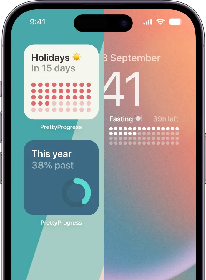
One app that fits this style is Pretty Progress, which lets you create countdown and progress widgets for Home and Lock Screens with adjustable themes, icons, colors, and layouts. That kind of customization matters because some people need a quiet widget to reduce overwhelm, while others need a stronger visual cue to stop scrolling.
If your phone still feels noisy after setup, remove a widget before adding another one.
A good iPhone system should answer these questions instantly:
| Screen | Best for | Keep it simple by using |
|---|---|---|
| Lock Screen | Time-sensitive cues | One urgent countdown |
| First Home Screen | Daily direction | One progress bar or one core habit |
| Second Home Screen | Reference tools | Calendar, Reminders, Notes only if you actually open them |
Use Apple’s built-in tools too. Reminders works well for lists. Calendar works well for time-based commitments. Notes works for parking thoughts. Widgets work best when they represent the one thing those apps can’t do on their own, which is stay visible all day without being opened.
Extending Reminders to Your Apple Watch and Mac
An ADHD-friendly system gets stronger when each device handles a different kind of reminder. Your watch should interrupt gently. Your Mac should hold the bigger picture.

What belongs on your watch
Your Apple Watch is best for cues that need speed. Not detail.
Think in terms of micro-prompts:
- Leave soon
- Meeting starts
- Take medication
- Focus block ends
- Pickup time
Watch complications work because they live in your peripheral awareness. You don’t have to activate anything, search for anything, or remember what app to open. If you want the setup steps, this tutorial on adding a countdown widget to your Apple Watch covers the process clearly.
The trade-off is screen size. A watch can’t carry a complex plan. If you cram too much into it, you’ll ignore it. Keep the watch face limited to one or two cues that matter every day.
A watch reminder should feel like a tap on the shoulder, not a dashboard.
What belongs on your Mac
Your Mac is better for slower-burning responsibilities. Visual reminders for ADHD prove useful for tasks that disappear during long workdays, especially if you work from a laptop and keep many windows open.
Good Mac uses include:
- A deadline countdown for a proposal, exam, launch, or travel date
- A workday shutdown cue so you don’t drift into evening without noticing
- A monthly goal tracker that stays visible near the desktop or in a widget area
- A focus timer for a writing or admin block
Mac reminders should be quieter than phone reminders. They don’t need to fight social media or incoming texts in the same way. They need to sit in your visual field long enough to keep a project from vanishing.
A simple device split usually works well:
| Device | Best reminder type | Avoid using it for |
|---|---|---|
| Apple Watch | Immediate transitions | Long descriptions |
| iPhone | Daily priorities | Too many parallel widgets |
| Mac | Ongoing work and deadlines | Flashy visuals that clutter your workspace |
If all three devices show the same exact reminder, you’ll tune it out. If each device plays a different role, the system feels lighter and works better.
Six Essential Visual Reminder Setups for ADHD
The best visual reminders for adhd solve a specific problem. They don’t try to “fix productivity” in general. They help with one friction point that keeps repeating.
Dynamic visuals tend to work better than one-time setups because they change as time passes. That changing signal creates the kind of glanceable motivation that static notes often lose, a gap often missed in common advice about vision boards and similar tools (discussion of dynamic motivation and vision boards).
Start with examples, then adapt them.

A quick cheat sheet
| Challenge | Widget Type | Example Setup |
|---|---|---|
| Trouble starting | Countdown or progress bar | “Start writing at 2:00” on Lock Screen |
| Late transitions | Short countdown | “Leave in 15 min” on iPhone or Watch |
| Forgotten deadlines | Long countdown | “Paper due” on Home Screen |
| Missed medication | Icon-based reminder | Pill icon on Lock Screen or Watch |
| Weak routines | Daily progress bar | Morning checklist anchor on Home Screen |
| Project drift | Ongoing countdown | One active project visible on Mac |
If you manage several moving parts at once, this guide on keeping track of multiple projects is a helpful next step.
Six setups that solve real problems
1. The Time to Begin cue
Some tasks don’t need motivation. They need an entry point.
Set a lock screen countdown to the exact moment you want to start, not the deadline itself. “Start slides at 6:30” works better than “Presentation tomorrow.” It removes the false comfort of a far-away due date and turns the challenge into one visible moment.
2. The Leave Soon countdown
Transitions are where many days fall apart. You think you have more time than you do, start one more thing, and then rush.
Use a short countdown on your watch or lock screen for leaving the house, ending lunch, picking up kids, or heading to class. Short countdowns work because they answer one question. How close am I to needing to move?
After you’ve seen a few examples, this video gives another practical angle on building reminders that stay useful over time.
3. The Deadline in Plain Sight setup
A paper due date hidden in a school portal is not a reminder. It’s stored information.
Put the deadline on your home screen with a simple label and a clean progress bar. Avoid adding sub-tasks here. The widget’s job is visibility. Your task manager can hold the details.
4. The Medication anchor
Medication reminders fail when they arrive at the wrong time or in the wrong form. If you always ignore standard alerts, use a visual with a pill icon and place it where you already look first thing in the morning.
For some people, the best setup is visual plus physical. Keep the medication near something you already touch, then let the screen cue reinforce it.
5. The Routine bar
Morning and evening routines often collapse when they live only as a mental script. A routine progress bar can represent a single block like “morning reset,” “shutdown,” or “bed prep.”
That’s often more effective than showing every tiny step. The bar reminds you that the routine exists. If needed, the checklist can live one tap away in Reminders.
6. The One Project rule
When everything feels urgent, choose one project to stay visible across devices. Not three. One.
That might be exam prep, portfolio updates, moving apartments, or a work launch. The visible project acts like an anchor for the week. It reduces the tendency to scatter attention across ten half-started priorities.
If your visual system makes you feel behind every time you see it, the system is overloaded.
When Your Visuals Start to Become Invisible
Every reminder system fades a little with time. That doesn’t mean the system failed. It means your brain adapted.
Background images and static visual elements can slow people down or fade into the background, especially when they add clutter instead of clarity, which is one reason minimalist, purposeful visuals tend to hold attention better over time than decorative ones. When your widgets stop standing out, don’t throw the whole setup away. Reset it lightly.

Try a small monthly audit:
-
Remove one stale reminder
If it no longer matters, delete it. Dead widgets become wallpaper fast. -
Change one visual property
Switch color, icon, theme, or bar style. Novelty helps without requiring a whole rebuild. -
Move one widget
A new screen position can make an old cue visible again. -
Promote a current priority
Bring this week’s real task forward. Demote last month’s goal. -
Shrink the system when life gets busy
On hard weeks, fewer cues usually work better than more.
The best systems stay alive. They change with your deadlines, routines, and seasons of life. That flexibility matters more than perfection.
If you want a cleaner way to build always-on countdowns and progress bars across your iPhone, Apple Watch, and Mac, Pretty Progress is built for that exact job. It lets you create simple, customizable visual cues that stay visible without adding noise, which is often the difference between a reminder that helps and one that disappears into the background.