

September 18, 2026
Countdown on My Desktop Made Simple and Always Visible
Learn how to put a countdown on my desktop on Mac and Windows with always-on widgets, setup steps, and customization tips for glanceable timers.
Your deadline is on the screen, but the tab with the timer keeps disappearing behind email, Slack, or a lecture note window. By the time you look up again, you’re not checking progress anymore, you’re re-orienting yourself, trying to remember how much time is left and what you were supposed to be doing.
That’s why a countdown on my desktop works better than a hidden browser tab or a phone alarm. A persistent cue sits where your eyes already go, which matters when the goal is to stay with one exam, one project, or one habit streak instead of bouncing between tasks. Microsoft’s description of Widgets in Windows captures the same idea, interactive elements that show dynamic content at a glance and stay available without opening the full app, which is exactly the kind of visibility desktop countdown tools try to preserve Microsoft Widgets in Windows. For a focus-first setup, the win is not decoration, it’s reducing the mental cost of checking time and returning to work.
A good desktop countdown acts like a single attention anchor. It keeps one commitment visible, cuts down on repeated app-switching, and gives your brain one place to land when motivation dips. If you want the practical version of that idea in a progress-style layout, the visual-goals approach is laid out well in this guide on visual goals and desktop motivation.
Table of Contents
- Why a Persistent Desktop Countdown Keeps You on Track
- Choosing the Right Way to Add a Countdown on Mac and Windows
- Setting Up Pretty Progress for a Countdown on Your Mac Desktop
- Customizing Your Desktop Countdown for Glanceable Motivation
- Keeping Your Countdown Efficient and Always On Without Draining Battery
- Your Always Visible Countdown Checklist and Next Steps
Why a Persistent Desktop Countdown Keeps You on Track
You know the moment. You open a doc to write, then hide the timer because it feels noisy. Twenty minutes later, the timer is gone, the browser has exploded into ten tabs, and now you are spending energy reconstructing the session instead of finishing it.
A persistent desktop countdown fixes that by making time part of the workspace. The point is not to watch every second. It is to keep one deadline, exam window, or fasting cutoff in view so you do not keep asking, “How much longer?” every few minutes.
Practical rule: if a timer makes you reopen an app to check it, it is too hidden to help with focus.
That matters even more for ADHD-friendly work and exam prep, where re-entry costs are real. A countdown on the desktop gives you a quick cue without forcing a context switch, and that is a better fit than a phone alarm that pulls you out of the desk entirely. It also works more like a reminder than a stopwatch, which lines up with evidence that reminder timing changes behavior. A controlled study on goal reminders found that reminders sent during the regular working period increased a productivity index by 0.08 standard deviations, while late reminders had no effect, which points to timing as part of the tool, not an afterthought goal reminder study.
Visible cues help, but they are not magic. The same study showed that reminders can shift study behavior when they arrive at the right moment, while other reminders do little. That is the practical lesson for desktop timers. A countdown works best when it stays visible, stays tied to one concrete goal, and reduces the mental work of re-orienting after every interruption. For a similar visual approach, the ideas in visual goals and desktop motivation are a useful reference.
Choosing the Right Way to Add a Countdown on Mac and Windows
The first decision is where the countdown lives. On a Mac, the best setup usually feels native and stays visible on the desktop. On Windows, a widget layer often fits better because it sits with the rest of the system cues. If the countdown only hides in a menu bar or browser tab, it is easy to miss during deep work or a long study block.
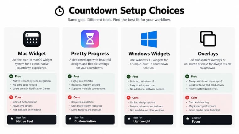
| Method | Visibility | Best For |
|---|---|---|
| Mac widget | Stays visually close to the workspace | People who want a native feel and quick glance checks |
| Pretty Progress on Mac | Single-event countdown with desktop widget support | One deadline, one exam, one goal that needs constant visibility |
| Windows Widgets | Dynamic, glanceable content in the system layer | Users who want built-in widget behavior without extra clutter |
| Lightweight overlay | Sits above other windows | People who need the countdown to remain on top during long sessions |
The trade-off is attention. A widget that lives in the system display layer is easier to trust than an app you have to open every time you want a check-in. Microsoft describes Windows Widgets as interactive, glanceable elements that refresh through the day and give quick access without opening the full app, which matches the logic behind a desktop countdown Microsoft Widgets in Windows.
For Mac, the cleaner choice is usually a desktop widget or overlay that tracks one current countdown instead of several competing ones. That matters for focus and ADHD-friendly work, because one visible deadline reduces re-orientation after interruptions. A screen full of timers turns into noise. A single timer keeps the next step obvious.
On Windows, the question is narrower if you want native persistence. The countdown needs to stay visible without becoming a busy panel that competes with your files, chat windows, and task list. That keeps it useful as a single-task attention anchor, not decoration.
A countdown should sit where your eyes naturally fall, not where your mouse has to hunt for it.
Setting Up Pretty Progress for a Countdown on Your Mac Desktop
Start with one deadline that has to stay visible all day. If you try to keep several on screen at once, the desktop turns into noise. One exam, one release date, one project cutoff, or one fasting window gives the widget a clear job, and that matters when you want a single-task attention anchor instead of more visual clutter.
Download the app, then build the countdown around the actual start and end dates for the event. A vague reminder that something is coming later is easy to ignore. A countdown tied to the specific window you are working against is harder to dismiss. Keep the label specific, too, such as “Biology midterm,” “Client handoff,” or “Year-end review.”
Place the widget where your eyes already land during work. Upper-left or upper-right usually works well on a Mac desktop, away from the dock, file piles, and chat windows. That keeps it glanceable without turning it into decoration that competes with everything else on screen. For ADHD-friendly work, one clear cue is easier to trust than a crowded cluster of timers.
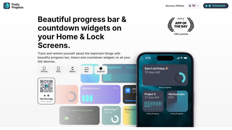
After you place it, test it once. Close and reopen the desktop, switch to another app, and check that the countdown still shows the right event. If the label or number is off, fix it right away. A countdown that is almost right gets ignored in practice.
For a practical Mac walkthrough on adding a countdown widget on Mac, use the desktop guide as the setup reference.
For exam week, I prefer a countdown that shows the exact date and the thing I keep putting off. For project work, a single deadline widget above the clutter does the job better than a dashboard full of competing timers.
Customizing Your Desktop Countdown for Glanceable Motivation
A useful countdown does not need to be flashy. It needs to be readable in half a second. Strong contrast, a layout you can parse without leaning in, and a theme that fits the task all matter more than decoration.
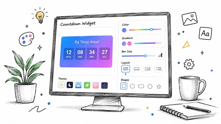
Pretty Progress offers curated themes such as Swiss Style, Minimal, Aqua, and Retro OS. That range matters because different goals call for different visual weight. A study countdown should look calm and restrained. A milestone or year-end countdown can be a little more expressive if you want it to feel celebratory without pulling attention away from work.
Design for quick recognition
The fastest way to ruin a desktop countdown is to make it decorative first and legible second. Keep the label short, use a theme that does not fight the background, and choose a layout that makes the remaining time obvious at a glance. If the widget needs explanation, it is already too complex.
Keep the timer boring enough that your eyes can ignore the styling and notice the deadline.
Color, gradients, bar size, shape, layout, and icons all shape whether the widget feels like a cue or an ornament. If you upgrade to PRO, the deeper styling controls give you tighter control over presentation, but the main principle stays the same. The countdown should reinforce one task, not ask you to admire it.
Match the widget to the goal
A countdown for an exam should feel different from a countdown for a life event. A fasting window usually benefits from a clear, minimal progress display. A release date or holiday can handle a more expressive look.
The safest rule is to adjust the design to the emotional temperature of the goal, not the other way around. A countdown on my desktop works best when it stays visually quiet and keeps one deadline visible, so I do not waste time re-orienting myself every time I return to the screen.
Keeping Your Countdown Efficient and Always On Without Draining Battery
A desktop countdown only helps if it stays current without becoming a drain in the background. The trade-off is refresh frequency. Apple’s WidgetKit guidance says reloading widgets uses system resources and battery, and for widgets people check often, the usual budget is about 40 to 70 refreshes per day, which lands around one update every 15 to 60 minutes depending on workload and system conditions Apple WidgetKit guidance.
That does not mean the countdown should feel stale. It means the display should separate visual ticking from full widget reloads. A simple on-screen countdown can update lightly while the heavier data fetch or state refresh happens far less often. If every second forces a full widget refresh, you pay battery and CPU for motion that does not improve focus.
The platform side points the same way. Idle native widgets are usually low-cost, while animated widgets, frequent network calls, and high refresh rates are what drain power, and slower or manual refresh settings can reduce CPU and battery impact desktop widget performance guidance. That makes a minimal render path the right default for a countdown on my desktop. The widget itself is not the issue. The update pattern is.
What to avoid
- Second-by-second reloads: fine for a stopwatch, wasteful for most countdown widgets.
- Animated flourishes: they look busy quickly, then start pulling attention away from the deadline.
- Network-heavy updates: unnecessary if the countdown is just doing local time math.
- Multiple always-on timers: each extra cue competes for attention and screen space.
For Mac users who want the lightweight route, the engineering advice around efficient widgets is summarized in this Mac desktop widgets reference. The practical takeaway is simple. Keep rendering light, keep refreshes sparse, and let the countdown do one job well.
Your Always Visible Countdown Checklist and Next Steps
A desktop countdown works when it stays in sight without asking for attention. It should keep one deadline visible, reduce the need to re-open apps, and help you return to the same task after every interruption. If it turns noisy, hides itself, or starts tracking several goals at once, it stops acting like an attention anchor.
Use this quick check before you rely on it for an exam, project, or event:
- One goal only: the countdown should point to a single exam, project, event, or streak.
- Readable at a glance: the label and time should be clear without zooming.
- Stable placement: it should stay where your eyes naturally land during work.
- Lightweight behavior: no excessive motion, no constant full refreshes.
- Useful timing: it should stay visible during the part of the day when you need the cue.
If the widget vanishes, check placement and refresh settings first. If it updates too often, slow the refresh rate. If it feels crowded, remove extra events and keep one commitment in front of you.
The strongest version of a countdown on my desktop is plain, persistent, and easy to ignore until I need it. That matters for deadline work, exam prep, and ADHD-friendly focus, because the goal is to keep one target visible without creating more re-orientation. Pretty Progress fits that role when you want a single cue on screen across desktop, iPhone, iPad, Apple Watch, and Mac.





