

August 29, 2026
Mac Desktop Widgets: A Practical Setup Guide
Learn how to add, customize, and style mac desktop widgets on macOS, with practical use cases, troubleshooting tips, and how third-party apps fit in.
Your Mac desktop usually falls into one of two camps. It’s buried under downloaded files and screenshots, or it’s perfectly clean but so passive that you never look at it. In both cases, a useful layer is missing. Mac desktop widgets can turn that background into a quiet status board for countdowns, progress, reminders, timers, weather, battery, and other information you want to see without opening a full app.
That doesn’t make widgets a replacement for menu bar utilities, Dock apps, or notifications. A desktop widget works best when the information benefits from repeated, low-effort glances. It works poorly when it demands attention, duplicates an alert, or competes with the window you’re using.
Table of Contents
- Why Mac Desktop Widgets Are Worth a Second Look
- Adding and Placing Widgets on Your Mac Desktop
- Customizing Widget Size, Content, and Style
- Choosing Where Widgets Live on Your Mac
- Real-World Uses for Desktop Widgets
- When Third-Party Widget Apps Make Sense
- Troubleshooting and Making Widgets Stick
Why Mac Desktop Widgets Are Worth a Second Look
Mac widgets have been through several lives. Apple introduced Dashboard with Mac OS X 10.4 Tiger in 2005, moved it into the background by disabling it by default in OS X 10.10 Yosemite in 2014, removed it in macOS 10.15 Catalina in October 2019, and restored desktop placement with macOS Sonoma in 2023. This history of Mac widgets shows a shift from a hidden overlay to information that can stay visible on the desktop.
The practical difference is substantial. Earlier widget systems expected you to summon a separate layer or open Notification Center. Sonoma lets you drag widgets from the gallery and position them directly on the desktop, so the information can remain part of your working environment instead of living behind another gesture. Apple’s current support guidance also covers manual desktop placement and the relationship between desktop widgets, Notification Center, and Stage Manager. Apple’s widget support documentation is the right reference when a control behaves differently on your Mac.
The useful limit
A widget earns its space when you can answer “What do I need to know?” with a single glance. A deadline countdown, a session timer, or a progress bar fits that test. A complicated project dashboard usually doesn’t, because it turns a glanceable surface into another app you have to interpret.
The best setups contain a small number of intentional signals:
- A countdown: Use it for a launch, exam, trip, event, or fixed deadline.
- A progress view: Keep a long-running goal visible without opening a tracker.
- A quiet timer: Place it where you can see the session without letting it dominate the screen.
- A practical status panel: Battery, calendar, or weather can justify a small corner if you check them often.
Start with the information you repeatedly seek, not with the widgets available in the gallery. The next decisions are about placement, footprint, appearance, and whether a native widget can do the job without adding clutter.
Adding and Placing Widgets on Your Mac Desktop
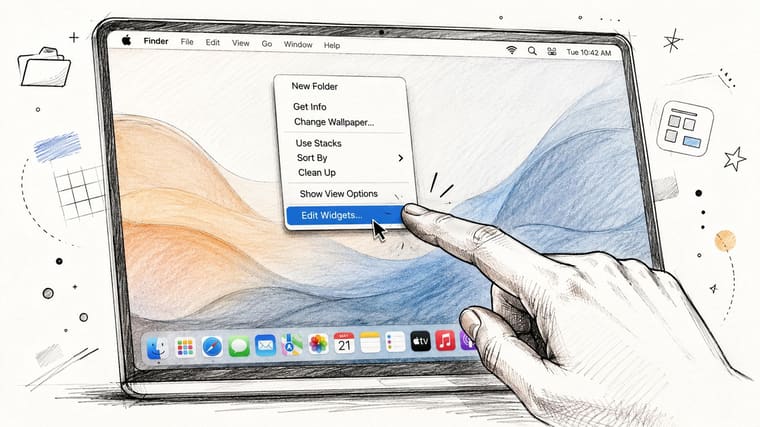
The gallery is the starting point, but the first placement shouldn’t be your final one. Right-click an empty area of the desktop and choose Edit Widgets. The gallery lets you browse by app or search for a widget by name, then preview available shapes and sizes before you add anything.
Drag a tile from the gallery onto the desktop. You can place it near the upper edge or drop it into a more open area of the wallpaper. macOS helps align nearby widgets, and the layout typically snaps into a coherent arrangement rather than leaving every tile at an arbitrary angle. That’s helpful for a neat status strip, but it can also make a dense group feel heavier than expected.
Build the layout before filling it
Place one widget, close the gallery, and use the desktop normally. This exposes problems that the editor hides. A tile that looks balanced against an empty wallpaper may cover files, collide with a frequently used corner, or draw your eye away from the window beneath it.
You can move a widget by dragging it while the desktop is in its editing state. To remove one, right-click it and choose the removal command, or enter the widget editing state and use the minus button. If you’re building a countdown surface, start with one widget and confirm that its placement remains useful while your normal windows are open.
Resize from the widget’s available corner control when macOS exposes one. A larger footprint can reveal more detail, but it also consumes visual space and may make the desktop feel like a dashboard. Keep large widgets for information you actively inspect. Use a compact size for anything that only needs to confirm a status.
Some third-party widget apps won’t appear in the gallery until their host app is installed. If a widget is missing, check the app installation first, then reopen the gallery. Stage Manager can also provide a cleaner working backdrop, while desktop folder visibility may need adjustment if icons are competing with your layout.
Customizing Widget Size, Content, and Style
A widget’s shape changes more than its dimensions. It changes how quickly your eye can read it and how much visual weight it adds to the wallpaper. Right-click a placed widget, or use a long press where supported, to reveal Edit Widget and the controls available for that tile.
Depending on the app, you may find small, medium, and large variants, along with app-specific shapes. A calendar widget might let you choose a calendar, a reminder widget may let you select a list, and a weather tile can use a chosen city. Some widgets also expose light, dark, or accent color treatments. Native Apple widgets tend to offer the most predictable controls, while third-party options vary by developer.
Size is a workflow choice
Use a small widget when the data has one clear answer, such as “How long is left?” A medium widget makes sense when you need a label, date, and supporting context. Large widgets are best reserved for visual progress or information that benefits from a broader layout.
A calm desktop usually needs contrast between function and decoration. Match an accent color to the wallpaper if you want the widget to recede. Use a stronger color when the widget represents a deadline or timer that must interrupt your peripheral vision. On a busy photograph, translucent or muted styling may become hard to read, so a simpler wallpaper can improve the result more than another round of color adjustments.
| Widget Category | Size Variants | Content Picker | Style Toggle | Notes |
|---|---|---|---|---|
| Calendar | Often several sizes | Calendar selection may be available | Varies by widget | More space improves context but increases visual density |
| Reminders | Often several sizes | List selection may be available | Varies by widget | Keep the list focused instead of displaying every task |
| Weather | Commonly compact and expanded forms | Location selection may be available | Often includes appearance choices | Useful when location and forecast are immediately readable |
| Countdown or timer | Depends on the app | Event, date, or timer selection may be available | Often app-specific | Prioritize legibility over decorative detail |
| Progress tracker | Depends on the app | Goal or progress source may be available | Frequently app-specific | Larger formats can make progress easier to interpret |
For timer-specific workflows, this overview of free timer apps for Mac can help you compare the kind of information you want visible before choosing a widget size.
Choosing Where Widgets Live on Your Mac
macOS gives widgets more than one home, and each surface creates a different relationship with attention. Desktop placement is persistent and glanceable. Notification Center is quieter. Stage Manager makes sense when the widget should belong to a particular working context rather than the entire desktop.
Apple’s current Mac guidance describes desktop widgets, Notification Center placement, and optional Stage Manager visibility in a feature set that continues to evolve across macOS releases. Apple’s guide to adding and customizing widgets is useful when the settings differ between versions.
| Surface | Visibility | Persistence | Click-Through | Best For |
|---|---|---|---|---|
| Desktop | Always available when the desktop is visible | Desktop widgets can persist across Spaces | Can interact with the widget or desktop behind it, depending on the action | Countdowns, progress bars, and quiet status cues |
| Notification Center | Hidden until you open the panel | Surface-bound to Notification Center | Designed for deliberate checking rather than constant viewing | Secondary reminders, detailed calendar information, and less urgent data |
| Stage Manager | Available alongside a selected workspace | Follows the Stage Manager context | Works as part of the active working arrangement | A timer or reference panel tied to one project or window group |
The desktop also has practical limits. When you drag widgets toward the right edge, macOS restricts the placement area there rather than allowing unlimited free positioning across every part of the screen. That can be useful for keeping the center clear, but it means the right edge can become crowded quickly.
A hybrid layout works better than putting everything on the wallpaper. Keep two or three high-value widgets on the desktop, then move secondary information into Notification Center. Use Stage Manager when a widget needs to follow a specific work session, such as a study timer beside a writing window. If you’re constantly noticing the widget instead of using it, the surface is wrong even if the widget itself is well designed.
Real-World Uses for Desktop Widgets
A desktop widget earns its place when repeated glances change what you do next. The point isn’t to display more information. It’s to keep one useful signal close enough that you don’t need to remember to seek it out.
A countdown is the clearest example. A product launch, travel date, exam, or project deadline becomes more concrete when the remaining time stays visible. You might glance at it while waiting for a build, before switching tasks, or during a call. The number doesn’t need a notification to remain relevant. Its value comes from being present without interrupting you.
Practical rule: If you only check the information once a day, keep it in an app or Notification Center. Desktop space is for signals you’ll naturally see several times during normal work.
Progress works best when it moves slowly
Progress bars suit goals that develop over time. A reading goal, side project, savings target, or creative milestone can sit in a corner and provide context without becoming a task list. The bar’s gradual change is easier to absorb than a series of alerts, especially when the goal doesn’t need a daily prompt.
Habit tracking needs more restraint. A small streak or completion indicator can support a routine, but a large habit dashboard makes the desktop feel like a place for self-monitoring rather than work. Keep the display narrow, choose one routine, and remove it if you start ignoring it.
Study timers and Pomodoro-style rings have a different rhythm. They’re useful when the session is active, then disposable afterward. Put the timer near the edge of the screen where you can glance over between tasks, not in the center where it competes with your notes.
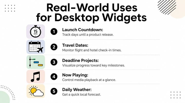
Native widgets can also cover practical information such as travel dates, now-playing controls, and weather, but those aren’t automatically good desktop choices. Ask whether the tile changes behavior or merely repeats something you already see in the menu bar, an app window, or a notification.
A useful test is removal. Hide the widget for a working day. If you miss the information at the exact moments it used to help, restore it. If nothing changes, it was decoration, and the desktop will probably feel better without it.
When Third-Party Widget Apps Make Sense
Apple’s built-in gallery handles system information well. Calendar, Reminders, Weather, battery status, and similar data fit naturally because macOS already owns the source and knows how to present it. The gap appears when you want the widget to represent your own defined number, rather than a system state.
A native widget may show an upcoming reminder, but it may not give you the exact countdown or progress treatment you want for a personal milestone. It may list tasks, but it may not show a visual path toward a goal or a habit streak in the format that makes sense to you. Third-party apps fill that gap with custom inputs, specialized data, and visual treatments that aren’t tied to Apple’s standard templates.
Pretty Progress is one example of that category. It provides countdown and progress widgets for Mac, with custom dates and visual settings intended for glanceable reminders. Its widgets can be added through the macOS widget editor, and its Single Event widgets are available on the Mac desktop and in Notification Center, as described in the supplied product information.
The install has a cost
A third-party widget app adds another application to maintain. You may need to grant permissions, keep its host app installed, tolerate another menu bar presence, and wait for compatibility updates after a macOS release. A widget that fails to refresh is worse than a plain reminder because you’ve trusted it to stay visible.
Use a native widget when the system already expresses the information clearly. Use a third-party option when the input is personal and specific, such as a deadline, progress target, or countdown that doesn’t belong in a standard calendar view. A sticky note may be enough for a single temporary fact. An app becomes worthwhile when you want that fact to update automatically, look consistent with the rest of your desktop, and remain useful across your Apple devices.
For a timer that needs more visual character than a standard system tile, this guide to aesthetic timer apps for Mac is a relevant comparison point. The decision should still come down to persistence and utility, not novelty.
Troubleshooting and Making Widgets Stick
Widgets usually fail in predictable ways. They disappear after a restart, become unreadable over a busy wallpaper, or stop updating because the app that supplies them is missing or stalled. Treat each problem as a layout or dependency issue before assuming the whole widget system is broken.
If a widget vanishes, open the gallery and check whether its app is still installed. Toggle the widget off and back on in the gallery to force macOS to rebuild the tile. If that doesn’t work, remove the widget from the desktop and add it again. A third-party widget depends on its host app, so deleting or offloading that app can remove the tile even when the layout itself remains.
Reduce visual and system load
A MacBook Air can feel the difference between a restrained desktop and one filled with constantly refreshing panels. Keep live widgets to the information you actively use. When you’re working unplugged, replace decorative or frequently updating tiles with static alternatives where possible, and remove anything that adds no decision-making value.
Busy wallpapers are another common culprit. A transparent widget may look elegant in the gallery and become unreadable over a photograph, a bright gradient, or a dense desktop full of files. Switch to a lower-contrast wallpaper, choose a stronger widget style, or move the tile behind application windows so it appears mainly when you return to the desktop.
A desktop widget should disappear from your attention until you need its information.
Widget stacks can consolidate related information without giving up glanceability. Group secondary tiles, keep the countdown or progress view separate, and use the desktop edge for the one signal you want to notice naturally. If a widget keeps interrupting your focus, move it to Notification Center or Stage Manager rather than endlessly restyling it.
A good setup is easy to maintain. Remove widgets that have become stale, adjust placements after your work habits change, and keep the desktop surface smaller than your ambition. Pretty Progress offers customizable Mac countdown and progress widgets for deadlines, events, and personal goals, making it a practical option when native widgets don’t express a specific countdown or progress target. Visit Pretty Progress to configure a persistent reminder that fits your Mac desktop instead of adding another noisy dashboard.





