June 3, 2026
Best Aesthetic Timer for Mac: Boost Focus in 2026
Discover the best aesthetic timer for Mac. Our guide helps you choose, customize, and use apps like Pretty Progress to boost focus and productivity in 2026.
Your Mac is probably doing this right now. A calendar in one corner, too many tabs open, a notes app half-hidden, and maybe a plain browser timer that looks like it belongs in a forgotten utility folder. It works, technically. It just doesn’t feel like part of your workspace.
That matters more than people admit. A timer sits in your peripheral vision all day. If it’s ugly, noisy, or easy to ignore, you’ll stop using it. If it looks clean, stays visible, and fits your desktop, it becomes part of your rhythm. That’s why an aesthetic timer for Mac isn’t just about appearance. It’s about lowering friction and making time feel tangible.
For a lot of people, the timer also grows beyond focus sprints. It becomes a visual reminder for exam prep, a project deadline, a creative streak, a fitness window, or the days left before a trip. Once you start treating your desktop like a living dashboard instead of a pile of apps, the right timer earns its spot.
Table of Contents
- Why Your Mac Deserves a Better Timer
- Finding Your Perfect Timer Format
- Setting Up Your Aesthetic Timer with Pretty Progress
- Designing a Timer That Matches Your Vibe
- Creative Ways to Use Your Aesthetic Timer
- Troubleshooting and Exploring Other Options
Why Your Mac Deserves a Better Timer
Many begin with whatever is already nearby. The Clock app. A random browser tab. A generic countdown that beeps once and disappears from your mind. That setup is fine for boiling pasta. It’s not great for a workday.
A Mac desktop is usually curated on purpose. People pick a wallpaper they like, arrange windows carefully, choose a note app they trust, and tune notifications so they can think. Then the timer gets treated like an afterthought. That mismatch creates friction. You end up avoiding a tool that should help you start.
The category has also changed. Mac timers used to be simple interval tools. Now many of them act more like progress trackers. Apple’s App Store listing for Be Focused highlights task creation plus progress tracking across a day, week, or custom period in the Be Focused App Store description. That shift tells you something important. People don’t just want a countdown. They want a visible way to track routines and deadlines over time.
Why visual quality changes behavior
A well-designed timer does two jobs at once. It measures time, and it signals intent. The moment you see it, you know what mode you’re in.
A timer works better when you can read it in one glance and leave it alone.
That’s why good aesthetic timers feel calm. They don’t ask for constant interaction. They sit on the desktop, in the menu bar, or inside a compact widget and keep the day moving.
A better timer also fits a broader system. If you already care about desktop organization, task batching, and fewer context switches, it helps to pair the timer with time management habits that reduce daily friction. The visual cue becomes part of the environment, not another thing to manage.
What doesn’t work
Some timer setups fail for predictable reasons:
- Too hidden: If it lives in a buried tab, you won’t check it.
- Too loud: Constant alerts make the tool feel stressful.
- Too plain: If it blends into digital clutter, it stops nudging you.
- Too busy: If the screen is full of metrics and tiny controls, the timer becomes another distraction.
An aesthetic timer for Mac works when it feels native to your workspace and honest about one thing: time is passing, and you can use that momentum well.
Finding Your Perfect Timer Format
The right timer format depends less on features and more on how you look at your screen. Some people need a timer they can see all the time. Others do better with a quieter cue that stays available but out of the way.
Many aesthetic timers are still rooted in the Pomodoro method, where work runs for 25 minutes followed by a 5-minute break, repeated four times before a longer rest, as described in Zapier’s overview of Pomodoro apps. That structure works especially well with Mac timer formats that support at-a-glance progress.

Desktop widgets
Widgets are the most lifestyle-friendly option. They feel like part of the desktop rather than an app you launch for a session. If you want an aesthetic timer for Mac that doubles as a goal reminder, this format is often the easiest to live with.
Widgets are best when you want ambient awareness. You’re not staring at the timer every minute. You just want to catch it when you glance away from a document or browser window.
Good fit:
- Longer countdowns: Project deadlines, study blocks, event reminders
- Low-friction visibility: You want the timer present without feeling aggressive
- Visual harmony: Matching wallpaper, widgets, and desktop theme matters to you
The trade-off is obvious. If you keep many apps full screen, a desktop widget may disappear from view more often than you’d like.
Menu bar timers
Menu bar timers are compact and disciplined. They work well for people who want structure without giving up screen space.
This format shines when you need a quick status check and nothing more. It stays out of the way, which is helpful if you already feel crowded by windows, sidebars, and floating panels.
Practical rule: If you hate clutter, start with the menu bar before trying anything larger.
The downside is emotional distance. Menu bar timers are useful, but they usually feel less motivating than a more visual widget or progress bar.
Always-on-top floating windows
Floating timers are the most assertive option. They stay visible over other apps, which makes them excellent for dedicated focus sessions.
If you write, code, study, or edit for long stretches, a small floating window can create urgency without forcing you to switch context. The timer remains in sight, so you don’t have to remember to check it.
The catch is screen real estate. Even a small floating window can feel intrusive if you already work with multiple panes.
Timer format comparison
| Format | Best For | Pros | Cons |
|---|---|---|---|
| Widget | Ongoing goals, soft visibility, visual desktops | Glanceable, attractive, easy to integrate into desktop life | Less visible in full-screen workflows |
| Menu Bar | Minimalists, compact setups, subtle focus cues | Clean, discreet, saves space | Less expressive and less motivating visually |
| Floating Window | Deep work sessions, active countdowns, urgency | Constant visibility, strong focus cue | Takes up space and can feel intrusive |
A lot of people start by asking which app is best. Start by asking which format you’ll keep visible. That choice matters more.
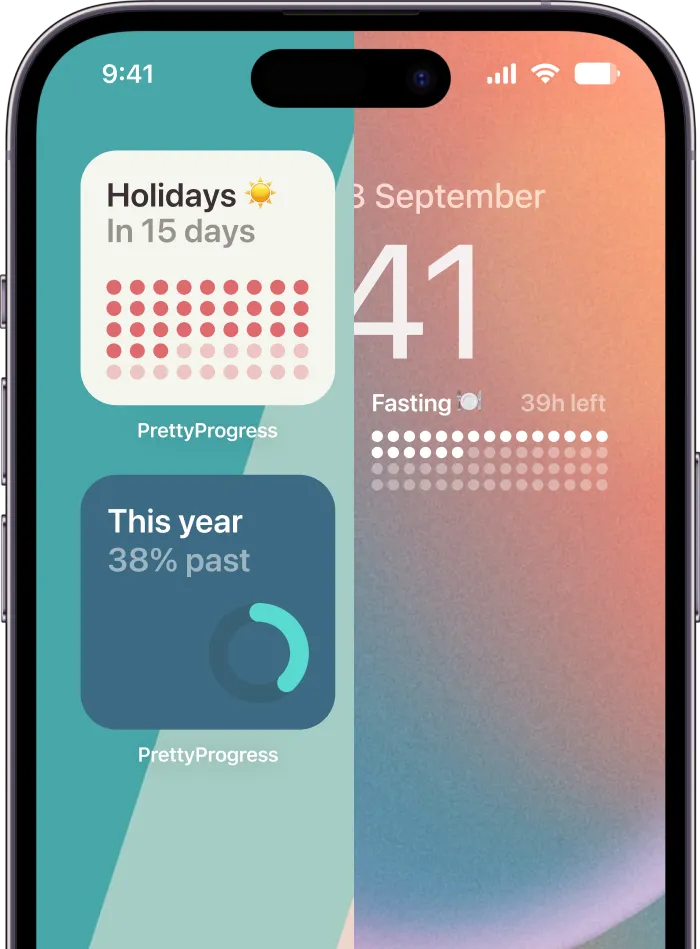
Setting Up Your Aesthetic Timer with Pretty Progress
The first setup should be fast. If a timer takes too long to configure, it is often abandoned before it becomes a habit.
One practical option is Pretty Progress, which supports countdown widgets, timers, and progress bars on Mac. For this kind of setup, the goal isn’t to build a perfect system on day one. It’s to get a clean timer onto your screen and make it useful immediately.

Get the first timer running
Start simple. Don’t build five timers, three themes, and a full life dashboard in one sitting. Set up one countdown you’ll use today.
A straightforward first pass looks like this:
- Install the app: Download it on your Mac and open it once so macOS can register the widget and notification options.
- Create one timer: A short focus countdown is easiest to test because you can see it working right away.
- Name it clearly: “Write draft,” “Study chemistry,” or “Inbox cleanup” is better than a vague label.
- Choose a clean display: Pick a style that’s easy to read from a distance.
- Place it where your eyes naturally drift: Usually that’s a side area of the desktop or widget panel, not the center of your screen.
If you want ideas for persistent layouts, these home screen timer patterns translate well to Mac too. The same principle applies. A timer helps more when it’s visible without becoming the star of the screen.
A quick first-use routine
For a classic focus test, use a single Pomodoro-style block. The familiar rhythm is easy to evaluate because you can tell quickly whether the visual placement helps or annoys you.
Try this:
- Use one work block: Start with a focused session rather than a full day system.
- Keep one visual priority: Show the countdown clearly. Hide or ignore anything extra at first.
- Watch your own behavior: Do you check it naturally, or forget it exists?
- Adjust placement once: Move it after one session if needed, then stop tinkering.
That’s enough to know whether your Mac setup is working.
A short visual walkthrough helps here:
Make it reliable on Mac
A beautiful timer that drifts after sleep isn’t useful. Reliability matters more on desktop than people expect, because laptops close, sleep, wake, and move between networks all day.
Mac-only timer setups have an advantage here. Apple-native apps built for modern macOS can use system scheduling, notifications, and background behavior more cleanly. The App Store listing for Be Focused requires macOS 11.5 or later, which supports this kind of native behavior in the US App Store listing for Be Focused.
What works in practice:
- Use native notifications: They’re easier to trust than custom alert systems.
- Anchor the timer to real time: A timer should restore from an end time, not just keep counting locally.
- Check after sleep: Close the lid, reopen the Mac, and confirm the timer still reflects current time.
- Avoid overcomplicated sync assumptions: If all you need is a Mac timer, local reliability matters more than feature sprawl.
If the timer survives sleep, stays readable, and doesn’t nag you, the setup is good enough to keep.
Designing a Timer That Matches Your Vibe
People either improve their workspace or accidentally make it noisier. The point of an aesthetic timer for Mac isn’t to show off customization. It’s to create a visual cue you’ll enjoy keeping around.
Many timer apps push themes, streaks, sounds, and layered interface elements. That can be fun at first, but it often adds friction. Study-focused coverage of aesthetic timers points out a simpler truth: the most effective setups prioritize minimalism, especially for users who want visual support without cognitive overload, including many users with ADHD, as discussed in StudyWithMe’s page on aesthetic Pomodoro timers.

Choose one visual job
A timer should serve one primary visual role. If you try to make it do everything, the design usually falls apart.
Pick one:
- Focus cue: A compact countdown with strong contrast
- Mood object: A softer progress bar that blends into the desktop
- Deadline reminder: A clear long-range timer with a calm color palette
- Habit anchor: A recurring visual marker that appears in the same place every day
When people get stuck, it’s often because they mix all four. A bright urgent timer for a vacation countdown makes no sense. A dreamy pastel gradient for an active deadline can be too easy to ignore.
If you can’t tell what the timer is asking you to notice, simplify the design before changing the app.
Build around your desktop, not against it
The best timer designs borrow from the rest of the workspace. Look at your wallpaper, your dock style, your note app theme, and how much contrast already exists on screen.
A few design rules work consistently well:
- Use contrast for active timers: If the timer tracks something happening now, make it easy to spot.
- Use softer tones for long-term goals: A vacation or life milestone should feel present, not alarming.
- Limit decorative accents: One shape choice, one icon style, one palette is usually enough.
- Preserve glanceability: The time or progress bar should remain readable faster than any supporting detail.
If you want inspiration for visual hierarchy, a countdown clock graphic library is useful mainly because it shows how different shapes and styles affect readability.
A few combinations that tend to work
Here are pairings I’ve seen work well on Mac desktops:
| Desktop style | Timer style that fits |
|---|---|
| Dark wallpaper, minimal icons | Thin high-contrast progress bar |
| Bright creative workspace | Rounded timer card with restrained color |
| Academic or study setup | Clean countdown with task label and no extra metrics |
| Calm personal dashboard | Soft gradient progress display with subtle typography |
The nicest-looking timer is not always the most useful one. The useful one wins. The aesthetic part matters because it helps the timer stay welcome on your screen for weeks instead of days.
Creative Ways to Use Your Aesthetic Timer
Once the timer is part of your desktop, you stop thinking of it as only a productivity tool. It becomes a visual marker for whatever you want to keep in view.
This is a significant advancement. A timer doesn’t need to live only inside a work sprint. It can sit in the background and make long-term goals feel more concrete.

For work and study
Shorter timers still make sense, especially when you attach them to specific outputs instead of vague effort.
Good examples:
- Writing block: Keep a visible countdown during drafting so the session has edges.
- Exam prep: Use a timer for a revision block, then switch to a longer countdown for the exam date.
- Project milestone: Track the time left before a deliverable, not just the next task.
- Admin sprints: Give email, planning, or cleanup a visible limit so low-value work doesn’t expand.
Placement matters here. Active focus timers should sit where you can catch them easily. A widget you never see won’t help you stop scrolling or start writing.
For personal life and long-term goals
An aesthetic timer for Mac proves surprisingly useful. Long-term timers don’t need urgency. They need persistence.
Try a timer for:
- Vacation countdowns: A fun reminder in a quieter corner of the screen
- Fitness windows: Track the next workout phase or recovery cycle
- Creative challenges: Keep a visible marker for a monthly sketch, reading, or writing goal
- Seasonal markers: Time left in the year, before a move, or before a major event
- Home routines: Baking, cleaning rotations, or meditation windows
A timer becomes more motivating when it tracks something you care about seeing, not just something you’re supposed to finish.
That’s why this category works so well on Mac. The desktop is already part office, part personal dashboard. A good timer respects both.
Troubleshooting and Exploring Other Options
If your timer isn’t updating properly, check the simple things first. Reopen the app, confirm widget permissions, and test whether the countdown stays accurate after your Mac sleeps and wakes. Most timer problems come from visibility or state issues, not from the countdown itself.
If the setup feels distracting, reduce it before replacing it. Shrink the widget, remove extra labels, mute sounds, or move the timer farther from the center of your screen. A lot of “wrong app” problems are really “wrong presentation” problems.
Some people do need a different tool. Session makes sense for users who care about analytics and stricter feature gating. A public review notes that the free plan includes unlimited sessions and rests but only keeps statistics for the past two days, while paid plans provide broader features in this review of Session on YouTube. Be Focused fits users who want an Apple-native task-and-timer workflow and are comfortable with a more traditional focus app model.
If your main goal is an elegant, always-visible timer that fits into daily desktop life, keep the setup lightweight. If your main goal is historical reporting, task structure, or deeper analysis, look for tools built around those trade-offs.
If you want a timer that lives on your desktop as a clean visual reminder, not just a one-off alarm, take a look at Pretty Progress. It’s built around countdowns, progress bars, and customizable widgets that can track focus sessions, deadlines, and personal milestones without turning your Mac into a busy analytics dashboard.