
October 31, 2026
Home Screen Widgets iPhone: Add, Size, and Stack
Add home screen widgets iphone users actually check: sizes, Lock Screen spots, stacks, and clean layouts for 2026.
You wake your phone to check one thing, maybe the weather, your next meeting, or how many days are left before an exam. Instead, you see rows of icons. You open one app, then another, and forget why you picked the phone up.
That’s the job Home Screen widgets on iPhone solve when they’re set up well. One tile shows one fact at a glance. When you need to type, edit, or scroll, you tap into the app. Knowing which job is which saves you from fighting a blank or stubborn widget.
For a Pretty Progress walkthrough, use our iPhone Home Screen widget guide.
Table of Contents
- iPhone Widget Sizes and Screen Spots
- How to Add a Home Screen Widget
- Edit, Resize, Stack, and Remove Widgets
- How to Add Lock Screen Widgets
- Layouts That Stay Easy to Read
- Widgets That Blank Out or Will Not Respond
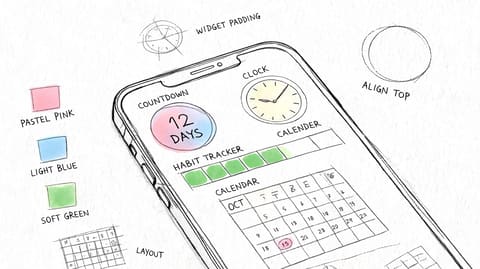
- Place One Countdown You Can See All Day
iPhone Widget Sizes and Screen Spots
Your first page is probably crowded already. Before you move anything, decide what single fact deserves space. It might be days remaining, the temperature, or your next calendar event.
That choice matters more than style. A widget that tries to show five things in a tiny square won’t help you. A widget that shows one clear number will.
Why These Sizes Exist
Apple introduced modern iPhone Home Screen widgets on September 16, 2020, when iOS 14 became publicly available, according to the Apple Newsroom announcement for iOS 14. Before that, widgets lived mostly in Today View. With iOS 14, you could place them on any Home Screen page.
You could also pick from small, medium, and large sizes in a widget gallery. Apple added Smart Stack at the same time. It rotates several widgets in one spot and can surface one based on time, location, and activity.
That changed the Home Screen from a grid for launching apps into a surface for staying informed. Weather, reminders, battery, and countdowns could stay visible all day without opening anything.
Pick Your Row First
Read the table top to bottom and circle one row in your mind. Don’t start dragging icons yet.
| Surface | Size | Space it uses | Best glance |
|---|---|---|---|
| Home Screen | Small | 2 by 2 app icons | One number such as battery, weather, or days left |
| Home Screen | Medium | 4 by 2 app icons | A short label plus a bar or two lines |
| Home Screen | Large | 4 by 4 app icons | A calendar, photo, or large countdown |
| Home Screen | Smart Stack | The size you already chose | Several widgets taking turns in one slot |
| Lock Screen | Inline | One line above the clock | A short status, not a chart |
| Lock Screen | Circular | A round slot under the clock | One icon or a single figure |
| Lock Screen | Rectangular | A wide slot under the clock | A short label and a value |
A small widget uses four icon spaces. It’s right for one figure, like 72 degrees or 9 days left. If you need a label and a progress bar, that’s medium territory.
A medium widget uses eight icon spaces, wide but not tall. It fits two lines of text, a label plus a bar, or today’s event with a time. Many find this the easiest size to read without losing too many apps.
A large widget uses sixteen icon spaces. Use it only when the information earns that much room, like a month calendar or a countdown you want to read across a desk. There’s no extra large size on the iPhone Home Screen, so don’t go looking for one in the gallery. That option belongs to iPad.
Choose the fact before the footprint. If you can’t say the one thing you’ll read in two seconds, the size won’t fix it.
Smart Stack confuses many people. It isn’t a fourth footprint. It reuses the small, medium, or large size you already picked, then lets several widgets share that slot.
Lock Screen widgets work differently. You get one inline line above the clock, plus circular and rectangular slots under the time. They’re smaller and simpler by design.
Close this decision now. Pick the surface you see first, Home Screen or Lock Screen, and the one fact for that spot. Everything else follows from that row.
How to Add a Home Screen Widget
You’ll add most widgets through the gallery in under a minute. The steps below assume a recent version of iOS. If a button looks slightly different on your phone, the order stays the same.
Home Screen widgets need iOS 14 or later. Lock Screen widgets need iOS 16 or later, and they use a separate editor covered later in this guide.
The Gallery Steps
Follow these taps in order. Each one has a clear job.
- Touch and hold an empty area of the Home Screen until the icons jiggle. You’re now in edit mode. If you held an app instead, you may see a menu. Tap empty wallpaper and try again.
- Tap the plus button at the top left. On some versions you’ll tap Edit first, then Add Widget. Either way, you’re opening the widget gallery.
- Search the app name or scroll the list. Search is faster if you already know which app you want.
- Swipe the size cards and stop on the size you chose from the table. Small, medium, and large cards show the footprint before you commit.
- Tap Add Widget. The tile lands on your page and nearby icons move aside to make room.
- Drag the widget where you want it. Don’t cover the apps you open every day. Keep those within easy thumb reach.
- Set its content if asked. Touch and hold the widget, tap Edit Widget, then choose the city, calendar, album, or event it should show.
- Tap Done to leave edit mode. The jiggling stops and your widget stays put.
This visual walkthrough shows the core sequence in four moves.
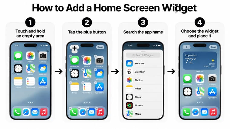
Check the result before you add anything else. Can you read the main number without leaning in? If not, the size is wrong or the app is showing too much in that tile.
When the Page Is Full
A large widget needs a clear 4 by 4 gap. If your page is packed, the widget may land on another page or refuse to sit where you dragged it.
Move a row of apps to the next page first. You can also remove an old widget you no longer read. Free the space, then add the new widget.
The gallery decides the footprint. If you wanted medium and added small, remove it and add it again at the right size.
That last point trips people up. Not every app offers every size, and you can’t stretch a small widget into a medium one from the Edit Widget panel. The size card in the gallery is the size you get.
If you’re comparing apps before you commit, this roundup of the best free widget apps for iPhone can help you see what each one offers. Pick one app, add one widget, and test it for a day before adding more.
Use Today View for Extras
Some widgets are useful but don’t deserve main page space. Put those in Today View instead.
From your first Home Screen page, swipe right. Scroll to the bottom, tap Edit, tap the plus button, and add the widget there. It stays one swipe away without pushing your daily apps around.
Stop once your first widget is visible at the right size. Stacking and editing come next, and they’re easier when you start from one tile that already works.
Edit, Resize, Stack, and Remove Widgets
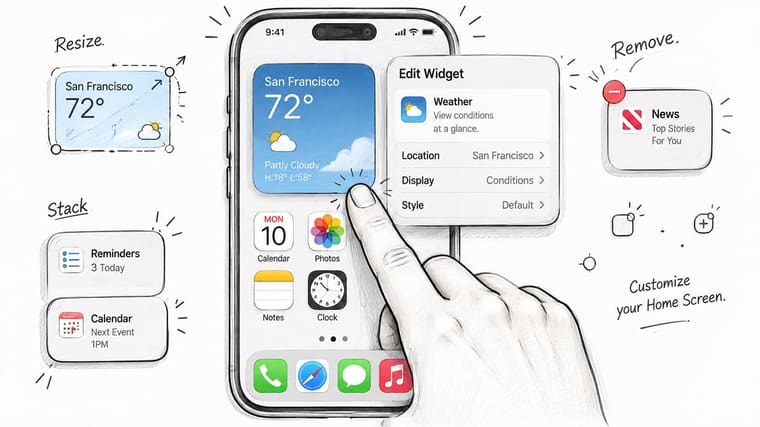
Start with the widget already on your page. Editing changes what it shows. Resizing changes how much space it takes. Stacking lets several widgets share one spot. Those are three separate jobs.
This photo shows the hands on editing position you’ll use for most changes.
Edit What It Shows
Touch and hold the widget. Tap Edit Widget. You’ll see only the options that app provides, such as a different city for weather or a different calendar for events.
Change one setting, then tap outside the panel to save. Read the tile again. If the new content doesn’t fit, shorten it inside the app or choose a larger size.
Don’t hunt for settings the app doesn’t offer. If there’s no option to change the font or layout, the widget doesn’t support it. That isn’t a fault on your phone.
Resize It
For a typical system widget, resizing means removing it and adding it again at the new size. The gallery choice sets the footprint, so a fresh add is the cleanest path.
Some widgets show corner handles after a long press in edit mode. If yours does, drag one handle and watch the label. If text gets cut off with dots at the end, go back or pick a bigger card.
- Text truncated: Move up one size or shorten the title in the app.
- Too much empty space: Move down one size and reclaim icon room.
- Number hard to read: A bigger widget helps, but a simpler layout helps more.
Build a Smart Stack
Drag one widget directly onto another widget of the same size. The phone combines them into a stack. Swipe up or down on the stack to move between them.
Touch and hold the stack and tap Edit Stack. Drag the handles to reorder the widgets inside. Put the one you check most near the top.
Leave Smart Rotate on when you want weather in the morning and calendar later. Turn it off when a deadline must stay visible. There’s no point pinning a countdown if the stack keeps swapping it away.
You can also turn off widget suggestions in that editor. That stops the phone from inserting extra widgets you didn’t choose.
Watch the stacking and editing gestures in motion before you try them on your own screen.
Remove It Cleanly
Touch and hold the widget, tap Remove Widget, and confirm. While icons jiggle, you can also tap the minus badge on the widget.
Removing a stack removes every widget inside it. If you want to keep one, edit the stack first and take that widget out, or add it again on its own afterward. End with either one fixed widget or one stack in the slot, not a mix you’re unsure about.
How to Add Lock Screen Widgets
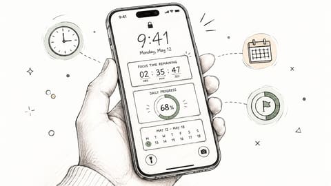
Your Lock Screen is the first thing you see when the phone wakes. That makes it perfect for one urgent fact and wrong for detailed information. Treat it as a second, smaller surface, not a copy of your Home Screen.
Apple expanded widgets to the Lock Screen with iOS 16, released in 2022, as described in the Apple support guide to Lock Screen widgets. You could add widgets showing temperature, battery levels, and upcoming calendar events, all visible before you reach your apps.
The Lock Screen Steps
Do this while the phone is locked but awake. Let Face ID recognize you without swiping up.
- Wake the iPhone and touch and hold the Lock Screen until editing options appear.
- Tap Customize, then choose the Lock Screen side of the preview.
- Tap the slot above the time to add one inline widget, such as a short date or status line.
- Tap the row under the time to add circular or rectangular widgets.
- Tap a placed widget to choose its city, calendar, or event.
- Tap Done, then tap the Lock Screen to leave the editor.
This checklist mirrors those taps in order.
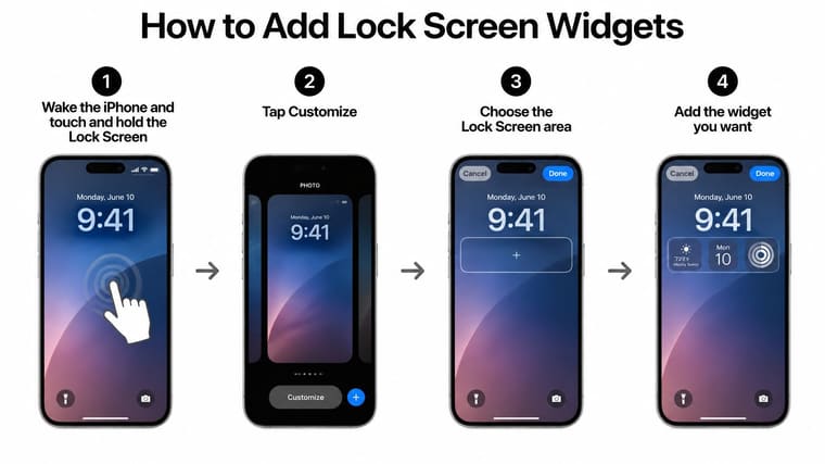
The row under the time has limited room. A wide rectangular widget leaves space for fewer circular widgets. Once the row is full, the editor stops accepting more, which confuses people who expect a second row.
There is no second row. If you want a new widget there, remove one first. That tradeoff is intentional, because the Lock Screen stays readable only when it stays sparse.
Pick Wake Up Information
Choose what matters in the first second. Good candidates are your next event, the temperature, your battery level, or a countdown in days. Anything needing explanation belongs on the Home Screen instead.
One fact per surface. If your Lock Screen already shows the countdown, let the Home Screen show something else.
Check readability against your photo. Thin text over a busy picture disappears outdoors. Change the photo, pick a bolder font style for the clock area, or choose a widget with stronger contrast until the row stands out.
Don’t expect second by second updates here. Lock Screen widgets refresh on the same schedule as Home Screen widgets, so they’re built for hours and days. A timer counting live seconds needs a different tool inside the app.
Finish by naming the one fact that lives on your Lock Screen. Write it down if you need to. When you later feel tempted to duplicate it on the Home Screen, you’ll catch yourself and keep both screens cleaner.
Layouts That Stay Easy to Read
A good layout isn’t about filling space. It’s about reading the right thing without thinking. Copy one of these three setups, then adjust it to your apps.
Keep your first page to about three widget blocks. More than that and your wallpaper vanishes, your main apps get pushed away, and nothing stands out.
Three Pages You Can Copy
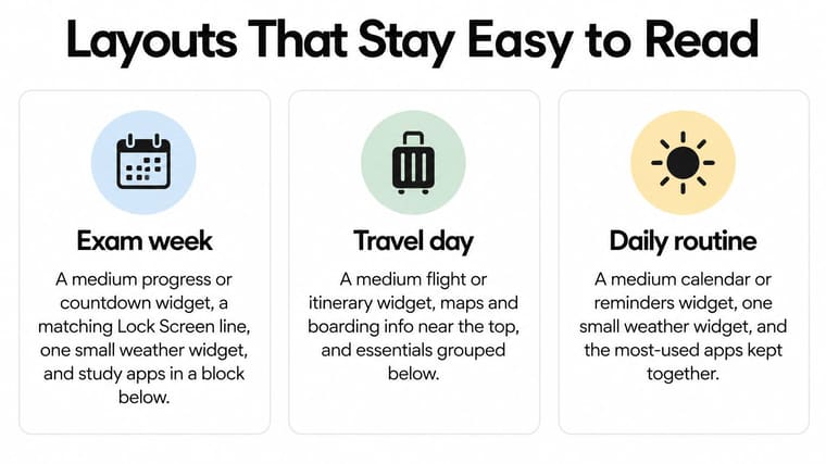
Exam week puts pressure front and center. Use a medium progress or countdown widget at the top, a matching line on your Lock Screen, and one small weather widget beside your study apps. Group the study apps in a block below so your thumb learns one area.
Travel day favors the next few hours. Place a medium weather and calendar pair at the top, add a small battery widget, and leave your map app clear of neighbors. You want directions one tap away while you’re carrying bags.
Quiet home screen goes the other direction. Use one large photo or calendar widget, nothing else in the top half, and keep apps in the bottom two rows. It reads calmly and still tells you the day at a glance.
These three arrangements are sketched side by side here.
Rules That Keep Tiles Legible
Apple’s Human Interface Guidelines for widgets treat these surfaces as constrained views across Home Screen, Today View, StandBy, and Lock Screen, so hierarchy and graceful truncation matter. In plain terms, the biggest element should be the remaining time or next event, and secondary labels should stay short.
Put the number in the largest type. Shorten long event names in the app so they don’t end in an ellipsis. If you see three dots, your future self won’t know what the tile means.
Never rely on color alone for a bar’s meaning. Print the percentage or day count next to it. Grayscale, bright sun, and low contrast all flatten shades, but a number stays a number.
Stick to one visual family across your widgets. Mixed themes make each tile compete for attention. If you’re learning what makes tiles readable, this overview of widget design choices that affect clarity explains the tradeoff in more depth.
For situations where a glance needs to support personal safety rather than schedules, you can explore monitored safety apps for iPhone as a separate category to evaluate beside your everyday widgets. Keep that decision distinct from your layout, since safety tools and countdown tiles solve different problems.
Test your page in light mode and dark mode. Add one long event name on purpose and see what breaks. Then run a two minute check. Wake the phone, read the Lock Screen, open the phone, and read the Home Screen without tapping anything. If you had to tap, that widget isn’t doing its glance job yet.
Widgets That Blank Out or Will Not Respond
A blank or spinning tile can look broken. First decide what you need to do: read the information at a glance, or change something. Widgets are designed to show information; for notes, lists, and other edits, open the app.
Know the Limit First
Apple’s WidgetKit documentation explains that widgets are designed for glanceable information. They generally do not support scrolling lists or text input, though selected buttons, toggles, and other supported interactions can work without opening the app.
A countdown works well as a stable display. Treat the widget like a signpost: read it on the Home Screen or Lock Screen, then tap through to the app when you need to make a change.
If you need to read it, keep it as a widget. If you need to change it, open the app.
Use that distinction before removing a tile. It can save you from troubleshooting a widget that is working as designed.
Match the Symptom to One Fix
Find the symptom that matches yours and try its first fix.
| What you see | Usual cause | Fix |
|---|---|---|
| Blank or spinning widget | The app may need to refresh its data | Open the app. If the tile stays blank, remove it, add it again, and restart the iPhone |
| Number looks old | iOS limits how often widgets update to help protect battery life | Use it for hours or days, not as a live seconds counter |
| Cannot type or scroll | The widget is for viewing information | Tap into the app to edit notes or use a long list |
| Needed widget is hidden | Smart Rotate may have changed which stack item appears | Turn Smart Rotate off or move the widget to the top |
| Lock Screen will not take another widget | The available slots may be full | Remove a circular or rectangular widget, then add the new one |
| Widget gone after an update | Its placement may need to reload | Remove the widget, add it again, and restart the iPhone |
For a blank or spinning tile, open the app first. If it still does not load, remove the widget, add it again, and restart the iPhone if the problem continues. After an app update, removing and adding the widget again is another step to try.
A stale number does not always mean something is wrong. Widgets may update less often than the app, so use them for information that does not need to change every second. If you need a more current view, open the app.
If a stack hides the widget you want, edit the stack. Turn off Smart Rotate or move that widget to the top. There is no need to remove the whole stack to change which item you see.
Keep glance tasks, such as checking days left or a completion percentage, on the widget. Open the app for action tasks, such as typing or changing a list. That glance-versus-tap choice helps you tell a broken tile from one that is not meant to do app work.
Place One Countdown You Can See All Day
Think of the date you keep opening an app to check. An exam. A trip. The end of a fasting window. A movie release, or the days left in the year.
That one date earns a slot. Not five dates, not every goal you have. One countdown you check is worth more than a page of tiles you ignore.
Set Up Your Countdown
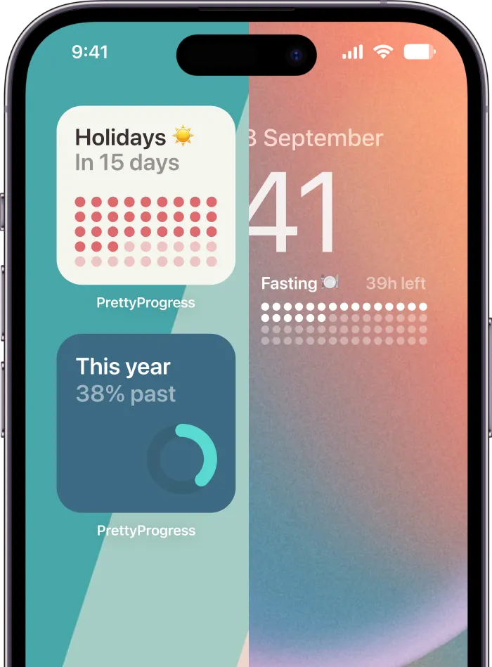
Pretty Progress builds countdown and progress bar widgets for both the Home Screen and the Lock Screen. You can use themes such as Swiss Style, Minimal, Aqua, and Retro OS, then adjust color, gradient, bar shape, and icons to match your page.
Setup takes four steps.
- Download Pretty Progress and create your event with a start date and an end date. The start date matters because it lets the bar show how far you’ve come, not just what’s left.
- Choose a simple theme first. You want the remaining time readable at arm’s length. Fancy styling can wait until the number reads clearly.
- Long tap the Home Screen, tap the plus button, select Pretty Progress, and add the widget. Pick small for days only, or medium if you want the bar and label together.
- Open the Lock Screen editor, tap the Pretty Progress widget, and choose which event it shows. Use the same event only if it’s your top priority each morning.
If you’re deciding between a compact tile and a bigger display for a deadline, this guide to a big clock countdown layout shows how a larger format reads across a room.
Set the Right Expectation
These tiles show days, hours, and progress. They don’t reliably count live seconds, because iOS limits how often widgets update to protect battery life. That’s the same batching you saw with stale numbers, and it’s exactly right for a deadline weeks away.
Put the countdown where your eyes land first, then leave it alone for a few days. If you stop noticing it, change the theme or move it up a row. If you check it every morning without thinking, you’ve placed it well.
One visible date changes how a deadline feels. It stops living in an app you forget to open and becomes part of your screen, counting while you get on with your day.
Pick your one date today, an exam, a trip, or a goal you keep checking, and put it on the screen you see most. Pretty Progress turns that date into a clear countdown or progress bar for your Home Screen and Lock Screen, with themes you can tune until the number reads at a glance. Start with one widget at Pretty Progress and watch the days move without opening an app.