

June 26, 2026
Mastering Lock Screen Widgets iOS: Your 2026 Guide
Master lock screen widgets ios with our 2026 guide. Discover setup, customization, and creative ideas using top apps like Pretty Progress to personalize your
You’ve probably seen it happen. Someone’s iPhone screen briefly comes to life, and the lock screen looks more useful and more personal than the default Apple setup you’ve been staring at for months. Instead of a plain clock and a weather icon, they’ve got a countdown to a trip, a progress ring for a goal, maybe a subtle reminder that finals week, a launch date, or a fasting window is getting close.
That’s the appeal of iPhone lock screen widgets. They turn the screen you check all day into something that nudges you, informs you, and reflects what matters to you. The catch is that most guides stop at “tap Customize and add Weather.” That’s only the beginning.
If you want a lock screen that feels motivating instead of generic, you need to understand both what iOS allows and where it gets frustrating. Once you know those limits, it becomes much easier to build something that looks good and works the way you expect.
Table of Contents
- What Are iOS Lock Screen Widgets
- How to Add and Arrange Your First Widget
- Go Beyond Basics with Pretty Progress Widgets
- Creative Lock Screen Setups for Daily Motivation
- Tips for Design Battery and Privacy
- Troubleshooting Common Widget Issues
What Are iOS Lock Screen Widgets
You check your phone before your feet hit the floor. If the lock screen shows the weather, your next calendar item, or a progress ring for a habit you care about, you get the update in a second instead of opening three apps.
That is what iOS Lock Screen widgets do. They place small pieces of app information around the clock on your iPhone’s lock screen so you can read them at a glance.
On iPhones running iOS 16 and later, Apple supports lock screen widgets through WidgetKit. Apple groups them into three widget families: accessoryInline, accessoryCircular, and accessoryRectangular. LogRocket’s overview of lock screen widget development gives a useful developer-side explanation of how those formats work. For everyday use, the key idea is simple. Each format has strict space limits, so every widget has to say one thing clearly.
Why they look so small and simple
Lock screen widgets work like sticky notes, not full app screens. They are built for quick reading, not tapping through lots of detail.
Here’s what each type is good at:
| Widget family | What it’s best for | What it looks like |
|---|---|---|
| Inline | Short text like a countdown label or current status | A slim text line |
| Circular | Rings, timers, gauges, or simple progress visuals | A compact round widget |
| Rectangular | A little more text, a short summary, or a tiny chart | A wider card with more room |
This is also why third-party widget apps can feel so different from Apple’s built-in options. Stock widgets often focus on utility first. Custom apps such as Pretty Progress use the same small canvas for something more personal, like a countdown to a trip, a study streak, or a visual reminder to keep going.
If you want an example of that style, this guide on adding a countdown widget to your iPhone lock screen shows how a widget can feel motivational instead of purely informational.
What makes a widget easy to read
A good lock screen widget still works when your wallpaper is bright, your text size is larger than default, or you are checking your phone outdoors for half a second.
Wallpaper choice has a significant impact. A thin white widget on a busy beach photo can disappear fast. A bold progress ring or short high-contrast label usually survives better. That is why the best widgets keep text short, use clear visual hierarchy, and avoid cramming in extra details.
This small-space design can feel limiting at first. It helps to treat the lock screen as a dashboard, not a destination. The widget’s job is to answer one fast question: What do I need to know right now?
That approach becomes even more useful once you start building lock screens around your own goals, not just Apple’s default app suggestions.
How to Add and Arrange Your First Widget
Adding your first lock screen widget is easy once you know where Apple hid the controls. The process feels more like editing a wallpaper than editing an app layout.
Getting into lock screen edit mode
Start from your lock screen, not your home screen. Wake the iPhone, then press and hold on the lock screen until the customization view appears. Tap Customize, then choose the Lock Screen preview instead of the wallpaper gallery.
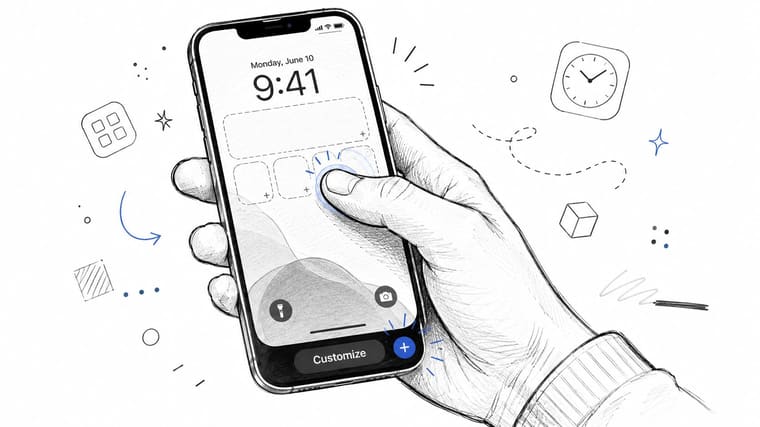
You’ll see widget areas around the clock. One space usually sits above the time for a slim inline widget, and another sits below the time for circular or rectangular widgets.
If you want a visual walkthrough before tapping around, this short demo helps:
Choosing the right spot and style
When you tap the widget area, iOS opens a panel with available widgets from Apple apps and any third-party apps installed on your phone. You can scroll, tap a widget, and drop it into place.
A few setup choices make a big difference right away:
- Use the top inline slot for urgency. A short countdown label or a brief status works well there because it reads almost like part of the clock.
- Use circular widgets for progress. Rings and simple gauges are easier to understand quickly than dense text.
- Use the rectangular slot when context matters. If you want a label plus a number or a short summary, this is usually the better fit.
Some widgets let you tap them after placing them to change details, like which city weather should show or which calendar list should appear. If you’re trying countdown-style lock screen widgets, this guide on adding a countdown widget to your iPhone lock screen shows the same placement flow with a goal-focused example.
Fine tuning the details
Arrangement matters more than people expect. If every widget is competing for attention, none of them helps.
Try this simple layout logic:
- Put your most important item closest to the clock.
- Pair one informative widget with one motivational widget.
- Leave some breathing room. A sparse lock screen often looks more intentional than a packed one.
If a widget looks good in the editor but feels distracting every time you check your phone, swap it out. The right lock screen should disappear into your routine and still be useful.
Also, don’t ignore the wallpaper. A clean background helps every widget look sharper. If a widget seems hard to read, the problem might not be the widget at all. It might be the photo behind it.
Go Beyond Basics with Pretty Progress Widgets
Apple’s built-in widgets are fine for basics. They tell you the weather, show a calendar item, or surface a battery level. But once you want your lock screen to feel personal, they start to show their limits.
Why stock widgets can feel limiting
A common complaint is that lock screen widgets promise glanceable usefulness but often deliver very little. In a MacRumors discussion about lock screen widget limitations, users describe them as “almost useless” because they show little information and still require full device access for real utility. That frustration makes sense when the design is monochrome, size-constrained, and not meant for rich, multi-row detail.
Often, many people give up too early. They assume lock screen widgets on iOS just aren’t worth much beyond Apple’s defaults. In practice, the better approach is to stop expecting mini dashboards and start using widgets for one strong visual cue.
A more personal kind of widget
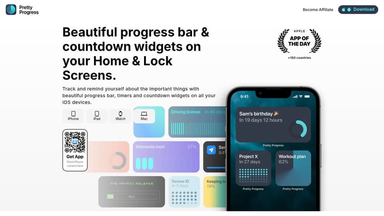
That’s where apps built around countdowns and visual progress become more interesting. Pretty Progress is one example. It lets you create lock screen widgets around deadlines, goals, events, or routines, then tune the visual style with options like themes, gradients, bar shape, and layout. If you want more ideas beyond Apple’s stock options, this roundup of free widget apps for iPhone is a useful place to compare approaches.
A practical example works better than theory. Say you want your lock screen to help you finish a portfolio before an application deadline.
You could build a widget around:
- A clear endpoint. For example, the submission date.
- A progress visual. A bar or ring communicates movement faster than text alone.
- A style that matches your wallpaper. Minimal, retro, bold, muted. Whatever keeps it readable and pleasant.
That kind of setup does something stock widgets often don’t. It turns your lock screen into a reminder with emotional weight. You’re not just seeing information. You’re seeing momentum.
A countdown widget works best when the event matters enough that seeing it several times a day changes your behavior.
This is the bigger shift with lock screen widgets on iOS. The most useful ones often aren’t the most data-heavy. They’re the ones that keep a goal in your line of sight without adding noise.
Creative Lock Screen Setups for Daily Motivation
Once you understand the limits of the format, the fun part starts. A good lock screen setup doesn’t try to represent your whole life. It picks one or two things you want to notice every day.
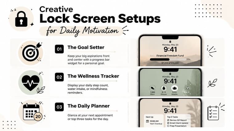
If you want more visual inspiration for styling and wallpaper pairing, these ideas for iPhone aesthetic widgets are handy because they focus on the overall look, not just the widget itself.
The student setup
A student’s lock screen should reduce mental clutter, not add to it. One useful combination is a rectangular countdown widget for the next exam and a circular progress widget for the semester or study sprint.
That setup works because the countdown creates urgency while the progress indicator prevents the usual feeling that everything is piling up at once. Instead of “I have so much to do,” the lock screen says, “This is the next thing, and I’m moving toward it.”
Try pairing it with a plain dark wallpaper or a lightly blurred campus photo. Busy photos make academic widgets harder to read.
The professional setup
For work, the strongest lock screen setups usually focus on one deadline and one checkpoint. A launch date, presentation, hiring target, contract renewal, or travel day all work well.
A professional screen might use:
- An inline widget for a short deadline label
- A rectangular widget for the main project countdown
- A circular widget for overall project progress
This type of setup is especially good if you tend to open your phone between meetings and lose focus. A quick glance can bring you back to the task without opening a productivity app.
Keep work widgets specific. “Project progress” is vague. “Launch in 12 days” changes what you do next.
The habit builder setup
Habit-focused lock screens are often the most satisfying because they reward consistency. The widgets don’t need to be dramatic. They just need to be persistent.
A habit builder might create a setup around:
| Goal type | Widget idea | Why it works |
|---|---|---|
| Fitness challenge | Progress ring toward challenge end date | Easy to scan in seconds |
| Reading goal | Countdown to a reading milestone or streak marker | Keeps a personal goal visible |
| Fasting or routine building | Time-based progress widget | Reinforces the daily rhythm |
This kind of lock screen is especially effective when the habit already exists but needs reinforcement. You’re not relying on motivation alone. You’re designing your phone to provide reminders of what matters.
The best part is that these setups don’t have to stay permanent. You can change them with the season of your life. Exam month can look different from summer training, and both can look different from a work-heavy quarter.
Tips for Design Battery and Privacy
A good lock screen should feel like a quick glance at a dashboard, not a crowded bulletin board. If you are building something personal with third-party widgets such as Pretty Progress, that matters even more. The goal is to make your phone feel motivating and visually calm without turning it into a source of distraction, battery drain, or accidental oversharing.
Design for quick reading
Your lock screen gives you only a second or two of attention. If a widget needs effort to decode, it is doing too much.
Treat the screen like a poster viewed while walking by. Big signal wins. Tiny details get ignored.
A cleaner setup usually comes from three choices:
- Pick contrast first. A busy wallpaper can make even a well-designed widget hard to read. If your progress ring or countdown text fades into the background, simplify the photo or use darker, plainer colors.
- Give each widget a single role. One widget can track progress. Another can show a short label or date. Combining too many ideas in one small space makes the lock screen feel cramped.
- Choose clarity over decoration. If you want a lock screen that feels polished and easy to scan, it helps to understand the impact of UX and UI. The difference between a screen that looks nice and one you enjoy using usually comes down to readability, spacing, and focus.
Personal lock screens work best when they stay visually quiet. A simple Pretty Progress ring with a meaningful label often has more impact than four widgets competing for attention.
Battery expectations that make sense
Battery worries are reasonable, but the biggest issue with lock screen widgets is often refresh timing, not pure power use. Apple controls much of that behavior in the background, so even a well-made widget may not update the second you expect.
That is why slow-changing widgets tend to feel better on the lock screen. Countdowns, habit trackers, milestone progress, and motivational visuals are a natural fit because they still look useful even if iOS delays a refresh.
A few practical rules help:
- Use lock screen widgets for glanceable info. They work best as status displays, not live control panels.
- Be selective with network-heavy widgets. Weather, live stats, or anything that checks servers often may use more battery than a simple progress or date widget.
- Expect some lag from iOS itself. If a widget looks slightly behind, that does not always mean the app is poorly made.
This is one of the frustrations many basic guides skip. A personalized lock screen can look great, but it should also be forgiving. If your widget shows progress toward a goal, a small refresh delay is usually easier to live with than if you were relying on it for fast-changing information.
Privacy choices to make up front
Lock screen widgets are public by default. Anyone nearby can see them when your phone lights up on a desk, in a meeting, or on public transport.
That changes what belongs there.
Be careful with widgets that reveal:
- Detailed calendar events
- Health or medication information
- Bank balances or account activity
- Private labels on personal countdowns
A safer approach is to keep the lock screen motivational and general. Progress rings, streak markers, study goals, travel countdowns, and broad reminders usually give you the emotional boost you want without exposing private details.
If you would not want a stranger reading it over your shoulder, it probably belongs inside the app, not on the lock screen.
Troubleshooting Common Widget Issues
You set up a lock screen that looks great, then your progress ring stays frozen for hours or a countdown shows yesterday’s number. That usually points to iOS background refresh behavior, not a mistake in your setup.
Why a widget doesn’t refresh when you expect
Lock screen widgets are closer to snapshots than live dashboards. They update on Apple’s schedule, with some help from the app, so a widget can look stale even when the app itself has the right data.
That frustration shows up outside of simple countdown apps too. In a Home Assistant community discussion about lock screen widget updates, users describe widgets updating only after reopening the companion app. It is a useful example because it shows the problem can come from the way iOS handles widget refreshes, not just from one app being poorly designed.
If your widget seems behind, try the fixes in this order:
- Open the app for a few seconds. This often prompts a fresh sync.
- Lock and wake the screen again. A redraw can help the widget catch up.
- Check Background App Refresh. If it is off for that app, delays are more likely.
- Give it a little time. Some widgets update periodically rather than the moment data changes.
For motivational lock screens, this matters less than many people expect. A Pretty Progress ring that trails your real total by a short time is usually still useful. A stock tracker or live sports score is where the delay feels much more annoying.
Other common fixes that save time
A blank widget, a missing widget, and the wrong widget content can look like three different problems. They usually come down to one of a few simple causes.
- Blank or grey widget: Restart the iPhone, then open the app directly to make sure it loads normally.
- Widget missing from the picker: Launch the app once after installing it. Some apps do not register their widgets until first launch.
- Widget disappeared from the lock screen: Check whether the app was offloaded during storage cleanup.
- Wrong countdown or progress showing: Open the widget settings and confirm you selected the correct item.
The helpful mindset here is simple. Treat lock screen widgets like polished glanceable cards, not tiny apps that update every second. Once you expect that rhythm, they become much easier to enjoy.
If your goal is a personal, motivational setup rather than live data, Pretty Progress fits that use case well. It focuses on countdown and progress-style widgets, where design and meaning matter more than second-by-second refresh speed.





