May 1, 2026
iPhone Aesthetic Widgets: A 2026 How-To Guide
Learn how to create beautiful iPhone aesthetic widgets for your Home & Lock Screen. Our step-by-step guide covers apps, styling, and functional countdowns.
Your Home Screen probably looks one of two ways right now. Either it’s a default grid you stopped noticing months ago, or it’s half-finished, with one cute widget, three random icon styles, and no clear system holding it together.
That’s why iphone aesthetic widgets are so appealing. They let you turn your phone from a pile of app squares into something that feels designed. Better still, when you build the layout well, it doesn’t just look nicer. It becomes calmer, easier to scan, and more useful in daily life.
Treating widgets like decorations often leads to getting stuck. The better approach is to treat your Home Screen like a tiny interface project. If you care about digital products in general, this broader guide on 2026 UI UX design is worth a look because the same principles show up on a phone screen too: hierarchy, clarity, consistency, and intent.
Table of Contents
- The Rise of the Aesthetic Home Screen
- Finding Your Unique iPhone Aesthetic
- Choosing Your Widget Creation Apps
- Building Your First Custom Widget
- Integrating Functional Widgets That Work
- Common Widget Problems and Pro Tips
The Rise of the Aesthetic Home Screen
The shift happened fast. Apple introduced home screen widgets with iOS 14 on September 16, 2020, and users almost immediately moved beyond simple glanceable data toward carefully styled layouts that looked more like mini mood boards than utility panels, as noted in this iOS widget trend review.
That change matters because it split the world of widgets into two camps. One side focused on aesthetic widgets, with custom fonts, photo frames, wallpapers, and themed colors. The other focused on functional widgets, where information mattered more than visual polish.
The sweet spot is using both together.
Practical rule: If a widget makes your phone prettier but harder to use, it’s decoration. If it helps you act faster and still fits the look, it belongs.
A lot of cluttered Home Screens come from downloading a widget app first and making design choices second. That order creates mismatched fonts, too many accent colors, and layouts that look busy by lunchtime. A better result starts with intent.
Use this mental checklist before you touch any settings:
- Pick the feeling first. Calm, playful, retro, dark, editorial, soft.
- Choose the job of the screen. Morning dashboard, study setup, work layout, habit tracker, event countdown.
- Limit what earns space. Weather, calendar, reminders, countdowns, and one personal touch is usually enough.
The best iphone aesthetic widgets don’t hide your life under decoration. They make your priorities visible. That’s what turns a nice-looking screen into one you keep.
Finding Your Unique iPhone Aesthetic
Some people know their style instantly. Others save twenty screenshots and still can’t explain why only three of them feel right. The trick is to stop collecting layouts and start noticing patterns.
A minimal setup might use muted neutrals, one serif accent font, and lots of empty space. A retro setup often leans on sepia tones, vintage type, and old-device references. A cyber look usually depends on dark backgrounds, glowing accents, and sharper contrast. You don’t need a design degree to spot the difference. You just need to choose one lane.

If you like studying how visual consistency works across different formats, this piece on Mastering social media design is useful. A good post layout and a good Home Screen rely on the same thing: repeatable visual choices.
Start with mood, not apps
Before downloading anything, answer these three questions:
- What do you want the phone to feel like when you view its home screen?
- What information do you need to see without opening apps?
- Do you want the screen to energize you or quiet your brain?
That last question matters more than people think. A neon setup can look amazing, but if you’re checking your screen during work or school, too much glow, motion, or contrast can become noise.
A cohesive aesthetic isn’t one where everything matches perfectly. It’s one where nothing feels accidental.
Build a tiny design brief
Keep it short. One note in your Notes app is enough.
| Element | What to decide |
|---|---|
| Color palette | One base, one accent, one neutral |
| Typography | Soft rounded, clean sans, serif, or retro display |
| Icon style | Flat, monochrome, outlined, glossy, or photo-based |
| Widget mood | Editorial, playful, dark mode, retro, clean utility |
| Wallpaper role | Quiet background or statement image |
A few examples help:
- Minimal dark mode works best with low-saturation backgrounds, simple clocks, and compact calendars.
- Retro looks stronger when the wallpaper, fonts, and widget borders all share the same aged feel.
- Neon cyberpunk needs restraint. One glowing accent color often looks better than several.
- Soft neutral productivity pairs well with muted creams, faded grays, and widgets that show tasks or dates without shouting.
This planning step saves you from the most common mistake in iphone aesthetic widgets: downloading five apps, mixing seven styles, and ending up with a screen that looks curated nowhere.
Choosing Your Widget Creation Apps
Once your aesthetic is clear, the next question is tool choice. At this stage, people often expect one app to do everything. It usually won’t.
By 2026, widget design trends were increasingly tied to digital wellness and organized screens that reduce overwhelm, and apps like Screenkit offered over 500 aesthetic widgets and themes for clocks, countdowns, and calendars that users could tune for both harmony and productivity, according to this widget ideas roundup.
That growth created different kinds of apps. Some are flexible generalists. Some are more advanced. Some are useful because they solve one specific need well.

What each tool is good at
Here’s the practical version.
- Widgetsmith is the generalist. It’s a good place to start if you want broad control over style, color, font, and common widget types without learning a complex interface.
- Widgy suits people who want deeper customization and more complex layouts. It’s more capable, but it asks more from you.
- Shortcuts isn’t a widget design app in the same sense, but it helps with custom app launching, automation, and icon workflows.
- Screenkit is useful when you want lots of ready-made looks and quick aesthetic variety.
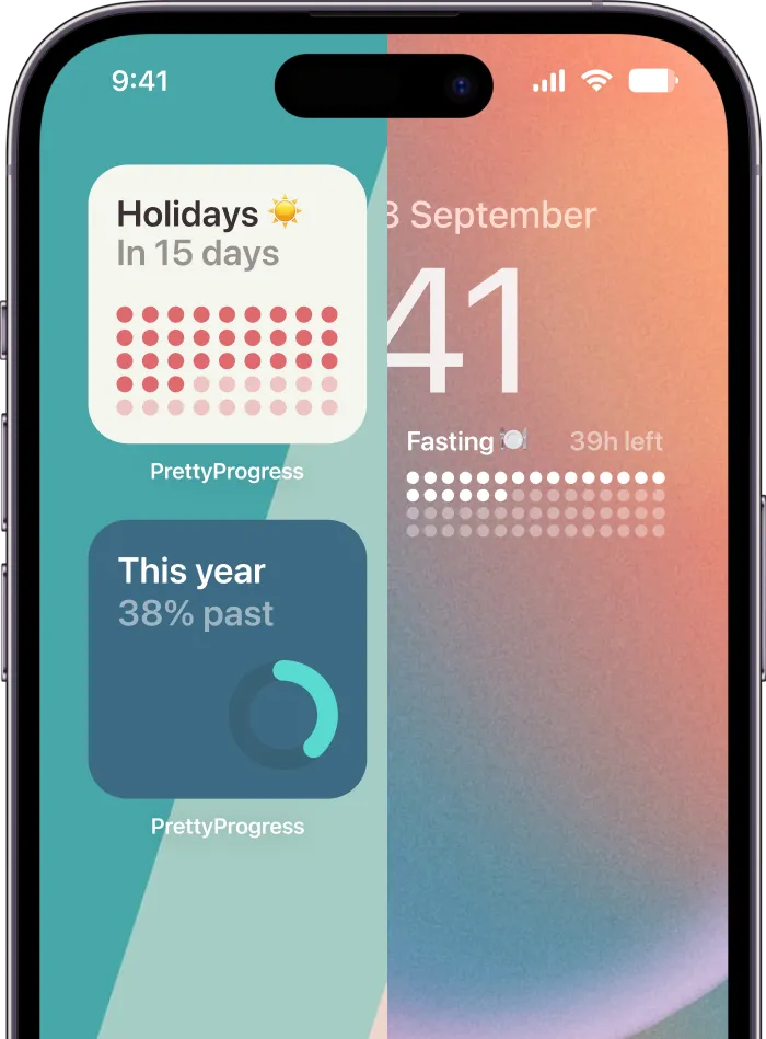
- Pretty Progress fits a different job. It focuses on countdown and progress bar widgets, with customizable themes, colors, gradients, layouts, and date-based tracking across Apple devices.
If you want more options for free tools before choosing, this roundup of free widget apps for iPhone gives a practical starting list.
A simple toolkit beats one do-everything app
Most polished Home Screens use a small stack of apps rather than one miracle solution.
A clean setup often looks like this:
| Need | Better tool type |
|---|---|
| General date and time styling | Widgetsmith |
| Complex visual layouts | Widgy |
| App launchers and custom actions | Shortcuts |
| Pre-made themed packs | Screenkit |
| Countdowns and progress tracking | Specialist countdown app |
Pick your main app based on your most important widget, not your first widget.
That one decision changes the whole experience. If your layout revolves around deadlines, habits, launches, exam dates, or personal milestones, start with the tool built for that. If your screen is more about static visual identity, start with a general styling app and add function later.
What doesn’t work is choosing tools based only on screenshots in the App Store. A layout that looks good in preview images can still fail on your actual screen if the app doesn’t give you enough control over font weight, spacing, or information density.
Building Your First Custom Widget
The fastest way to learn widget design is to build one that solves a real problem. A countdown widget works well because it gives you a clear job, a visible data point, and enough design flexibility to match almost any theme.

Professional widget creation usually comes down to a few core layers: background, typography, color palette, data elements, and decorative details like borders or shadows. This modular setup can create over 200 distinct customization combinations per widget type, based on this aesthetic widget design guide.
Pick one real purpose
Start with an event or deadline you care about. Good examples:
- An exam date if you’re a student
- A launch day for a project
- A trip or concert
- A habit streak milestone
- A personal deadline like portfolio updates or moving day
The reason matters because it shapes the tone. A vacation countdown can be playful. A thesis deadline should probably be cleaner and easier to read.
Style the widget in layers
This is the part most tutorials rush. Don’t just choose a theme and stop there.
Use this order instead:
-
Choose the size first
Small widgets work when the message is simple. Medium widgets are often the best balance for countdowns because they give the progress bar room to breathe. -
Set the dates
Add the start and end point before making visual tweaks. You need to see the actual content to judge spacing. -
Match the wallpaper, not just the palette
A color can look perfect in the app editor and wrong on your Home Screen. Check the widget against the wallpaper. -
Adjust font weight for distance
If you can’t read the title at arm’s length, the styling is too delicate. -
Use decorative details carefully
Borders, shadows, and shape changes help define the widget, but too many layered effects make it look older and busier.
For visual inspiration on how a countdown can work as a graphic element, this countdown clock graphic guide shows useful layout ideas.
After you’ve styled the first draft, pause and compare it against the rest of your screen. If it steals all the attention, reduce the contrast or simplify the label.
Here’s a good walkthrough format to watch while you build:
Add it to your screen without ruining the layout
A strong widget can still fail once it lands on the Home Screen.
Use these placement rules:
- Anchor one side. Put the main functional widget on the top-left or center-left if you want it noticed quickly.
- Leave breathing room. Don’t surround a detailed widget with equally loud elements.
- Repeat one visual trait. Match either corner radius, accent color, or font style somewhere else on the screen.
- Check tap behavior. Make sure your most-used apps are still easy to reach.
The right first widget teaches almost everything you need to know about iphone aesthetic widgets. Not because it’s perfect, but because it forces you to balance style, information, and layout all at once.
Integrating Functional Widgets That Work
A Home Screen looks finished when every visible element earns its place. That’s where many aesthetic layouts fall apart. They look polished in screenshots, then become annoying to use after a few days.
Expert guidance on widget ecosystems stresses dual-axis performance, meaning visual appeal plus usable information density, and notes that widgets with no functional data layer often get abandoned as people return to more practical layouts, as described in this widget usage analysis.
That idea is the difference between a styled screen and a useful one.

Treat the screen like a dashboard
Think in roles, not just widget types.
One widget should orient you. That might be the date, weather, or current agenda. Another should move you toward action. That could be a countdown, progress bar, or reminder list. A third can add personality, like a photo or quote, but only if the first two are already doing their jobs.
A balanced screen often includes:
- One orientation widget such as calendar or weather
- One momentum widget such as a deadline bar or habit tracker
- One mood element such as a photo frame or simple visual accent
If every widget tries to be the hero, none of them help you.
Where functional widgets fit best
Progress bars and countdowns work because they turn time into something visible. That’s especially useful when your goal is easy to postpone.
Here are layouts that tend to hold up well:
| Screen type | Functional widget idea |
|---|---|
| Student screen | Exam countdown plus agenda widget |
| Work screen | Project deadline bar plus calendar |
| Habit screen | Streak or milestone tracker plus reminders |
| Personal life screen | Trip countdown plus weather and notes |
A good progress widget does more than display a date. It changes how often you notice the thing you’ve been avoiding. That’s why this piece on visual goals is worth reading if you like goal-oriented layouts. It focuses on keeping progress visible without making your screen noisy.
Placement matters as much as content. Put high-value widgets where your eye lands first. Keep supporting widgets quieter. If you use a bold countdown bar, pair it with a simpler calendar. If you choose a dense medium widget, leave the neighboring area less crowded.
Functional widgets are what make iphone aesthetic widgets sustainable. They give beauty a job.
Common Widget Problems and Pro Tips
Even a strong layout can get weird in daily use. Widgets go blank, stop updating, clash with wallpapers, or look great in setup and strangely irritating a week later.
Most of these issues come from a short list of causes.
Fix the issues people hit most
- Blank widget. Open the source app and confirm the widget is assigned to the right preset or slot. Many apps let you design multiple widgets, and the Home Screen one may still point to the wrong version.
- Widget not updating. Check whether the app has the latest data entered, then re-add the widget if needed. Some stale widgets need a refresh through the app itself.
- Layout feels cluttered. Remove one thing, not five. Usually the problem is one oversized or overly detailed widget breaking the hierarchy.
- Photo widget looks cheap. The image is probably too low quality or too busy. Use cleaner images with fewer focal points.
- Battery worries. In practice, the bigger problem is often relevance, not battery. A widget you stop trusting is one you’ll eventually remove.
A few pro moves help once the basics are stable:
- Use transparent-style effects carefully so the wallpaper and widget feel connected, not camouflaged.
- Stack widgets when roles overlap. This helps when you want access to more information without filling every open slot.
- Audit your screen at night. A layout that feels calm in daylight may feel harsh later if the contrast is too intense.
Remove the widget you keep ignoring first. Your screen is telling you what isn’t working.
Make your layout more accessible
This part deserves more attention than it gets. Apple’s 2025 accessibility reports found that high-contrast, minimal widgets improved task completion by 40% for ADHD users, and post-iOS 18.2 dynamic type scaling made auto-adjusting fonts more useful for accessible widget design, according to this accessibility-focused widget article.
That has real design implications.
If you want a more ADHD-friendly Home Screen:
- Use stronger contrast between text and background.
- Reduce animation and visual novelty on your main productivity screen.
- Limit competing accents so one element draws attention at a time.
- Choose clearer labels instead of vague decorative wording.
- Let font size breathe if dynamic type scaling makes the widget easier to scan.
Aesthetic doesn’t have to mean busy. Some of the most elegant Home Screens are also the easiest to process.
If you want a clean way to keep deadlines, habits, events, or personal milestones visible without turning your screen into clutter, Pretty Progress is built for that job. It lets you create customizable countdown and progress widgets for Home and Lock Screens, then tune the theme, colors, gradients, layout, and bar style so the widget fits your overall aesthetic instead of fighting it.