

September 25, 2026
Big Clock Countdown Guide: Pretty Progress on Every Screen
Create a big clock countdown on your Home, Lock, and Apple Watch screens with Pretty Progress. Step-by-step tutorial with sizing and contrast tips.
Pretty Progress lets you turn any iPhone, iPad, or Apple Watch into a big clock countdown in under two minutes with zero ads, while the Lock Screen stays live and always-on. The key is making the timer large, high-contrast, and simple enough to read without opening an app.
You’re probably looking at your phone right now, checking how long you have before a meeting, deadline, workout, class, or evening plan. A small date buried in a calendar creates friction. A well-designed countdown puts the remaining time in your peripheral vision and lets you make a decision immediately.
A big clock countdown works best when it behaves like part of your environment, not another task to manage. The digits should be readable in bright light, the label should explain the goal, and the layout should stay consistent across the devices you already use. Pretty Progress supports countdown and progress displays across iPhone, iPad, Apple Watch, Mac, and Android, so the same goal can remain visible in different places.
Table of Contents
- Why a Big Clock Countdown Changes Your Day
- Getting Started with Pretty Progress
- Sizing and Typography for a Legible Big Clock Countdown
- Color Contrast and Accessibility Tips
- Choosing the Best Layout Across Devices
- When a Big Clock Countdown Helps and When It Does Not
Why a Big Clock Countdown Changes Your Day
You glance at your Lock Screen between messages. Instead of seeing a vague reminder about “project deadline,” you see the exact time remaining. That small moment changes the next action. You either start the next task, shorten the break, or decide that the remaining window is too small for anything ambitious.
This is why a big clock countdown feels different from a calendar alert. An alert interrupts you once. A persistent countdown gives you context whenever you look, without asking you to remember a date or calculate the gap yourself.
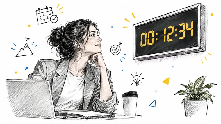
The value of instant time awareness
Countdowns have become powerful public symbols because they turn an abstract future moment into a shared visual sequence. Historical reporting from NPR’s account of the Times Square countdown notes that New Year’s Eve countdowns became a modern mass ritual during the twentieth century, while the Times Square version didn’t become a true group countdown until 1979. By the late 1980s, countdown clocks were common in public displays, television graphics, and broadcast hosting.
The same principle works on a smaller scale. NASA’s launch countdown clock at Kennedy Space Center, installed in 1969 for Apollo 12 and kept in service until 2014, became a durable symbol across generations of spaceflight, as described by Kennedy Space Center’s history of the launch countdown clock. A visible clock signals that something matters and that the next step is approaching.
Practical rule: If you need to act before a specific moment, keep the remaining time visible. If you only need to remember the moment, a calendar reminder may be enough.
Pretty Progress fits the first use case. Put a deadline on the Lock Screen, keep a project milestone on your Home Screen, or use an Apple Watch display for a goal you check while moving. The visual cue reduces the small mental calculation that otherwise happens throughout the day.
Getting Started with Pretty Progress
Start with one countdown, not a wall of competing deadlines. A crowded screen turns every goal into background noise, while one prominent event gives your attention a clear target.
Download Pretty Progress from the App Store, open it, and create a countdown event. Choose a goal with a definite endpoint, such as an exam, trip, project delivery, movie release, fasting window, or New Year’s Eve marker. A clear label matters because the number alone won’t tell you what you’re working toward.
Set the dates and label
Enter the start date and end date that define the progress period. Use the actual beginning of the goal when you want the display to communicate progress, rather than only showing distance from today. For a simple deadline countdown, the end date carries most of the meaning. For a long-term project, both dates help frame the journey.
Keep the title short enough to scan. “Design portfolio” is more useful on a small widget than a sentence-length description. Save the event, then preview how the remaining time appears in the selected layout.
The app can show remaining time in units such as years, months, weeks, days, hours, and minutes. Pick the unit that matches the decision you’re making. Hours and minutes suit a study session or meeting. Days work better for a trip or delivery milestone.
Put the first widget where you’ll see it
Add the saved countdown as a Home Screen or Lock Screen widget. Start with the largest practical layout, then reduce it only if it crowds out information you genuinely need. On an Apple Watch, choose a complication or face arrangement that keeps the digits visible without forcing a tap.
A live widget is more useful than a decorative countdown image because it can continue reflecting the target date. If you’re comparing visual approaches, the countdown clock graphic guide can help you think about presentation before you settle on a design.
Don’t create separate versions of the same goal for every screen at first. Build one clear event, place it on your primary device, and check whether you notice it naturally. If you keep opening the app to confirm the time, the widget is either too small, too subtle, or in the wrong location.
Sizing and Typography for a Legible Big Clock Countdown
A countdown can be technically present and still fail at its job. If you need to stop, focus your eyes, and decode the digits, it isn’t glanceable. Size and typography should help you understand the timer during an ordinary movement, not only when you’re holding the phone close.
Start with the largest readable number your surface allows. The supplied typography guidance uses 72pt minimum as a design target for a large countdown, but the right result still depends on viewing distance, screen size, and surrounding elements. Treat that figure as a starting point, then test the actual widget in the place where you’ll use it.
Make the digits carry the design
Use a bold typeface with generous spacing. Thin strokes disappear against wallpaper, while tightly packed numerals make similar characters harder to distinguish. A straightforward sans-serif usually performs better than a decorative serif when you’re reading quickly, especially on a small Lock Screen or Apple Watch surface.
Condensed fonts can save space, but they often make a countdown feel busier than it needs to be. Avoid styling the digits so heavily that the label, separators, or progress bar compete with the primary information. The remaining time should be the first thing your eye finds.
| Surface | Useful priority | Common mistake |
|---|---|---|
| Lock Screen | Large digits and strong weight | Letting wallpaper reduce clarity |
| Home Screen | Balance between size and surrounding apps | Choosing a small module automatically |
| Apple Watch | Distinct numerals and restrained labels | Packing too much text into the complication |
| Mac desktop | Distance readability and stable placement | Treating a desktop view like a phone widget |
Test from the real viewing distance
Place the phone on your desk, walk past it, and check whether you can identify the time without leaning in. On an Apple Watch, test the face while your wrist is in a natural position. A font that looks elegant in the customization screen may look cramped once the widget sits beside icons, wallpaper, or other complications.
For a playful way to think about quick visual recognition under pressure, a clock face shooting drill offers a useful visual association exercise. The broader lesson is simple: recognition should happen before analysis.
If you want to connect a countdown to a broader visual progress system, the progress bar creation guide is a useful companion. Keep the hierarchy consistent. The clock tells you how much time remains, while the bar shows movement toward the endpoint.
Color Contrast and Accessibility Tips
Color should support the timer’s function, not merely match your wallpaper. A beautiful gradient that weakens the digits is a poor choice for a countdown you need to read quickly. Start with a solid or quiet background, then give the numerals a foreground color that remains distinct in both bright and dim conditions.
Pure black on pure white produces a strong difference, but maximum contrast isn’t automatically comfortable for every person or setting. Some users prefer a softened background or off-white surface, provided the digits remain clearly separated. The practical test is whether you can read the timer immediately without changing the angle of the screen.
Design for changing light
A theme that works indoors may fade in direct sunlight. Test your Lock Screen near a window, under overhead lighting, and with the phone tilted. If the digits merge with the wallpaper, reduce transparency, switch to a solid background, or choose a heavier font weight.
Avoid low-contrast pastel combinations for the main countdown. Aqua, Swiss Style, and other curated themes can look polished, but decorative color should never outrank legibility. Use accent colors for the progress bar, icon, or label, while keeping the time itself visually dominant.
Reduce visual strain and ambiguity
People with visual impairments may need stronger weight, larger numerals, or a simpler layout. Don’t rely on color alone to communicate progress. Pair a changing bar or color with explicit remaining-time text, and make sure the label identifies the event without requiring the user to interpret a hue.
These adjustments also help users with attention differences. A clear number and short label demand less interpretation than a busy image, animated background, or complex ornament. If the timer feels loud, soften the color treatment while preserving the size and contrast of the digits.
Accessibility check: Read the countdown in the environment where you’ll depend on it. A design that passes your indoor desk test may still fail on a bright commute, beside a window, or on a wrist in motion.
A useful countdown doesn’t need to dominate the screen. It needs to remain stable, distinct, and predictable. The visual system should tell you what matters first, what the timer refers to second, and everything else only if you choose to look closer.
Choosing the Best Layout Across Devices
The same countdown doesn’t need the same layout everywhere. A Lock Screen widget competes with notifications and wallpaper. A Mac display can sit farther away and use more space. An Apple Watch complication needs to survive a brief glance while your wrist is moving.
On iPhone, use the Lock Screen when the countdown is tied to a decision you make throughout the day. A project deadline, departure, or appointment benefits from immediate visibility. The Home Screen works better when you want the countdown near planning tools, notes, or task apps.
Match the layout to the distance
The iPad gives you more room for a large clock countdown, especially when it sits on a desk during study or focused work. Use that space for a clear number, a short label, and a restrained progress indicator. Don’t fill the extra area with decorative elements just because the canvas allows it.
Mac is the strongest option for an ambient display across a room or beside a working document. A desktop layout can use larger type and more generous spacing, but it should remain quiet enough not to compete with the task in front of you. The aesthetic timer guide for Mac is relevant when you want the timer to feel integrated with your desktop rather than like a temporary browser tab.
Apple Watch requires the most discipline. Show the core time remaining and keep the event name short. A complication that needs a tap, a swipe, or a second glance has already lost much of its value.
Keep one visual hierarchy
Use the same relationship between elements across devices:
- Primary information: The remaining time gets the largest and strongest treatment.
- Context: The event label stays short and readable.
- Secondary progress: A bar, icon, or accent color supports the number without competing with it.
- Theme: Retro OS, Aqua, Swiss Style, and Minimal treatments can change the mood, but they shouldn’t change what you notice first.
A minimalist theme usually wins on small surfaces because it protects spacing. Richer retro or gradient designs can work on an iPad or Mac where you have more room to separate elements. The best layout is the one that preserves recognition as the countdown moves between screens.
Persistent displays also create a practical maintenance question. Product documentation for auto-updating countdown visuals describes selectable refresh intervals ranging from minutes to a day, along with widgets, themes, and glanceable surfaces. Frequent updates can feel responsive, but they may add visual noise or consume more resources. In a calm desktop display, a less aggressive refresh may be preferable to constant movement.
When a Big Clock Countdown Helps and When It Does Not
A visible timer helps when the task has a clear endpoint and the remaining time should influence your next action. Exam preparation, meeting segments, travel preparation, cooking, exercise intervals, and project milestones all benefit from a concrete boundary.
It’s less useful when the work depends on exploration, reflection, or creative wandering. A large number that keeps shrinking can make you judge every minute instead of following the problem. In those situations, hide the timer, reduce its visual prominence, or replace it with a softer progress cue.
Use urgency selectively
A study on an ambient progress bar found that participants completed a task in 188.8 seconds with the always-visible bar, compared with 202.25 seconds without it, as reported in the study’s published document. The practical lesson isn’t that every task needs a giant clock. It’s that persistent, low-friction feedback can help people maintain orientation without opening another interface.
Countdown pace also changes how the timer feels. Experimental work summarized by StudyClock’s countdown guidance indicates that participants were more patient when a clock counted down quickly than when it moved slowly. That suggests perceived pace matters. A constantly ticking display may create urgency, while a calmer update style can support sustained attention.
Use this decision filter:
- Choose a large countdown when the endpoint is fixed and time awareness changes behavior.
- Choose a medium widget when you need context but don’t want the deadline dominating your screen.
- Hide or soften it during creative work, emotionally demanding tasks, or activities where pressure narrows your thinking.
- Change the update cadence when constant movement distracts you or the display feels stale.
Research on timer use has also associated timer presence with higher reported productivity and effectiveness compared with having no timer, but that doesn’t erase the trade-off. A timer can focus attention for a linear routine and create pressure during high-cognitive-load work. The right question isn’t whether a big clock countdown looks impressive. It’s whether seeing the time remaining helps you choose better actions.
Pretty Progress turns your iPhone, iPad, Apple Watch, Mac, or Android device into a persistent countdown and progress display with customizable widgets, themes, colors, layouts, and labels. Create one deadline, test its size and contrast in real conditions, and visit Pretty Progress to build a countdown that stays useful instead of becoming screen decoration.





