
September 5, 2026
How to Make a Progress Bar That Actually Works
Learn how to make a progress bar for web, iOS, and Android with clear steps, accessibility tips, and design tricks that make waits feel shorter.
You’ve just started a file upload, and the progress bar reaches 64% before freezing. You wait. The spinner keeps turning, but nothing confirms whether the upload is still working, stalled, or already failed. A few seconds later, you’re considering a refresh that could cancel the entire task.
That’s the challenge behind how to make a progress bar. The code may be a small combination of markup, styles, state, and events. The design is a promise about time, accuracy, and control. A useful bar must be technically correct, feel responsive, remain understandable to assistive technology users, and justify its maintenance cost.
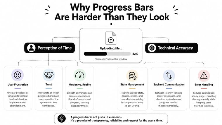
Table of Contents
- Why Progress Bars Are Harder Than They Look
- Building a Progress Bar in HTML, CSS, and JavaScript
- Custom Code Versus a Ready-Made Widget
- Design Choices That Make the Wait Feel Shorter
- Accessibility and Contrast Essentials
- Quick Fixes for Common Progress Bar Problems
- Putting It All Together and What to Learn Next
Why Progress Bars Are Harder Than They Look
A progress bar has two jobs. First, it reports a technical state, such as bytes uploaded, steps completed, or content loaded. Second, it manages uncertainty. Users want to know whether the system is alive, whether the estimate is believable, and what they can do while they wait.
That psychological contract is why a beautiful bar can still feel broken. A fill that jumps backward, stalls near completion, or moves without any meaningful status makes the interface look dishonest. A plain bar with accurate state, a clear label, and sensible motion usually earns more trust than a polished animation attached to an unreliable estimate.
The pattern itself has a longer history than many front-end developers realize. Karol Adamiecki created a scheduling chart called a harmonogram in 1896 and published it in 1931, while Henry Gantt popularized a related charting approach in the West between about 1910 and 1915. In software, Mitchell Model’s 1979 Ph.D. thesis is credited with an early graphical progress bar, and Brad Myers formalized the idea in a 1985 paper about percent-done progress indicators, helping establish the pattern as a standard way to communicate completion during long waits. (Progress bar history)
I judge every implementation through four lenses:
- Technical correctness: Does the value reflect a real task state, and does the bar handle completion, failure, and cancellation?
- Perceived speed: Does motion reassure users, or does it draw attention to the delay?
- Accessibility: Can people understand the state without relying on color, sight, or rapid announcements?
- Maintenance cost: Is custom code justified, or would a vetted widget reduce risk?
The practical fixes below focus on those questions. You’ll get a native HTML version, a custom CSS pattern, event-driven JavaScript, a cross-platform example, design guidance, accessibility rules, and a troubleshooting checklist.
Building a Progress Bar in HTML, CSS, and JavaScript
A file upload can sit at 42% while the network is still working, or jump from 80% to complete as the server finishes processing. Build the bar around the task’s real state, not around a visually pleasing animation.
For determinate work, start with native semantics. The HTML <progress> element represents progress toward a known maximum, so it is preferable to recreating that meaning with unrelated div elements. Give it a programmatic name and keep visible status text available when the task matters.
<label for="upload-progress">Uploading report.pdf</label>
<progress id="upload-progress" value="0" max="100">0%</progress>
<span id="upload-status" aria-live="polite">Preparing upload</span>
The fallback text inside <progress> supports older or unusual environments. The separate status also gives users context beyond a number. Use a custom wrapper only when you need precise visual control, because custom markup makes your code responsible for the progressbar semantics.
<div class="progress-track">
  <div
    id="custom-progress"
    class="progress-fill"
    role="progressbar"
    aria-label="File upload progress"
    aria-valuemin="0"
    aria-valuemax="100"
    aria-valuenow="0">
  </div>
</div>
This CSS creates a visible track, rounded fill, and restrained movement.
.progress-track {
  width: 100%;
  height: 0.75rem;
  overflow: hidden;
  border-radius: 999px;
  background: #d9dee7;
}

.progress-fill {
  width: 0%;
  height: 100%;
  border-radius: inherit;
  background: #155eef;
  transition: width 180ms linear;
}
The transition should smooth ordinary updates without making the bar trail the source of truth. A decorative animation that continues after the upload finishes makes the interface feel less reliable.
Connect the bar to real task state
A determinate value is useful only when it comes from the operation it represents. For an upload, XMLHttpRequest exposes loaded and total byte counts through its progress event.
const input = document.querySelector("#file-input");
const progress = document.querySelector("#custom-progress");
const status = document.querySelector("#upload-status");

input.addEventListener("change", () => {
  const file = input.files[0];
  if (!file) return;

  const request = new XMLHttpRequest();
  request.open("POST", "/upload");

  request.upload.addEventListener("progress", (event) => {
    if (!event.lengthComputable) return;

    const rawValue = (event.loaded / event.total) * 100;
    const value = Math.max(0, Math.min(100, rawValue));

    progress.style.width = `${value}%`;
    progress.setAttribute("aria-valuenow", String(Math.round(value)));

    if (Math.round(value) % 10 === 0) {
      status.textContent = `Uploaded ${Math.round(value)}%`;
    }
  });

  request.addEventListener("load", () => {
    if (request.status >= 200 && request.status < 300) {
      progress.style.width = "100%";
      progress.setAttribute("aria-valuenow", "100");
      status.textContent = "Upload complete";
    } else {
      status.textContent = "Upload failed";
    }
  });

  const formData = new FormData();
  formData.append("file", file);
  request.send(formData);
});
Rapid events can cause visible jitter. A small requestAnimationFrame scheduler or debounce can reduce redundant paints, but do not postpone meaningful state changes. Accessible progress indicators recommends announcing meaningful milestones instead of interrupting a screen reader for every incremental update.
For SwiftUI, the native equivalent is compact:
ProgressView("Uploading", value: progress, total: 100)Every working bar needs three basics:
- A numeric maximum: The system must know what completion means.
- An announced label: Users need the task name, not just a moving shape.
- A restrained transition: Keep visual interpolation shorter than the wait it represents, and never let animation outrun the actual state.
Custom Code Versus a Ready-Made Widget
The right implementation depends on how central the progress experience is. A one-off upload on a marketing site doesn’t deserve the same architecture as a dashboard where users monitor imports, exports, and background jobs every day.
| Dimension | Custom Code | Ready-Made Widget |
|---|---|---|
| Control | Exact markup, styling, motion, and state integration | Configuration within the widget’s supported options |
| Bundle and dependencies | Potentially smaller and easier to audit | Adds a dependency or hosted tool to the project |
| Edge cases | Your team owns errors, cancellation, indeterminate states, and reduced motion | A mature component may already handle common states |
| Design-system fit | Can match product tokens precisely | May require overrides or wrapper styles |
| Delivery speed | Slower initially, especially with testing | Faster when the visual and behavioral requirements are standard |
| Maintenance | You own browser, platform, and accessibility regressions | The maintainer owns part of the compatibility burden |
Custom code wins when the bar is part of the product’s identity or when the backend exposes unusual states. A SaaS dashboard might need queued, processing, paused, retrying, and failed states, each with different controls. A small component can grow into a state machine, and writing that deliberately is safer than forcing a generic widget to imitate it.
A ready-made option makes more sense when the bar supports the page rather than defines it. A team shipping weekly may get more value from a vetted component with reduced-motion behavior and indeterminate handling than from another internally maintained CSS fragment. For small visual utilities, compare the maintenance surface carefully. A permanent progress resource such as Littleprogress on IndieTool can help you evaluate a focused tool before committing engineering time.
The same principle applies to adjacent UI. If you’re looking for a lightweight countdown rather than a task-progress component, this iPhone countdown widget guide addresses a different use case, with time remaining as the primary value.
Decision rule: Build the bar when it’s core to the product and your team owns the design. Choose a vetted widget when it’s supporting UI and the team is stretched.
Design Choices That Make the Wait Feel Shorter
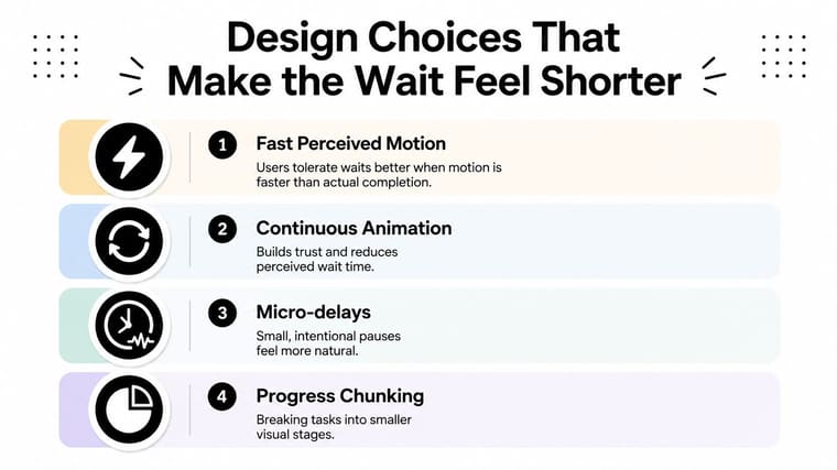
A physically faster progress bar can improve the experience even when the underlying task hasn’t become more accurate. Recent HCI research found that faster bars increase both duration estimates and speed evaluation, while speed evaluation affects the overall experience more directly than duration estimates. (Research on progress-bar speed and perceived waiting)
That finding sounds counterintuitive, but it matches what I see in shipped interfaces. Continuous motion tells users that the system is alive. A tiny delay at the start feels more suspicious than the same delay after the task has visibly begun. A bar that crawls through its final stretch makes completion feel farther away than the clock suggests.
Tune motion without lying
For an upload or calculation with a reliable estimate, start the visual fill with a small non-zero value instead of leaving users staring at an empty track. Keep that initial movement truthful, then use a linear or mild ease-out curve so the bar doesn’t linger near completion.
For tasks longer than a brief interaction, pair the fill with a percentage, completed-step count, or remaining-time estimate. The text should explain what the bar means, such as “Preparing files” before bytes are available, then “Uploaded 62%” once the source reports determinate progress.
Use striping or shimmer for an indeterminate state, where the system knows work is happening but can’t calculate a defensible percentage. Don’t apply decorative stripes to a determinate bar just because they look lively. In a practical review of fake loading screens in AppLighter, the important distinction is between communicating activity and pretending to know completion.
On mobile, make the track visually substantial. Hairline tracks can disappear on high-density screens, and touch-oriented controls need enough surrounding space to remain easy to perceive and operate. Don’t stack a skeleton screen, a spinner, and a progress bar for the same wait unless each one communicates a distinct state. Celebration effects should run once at completion, not restart with every value update.
For additional patterns, browse these progress bar examples, but judge each example by state clarity before copying its appearance.
Accessibility and Contrast Essentials
A progress bar carries state, so audit it as an interface component rather than decoration. Users should be able to identify it, perceive its state, understand it without color, and receive updates without disruptive announcements.
Give the bar a programmatic name. A native <progress> element can use an associated label. A custom element with role="progressbar" needs aria-label or aria-labelledby. For determinate progress, expose aria-valuenow, aria-valuemin, and aria-valuemax, and keep those values within the valid range. If a region is loading, associate the bar with explanatory status text through aria-describedby. Keep aria-busy="true" on that region until the work finishes.
Don’t rely on color alone. Add visible text, a completed-step count, an icon, or a change in shape or pattern. A W3C accessibility discussion document highlights that adequate non-text contrast does not, by itself, address use-of-color concerns when users need another visual cue.
Control announcements. Speaking every percentage change through a live region creates noise and can interrupt other content. Keep routine updates quiet, then announce meaningful milestones through a polite live region. Use role="status" for concise messages intended for assistive technology. It does not replace the progress bar’s own semantics.
Check contrast across the fill, track, segments, and any text placed over the bar. Material Design calls for the active indicator to maintain at least 3:1 contrast against most backgrounds. GitHub Primer specifies 3:1 for adjacent segments and the background, plus 4.5:1 for visible label text. Its progress accessibility guidance is a useful implementation reference.
Native HTML and platform components can expose different semantics. HTML <progress> and native iOS ProgressView may not behave identically to a screen reader. After replacing either with custom markup, test the accessible name, value, and state directly. Visual similarity does not guarantee equivalent accessibility.
Quick Fixes for Common Progress Bar Problems
A progress bar rarely fails in a dramatic way. More often, it develops one small behavior that makes the whole interface feel unreliable.
-
“It never moves past 99%.” Check the calculation before changing the CSS. Integer division, early rounding, or a value capped below the maximum can leave the fill short. Keep the internal value precise, clamp it to the valid range, and only round the displayed number.
-
“It reaches 100%, then jumps backward.” Look for an interval or promise callback using stale state. A closure may be writing an older captured value after the completion handler runs. Clear the interval on completion and make the final state authoritative.
-
“The bar flickers on mobile Safari.” Don’t animate
transformwhile also moving a striped background withbackground-position. Choose one motion layer, preferably the fill transform or width, and disable decorative background animation when the device or user preference calls for reduced motion. -
“The spinner keeps running after the page loads.” The global loading flag probably never resets on the success, error, or cancellation path. Put cleanup in a shared finalizer so every exit route turns the indeterminate state off.
-
“The fill leaks outside the track when zoomed.” The parent track needs
overflow: hidden, and the fill should inherit the track’s radius. Test at browser zoom levels and with fractional widths, because rounding can expose corners that look fine at the default viewport.
The smallest fix is usually a state fix, not a visual trick. Log the source value, rendered value, and terminal state together before rewriting the component.
Putting It All Together and What to Learn Next
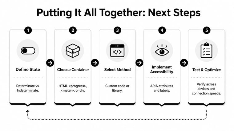
A reliable implementation follows a short decision path:
- Define the state. Use determinate progress only when the system can defend a numeric value. Otherwise, use an indeterminate pattern with a useful status message.
- Choose the container. Prefer native
<progress>for HTML determinate tasks. Use a customrole="progressbar"only when native behavior can’t meet the design or platform requirement. - Select the method. Build custom code for product-critical workflows. Choose a maintained widget for supporting UI when testing and accessibility would otherwise be rushed.
- Implement accessibility. Add a name, valid values, non-color cues, appropriate contrast, and restrained announcements.
- Test the uncomfortable cases. Throttle the connection, interrupt the task, resize the viewport, zoom the browser, enable forced colors, and test with reduced motion and a screen reader.
For a broader view of how visibility helps people understand progress, this guide from Kohru on visibility offers useful context beyond the implementation details. You can also explore this countdown timer and progress bar inspiration list when the goal is tracking time, deadlines, or milestones rather than an active network task.
The next skill is timing. Learn how easing curves affect perceived performance, then explore optimistic updates, skeleton transitions, and staged determinate progress. A progress bar is a small component, but it teaches the larger lesson that users judge systems by both what they accomplish and how clearly they communicate the wait.
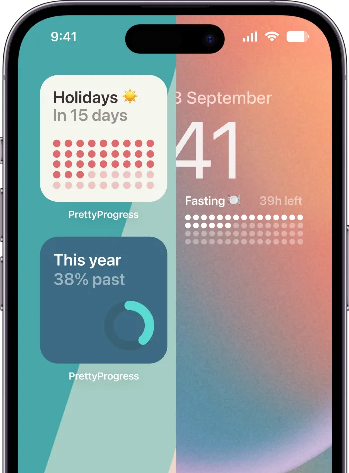
Pretty Progress offers customizable countdown and progress widgets for iPhone, iPad, Apple Watch, Mac, and Android, with configurable dates, colors, layouts, and visual styles. If you want a glanceable way to track a deadline or long-term goal beyond a web task, visit Pretty Progress and create a progress display that fits your screen.