April 28, 2026
Goal Progress Tracker App: Your Ultimate Setup Guide
Master your goals with our guide to setting up a goal progress tracker app. Learn to customize widgets, use pro features, and build workflows for any lifestyle.
You probably have goals sitting in three places right now. A deadline in your calendar, a half-made plan in your notes app, and a mental list that keeps resurfacing when you’re trying to relax. The problem usually isn’t ambition. It’s visibility.
A good goal progress tracker app fixes that by turning vague intention into something you can see. A shrinking countdown, a filling progress bar, or a widget sitting on your screen changes the feel of a goal. It stops being a promise you have to remember and becomes a cue you can respond to in seconds.
That’s why the best setups aren’t just about features. They’re about workflow. A student needs one kind of visual system. A project manager needs another. Someone with ADHD often needs goals to stay visible without opening an app at all. The app matters, but the setup matters more.
Table of Contents
- Why Visualizing Your Goals Changes Everything
- Your First Countdown From Install to Action
- Designing Widgets for Maximum Impact
- Unlocking Power Features and Custom Styles
- Tailored Tracking Workflows for Your Lifestyle
- Quick Answers and Final Pro Tips
Why Visualizing Your Goals Changes Everything
Individuals rarely abandon goals because the goals are wrong. They quit because the goals disappear into the background. If your target only lives inside a task app, a notebook, or your memory, it has to compete with everything else pulling at your attention.
A visual tracker changes that. It puts the goal back in front of you before your brain has time to negotiate with it. A progress bar says, “you’re moving.” A countdown says, “time is passing whether you act or not.” That tiny moment of friction matters more than people expect.
Glanceable progress creates useful pressure
The big shift is glanceability. You shouldn’t have to open three screens, dig through folders, and interpret a dashboard just to remember what matters today. The strongest visual systems work in the background. They keep your goal present without being loud.
That matters because motivation is rarely stable. Visibility is more reliable.
A forgotten goal doesn’t need better advice first. It needs to stay visible long enough for action to happen.
When readers ask me why some tracking systems stick and others fail, the answer is usually simple. If the system demands attention, people abandon it. If the system earns attention by staying clear and attractive, people keep using it.
The right setup is personal
Students often need long-range timelines plus short-range exam pressure. Professionals need milestone visibility without clutter. People who are neurodiverse often need passive cues more than aggressive notifications. Those are different problems, and they need different setups.
That’s also why browsing feature lists isn’t enough. You need a practical visual workflow built around your life. If you’re interested in the psychology behind this, visual goal design for everyday motivation is worth reading.
A goal progress tracker app works best when it becomes part of your environment. Not another thing to manage. A thing that quietly keeps you moving.
Your First Countdown From Install to Action
Getting started should take minutes, not an afternoon. A common mistake is building five goals at once, color-coding everything, then never checking the app again. Start with one real deadline that already matters to you.
![]()
Pick one goal with a clear finish line
Choose something concrete:
- Work example: Finish Q3 project report
- Study example: Complete final exam revision
- Health example: Train for a 5K race
- Life admin example: Save for a planned purchase
Your first goal should have a visible endpoint. That makes the progress bar honest. If the finish line is fuzzy, the app can only give you fuzzy motivation back.
Set the dates correctly
This part is not busywork. Your start date and end date are the engine of the whole visual system. If they’re off, your progress bar lies to you.
Use this quick checklist:
-
Start with reality
If the project began last week, set last week’s date. Don’t restart the story just because you’re installing a new app today. -
Choose the true deadline
Use the date the work needs to be done, not the date you’d “like” to finish. -
Split hard goals into milestone dates
If your semester ends in months, add separate countdowns for each exam, draft, or checkpoint.
Practical rule: If a date changes often, track the milestone you control, not the final outcome you don’t.
Name the goal so it drives action
Bad title: “School stuff”
Better title: “Submit economics paper”
Bad title: “Fitness”
Better title: “Run 5K without stopping”
A good title gives your brain a target. It also makes widgets more useful later, because you’ll recognize the goal instantly.
Let the dashboard do its job
Visual tracking works because the numbers become shape and motion. According to Hive’s review of goal tracking apps, 68% of users report better goal adherence with visual dashboards, and user data indicates this kind of tracking can support a 75% improvement in long-term milestone completion for professionals and students when apps provide clear charts, overviews, and progress reporting.
That doesn’t mean every chart helps. Too many views too early creates friction. For your first setup, you only need:
| Setting | What to choose | Why it helps |
|---|---|---|
| Goal type | One deadline-based goal | Easiest to understand at a glance |
| Reminder | One daily reminder | Enough support without annoyance |
| Progress view | Bar or countdown | Fastest visual read |
| Review rhythm | Check once in morning, once at night | Builds consistency |
If your goal also connects to promotion, launch timing, or a sales event, it can help to see how other countdown-driven workflows work in business settings. A practical example is this guide on how to boost sales with a countdown timer, because it shows how visible urgency changes behavior.
Your only job after setup is simple. Open the app once, create one honest goal, and make sure the countdown reflects real life.
Designing Widgets for Maximum Impact
The app is where you configure the goal. The widget is where the goal starts influencing behavior. That’s an important distinction. If your goal progress tracker app stays hidden behind an icon, it still depends on memory. Widgets remove that dependency.
![]()
Home Screen versus Lock Screen
These two widget spaces should not do the same job.
Home Screen widgets are for ambient awareness. They work well for ongoing goals like semester progress, quarterly projects, savings targets, or habit streaks. You see them while moving through your day, which keeps your larger arc visible.
Lock Screen widgets are better for urgency. An exam this week. A deliverable due tomorrow. A countdown that should interrupt your autopilot before you scroll.
Here’s the simplest way to divide them:
| Widget location | Best for | What to show |
|---|---|---|
| Home Screen | Ongoing goals | Overall progress bar, long countdown, top priorities |
| Lock Screen | Near-term pressure | One urgent deadline, next reminder, quick completion action |
| Apple Watch or desktop | Fast glances | Single metric, simple countdown, no clutter |
How to place them well
On iPhone or iPad, add a larger widget for your main goal where your eye already goes. Don’t hide it on a secondary page unless the goal is low priority. For Lock Screen placement, choose the one goal that deserves immediate visibility.
For Apple Watch, keep the complication minimal. A tiny progress cue works. A crowded one doesn’t. On Mac, use desktop visibility for long-running work like a launch timeline or thesis deadline.
I like to build a small widget ecosystem instead of one giant control panel:
- One big anchor widget for the main goal
- One smaller urgency widget for the next deadline
- One optional support widget for a streak, sub-goal, or routine
That structure gives you focus without visual noise.
Customize for function first
People often treat widget styling as decoration. It isn’t. Color, contrast, size, and layout affect whether you notice the goal or ignore it.
If you want a deeper framework for designing widgets people use, Ascendly Marketing’s UX design insights are useful because they reinforce a principle that applies here too. Clear interfaces reduce friction.
Use these practical rules:
- Use bold contrast for urgent deadlines: If a goal needs your attention this week, don’t make it pastel and subtle.
- Reserve minimal themes for stable goals: Clean layouts work well when the goal doesn’t need to shout.
- Match size to importance: Your biggest widget should belong to your highest-stakes current target.
- Avoid duplicate information: If the Home Screen already shows full-semester progress, let the Lock Screen focus on the next exam.
Good widgets don’t just look nice. They decide what your future self will notice when attention is low.
For examples of countdown placement that keeps pressure visible without clutter, this piece on using a timer on your home screen effectively is a useful reference.
Three widget setups that work
Student setup
A large Home Screen widget tracks the semester. A small Lock Screen widget tracks the next exam. The contrast matters. One says “stay on pace.” The other says “act now.”
Professional setup
Use a medium Home Screen widget for a quarterly objective and a smaller widget for the current milestone. That keeps the strategy and the deadline in the same visual system.
ADHD-friendly setup
Prioritize persistent visibility over dense data. One always-visible widget with one clear target usually beats a dashboard full of options.
Unlocking Power Features and Custom Styles
Basic tracking gets you started. Personalization is what makes you stay. When a tracking setup feels natural on your screen and useful in your routine, you stop treating it like a productivity experiment and start treating it like part of your day.
![]()
Themes change attention
A theme isn’t just cosmetic. It changes how often your eye catches the widget and whether the interface feels calm, sharp, playful, or urgent.
I’ve seen three styling directions work especially well:
- Minimal for serious work goals where clutter lowers trust
- Swiss Style for users who want clean structure and strong readability
- Retro OS for people who stay engaged when the tracker feels fun and distinctive
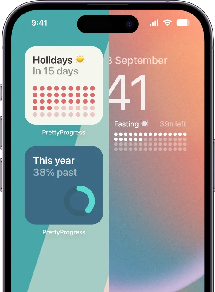
Tools like Pretty Progress fit well as one option, because it supports countdowns and progress bars across iPhone, iPad, Apple Watch, Mac, and Android, with customizable widgets, themes like Minimal and Swiss Style, and controls for colors, gradients, bar shape, layout, and icons.
Small style choices have real effects
A few examples from actual setup behavior:
A rounded progress bar often feels softer and more encouraging for long-term habits. A sharper bar shape can feel better for deadline-driven work. Dark themes often help urgent widgets stand out less aggressively at night, while brighter themes make daytime goals harder to ignore.
The key is not to style everything the same way.
Match design to goal type
| Goal type | Better style direction | Why |
|---|---|---|
| Exam prep | High contrast, clean typography | Fast reading under pressure |
| Savings target | Calm colors, steady progress bar | Encourages patience |
| Launch countdown | Bold accent, tight layout | Keeps urgency visible |
| Wellness routine | Softer color palette | Reduces friction and guilt |
If a widget feels annoying to look at, you’ll mentally hide it. If it feels satisfying, you’ll keep checking it.
Power features worth using
Some advanced features sound niche until you try them. Then they become part of the workflow.
Use calculators and related tools when they shorten setup friction:
- Business day calculation: Helpful for work deadlines that need realistic timing
- Date calculations: Useful when a project starts before you install the app
- Intermittent fasting windows: Good for wellness tracking that depends on timing
- Exact age or anniversary calculations: Useful for personal milestones and long-range countdowns
These tools matter because they remove guesswork. That keeps the tracker accurate, and accuracy matters more than fancy visuals.
What not to overdo
Don’t chase customization for its own sake. If you change colors every two days, rename goals constantly, or rebuild layouts every week, the system becomes a hobby instead of a support tool.
Use advanced styling when it solves one of these problems:
- You keep ignoring the widget
- The current layout is hard to read fast
- You need different visual moods for different goals
If none of those are true, leave the setup alone and let repetition do the work.
Tailored Tracking Workflows for Your Lifestyle
The most effective goal systems aren’t universal. They fit the pressure pattern of your life. A student needs deadline clustering. A manager needs milestone sequencing. Someone with ADHD often needs passive visual cues more than deeper analytics.
![]()
Students who need semester control
Students often make one mistake with a goal progress tracker app. They create a single end-of-semester countdown and assume that will keep them moving. It won’t. A faraway date is useful for orientation, but not for weekly execution.
A better student workflow uses layers:
- Semester widget: Shows the full arc
- Current assignment widget: Shows the nearest due date
- Exam widget: Appears when revision phase starts
That setup helps because each widget answers a different question. How far through the term am I? What’s due next? What deserves focused effort now?
If you like planning outside the app first, a simple spreadsheet can still help. This tutorial on creating a habit chart is useful when you want to map routines before translating them into widgets.
Professionals managing moving deadlines
Professionals usually deal with shifting scope, not just fixed due dates. That means a single final countdown can become misleading if the project has multiple internal phases.
Use one tracker per phase instead:
| Work situation | Better tracker setup | Why it works |
|---|---|---|
| Quarterly objective | One long-range progress bar | Keeps strategic pace visible |
| Client deliverable | Countdown to draft date | Encourages earlier completion |
| Team rollout | Separate widgets for review and launch | Prevents one date from carrying all pressure |
This method keeps progress honest. It also helps you recover faster when a deadline moves, because you’re editing one phase instead of redesigning the whole system.
ADHD-friendly setups that stay visible
Many mainstream app reviews miss the core issue. The problem often isn’t willingness. It’s object permanence, friction, and attention drift.
According to Mindfulsuite’s review of goal tracker apps, visual persistency via always-on widgets can boost goal completion by 40% for neurodiverse users, and 70% of ADHD adults report forgetting goals without constant, non-intrusive cues. The same source also notes that Android holds a 70% global market share, which highlights the unmet need for strong visual widgets across platforms.
That tells you something practical. If you have ADHD, don’t build a system that requires remembering to open the app.
Use this instead:
- One main widget on the first screen: Make it impossible to miss
- One lock screen reminder for the current priority: Not everything. Just today’s most important target
- Short titles only: Fewer words means faster recognition
- Visual reward built in: A filling bar or countdown movement matters because the cue itself becomes motivating
For ADHD, the right setup is often less about reminders and more about reducing the number of steps between seeing the goal and remembering why it matters.
Here’s a useful companion approach for maintaining consistency in the behavior behind the widget: practical goal consistency habits.
This short video is also a good visual reference for thinking about practical progress tracking in daily life:
Habit builders who need momentum not complexity
Habit tracking fails when people confuse logging with progress. If your app asks for too much input, you’ll skip the check-in and feel behind.
A cleaner setup works better:
- Track one habit streak you care about
- Pair it with one outcome bar that shows what the habit is building toward
- Keep the widget celebratory, not judgmental
For example, instead of only tracking “meditate daily,” track both the daily check-in and a larger “90 days of meditation” progress bar. One supports the action. The other supports the story.
Android users who want beauty and visibility
Android users often want the same thing Apple users want. Aesthetic widgets that feel polished enough to keep on-screen all day. The difference is that many reviews still lean heavily toward iOS-first tools, which leaves Android users improvising with generic or ad-heavy options.
So if you’re on Android, prioritize these criteria:
- Home and lock screen support
- Strong visual customization
- Simple editing when dates change
- A design you won’t hide after two days
For this audience, style is not superficial. A beautiful widget is more likely to stay visible. A visible widget is more likely to shape behavior.
Quick Answers and Final Pro Tips
A few questions come up almost every time someone starts using a goal progress tracker app seriously.
Can I track a goal that already started
Yes. Use the actual start date, not today’s date. That gives you an honest progress bar and stops the app from pretending you’re earlier in the process than you are.
What if my goal doesn’t have a clean end date
Use milestone tracking. Saving money, building a reading habit, or improving fitness usually works better as staged checkpoints than one vague forever-goal.
Should I track many goals at once
Usually no. Track one primary goal, one secondary goal, and only add more if both are already visible and manageable. Too many widgets turn motivation into wallpaper.
How often should I change my setup
Only when the setup stops helping. Good reasons include a new deadline, a phase change, or a widget you keep ignoring. Boredom alone isn’t always a good reason to redesign the system.
Does syncing matter
Yes, if you work across devices. If you check goals on your phone but plan on a tablet or computer, syncing reduces friction. The best setup is the one you can trust everywhere you work.
Final tips that make the biggest difference
- Start smaller than you want to: One visible goal beats six hidden ones.
- Keep your most important widget on page one: If you have to swipe to find it, you’ll forget it.
- Use names that describe action: “Submit proposal” works better than “Big project.”
- Review visually, not emotionally: A stalled bar is information. Adjust the plan, don’t create guilt.
- Protect visibility: If a widget becomes background decoration, resize it, restyle it, or replace it.
The strongest systems are usually the simplest ones. A visible goal, a real deadline, and a design you’ll keep on-screen can carry more consistency than a complicated productivity stack ever will.
If you want a cleaner visual system for deadlines, milestones, and everyday motivation, Pretty Progress is built for exactly that style of tracking. You can create countdowns and progress bars, customize widgets for Home and Lock Screens, and keep your goals visible across the devices you already use.