

September 22, 2026
Due Date Reminder Software That Keeps You on Track
Discover how due date reminder software works, what to look for, and how to set up widgets that keep deadlines visible. Includes workflows
You check your calendar on Monday, see a due date at the end of the week, and feel reassured. By Friday afternoon, the deadline has disappeared beneath meetings, messages, errands, and smaller tasks that seemed more urgent. The calendar did its job, but it only showed the date. It didn’t keep the deadline visible while you worked.
That gap is where due date reminder software becomes useful. The right setup doesn’t make a sound at the last possible moment. It keeps time remaining, progress, and the next action close enough to notice without forcing you to stop what you’re doing.
This matters whether you’re preparing for an exam, managing a project milestone, tracking a renewal, building a habit, or trying to reduce the mental effort of remembering everything. By the end of this guide, you’ll understand how these tools work, how to choose a setup without creating notification overload, and how to turn a distant deadline into a visible path.
The central example is Pretty Progress, a countdown and progress bar app that can place customizable reminders on devices such as an iPhone, iPad, Apple Watch, Mac, or Android device. The broader lesson applies to many tools: a deadline is easier to act on when it stays visible between alerts.
Table of Contents
- Introduction Why Deadlines Slip Even With Calendars
- What Due Date Reminder Software Really Does
- Core Features That Make Reminders Actually Work
- How to Choose the Right Due Date Reminder Setup
- Creating Effective Due Date Reminders Step by Step
- Real World Use Cases From Students to ADHD Support
- Stay on Track With Pretty Progress and Next Steps
Introduction Why Deadlines Slip Even With Calendars
A calendar entry is often a promise to your future self. You add “submit research paper” or “send client proposal,” choose a date, and move on. The problem arrives later, when the entry remains hidden until you open the calendar or receive a notification that appears among many others.
Suppose a student has an assignment due Friday evening. On Monday, the deadline feels far away. On Wednesday, several other tasks compete for attention. On Thursday night, the student realizes that the research, drafting, editing, and upload still need to happen. Nothing was wrong with the calendar entry. It didn’t show the amount of work left or the shrinking window available to complete it.
Professionals face the same pattern with project launches, contract reviews, invoices, and internal approvals. A due date can exist in a project platform and still fail to guide daily decisions. People need more than a finish line. They need a visible sense of where they are now and how much time remains.
A reminder should bring the deadline back into view before it becomes an emergency.
Why a single alert isn’t enough
The phrase “due date reminder” can cause confusion. Some systems display a task on its due date, while users expect an advance reminder. In practice, a due date and a true reminder sequence aren’t always the same thing. User discussions around task tools have highlighted this gap, particularly when a task appears on the due date unless a separate notification is configured, as seen in this discussion about due dates and notifications.
A reliable system creates several opportunities to notice and act. It might show a progress widget every day, send a carefully timed nudge during a work window, and provide a final alert when the deadline is close. That approach gives you a chance to adjust instead of merely announcing that time has run out.
The rest of this guide turns that idea into a practical system. You’ll start with the basic model, examine the features that reduce forgetting, compare different approaches, build a reminder step by step, and see how the same visual method works for students, professionals, people with ADHD, and habit builders.
What Due Date Reminder Software Really Does
Think of a traditional reminder as a low-fuel beep in a car. It tells you that the tank needs attention, but it doesn’t show how far you can drive, which station is closest, or how quickly the fuel is disappearing. A persistent due date display works more like a dashboard gauge. It gives you a continuing visual readout instead of waiting for one dramatic warning.
At a basic level, due date reminder software connects an action to time. You enter an event, project, or goal, define its start and end dates, and choose how the system should make the remaining time visible. The software may calculate a countdown, show a progress bar, place information in a widget, or send notifications through channels such as email, WhatsApp, or SMS.
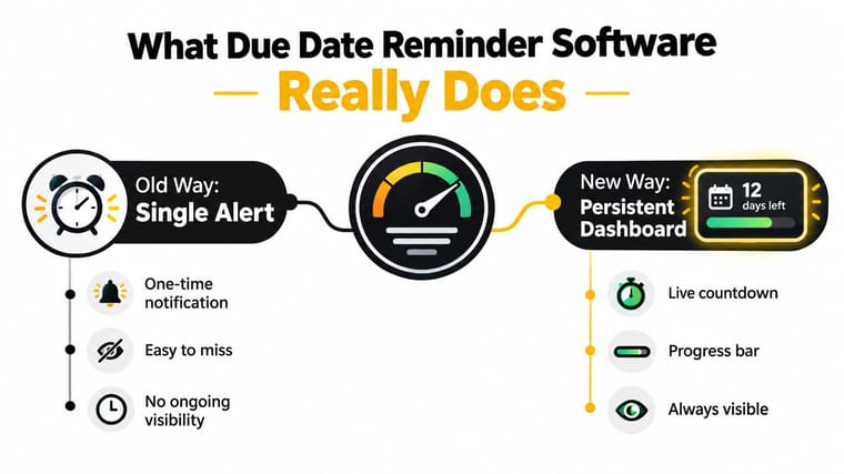
The important shift is from event-based alerting to continuous visibility. A single alert interrupts you at one moment. A dashboard or widget stays available while you check the time, open your phone, glance at your computer, or look at a watch. That persistent surface can support a small decision: spend ten minutes outlining, review the next milestone, or move a task before the available time becomes too tight.
The difference between a due date and a reminder
A due date answers, “When must this be finished?” A reminder sequence answers, “When should I start paying attention, and how often should the deadline return to view?”
Those questions need different settings. A project might end on Friday, begin on Monday, and need a planning prompt near the beginning, a progress check during the middle, and a completion alert before submission. The software isn’t replacing your task list. It’s adding a time-aware layer that helps the task compete with everything else on your screen.
Research on task reminders found that notification time is often set shortly after a task is created, and that creation time can help predict when a user wants an alert. The delay between creating a task and receiving a reminder also matters, which supports adaptive lead times rather than one universal default. You can review the findings in this task reminder timing research paper.
A useful explanation for another person would be simple: due date reminder software turns a deadline into a visible, time-aware object. It can show the finish line, the distance to it, and the moments when you should act. More notifications aren’t automatically better. Better visibility, closer to the context where work happens, often matters more.
Core Features That Make Reminders Actually Work
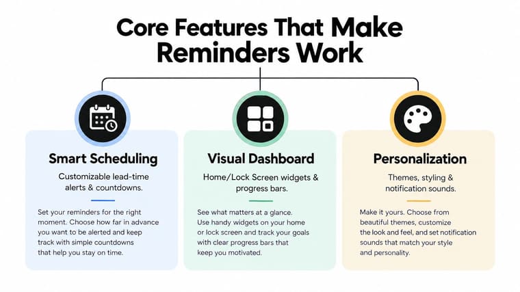
The strongest reminder systems combine scheduling with visual design. They don’t rely on a single alert to rescue a task you haven’t seen for days. Instead, they place the deadline in a surface you already use and let you decide how much interruption you can tolerate.
Countdown and progress display
A countdown answers the immediate question, “How long is left?” A progress bar adds context by showing movement through a period. Together, they transform an abstract date into something you can read at a glance.
For example, “Report due Friday” requires mental calculation. “Two days left” is faster to process. A bar that fills or empties can help you understand whether the project is still comfortably on track or entering a narrow completion window.
Start and end dates make this display more useful for long projects. A year-long goal, an exam study period, or a fasting window has a beginning as well as an endpoint. Showing the whole interval gives the deadline shape.
Widgets and glanceable surfaces
Home Screen and Lock Screen widgets reduce the number of steps between you and the information. Instead of opening a calendar, finding a project, and interpreting a date, you can see the countdown where you already check your device.
That doesn’t mean notifications have no role. They can help with a specific action, especially when a deadline requires a response. But a widget offers a quieter layer of awareness. It supports people who miss alerts, dismiss them automatically, or become distracted by the interruption itself.
Design principle: Persistence beats frequency. Keep the deadline visible before increasing the number of pings.
Personalization and device coverage
Themes, colors, bar shapes, layouts, icons, and notification sounds affect whether a reminder blends into your routine or becomes visual clutter. A calm design may suit a long-term goal, while a brighter style can distinguish a high-stakes submission from ordinary events.
Multi-device access also changes the experience. An iPhone user may want a Lock Screen widget, a student may check an iPad while studying, and a professional may prefer a Mac display during focused work. A system becomes easier to trust when the same deadline appears consistently across the places where work happens.
Helpful calculators can reduce setup friction for date ranges, business days, exact ages, or recurring routines. These tools aren’t the reminder itself, but they can prevent mistakes when the time period is complicated.
For people managing attention challenges, visual reminders for ADHD can be especially relevant because the goal is to lower the amount of memory and context switching required. The design should make the next time-based fact easy to see without demanding a new workflow.
How to Choose the Right Due Date Reminder Setup
You don’t need the most elaborate reminder system. You need one that matches the way you work. A person who checks a calendar consistently may need only a few carefully timed alerts, while someone who forgets tasks once they’re out of sight may benefit more from a persistent widget.
Start with visibility. Ask where you naturally look during the day. If you use a phone often, a Home Screen or Lock Screen widget may be more useful than an email reminder. If your work happens at a Mac, a desktop surface can keep the deadline present without adding phone interruptions.
Then consider customization. A simple event may need one reminder. A multi-stage project may need a start date, an end date, a progress indicator, and separate prompts for planning and completion. The tool should let you adjust lead time rather than forcing every task into the same schedule.
Noise deserves equal attention. Reminder studies show that poorly timed or overly frequent alerts can interrupt attention, while well-timed reminders during a regular working period can support performance. A randomized controlled trial on self-set goals reported a 0.08 standard deviation increase in a productivity index for reminders sent during regular working periods, while late reminders had no effect, as detailed in this research on reminder timing and productivity.
Choosing your reminder approach
| Criteria | Calendar Alerts Only | Spreadsheet Tracking | Dedicated Reminder Widgets |
|---|---|---|---|
| Visibility | Appears when you open the calendar or receive an alert | Depends on opening and reviewing the file | Stays visible on a chosen device surface |
| Customization | Strong for appointments and individual alerts | Flexible, but often manual | Designed for countdowns, progress, and visual styling |
| Noise level | Can become easy to dismiss when alerts accumulate | Usually quiet, but easy to forget | Offers a quiet visual layer with optional notifications |
| Platform coverage | Often broad, depending on the calendar service | Usually requires access to the spreadsheet | Depends on the product and supported devices |
| Ease of setup | Fast for a single date | Requires structure and maintenance | Fast once the date range and display are chosen |
Spreadsheets remain useful for lists, owners, notes, and complex project data. They aren’t naturally persistent reminders, though. Calendar alerts are convenient, but they often focus on a moment rather than the progress leading to it.
A dedicated widget is a good fit when being able to see the deadline matters more than receiving another interruption. Choose a notification schedule that lands inside your active work window, then let the visual display handle background awareness.
Creating Effective Due Date Reminders Step by Step
A useful reminder begins with a clear deadline, but it shouldn’t end there. Build the setup as a small time map, moving from the final date backward to the moments when you need to prepare.
Step one Define the finish line
Write the outcome in concrete language. “Finish project” is vague. “Submit the edited proposal to the client” gives you a visible result. Enter the exact due date and time when the deadline has a fixed cutoff.
If the date is uncertain, resolve that before building the reminder. A countdown based on an assumed date can create false confidence.
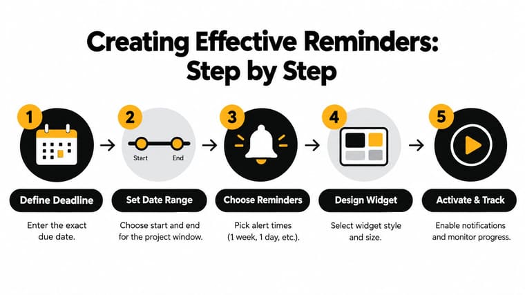
Step two Add the working window
Set the start date as well as the end date. This tells the system when the period begins and lets a progress display show more than a distant finish line.
For a student, the range could cover the study period before an exam. For a professional, it could cover drafting, review, approval, and delivery. The start date gives you a reason to act now, even when the due date still feels remote.
Step three Build a reminder ladder
Avoid treating one alert as the whole plan. Create layers with different jobs:
- Planning reminder: Bring the deadline into view when work should begin.
- Progress reminder: Prompt a check on whether the work is moving.
- Action reminder: Reserve time for the next concrete step.
- Final reminder: Protect the handoff, upload, payment, or submission.
The exact spacing depends on the task. A short assignment needs a tighter sequence than a long project. Set notifications during the hours when you can act, rather than late at night when the alert creates stress without creating useful work time.
Step four Design the visual cue
Choose a widget size that you can read without opening an app. Use color to separate categories, not to decorate every item. A muted theme may work for a yearly goal, while a stronger contrast can help an urgent work deadline stand out.
Pretty Progress can be used as one example of this approach. Its setup combines a start date, an end date, a countdown or progress display, and customizable widget styling. If the deadline also needs written communication, a separate deadline reminder email workflow can support the visual reminder with a clear message and record.
Step five Place and review it
Add the widget to the Home Screen, Lock Screen, or another location you check naturally. Then test the display and notification settings before relying on them for an important deadline.
Review the setup when the project changes. Moving the due date without updating the working range can make the progress view misleading. A reminder stays trustworthy when its dates reflect reality.
Real World Use Cases From Students to ADHD Support
A student opens a tablet to study for an exam. Instead of searching through a calendar, they see the remaining time and the study period on the screen. That small visual cue makes the deadline part of the study environment, not a detail buried in a weekly schedule.
For assignments, the useful setup often includes the final submission date, a start point for research, and separate prompts for drafting and checking the upload. A student can also pair a progress widget with an assignment list, as described in this assignment tracker for students.
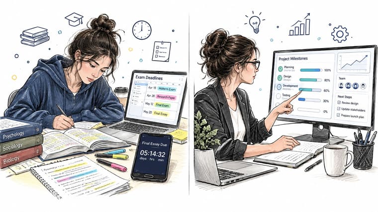
A project manager has a different problem. The deadline may depend on several milestones, each with its own owner and risk. A persistent countdown doesn’t replace the project plan, but it gives the manager an immediate view of the overall time window. The team can then use task software for detailed assignments and the visual reminder for shared urgency.
For someone with ADHD or another executive-function challenge, the main benefit may be reducing the number of mental translations required. “The report is due next Thursday” must be converted into “I need to start today, outline tomorrow, and review later.” A visible progress bar makes part of that passage immediate.
Low-noise design matters here. Too many pings can create alert fatigue, while a widget can offer background awareness without repeatedly pulling attention away from the current task. People who need more personalized support can also explore resources such as Uptown Psychology ADHD coaching alongside practical changes to their reminder environment.
A habit builder might track a fasting window, a yearly milestone, or a recurring personal goal. The point isn’t only to count down to an endpoint. A progress display can show that the routine is underway, which makes consistency visible rather than dependent on memory.
The following video offers another visual perspective on using countdowns and progress displays in everyday planning.
Business users also have a reason to treat reminders as workflow infrastructure. A 2025 industry summary reported a 45% increase in on-time task completion among companies using automated reminder tools and 30% fewer overdue tasks for teams using centralized reminder platforms instead of spreadsheets or manual tracking. The same vendor-published summary reported that mobile-friendly apps can improve engagement by up to 50%, while integrated systems using channels such as email, WhatsApp, and SMS can double on-time project delivery. These figures come from the due date reminder software industry summary and should be treated as vendor-published rather than universal results.
Stay on Track With Pretty Progress and Next Steps
The most dependable deadline system has two layers. Notifications handle moments that need action, while persistent visual progress keeps the larger time picture available between those moments.
That distinction helps explain why a widget can work better than a stream of alerts for some people. Alerts ask you to stop and respond. A widget lets you notice, interpret, and choose when to act. For students, professionals, habit builders, and people managing ADHD-related attention challenges, that lower-friction awareness can make planning feel less like memory work.
A simple starting checklist looks like this:
- Choose one deadline: Pick an upcoming exam, project handoff, renewal, or personal goal.
- Define the interval: Add both the start date and the final date.
- Select a reminder ladder: Use prompts for planning, progress, action, and completion where appropriate.
- Place the visual cue: Add the widget to the screen you already check.
- Review the design: Remove unnecessary noise and keep the important deadline easy to read.
Pretty Progress supports countdown and progress widgets across iPhone, iPad, Apple Watch, Mac, and Android. You can customize themes, colors, gradients, bar shapes, layouts, and icons, then use optional calculators for date-related planning. The app also offers a PRO upgrade for deeper styling controls, while its zero-ad experience keeps the display focused.
Don’t wait for a missed deadline to test your system. Create one visible reminder today, let it become part of your environment, and adjust the timing after you’ve used it through a real work period.
Pretty Progress turns deadlines, events, fasting windows, yearly goals, and habits into customizable countdowns and progress widgets that stay visible without relying on noisy alerts. Visit Pretty Progress to create your first visual reminder on the device you use every day, then build a calmer system that keeps progress in sight.





