
October 28, 2026
Best Widget Themes for 2026: 8 Styles Compared
Explore 8 of the best widget themes for Pretty Progress, from Swiss Style and Minimal to Aqua and Retro OS, with when to use each and customization tips.
You add a countdown to your Home Screen, choose the right date, and place it beside your calendar. The timer works, but something feels off. The number gets lost against your wallpaper, the progress bar looks too delicate, or the glossy background feels wrong for an exam deadline.
The problem is usually the theme, not the timer. A deadline needs a clear signal. A daily habit needs a reminder you won’t get tired of seeing. A holiday countdown can be playful without making you work to read it.
The best widget themes match both the goal you’re tracking and the screen where you’ll check it. A spacious Home Screen widget can carry personality and detail. A compact Lock Screen widget needs stronger editing, with the remaining time and goal label taking priority.
These eight styles cover curated themes in Pretty Progress and broader visual approaches you can use when customizing your widgets. Each gets equal footing, with a practical use case, an honest trade-off, and a customization tip. Availability and styling controls can differ across devices, so treat the examples as design directions rather than promises that every screen will reproduce every effect.
Start with the goal that matters most. Then choose a style you can read without opening the app or leaning closer to your phone.
Table of Contents
- 1. Swiss Style (International Typographic Style)
- 2. Minimal
- 3. Aqua
- 4. Retro OS
- 5. Frosted Glass (Glassmorphism)
- 6. Dynamic Color (Material You)
- 7. Dark Mode / OLED Black
- 8. Neo-Brutalism
- How the 8 widget themes compare at a glance
- Pick One Theme, Then Make It Yours
1. Swiss Style (International Typographic Style)
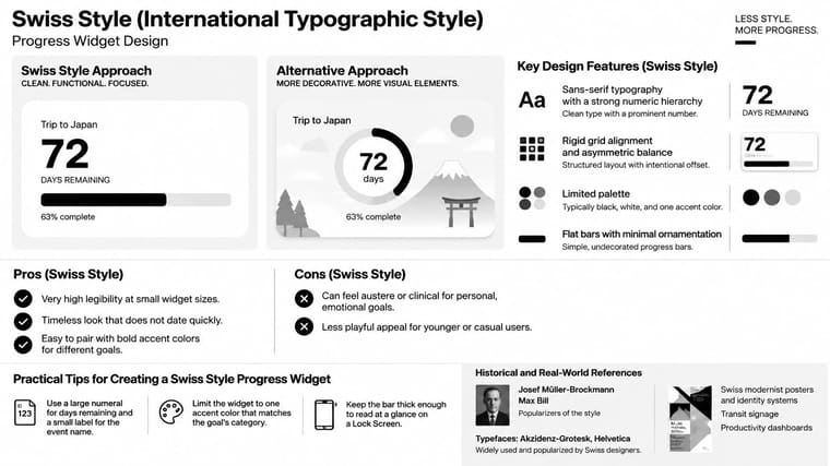
Swiss Style is my recommendation for deadlines that need clarity rather than decoration. It uses an orderly grid, sans-serif lettering, flush-left labels, and generous empty space. The countdown number becomes the focal point, with a plain progress bar supporting it.
The historical connection is practical, not just aesthetic. The Swiss government’s history of Swiss Style describes its foundations in mathematical grids, asymmetrical composition, sans-serif typography, and restrained color. Those principles translate naturally to dates, percentages, and progress bars.
Make the deadline unmistakable
Say you’re preparing for a professional certification exam. Put days remaining in the largest type, use the exam name as a smaller label, and place the progress bar underneath. Keep the full event description in your calendar rather than squeezing it into the widget.
On a Home Screen, leave enough padding that the number doesn’t crowd the edges. On a Lock Screen, preserve the numeral and shorten the label before reducing the text size. The design should still make sense when decorative details disappear.
- Accent color: Choose a restrained accent for the goal category, such as blue for study or amber for a submission deadline.
- Bar weight: Make the bar substantial enough to distinguish its filled and unfilled portions.
- Typography: Keep the event name quieter than the remaining time, but not faint.
The trade-off is emotional warmth. Swiss Style can feel clinical for birthdays or holidays, but that restraint works well for exams, applications, and project handoffs. The same hierarchy principles apply beyond this theme, as explained in Pretty Progress’s widget design guide.
2. Minimal
A year-progress widget doesn’t need to demand attention every time you open your phone. Minimal works best for information you want present without making it urgent. Think long-term savings goals, a reading routine, or the time remaining in a personal project.
The look is deliberately spare: a short label, a clear value, a simple bar, and a neutral background. Negative space separates the information instead of borders, shadows, or decorative icons. It’s a good companion to a Home Screen that already contains calendar appointments and task lists.
Customization doesn’t have to mean adding more. A mobile-device customization study identified both functional and aesthetic motivations, alongside screen-organization preferences involving visual simplicity, negative space, and patterned arrangements. Minimal gives you room to satisfy both motives without filling the widget with controls or ornaments.
Practical rule: Remove information before you shrink it. A shorter label is usually more useful than smaller text.
Keep quiet from becoming invisible
For a year-progress widget, emphasize the percentage or bar and keep the year label secondary. For a daily routine, use a specific label such as Evening reading rather than something vague like My goal. The sparse design leaves little room for ambiguity.
The main failure is excessive subtlety. Pale gray text and a hairline bar may look elegant in a preview but become difficult to distinguish on your actual wallpaper.
Choose a solid neutral surface and a clearly visible bar color. If the widget disappears among your icons, increase the text weight before adding decoration. You can also pair a restrained Lock Screen version with a more expressive Home Screen version, keeping the same goal label so they’re easy to recognize.
3. Aqua
Choose Aqua when you want progress to feel tangible. Glossy capsule shapes, blue or teal gradients, soft highlights, and gentle shadows make the bar resemble a container filling up. It’s a warmer alternative to a purely typographic countdown.
For a self-selected fasting window or a long-term creative project, that visual metaphor can be appealing. The fill communicates how far through the interval you are, while the number supplies the exact remaining time. Keep both visible rather than relying on the liquid-like effect alone.

Let the gloss support the information
Visual appeal deserves consideration, but it isn’t permission to obscure the timer. A peer-reviewed smartphone-interface study found that a visually appealing application improved perceived usability and objective task performance compared with an unaesthetic version. That finding supports taking appearance seriously, not assuming any particular glossy treatment will work for everyone.
Use Aqua on a medium or spacious Home Screen widget where the capsule, highlight, and number have room to remain distinct. On a compact screen, simplify the effect and prioritize the remaining time.
- Gradient: Keep the transition gentle so the text doesn’t cross sharply different background tones.
- Highlight: Place the shine away from the label and countdown value.
- Wallpaper: Check the widget against both pale and dark backgrounds before settling on the finish.
Aqua’s weakness is excessive surface detail. Heavy shadows and bright reflections can make an ordinary progress bar look busier than the goal deserves. If you notice the gloss before you can read the time, reduce the styling rather than increasing the numeral indefinitely.
4. Retro OS
A holiday countdown can look like a tiny desktop window. A game-release reminder can resemble a handheld status display. Retro OS fits goals where anticipation and personality matter as much as urgency.
The visual ingredients are familiar: chunky borders, beveled controls, monospaced lettering, and segmented progress bars. References such as classic Mac OS, Windows interfaces, and Game Boy-style palettes give you distinct directions to choose from. Pick a coherent reference rather than combining every nostalgic detail.
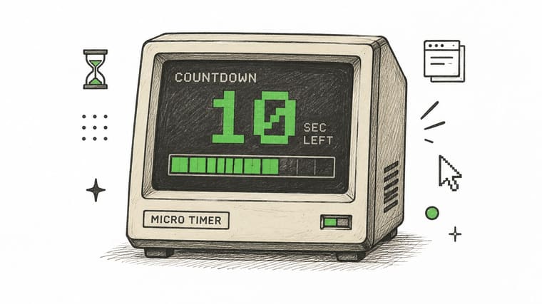
For a game-release countdown, use a compact window title, a large remaining-days value, and a segmented bar beneath it. Keep the playful lettering in the heading if it makes the main number difficult to distinguish. A clear numeral matters more than perfect historical imitation.
Give the nostalgia enough space
Retro OS generally makes more sense on a Home Screen than on a tightly constrained Lock Screen. Window borders consume space, and bitmap-like lettering needs breathing room. When adapting the design to a smaller placement, remove the fake controls and retain the palette, label, and clear countdown.
The iPhone widget theme guide is a useful starting point for choosing a direction that suits your screen rather than copying a desktop composition.
Keep the retro character in the frame. Keep the essential information easy to read.
A segmented bar should also have an understandable meaning. If segments represent periods, make that relationship clear; otherwise, keep a percentage or remaining-time label beside them. Avoid mixing pixel lettering with glossy gradients unless you deliberately want a hybrid look. For a playful personal goal, Retro OS works well. For an urgent submission deadline, a quieter design may be easier to scan.
5. Frosted Glass (Glassmorphism)
Frosted Glass is best when your wallpaper is part of the design. Translucent panels, blurred backgrounds, fine borders, and soft shadows let the widget feel layered over the screen rather than pasted onto it.
A travel countdown on a simple wallpaper is a good fit. Place the widget over a quiet area of sky or water, use a solid-looking text treatment, and reserve the accent color for the progress fill. You get visual depth without asking the background photograph to compete with the date.
The trade-off is dependence on whatever sits behind the widget. SQLI’s mobile-accessibility guidance warns that transparency and blur can make text and icon legibility depend on the wallpaper. A polished preview on a plain background doesn’t establish that the same theme will work over a detailed photograph.
Test the wallpaper, not just the theme
Move the widget to its intended location before adjusting the colors. Look for bright patches behind pale text, sharp edges crossing the label, and background details that resemble parts of the progress bar. Increasing the panel’s opacity is often more effective than adding a stronger shadow.
- Quiet background: Prefer a broad, uncluttered wallpaper area behind the widget.
- Readable text: Increase font weight when the background remains visually active.
- Controlled accent: Keep vivid color in the fill rather than spreading it across labels and borders.
For deadlines you cannot afford to misread, choose a more opaque version of the style. For a decorative Home Screen countdown, you can retain more translucency if the text stays clear.
Don’t assume you need animation to complete the glass effect. A static panel can provide depth without movement. If blur, reflections, or changing backgrounds make the widget tiring to check, a solid surface is the better choice.
6. Dynamic Color (Material You)
Dynamic Color suits Android users who want widgets to belong to the whole screen. Instead of selecting an isolated palette for each goal, use colors that coordinate with the wallpaper or system appearance where supported.
This is a practical choice for general reminders, year progress, and ongoing personal projects. A reading-goal widget can sit beside your calendar without introducing a competing color scheme. The limitation is that automatic coordination doesn’t guarantee that your most important deadline will stand out.
This video provides a visual reference for the styling direction.
Separate coordination from priority
Platform differences matter more here than they do with a simple black-and-white design. An Android and iOS customization comparison describes Android’s broader placement and theming flexibility alongside iOS’s more curated constraints. Don’t assume a wallpaper-responsive Android setup will reproduce identically on an iPhone, watch, or desktop.
Use the Android widget theme guide to plan around your device’s available placements and controls. Confirm Lock Screen support on your particular setup rather than choosing a theme around a placement you haven’t tested.
For a recurring personal goal, adaptive colors can reduce manual styling. For a high-stakes deadline, consider a fixed accent that remains recognizable when you change wallpaper.
Check the filled bar, unfilled track, and label in both light and dark appearances. If the palette makes them too similar, adjust the surface or select a manual color where the app allows it. The best result isn’t the closest wallpaper match. It’s a coordinated widget whose meaning stays obvious after your screen changes.
7. Dark Mode / OLED Black
Checking a fasting window or bedtime routine shouldn’t require a bright white panel. Dark Mode works well for evening reminders and low-light screens, using a black or near-black surface with clear text and a restrained accent.
Choose this style for the conditions in which you’ll read it, not because the theme name promises a battery benefit. Display behavior, brightness, and the surrounding screen all matter. Readability is the more useful starting point when choosing a countdown theme.
A nighttime fasting widget, for example, can show the remaining time in light text, a muted track, and an amber or cyan fill. Keep the full interval understandable through the number and label, not just the changing color.
Readability first: A dark background doesn’t automatically make a widget accessible. The text and progress track still need clear separation.
Check contrast and type together
Android’s accessibility guidance recommends a minimum 4.5:1 contrast ratio for text and 3:1 for non-text elements such as icons. Use those as practical design checks rather than assuming every bright accent will work against black.
Avoid extremely thin white lettering, especially for small labels. If bright text feels harsh, try a slightly softened light foreground while preserving strong contrast. Near-black can also be a useful choice if pure black makes the widget feel disconnected from the rest of your screen.
Test the same design in daylight before using it everywhere. A theme that feels comfortable beside your bed may need a stronger label or brighter track outdoors.
For compact Lock Screen placements, simplify the content to the goal and remaining time. On a larger Home Screen widget, you can retain the bar and interval label. Dark Mode is a screen-condition choice, not a requirement to make every goal look identical.
8. Neo-Brutalism
Neo-Brutalism is for the goal you want to notice immediately. Thick outlines, flat saturated colors, hard offset shadows, and oversized type create an assertive widget without relying on glossy effects.
Use it for a launch, a portfolio submission, or a personal challenge that benefits from a prominent visual reminder. A chunky progress bar and large countdown can work well on a plain Home Screen. Keep the surrounding widgets quieter so the important goal has a clear place in the layout.
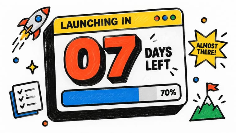
The trade-off is visual pressure. A bold widget can become unpleasant if you’re already anxious about the deadline. There’s also no reason to assume that an attention-grabbing style will improve focus for everyone, including people with ADHD.
Make the content as direct as the styling
Say you’re preparing a portfolio submission. Use Portfolio due as the label, put the remaining time in oversized type, and keep the progress bar directly beneath it. Don’t surround the countdown with slogans or decorative badges that make the next glance harder.
- Palette: Use a limited group of colors with distinct roles for background, text, and progress.
- Outline: Keep borders strong without letting them consume the content area.
- Shadow: Use a hard offset sparingly, leaving enough space that the widget doesn’t feel cramped.
On a Lock Screen, preserve the bold numeral and clear label rather than trying to reproduce every border and shadow. On a Home Screen, a thick bar can carry the style without extra ornaments.
Choose Neo-Brutalism when you want a prominent reminder and enjoy the aesthetic. If you start avoiding the widget because it feels demanding, switch to Swiss Style or Minimal. A reminder should be usable, not something you have to tolerate.
How the 8 widget themes compare at a glance
| Item | Visual Trait | Best For | Main Drawback |
|---|---|---|---|
| Swiss Style (International Typographic Style) | Sans-serif type, strict grid, generous whitespace, and a flat high-contrast bar | Quick-glance legibility and timeless, goal-focused widgets | Can feel austere or less playful |
| Minimal | Neutral background, thin bar, small label, and few decorative elements | Calm, distraction-free reminders and frequent viewing | Can look bland; small text may be hard to read |
| Aqua | Glossy capsule bars, blue or teal gradients, highlights, and soft shadows | Tactile, engaging progress displays with nostalgic appeal | Glossy effects may look dated or clash with flat design |
| Retro OS | Pixel-inspired type, segmented bars, beveled edges, and limited palettes | Nostalgic, playful goals and easy-to-estimate progress | Can feel gimmicky; pixel fonts may be hard to read |
| Frosted Glass (Glassmorphism) | Translucent blurred panels, light borders, vivid fills, and soft shadows | Modern, premium widgets on image-heavy wallpapers | Busy wallpapers can reduce legibility |
| Dynamic Color (Material You) | Wallpaper-matched tonal colors with automatic light and dark variations | Native-feeling, cohesive Android widgets with minimal styling effort | Exact color control is limited; some palettes lack contrast |
| Dark Mode / OLED Black | Black backgrounds, bright text, vivid progress fills, and subtle gray labels | Nighttime use and OLED displays | Can look stark on light wallpapers and hide subtle gradients |
| Neo-Brutalism | Thick black outlines, saturated fills, hard shadows, and oversized type | Energetic, attention-grabbing goals and clear progress | Can feel overwhelming or clash with minimal wallpapers |
Pick One Theme, Then Make It Yours
The best widget themes aren’t universally calm, colorful, or bold. They’re appropriate to the goal and readable on the screen where you’ll use them. Start by deciding how you want the reminder to feel, then choose the visual treatment.
For an exam or submission deadline, Swiss Style makes the remaining time straightforward. Minimal suits year progress and routines you check frequently. Aqua adds a tangible filling effect, while Retro OS gives personal events and entertainment countdowns a playful identity.
Match the emotional tone to the task
Choose Frosted Glass when you want the wallpaper to remain part of the composition, provided it doesn’t interfere with reading. Use Dynamic Color for a coordinated Android setup where supported. Try Dark Mode for evening tracking, or Neo-Brutalism when you deliberately want a goal to stand apart.
Don’t choose an urgent-looking theme just because the deadline matters. If a loud countdown makes checking your progress unpleasant, a calmer design may be a better fit. Likewise, a subtle widget isn’t successful if you consistently overlook it.
- For exact timing: Give the remaining-time value priority over decorative effects.
- For long-term progress: Make the bar and goal label clear enough to interpret together.
- For compact screens: Remove secondary detail before reducing the main text.
- For cross-device use: Preserve the same label and hierarchy even when the styling must change.
Test your choice on your actual wallpaper, not only inside the theme preview. Look at the Home Screen in ordinary use, then check the Lock Screen placement if your device supports it. Confirm that you can distinguish the fill from the track and understand what the number represents.
Change one element at a time
If the widget isn’t working, identify the problem before switching themes. Adjust the accent color when the fill blends into the background. Increase bar thickness when progress is hard to see, or strengthen font weight when the label disappears.
Keep the date range unchanged while you compare designs, so you’re judging presentation rather than different information. Once the widget is readable and feels appropriate, stop tuning it. Open Pretty Progress, pick a theme that fits your most important countdown, and add it to your Home Screen today.
Pretty Progress offers customizable countdown and progress widgets, with curated themes and controls for colors, layouts, and progress-bar styling. Visit Pretty Progress, set your goal’s start and end dates, and choose a design you can read at a glance on your everyday screen.