

September 10, 2026
7 iPad Home Screen Themes to Try in 2026
Explore 7 iPad home screen themes with wallpaper, widget, layout, and icon ideas—plus ways to recreate each look with Pretty Progress.
Your iPad can look polished and still feel inefficient. A beautiful wallpaper may compete with widgets, themed icons can make familiar apps harder to scan, and a crowded Home Screen can send you searching instead of working. That’s why the best iPad Home Screen themes are complete visual systems, not isolated wallpaper or icon packs.
Start with the screen you want to use. Choose a visual mood, reserve the largest widget area for one useful function, group icons by task, and add Pretty Progress when a deadline, habit, or goal deserves a visible place on the Home Screen. Third-party icon changes may require Apple Shortcuts, and widget behavior can vary by operating system. A clean setup can also help when troubleshooting problems such as an iPad that keeps returning to the Home Screen.
Table of Contents
- 1. Pretty Progress
- 2. ScreenKit
- 3. Brass, Icon Themes & Widgets
- 4. Themify, Widget & Icon Themes
- 5. Color Widgets
- 6. Widgetsmith
- 7. Widgy
- iPad Home Screen Themes: 7-Way Feature Comparison
- Build the Theme You Will Actually Keep
1. Pretty Progress
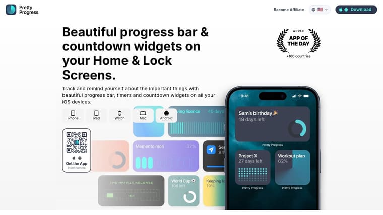
Pretty Progress is the strongest choice when your theme needs to do more than decorate the screen. It turns a visual system into a working reminder by combining countdowns, progress bars, and timers with customizable Home Screen widgets for iPad, as well as support across iPhone, Apple Watch, Mac, and Android.
The best layout gives Pretty Progress the largest widget space on the page. Place a project deadline, exam date, launch milestone, or personal goal where your eyes naturally land first. Use smaller widgets for the calendar or reminders, then keep the surrounding app icons limited to the tasks connected to that goal.
Build the visual system around progress
Pretty Progress offers curated styles such as Swiss Style, Minimal, Aqua, and Retro OS, then lets you adjust colors, gradients, bar size, bar shape, layout, and icons. That flexibility matters on iPad because a widget can occupy a large canvas without becoming visually heavy. A restrained color palette works best. Match the progress bar to one accent color in the wallpaper, then use neutral icons around it.
You can sync with Calendar and Reminders to turn existing events into live widgets, or create trackers from scratch for deadlines, fasting windows, project milestones, and long-term goals. Built-in date calculators, business-day tools, exact-age calculations, intermittent-fasting tools, loan-payoff tools, sleep tools, and percentage-of-year tools can reduce setup friction.
Practical rule: Give the Home Screen one primary message. If the countdown matters, let it lead. Don’t surround it with several competing timers.
The app is free to download, with PRO available for deeper styling controls. Pretty Progress is also ad-free and supports multiple languages across more than 160 countries, as described by the publisher. The app has been used by more than 2 million people and carries a 4.8 rating, according to the publisher’s supplied product information. Widget interactions still depend on operating-system limits, especially where Lock Screen and widget behavior differ. For a focused setup, use this home screen timer guide when you’re ready to place a countdown.
Pros
- Glanceable motivation: Progress bars make an invisible deadline easier to notice without opening an app.
- Deep visual control: Themes, gradients, icons, bar shapes, and layouts can fit a carefully planned iPad palette.
- Useful integrations: Calendar and Reminders imports help turn existing plans into visible cues.
- Cross-device support: The same goal can remain visible across compatible Apple and Android devices.
Cons
- Advanced styling costs extra: PRO features require an upgrade, and pricing isn’t listed on the homepage.
- Platform limits remain: Widget size, interaction, and Lock Screen behavior depend on the operating system.
2. ScreenKit
ScreenKit works when you want a coordinated result quickly. Instead of assembling a wallpaper, icon set, and widget style from unrelated sources, you can choose a ready-made theme designed around those elements. Its catalog includes icon packs, matching wallpapers, and widgets for clocks, calendars, weather, countdowns, photos, and other everyday information.
On iPad, use the wider canvas to create a clear left-to-right hierarchy. Put a large calendar or countdown widget on one side, place the most-used task icons nearby, and move secondary apps to another page. A monochrome or low-detail wallpaper will keep the larger widget area readable.
Choose speed over fine control
ScreenKit’s bulk-install flow is useful when you don’t want to configure every icon individually. Ready-made packs reduce visual mismatch, and the theme/icon maker gives you an escape route when a pack is close to what you want but doesn’t fit your exact workflow. Its explicit iPad support is also helpful when checking compatibility before downloading.
The trade-off is that a large catalog can encourage over-decoration. A theme may look cohesive in a preview while still putting decorative widgets where you need practical information. Before installing everything, identify the one widget you’ll check repeatedly, then choose the pack that supports it.
The app includes premium content and in-app purchases, so the most attractive pack may not be available without payment. Icon changes still follow Apple’s rules and may use Shortcuts-style launchers, depending on the pack. That can add a redirect moment when opening an app, so test your most frequently used icons before rebuilding every page.
For a more deliberate setup, combine ScreenKit’s visual pack with a guide to customizing the Home Screen. The result should feel themed without turning every app launch into a visual experiment.
3. Brass, Icon Themes & Widgets
Brass is a good fit for users who care most about cohesive icon artwork. Its strength is the visual library. You can start with a themed collection, add basic widgets such as weather, and build a screen where icons share a consistent color language rather than looking like individually selected downloads.
The most effective Brass layout uses icons as a supporting layer. Pick a quiet wallpaper, reserve a large open area for a practical widget, and use Brass icons for the apps you open most. Avoid changing every app at once. A smaller, task-based group is easier to learn and less likely to make the Home Screen feel unfamiliar.
Test before committing
Brass supports iPad, and some icons can be sampled without paying by watching advertisements. That makes it easier to test whether a style works with your wallpaper and widget colors before buying into a larger set. Use the test phase to check legibility at normal brightness, not only in an attractive preview.
Premium plans are generally needed for advanced sets and bulk application. Ad-gated downloads can also make large-scale setup slow. More importantly, custom icons may rely on Apple Shortcuts or profiles, which can create a brief redirect when you launch an app. That behavior is a functional cost, particularly for apps you open dozens of times during a work session.
Brass works best for an aesthetic-first page, such as a reading, journaling, or creative workspace. It’s less suitable when the Home Screen must act like a dense dashboard. Keep the functional information in one prominent widget and let the icons establish the mood around it.
Best use: Build a restrained page with a small set of matching icons, one weather or calendar widget, and a wallpaper with enough negative space for scanning.
Watch for: A screen can become slower to use when every icon needs a shortcut redirect. Keep original app icons on a utility page if launch speed matters more than visual consistency.
Visit Brass to review its icon and widget options before choosing a complete visual direction.
4. Themify, Widget & Icon Themes
Themify is the broadest all-in-one option in this list. It combines wallpapers, widgets, icon packs, and premade Home Screen and Lock Screen themes, so it’s useful when you want style coverage rather than a narrowly defined look. Minimal, pastel, seasonal, anime, and neon directions all fit within the catalog.
The practical advantage is coordination. You can select a pack where the wallpaper, icon colors, and widget treatment already belong together, then refine the arrangement on iPad. Put the largest information widget in the quietest section of the wallpaper, place task icons in small groups, and avoid adding a second large widget unless it answers a different daily question.
Don’t confuse one-tap selection with one-tap completion
Themify’s packs can speed up choosing a style, but icon installation has become more manual because batch icon installation profiles were removed due to App Store policy. Icons now generally require Apple Shortcuts, which adds setup time and may affect how quickly apps open. Some users also report glitches or slower launches with custom shortcut icons, so the most frequently opened apps deserve a test run.
The app’s Health-aware widgets can add steps, sleep, and water information through Apple Health. That makes it more useful than a purely decorative theme, but health data can easily turn a calm page into a monitoring dashboard. Choose one metric that supports your routine instead of displaying every available measure.
Themify is a sensible starting point for users who want one place to browse complete looks. It isn’t the best choice for people who want precise widget construction or a completely native-feeling icon experience.
5. Color Widgets
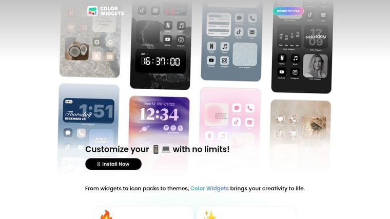
Color Widgets suits a mixed approach. It gives you a large selection of widgets, icon sets, countdowns, clocks, calendars, and health elements, while Theme Studio and the Icon Pack editor let you tune the details after choosing a starting point.
On the iPad’s larger canvas, use one extra-wide widget for the information you check most often. A calendar works for planning, a countdown works for a fixed deadline, and an activity widget works when movement is part of your routine. Put the related apps directly below or beside that widget, then move unrelated icons away from the visual center.
Use the editor to protect readability
Color Widgets is strongest when you treat the editor as a usability tool, not only a decoration tool. Adjust fonts and colors until the widget remains readable against the wallpaper. If a countdown is the main function, remove visual elements that compete with the remaining time. If the page is for planning, make the calendar the anchor and keep icon colors quiet.
The app supports iPad and receives regular feature updates, including new icon packs, fonts, and countdown options. Its wide widget selection makes it particularly useful when you want a theme that combines practical information with matching icons. Health integration can also provide activity or step widgets without requiring a separate visual system.
Many premium designs and features require a PRO purchase, and some users want more widget categories available for free. That means Color Widgets is easy to explore, but the exact design you prefer may sit behind an upgrade.
Use Color Widgets when you want a polished starting point with enough editing control to correct the weak spots.
6. Widgetsmith
Widgetsmith is the right tool when the widget matters more than the icon pack. It lets you design widgets around time, weather, photos, calendars, reminders, astronomy, health, and other data sources, with control over size, font, color, and layout. On iPad, its large and extra-large widgets can become the main structure of a theme rather than a small accessory.
Start with the information hierarchy. A productivity page might use a large calendar widget, a medium reminders widget, and a small time display. A calmer personal page could use a photo or astronomy widget with only the essential app icons nearby. The wallpaper should support those widgets, not compete with them.
Pair it with a separate icon system
Widgetsmith doesn’t change app icons on its own. You’ll need an icon-pack app or Apple Shortcuts to complete the themed appearance, so it’s better for people who are willing to build the screen in layers. That extra work gives you more control, but it also makes Widgetsmith less convenient than an all-in-one theme app.
Its iPad guidance explains platform-specific details, including the absence of widget label text and the process for changing icons through Shortcuts. That kind of documentation matters because a setup can fail through misunderstanding rather than poor design. Detailed weather data may require a subscription, so choose data sources based on what the screen needs rather than adding every available option.
A strong Widgetsmith screen looks designed because every widget has a job, not because every space is filled.
Use a neutral wallpaper, choose one font family, and repeat one accent color across widgets. Then add icons from another tool only after the information layout feels right. This customizable widget app guide can help you compare widget-focused approaches.
7. Widgy
Widgy is for builders, not browsers. Its freeform canvas editor, layers, effects, transparency tools, charts, data sources, and tap actions let you create an iPad Home Screen that feels more like a personal dashboard than a standard theme.
That freedom is valuable when ordinary widget layouts don’t match your workflow. You can design a large project panel with a calendar, chart, health data, stock information, and tap actions, then use an icon pack to complete the surrounding page. The community marketplace also gives you ready-made designs to study or adapt instead of starting with an empty canvas.
Trade simplicity for control
Widgy has a higher learning curve than one-tap theme apps. Layers, transparency, data sources, and tap actions create more opportunities for a distinctive result, but they also make setup and troubleshooting more involved. Build one widget first. Confirm that its text is readable, its data updates correctly, and its tap actions are useful before expanding the system.
The iPad-friendly extra-large canvas is especially suited to dashboard layouts. Keep the wallpaper simple and let the widget provide the visual identity. If you use charts or multiple data sources, establish a clear reading order with spacing and contrast. A dashboard that contains everything but offers no starting point is still cluttered.
Widgy doesn’t replace app icons, so a complete theme needs a separate icon-pack app or Apple Shortcuts. That division is a strength for advanced users because it lets you choose the best tool for each layer. It’s a weakness for anyone who wants a finished screen immediately.
For additional iPad app discovery, browse this native iOS app directory, then return to the core principle: the widget should make the screen easier to use, not merely more elaborate. Visit Widgy when you want to design a custom dashboard.
iPad Home Screen Themes: 7-Way Feature Comparison
| App | Implementation Complexity 🔄 | Resource Requirements ⚡ | Expected Outcomes ⭐ / 📊 | Ideal Use Cases 💡 | Key Advantages ⭐ |
|---|---|---|---|---|---|
| Pretty Progress | Low, quick setup, glanceable widgets 🔄 | Moderate, free + PRO upgrade; cross‑device sync (iOS/Android) ⚡ | High, reliable persistent progress cues and timers ⭐📊 | Deadlines, habit tracking, ADHD-friendly visual reminders, fasting, milestones 💡 | Highly polished customizable widgets; Calendar/Reminders import; built‑in calculators; large user base ⭐ |
| ScreenKit | Low, one‑tap bulk installs for themes 🔄 | Medium, large paid catalog; iPad support; some packs may use Shortcuts ⚡ | High, fast full‑theme makeovers with cohesive visuals ⭐📊 | Users wanting ready‑made full themes and rapid home‑screen refreshes 💡 | Huge, frequently updated catalog; bulk install; matching wallpapers and theme maker ⭐ |
| Brass – Icon Themes & Widgets | Low–Medium, simple flows but may use Shortcuts or ad gates 🔄 | Medium, many premium sets; ad‑gated sampling available ⚡ | Medium, cohesive icon sets with basic widgets; aesthetic refresh ⭐📊 | Icon-focused themers who want to sample before buying or use basic widgets 💡 | Large cohesive icon library; ability to sample icons via ads; strong ratings ⭐ |
| Themify – Widget & Icon Themes | Low–Medium, one‑tap packs, but icon installs often use Shortcuts now 🔄 | Medium, many premium packs; iOS‑centric ⚡ | High, coordinated Home + Lock Screen themes across styles ⭐📊 | Users seeking combined icon/widget/wallpaper packs in many styles 💡 | Extremely broad style coverage; consolidated source for icons, widgets and wallpapers ⭐ |
| Color Widgets | Low, editor and Theme Studio make setup straightforward 🔄 | Medium, free core with Pro paywall for many designs; iPad support ⚡ | Medium–High, functional widgets with matching icon/theme options ⭐📊 | Mixing functional widgets (health, countdowns) with themed icons on iPad 💡 | Regular updates, Theme Studio and Icon editor, health integration ⭐ |
| Widgetsmith | Medium, deep customization needs time and pairing with icon apps 🔄 | Low–Medium, free core; some subscription data sources; optimized for iPad ⚡ | High, bespoke, large-format widgets and coordinated themes ⭐📊 | Power users building custom widgets and themed iPad home screens 💡 | Very flexible customization, stable performance, great for extra‑large iPad widgets ⭐ |
| Widgy | High, freeform canvas, layers and effects with steeper learning curve 🔄 | Medium, community marketplace; pairs with icon apps; some setup time ⚡ | Very High, advanced, dashboard‑style widgets with rich data and visuals ⭐📊 | Designers and advanced users creating unique dashboards and animated widgets 💡 | Extreme flexibility, layer/effect tools, community templates and data sources ⭐ |
Build the Theme You Will Actually Keep
The best theme is the one you’ll still understand after the novelty fades. Choose a ready-made pack when speed matters, a widget editor when layout control matters, or Pretty Progress when a countdown or progress cue is central to the screen. Each approach solves a different problem, and combining tools can work well when you give each one a defined role.
Start with one wallpaper. Pick a background with enough negative space for text and icons, then select the main widget. If the page is for work, use a calendar, reminders, or project countdown. If it’s for study, use a deadline or progress bar with the apps tied to that subject nearby. If it’s for personal routines, choose one health, weather, or habit-related cue instead of filling the page with every available metric.
Group icons by real tasks, not by color alone. A writing group might include Notes, a document editor, cloud storage, and communication tools. A travel group might include maps, tickets, translation, and bookings. This keeps the visual system attractive while preserving the muscle memory that makes the iPad quick to use.
The durable setup: one clear wallpaper, one dominant information widget, a small set of task-based icons, and enough empty space to scan the page instantly.
Test the arrangement for a few days before adding more decoration. Notice which widget you ignore, which icons you keep searching for, and whether custom shortcut icons interrupt your normal flow. Remove anything that creates friction. Apple’s iPadOS 15 guidance introduced Home Screen widgets as part of a broader personalization workflow, while later iPadOS 26 controls added icon tinting, darker wallpaper treatment, hidden app names, and larger icons through built-in appearance options. You don’t need a third-party pack for every visual change.
Apple’s native controls can also help you balance appearance and readability. Use larger icons when scanning is difficult, darken the wallpaper when contrast is weak, and reserve third-party tools for the specific function they handle best. The strongest iPad Home Screen theme looks consistent, but it also tells you what matters at a glance.
Pretty Progress gives your iPad customizable countdowns, progress bars, and timers in polished themes such as Swiss Style, Minimal, Aqua, and Retro OS. Build a widget for an exam, deadline, project milestone, habit, or personal goal, then visit Pretty Progress to create a Home Screen that keeps progress visible without adding noise.





