

September 27, 2026
8 Home Screen Tips Widget Ideas for Better Progress
Explore 8 home screen tips widget ideas for layouts, themes, and use cases, with practical examples using Pretty Progress for glanceable motivation.
More widgets don’t automatically create more motivation. A crowded Home Screen can turn every reminder into background noise, especially when several countdowns compete for attention. The strongest setup shows the right amount of progress, in the right visual format, for a specific goal.
That principle matters because widgets became a major iPhone platform change with iOS 14 in September 2020. Apple moved them from the separate Today View onto the Home Screen, introduced redesigned size options, and let users place them directly among app icons, as documented in Digital Trends’ account of Apple’s widget history. The change followed more than a decade of Home Screen stability and arrived alongside the App Library and broader customization, according to MacStories’ iOS 14 review.
This list focuses on practical home screen tips widget ideas that remain useful after the novelty fades. Choose by visibility, readability, emotional fit, and maintenance. The right Pretty Progress setup might be a compact lock screen cue, a multi-goal stack, a business-day timeline, or a reflective milestone that gives a meaningful date a permanent visual place.
Table of Contents
- 1. Multi-Goal Progress Stack Widget
- 2. Lock Screen Glance Widget with Minimal Stats
- 3. Habit Streak Counter Widget
- 4. Seasonal and Holiday Countdown Widget
- 5. Business Day and Project Timeline Widget
- 6. Year Progress Awareness Widget
- 7. Intermittent Fasting and Wellness Window Widget
- 8. Personal Milestone and Age Tracking Widget
- Home Screen Tips: 8-Widget Comparison
- Choose the Reminder You’ll Actually See
1. Multi-Goal Progress Stack Widget
A multi-goal stack works best when you’re managing several deadlines but don’t want several separate widgets. It places multiple countdowns or progress bars inside one coordinated tile, so a student might see semester deadlines, exam dates, and a project milestone without filling the Home Screen with unrelated blocks.
The design challenge is hierarchy. If every goal has the same color, size, and prominence, the widget becomes a list you have to decode rather than a glanceable reminder. Arrange goals by urgency or importance, not alphabetically, and give each bar enough contrast to remain distinct on your actual device.

Keep the stack readable
A project manager could place a client deliverable first, a sprint timeline second, and a team milestone third. A fitness user might prioritize a training target, a nutrition challenge, and a recovery goal. In both cases, the widget should answer one question quickly: what deserves attention next?
Practical rule: If you need to read every label carefully, the stack is carrying too much information.
In Pretty Progress, create each countdown or progress event separately, then choose a shared theme so the group feels intentional. Use contrasting colors, but keep the palette related rather than turning every bar into a different visual language. Test the widget in the exact size you’ll use, because a layout that looks clear in the editor may feel compressed beside your real app icons and wallpaper.
The stack is useful when several goals are active at once. It’s less effective for one emotionally important deadline, where a larger single progress bar will create stronger focus.
2. Lock Screen Glance Widget with Minimal Stats
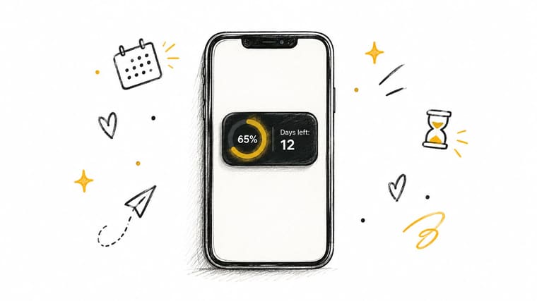
The lock screen is a different viewing environment from the Home Screen. You’re usually checking it while walking, waiting, or preparing to open your phone, so a widget that demands interpretation has already missed its moment.
Choose one critical cue. That might be days remaining until an exam, a percentage-complete indicator for a project, or a simple bar showing time left before an important event. The more text you add, the less immediate the reminder becomes.
Design for difficult viewing conditions
High contrast matters more on the lock screen than it does in a carefully arranged Home Screen. Bright sunlight, a busy wallpaper, and a quick glance can all reduce legibility. Pick one accent color that complements the wallpaper, then let the progress bar or remaining time do most of the communication.
A student preparing for an exam could use a compact countdown that shows the remaining time without listing every study task. A consultant approaching a client deadline might display the due date and progress state before opening messages. The widget doesn’t replace planning. It keeps the most important constraint visible.
Pretty Progress can support this setup with a compact countdown or progress widget configured for a Home or Lock Screen. Keep the label short, use a bold bar shape, and remove decorative elements that don’t help you understand the state immediately. Check the result at different brightness levels and viewing angles before deciding that the design works.
Apple’s own guidance covers adding, moving, and editing widgets, but the deeper design question is whether the widget remains useful without becoming clutter. That distinction is increasingly important as widgets operate across the Home Screen, Lock Screen, and StandBy, as described in Apple’s widget guidance.
3. Habit Streak Counter Widget
A countdown points toward an endpoint. A streak counter rewards continuity. That makes it a better fit for meditation, daily writing, study practice, workouts, or any routine where showing up today matters more than reaching a fixed date.
The most effective streak widget balances celebration with recovery. Flames, stars, trophies, or confetti can make progress feel visible, but excessive decoration can make a small streak look more important than the behavior itself. Choose visual symbols that feel personally motivating, not merely familiar.
Reward consistency without creating pressure
A student might use the widget to keep a daily study practice visible. A writer could track consecutive writing sessions, while someone building a meditation routine could use a simple number and a calm color transition. The same format can support different emotional tones, from energetic and competitive to quiet and reflective.
Set milestone markers that make sense for your routine. Short milestones can provide an early sense of progress, while longer ones give an established habit somewhere to go. Don’t treat a missed day as proof that the system failed. A reset or recovery-friendly design is more useful than a widget that turns one interruption into a reason to quit.
A streak should invite the next action, not punish the last one.
For a Pretty Progress setup, use a progress event for a current practice period or milestone, then pair it with a complementary habit tracker if you need daily completion details. An amber-to-gold palette can communicate advancement without requiring a crowded collection of icons. If you’re designing the surrounding routine, the practical ideas in building good habits effectively can help you connect the visual cue to a repeatable behavior.
4. Seasonal and Holiday Countdown Widget
Seasonal widgets work because the emotional meaning comes before the measurement. A vacation, birthday, wedding, school break, or holiday already matters to you, so the countdown doesn’t need to manufacture urgency. It just keeps anticipation visible.
Use a themed design when the event is genuinely meaningful. A destination-inspired palette can make a travel countdown feel personal, while a restrained holiday color scheme can fit a minimalist Home Screen. The design should support the event without making every app page look like a poster.
Let the theme change with the moment
Parents might use a countdown to build anticipation for Christmas. A traveler could track the start of a planned trip, and an event planner might display the date of a wedding or celebration. You can also use this format for less traditional milestones, such as the next movie release or the beginning of summer break.
Pretty Progress lets you configure the date, theme, colors, bar style, and icon, so the same basic countdown can take on different visual roles. Keep the label specific. “Trip” is less useful than the destination or event name because the label should explain the reminder without forcing you to remember what it means.
For a birthday countdown, the date is only part of the experience. The way you frame the reminder can make it feel celebratory rather than merely numerical, as the personal perspective behind a countdown to a birthday illustrates.
Update recurring custom holidays when the date or context changes. An old event left on your Home Screen creates distrust, and once you stop trusting a widget, you stop seeing it.
5. Business Day and Project Timeline Widget
Calendar days and working days answer different planning questions. A project manager who needs to know how much working capacity remains shouldn’t rely on a simple countdown that includes weekends or ignores company holidays.
A business-day timeline is especially useful for software sprints, client deliverables, grant submissions, proposals, and other deadlines where the team can act only during defined working periods. Display business days remaining as the primary figure, with calendar timing as supporting context if needed.
Make the timeline operational
A consultant could use the widget for a proposal deadline while accounting for the client’s holiday calendar. A development team might track a sprint end date, while an academic professional could monitor a submission window that depends on institutional closures. The value comes from matching the countdown to the way the work really happens.
Configure the organization’s holiday calendar before relying on the result. If the calendar changes, update it rather than assuming the original calculation remains valid. A green, yellow, and red progression can help communicate urgency, but use color as a supplement to the number, not as its only signal.
In Pretty Progress, create a dedicated project event and choose a layout that gives the remaining working time visual priority. If the widget sits on a professional Home Screen, keep the theme restrained and make the deadline label explicit. A shared team calendar can carry the detailed schedule, while the widget acts as the persistent summary.
This setup isn’t ideal for personal events where every day matters equally. Use a regular countdown for a vacation or birthday, and reserve the business-day format for deadlines shaped by actual working availability.
6. Year Progress Awareness Widget
A year-progress widget gives you a wide-angle view of time. It’s useful when your goal isn’t a single deadline but a pattern of action across a long period, such as publishing consistently, completing annual objectives, or keeping a personal project moving.
The format is simple by design. A large progress bar shows the passage of the year, while a nearby annual goal can explain what you want that passage to produce. Without the second layer, the bar can become an interesting decoration rather than a planning cue.
Connect time passage to a real objective
A content creator might pair the year bar with a publishing target. A professional could place it beside an annual project milestone, while a student might adapt the concept to an academic cycle rather than the calendar year. The important question is what the visible passage of time should prompt you to do.
Place the widget where you’ll see it during ordinary phone use, but don’t make it so dominant that it creates constant pressure. Review it at meaningful planning points and ask whether your current pace matches the goal. If the answer is no, change the plan rather than merely changing the color.
Pretty Progress includes a dedicated time left in year calculator, which can help you define the event before styling the widget. Choose a bold color if the bar needs to stand out against your wallpaper, or use a muted theme if the reminder should remain unobtrusive among work apps.
A year-progress widget works best for macro awareness. It won’t tell you what to do today, so pair it with a daily task system or a smaller milestone when the annual goal needs a direct next action.
7. Intermittent Fasting and Wellness Window Widget
A wellness window widget tracks a state that changes with time. Instead of asking how far away an event is, it tells you whether you’re currently inside a fasting, eating, sleep, medication, workout, or recovery window.
That distinction makes the visual language important. Cool tones can represent fasting or rest, while warmer tones can signal an eating or active period. The bar should make the current state obvious without requiring a detailed log every time you look at the screen.
Use clear windows and careful boundaries
Someone following an intermittent fasting routine might want to see when the current window closes. A shift worker could use the same structure for changing sleep and meal times, while an athlete might track a planned workout or recovery period. People managing medical schedules should treat the widget as a reminder aid, not as a substitute for professional instructions.
Set the start and end times carefully, including any changes to your daily routine. Notifications can help at transitions, but too many alerts may create the same noise that a crowded widget creates. A daily log is useful when you want to review adherence over time rather than relying only on the current display.
Pretty Progress supports this use case through its fasting window app guidance and configurable progress events. Build one widget around the current window, give it a clear label, and choose a theme that separates active and inactive states. If your schedule changes seasonally or across time zones, review the configuration instead of assuming the original times still fit.
The best wellness widget is calm and unambiguous. It should support a routine you already understand, not encourage you to chase a more complicated protocol because the screen looks more refined.
8. Personal Milestone and Age Tracking Widget
Some reminders are practical. Others help you notice that you’ve made it through something meaningful. A personal milestone widget can track time since a wedding, career beginning, recovery date, friendship, health event, or another moment that deserves recognition.
This format works because the progress has emotional context. “Days since” may be technically precise, but a personalized label gives the number a reason to matter. “Years of friendship” or “Career milestone” creates a warmer connection than an unexplained counter.
Make the number personal
A couple might track a relationship anniversary, while a parent could use a widget to notice a child’s changing age. Someone in recovery may use a milestone to recognize continuing progress, and a professional might mark time in a role or career. The same visual system can support celebration, gratitude, reflection, or quiet resilience.
Choose dates that genuinely help you. Not every important event needs a permanent widget, and a reminder connected to grief or trauma should be handled with care. If the number feels heavy every time you see it, change the design or remove it. The purpose is to support your relationship with the milestone, not to force attention toward it.
In Pretty Progress, create a specific event name, enter the relevant start date, and select a warm theme with a restrained icon. A larger widget can show the label and elapsed progress clearly, while a smaller version may work better when the milestone is meant to be a gentle background reminder. Keep a record of important dates outside the device as well, especially for milestones you’d regret losing after a phone change.
Use this design for events you want to acknowledge repeatedly. If you need a reminder to take a concrete action, a deadline or window widget will be more useful.
Home Screen Tips: 8-Widget Comparison
| Widget | Implementation Complexity 🔄 | Resource Requirements ⚡ | Expected Outcomes ⭐📊 | Ideal Use Cases | Key Advantages | Quick Tips 💡 |
|---|---|---|---|---|---|---|
| Multi-Goal Progress Stack Widget | Medium–High 🔄 (stacking, sorting, theme sync) | Moderate ⚡ (multiple UI elements, per-item customization) | High ⭐⭐⭐ 📊 (dense at-a-glance tracking of several goals) | Students, project managers, multi-project users | Maximizes info density; reduces widget count; cohesive visuals | Limit to 3–4 items; use contrasting colors; prioritize by urgency |
| Lock Screen Glance Widget with Minimal Stats | Low–Medium 🔄 (must meet OS lock‑screen specs) | Low ⚡ (tiny footprint, minimal assets) | Moderate ⭐⭐ 📊 (instant motivation for one key goal) | ADHD users, quick daily reminders, fasting or single-deadline tracking | Always-visible, low friction, fast access | Pick one priority goal; use high‑contrast colors; test visibility |
| Habit Streak Counter Widget | Low–Medium 🔄 (counter logic, milestones, celebratory visuals) | Low ⚡ (simple state storage, occasional animations) | High ⭐⭐⭐ 📊 (strong behavioral reinforcement via streaks) | Habit builders (meditation, workouts, writing) | Reinforces consistency; motivates via loss aversion | Set realistic milestones; include reset/recovery option; choose meaningful visuals |
| Seasonal & Holiday Countdown Widget | Medium 🔄 (theme switching, holiday database) | Moderate ⚡ (theme assets, localization) | Moderate–High ⭐⭐📊 (emotional engagement, anticipation) | Families, gift shoppers, event planners, travelers | Festive, automatically themed; boosts emotional connection | Select personally meaningful holidays; update custom holidays yearly |
| Business Day & Project Timeline Widget | High 🔄 (business‑day calc, holiday integrations) | Moderate–High ⚡ (calendar sync, org holiday data) | High ⭐⭐⭐ 📊 (accurate work‑time visualization; reduces scheduling risk) | Project managers, teams, consultants, sprint planning | Shows realistic working time; integrates with workflows | Configure org holiday calendar; display business days prominently |
| Year Progress Awareness Widget | Low 🔄 (simple percent & day calc) | Low ⚡ (minimal data, daily update) | Moderate–High ⭐⭐📊 (macro-level urgency and perspective) | Goal-setters, productivity enthusiasts, planners | Zero maintenance; strong time-perspective visual | Place on primary screen; pair with annual goals for context |
| Intermittent Fasting & Wellness Window Widget | Medium 🔄 (real-time phase detection, timers) | Moderate ⚡ (accurate timers, notifications) | High ⭐⭐⭐ 📊 (improves adherence to timed health protocols) | Fasting practitioners, medication schedules, shift workers | Real-time accountability; phase color coding for clarity | Set precise windows; enable transition alerts; pair with logs |
| Personal Milestone & Age Tracking Widget | Low–Medium 🔄 (exact age/milestone calculations) | Low ⚡ (date storage, occasional notifications) | High ⭐⭐📊 (emotional resonance; regular reflection) | Recovery milestones, anniversaries, life-event tracking | Deep personal meaning; shareable celebratory moments | Backup milestone data; personalize labels; use warm celebratory colors |
Choose the Reminder You’ll Actually See
The best widget isn’t the one with the most controls. It’s the one that fits the moment when you need the reminder and communicates its state without demanding extra attention.
Choose a multi-goal stack when several priorities are active and you need one coordinated view. Keep the stack focused, order the items by importance, and remove goals that no longer influence your decisions. Choose a minimal lock screen widget when one cue matters more than everything else. A single deadline, progress bar, or window is usually stronger there than a collection of small statistics.
Use a business-day timeline for work governed by schedules, holidays, and realistic team capacity. A regular countdown is better for personal events, while a year-progress widget suits broad objectives that need steady awareness rather than daily instructions. For emotional motivation, choose a seasonal countdown, habit streak, or personal milestone. Those formats work because the visual reminder connects to anticipation, consistency, or meaning.
Widget adoption remains uneven, which is a useful warning against assuming that every available widget deserves a place on your screen. A 2024 TidBITS poll found that only 14% of iPhone respondents used Home Screen and Lock Screen widgets heavily, while 46% of iPad respondents didn’t use Home Screen widgets at all and 58% didn’t use Lock Screen widgets, as reported in TidBITS’ widget adoption poll. A widget earns its space by staying useful, not by existing.
Use this setup sequence in Pretty Progress:
- Choose the goal: Decide whether you need a deadline, elapsed milestone, streak, year view, or wellness window.
- Set the dates or times: Enter the start and end points carefully, including business-day or recurring-window details where relevant.
- Select the theme: Match the visual mood to the goal. Calm for wellness, clear for work, celebratory for milestones.
- Adjust the visual hierarchy: Change colors, gradients, bar size, shape, layout, and icons until the main signal is obvious.
- Add the widget: Place it on the Home Screen or Lock Screen where you’ll naturally see it.
- Review it in daily use: Check whether it remains readable, motivating, and accurate after the novelty wears off.
Pretty Progress offers configurable countdown and progress widgets for iPhone, iPad, Apple Watch, Mac, and Android, with themes and styling controls designed for persistent visual reminders. Start with one goal, not an entire productivity system. After you’ve used it in real conditions, you’ll know whether the widget belongs on your primary screen, in a quieter location, or nowhere at all.
Pretty Progress gives you customizable countdown and progress widgets for deadlines, habits, milestones, fasting windows, events, and time left in the year. Choose a theme, fine-tune the visual details, add the widget to your screen, and visit Pretty Progress to build a reminder you’ll keep seeing.





