

September 17, 2026
Presentation Timer App That Works: Features and Setup
Discover what a presentation timer app does, which features matter most, and how to set one up so your talks end on time without breaking your flow.
You’re about to present. The clicker is in one hand, your phone is running a timer in the other, and your attention keeps slipping toward the clock instead of the people in front of you. The opening takes longer than planned, one slide invites an unexpected question, and by the time you reach the final point, you’re rushing through the conclusion.
That’s the friction a well-designed presentation timer app is meant to remove. It shouldn’t become another dashboard to operate. It should act like a quiet second pair of eyes, giving you a clear cue when your pace is healthy, when a section is expanding, and when it’s time to land the talk.
Table of Contents
- What a Presentation Timer App Actually Does for You
- Why Slide Decks Created the Need for Timing Tools
- Features That Separate a Good Timer From a Noisy One
- Platform-Specific Setup on iPhone, iPad, Mac, and Android
- Matching the Timer to the Type of Talk You Are Giving
- Accessibility and Calm Design for Stressful Presentations
- Best Practices and Fixes When the Timer Misbehaves
- How Pretty Progress Fits Your Presentation Workflow
What a Presentation Timer App Actually Does for You
A presentation timer app is more than a stopwatch with a colourful skin. It tracks elapsed or remaining time, gives you visible progress, and can signal important moments without forcing you to interrupt your delivery. Depending on the setup, the cue may be visible only to you, mirrored to a confidence monitor, or displayed for the whole room during an exercise or timed activity.
Suppose you’ve planned a short introduction, a demonstration, and a question period. A generic stopwatch tells you how long you’ve been speaking. A speaker-focused timer helps you understand whether you’re still moving through the talk at a workable pace. Large numerals, a readable colour change, and discreet alerts turn passing time into information you can use while maintaining eye contact.
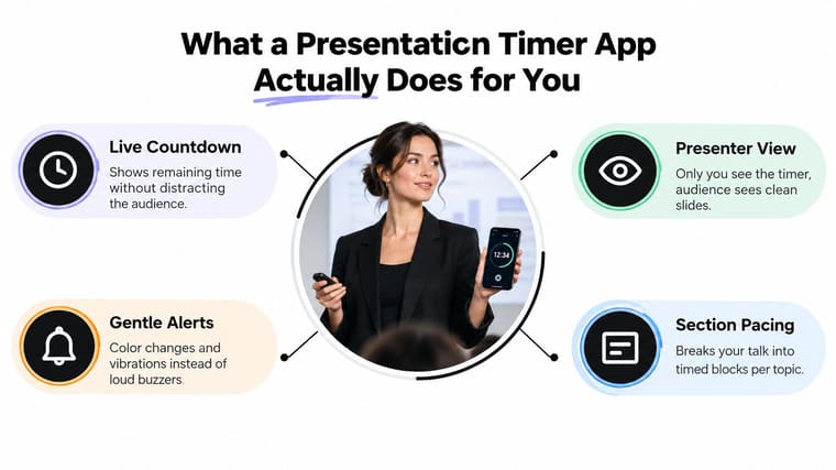
The three jobs that matter on stage
First, it keeps your pace honest. Speakers routinely underestimate how long explanations, audience questions, and demonstrations take. A timer gives you an external reference instead of relying on a feeling that the talk is “nearly done.”
Second, it signals the room without interrupting it. A visible display can tell a student that an activity is ending or help a moderator prepare a handoff. For a solo speaker, a silent colour shift or vibration can provide the same information privately.
Third, it removes mental arithmetic. You shouldn’t be calculating how much time remains while explaining a chart. The app handles that calculation so you can concentrate on emphasis, transitions, and the audience’s response.
Practical rule: Put the timer where you can glance at it naturally, not where you’ll need to turn your whole body to find it.
A second monitor, laptop, podium tablet, or adjacent window usually works better than a phone held below the lectern. Guidance on placing and styling a presentation timer also stresses high-contrast themes, large numerals, and consistent placement, because stage and classroom lighting can make small text unreliable.
Why Slide Decks Created the Need for Timing Tools
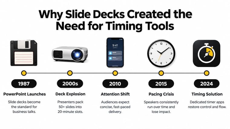
Slide decks changed the presenter’s working environment. PowerPoint became a major software category in 1987, when PowerPoint 1.0 shipped for Macintosh after being developed under the name Presenter. Microsoft acquired Forethought for $14 million that year, and by 2001 Microsoft estimated that roughly 30 million PowerPoint presentations were delivered every day worldwide. Those historical details are documented in the PowerPoint development timeline.
The important point isn’t the brand history by itself. Slide software made it easy to build a sequence of visual prompts, but it didn’t automatically teach speakers how to allocate time across them. A presenter can move from an opening slide to a complex diagram, spend too long explaining it, and discover the problem only when the final slides remain.
Conferences, classrooms, meetings, and online sessions all expose that mismatch in different ways. A conference speaker has to respect the event schedule. A teacher may need to release students into an activity at a specific moment. A remote presenter has to share attention between slides, participants, chat, and the clock.
Why attention makes pacing visible
Audience timing data helps explain why a quiet timing cue matters. A 2026 presentation-statistics roundup reports that the average attention on a single point on a screen is 47 seconds, that over 60% of audiences prefer presentations lasting 10 to 15 minutes, and that many audiences begin disengaging within 10 minutes. The same roundup also reports that speakers have about 15 seconds to make a positive first impression, while average audience attention spans are around 5 minutes in another presentation-metrics context. These figures appear in the presentation statistics roundup.
Those figures don’t mean every talk must be compressed into a fixed format. They do show why pacing is a delivery skill, not an administrative detail. If your explanations arrive in uneven bursts, the audience feels the imbalance before you notice it.
A timer won’t improve a weak argument or rescue overcrowded slides. It can, however, expose where your delivery is spending its available time. For PowerPoint users who want to explore slide-based timing methods, this guide to an animated countdown clock for PowerPoint offers one possible approach.
Features That Separate a Good Timer From a Noisy One
Start with the speaker problem, not the feature list. If you forget the timer is running, a beautiful animation won’t help. If you can’t read the display from the podium, social sharing is irrelevant.
A strong timer usually includes:
- Glanceable colour cues: A background that moves from green to amber to red can communicate pace through peripheral vision. You don’t need to stop speaking and interpret a chart.
- Custom milestones: Alerts should be set around the structure of your talk, such as a midpoint, a final-minute warning, or the beginning of questions. Fixed alerts are less useful when every session has a different rhythm.
- Presenter-only display: Your notes and timer can remain on your device while the audience sees clean slides. This is especially useful when you’re presenting from a laptop or confidence monitor.
- Audience-facing mode: Some sessions need a shared clock. Classroom activities, quizzes, and group exercises benefit from a display everyone can understand.
- Quiet alerts: Vibration, a connected watch, or discreet audio through earbuds can nudge you without making the audience wonder what went wrong.
- Reliable timing logic: Visual systems can run slightly longer than their specified display durations. Controlled studies found overruns commonly around 10 to 20 milliseconds, with some exceeding 50 milliseconds, and a related timing study found requestAnimationFrame-based timing correct on roughly 75.5% to 81.0% of trials, depending on the method. The timing research supports choosing event-driven, high-resolution timing when sub-second precision matters.
A timer can also become noisy. Flashing screens, loud alarms, animated themes, scoreboards, and social controls may look impressive in a product screenshot, but they create more decisions during a talk. The right test is simple: does this feature reduce a real interruption, or does it ask you to manage another screen?
| Feature | Speaker Problem It Solves |
|---|---|
| Large remaining-time display | You can’t read small numerals during movement or poor lighting |
| Colour-coded progress | You miss a warning because you’re focused on delivery |
| Section timing | One topic expands and steals time from the conclusion |
| Presenter view | You need pacing information without exposing notes |
| Silent vibration | An audible alert would distract the room |
| Pause and resume | A question, demo, or co-presenter interrupts the countdown |
| Count-up after zero | You need to see how far the session has overrun |
| Screen mirroring | A moderator, teacher, or production team needs the same clock |
A useful filter: If you must look down, read instructions, and make a choice while presenting, the timer is adding friction rather than removing it.
Platform-Specific Setup on iPhone, iPad, Mac, and Android
The best device is the one you can check without breaking your posture or eye contact. A phone at the podium may be enough for a short talk, while a tablet or second computer works better when the presentation runs across multiple sections.
On an iPhone, increase brightness, silence unrelated notifications, and schedule Do Not Disturb before the audience arrives. Lock the orientation so the timer doesn’t rotate when you move the device. If the phone sits below a lectern, pair it with a watch or discreet audio cue rather than repeatedly looking down.
An iPad works well as a confidence monitor. Its larger display makes section labels and colour changes easier to read, and it can sit beside the presentation laptop or on a podium stand. A Mac is useful for desk-based webinars, rehearsal recordings, and presentations where a separate speaker-view timer can remain beside the meeting window. For Mac users who want an external timing window, this free timer app for Mac is a relevant option to investigate.
Match the device to the room
| Device | Best Use Case | Key Setup Step | Watch Out For |
|---|---|---|---|
| iPhone | Podium talks and compact presenter cues | Lock orientation and raise brightness | Small screen can encourage frequent glances |
| iPad | Confidence monitor or shared room timer | Place it at a fixed viewing angle | Stand stability and cable placement |
| Mac | Webinars, rehearsals, and desk presentations | Keep the timer in a separate speaker-view area | Notifications or window changes can interrupt |
| Apple Watch | Silent wrist-based reminders | Test vibration and display behaviour beforehand | Alerts may be too subtle in a noisy room |
| Android | Flexible phone-based timing | Review battery and background-app settings | Vendor-specific restrictions can stop alerts |
Keep the device powered for any substantial session, disable auto-lock where appropriate, and test audio routing through AirPlay or Bluetooth if you’re using an earbud cue. A keynote with a clicker often favours an iPhone or Apple Watch. A training room with a presenter’s display may favour an iPad or Mac. A hybrid call usually benefits from a Mac with a separate speaker-view timer, so the shared screen remains uncluttered.
Matching the Timer to the Type of Talk You Are Giving
A five-minute talk, a teaching activity, and a multi-speaker conference segment don’t need the same timer behaviour. Shopping for the most feature-packed app often creates the wrong result. Choose the control surface that matches the session.
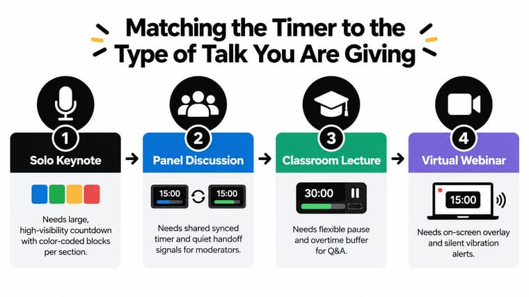
Solo speaking
A keynote or pitch needs a large private countdown, clear section boundaries, and a gentle cue before the closing portion. A colour-coded block for the introduction, core argument, demonstration, and questions can show whether you’re spending too much time early. The speaker shouldn’t need to open a menu to understand the next move.
Lightning talks demand even less interface. Use one countdown, one warning, and a reliable end signal. Improv or performance settings may benefit from elapsed time and a visible overtime state, because the goal isn’t always to stop exactly at zero.
Shared sessions
Panels and conferences need a run-of-show model rather than a single personal clock. Each speaker can have an assigned block, while the moderator controls pause, resume, and handoff. A shared display helps production staff and presenters work from the same reference without verbal interruptions.
Timing tools are also appearing in PowerPoint workflows for countdowns, stopwatches, classroom quizzes, and meeting agenda sections, as shown by this PowerPoint timing add-in. That broader use matters because a presentation timer app may serve the whole event, not just rehearsal.
Teaching and hybrid delivery
Classroom activities need pause and reset controls. A teacher may start a countdown for group work, pause it to clarify instructions, and restart it without losing the planned activity. Hybrid meetings need a timer that remains visible to the presenter while a clean version can be shared with remote and in-room participants.
After the event, your timing notes can also support post-event LinkedIn repurposing. If you know which sections received questions or ran long, you’ll have a clearer basis for turning the talk into useful follow-up content.
For conference planning, a dedicated conference countdown timer can be evaluated against the run-of-show rather than against a solo rehearsal checklist.
Accessibility and Calm Design for Stressful Presentations
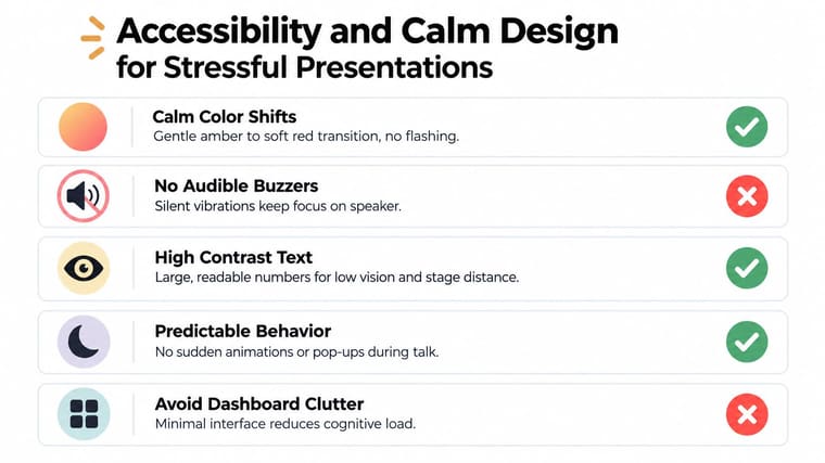
A timer shouldn’t demand more attention from a stressed speaker. Flashing red screens, repeated buzzers, and constant vibration may announce urgency, but they can also pull the presenter out of a sentence, interrupt eye contact, and increase cognitive load.
The calmer approach is more practical. Use one large numeric readout, a restrained colour transition, and an optional alert that happens at a meaningful checkpoint. The interface should become almost invisible when pacing is on track and become gently noticeable only when the speaker needs to adjust.
Design for different ways of noticing time
High contrast helps presenters with low vision and improves readability at a distance. Scalable text supports older speakers and anyone presenting in a room where the device must sit farther away. Colour-blind-safe palettes matter because red and green alone shouldn’t carry the entire meaning of the display.
Auditory checkpoints can support speakers who can’t continuously watch the timer, including people with attention or vision needs. Hearing needs require alternatives, so the same checkpoint should be available through visual change, vibration, or another configurable signal. Recent independent work on an accessible iOS timer was created specifically “to address this gap,” highlighting that a basic visible clock doesn’t serve every user. The multi-purpose accessible mobile timer research also supports thinking beyond countdown accuracy.
Calm design principle: The timer should interrupt your uncertainty, not your delivery.
Reduced-motion settings are useful for neurodivergent presenters and anyone who finds animated transitions distracting. Predictable behaviour matters just as much. The display shouldn’t suddenly open a panel, flash continuously, or change position because a warning has started.
The contrarian answer is that more features aren’t automatically more accessible. A timer with templates, dashboards, and many notification styles may offer choice, but too much choice can create preparation work and uncertainty. In a high-pressure room, a simple display that you can read, hear, or feel is often more usable than a feature-rich control centre.
Best Practices and Fixes When the Timer Misbehaves
Treat the timer like a rehearsal partner, not a security blanket. Run through the complete talk with the app before the room fills, and repeat the session until checking the display becomes a natural part of transitions rather than a conscious task.
Use deliberate glance points. Look after the introduction, following a demonstration, when you finish a major section, and before questions. Checking every few seconds fragments your eye contact and can make the audience feel that you’re waiting for permission to continue.
Diagnose the symptom
If the timer appears to be a minute off late in the session, check the opening first. Speakers often spend extra time welcoming the room, handling a technical issue, or answering an early question. That pattern usually points to a warm-up overrun rather than a timing defect.
If the halfway alert doesn’t sound, check silent mode, notification permissions, connected audio, and vibration settings. Don’t assume the alert failed until you’ve tested the exact device and output route you’ll use on stage.
A co-presenter taking over mid-countdown needs a pause-and-resume plan. Resetting the clock loses the shared reference, while pausing preserves the remaining allocation. Agree in advance who controls the timer and what signal means “handoff complete.”
Protect the setup
- Keep power available: Plug in the device for longer talks and sessions with several transitions.
- Lock the display: Prevent orientation changes from moving or resizing the timer.
- Prepare a backup: Keep a second device configured with the same duration and alert plan.
- Test the room: Check brightness, viewing angle, projector visibility, Bluetooth, and network dependence before people arrive.
- Rehearse interruptions: Practise pausing for questions, demonstrations, technical delays, and speaker handoffs.
Rehearsal test: If the timer fails, you should still know the next transition. The app should improve your control, not become the only thing holding the talk together.
How Pretty Progress Fits Your Presentation Workflow
Pretty Progress fits the quieter model of timing because its relevant functions are easy to understand at a glance. It provides countdown and progress widgets across iPhone, iPad, Apple Watch, Mac, and Android, with customisable event settings, names, colours, and visual layouts. That makes it suitable for a presenter who wants a persistent cue without opening a complex control panel during delivery.
For a speaker, the useful workflow is straightforward. Configure the start and end points, choose a readable design, place the widget where you’ll naturally see it, and rehearse with the same device position you’ll use on stage. Home Screen, Lock Screen, StandBy, watch complication, Mac desktop, and Notification Center placements can support different room layouts, although each should be tested before a live session.
Evaluate any app with this checklist
- Readability: Can you identify the remaining time instantly from your presentation position?
- Placement: Can the timer stay visible to you without exposing notes or distracting the audience?
- Signals: Can you choose visual, vibration, or quiet audio cues?
- Structure: Can you represent sections, handoffs, activities, or questions?
- Recovery: Can you pause, resume, and continue after an interruption?
- Calm behaviour: Does the interface remain stable when the warning state begins?
- Device fit: Does it work on the hardware you already trust in that room?
Pretty Progress also belongs beside, not inside, your slide-design decisions. For help with visual support and presentation materials, these Intonetic presentation design tips offer useful guidance on making visuals serve the speaker’s message. A timer can protect pacing, but it can’t compensate for slides that force the presenter to read dense text or explain an unclear diagram.
Use the app as a quiet reference. Set section boundaries before rehearsal, watch where you consistently lose time, and adjust the talk rather than trying to overpower the clock with louder alerts. The strongest setup is the one you stop noticing until it gives you exactly the cue you need.
Pretty Progress offers customisable countdown and progress widgets for iPhone, iPad, Apple Watch, Mac, and Android, so you can build a presentation timing setup around the device and cues you use. Visit Pretty Progress to configure a calm, glanceable timer and test it during your next rehearsal before you take the stage.





