

August 9, 2026
Habit Building App That Actually Sticks: A Pretty Progress
Discover the habit building app designed to keep you on track. Build routines that stick with visual progress tracking and daily motivation.
You’re probably not looking for another app. You’re looking for the one that doesn’t disappear after the third day, the work trip, or the week when your inbox eats your mornings. That’s the test for a habit building app, not whether it looks good in screenshots, but whether it stays visible enough to nudge you when your willpower is already busy somewhere else.
Don’t need more reminders. You need a cue that sits where you already look, then keeps the habit small enough to survive a normal life. That’s why a widget-first setup makes more sense than a checklist buried inside an app you remember to open once a week.
Table of Contents
- Why Most Habit Building Apps Fail
- Setting Up Pretty Progress for the First Time
- Designing Habits That Survive Real Weeks
- Building Your Review Routine Across Devices
- Deciding Whether PRO Is Worth the Upgrade
- Staying Consistent on ADHD Days and Busy Weeks
- Your First 30 Days and Troubleshooting Tips
Why Most Habit Building Apps Fail
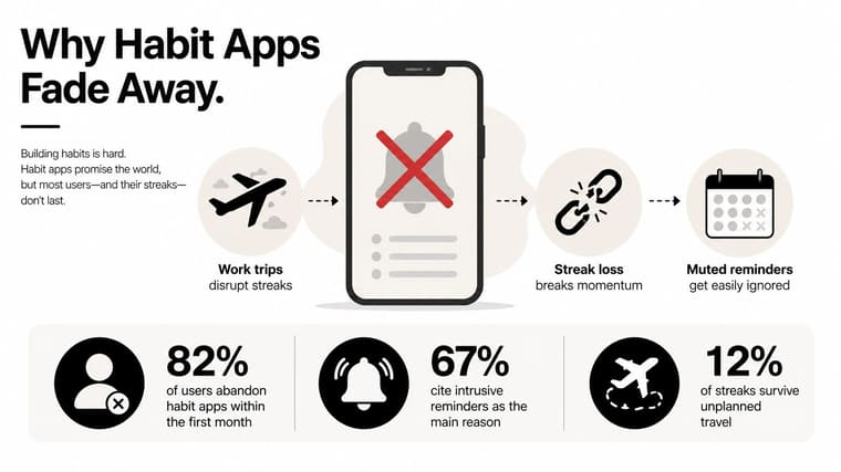
I’ve seen this pattern enough times to trust it. Someone installs a tracker on Sunday night, sets three ambitious goals, then mutes the notifications by Wednesday because the app starts acting like a disappointed manager in their pocket. The streak dies on a work trip, the calendar gets weird, and the app becomes one more icon you feel mildly guilty about opening.
That is a cue problem.
The reminder isn’t the habit
Push notifications are easy to ignore because they arrive as requests, not context. A home screen widget behaves differently. It sits there while you open your phone, answer messages, and check the weather, so the cue becomes part of the room instead of another task to dismiss.
That distinction matters for any habit building app. Usage data shows around 64% of global app users actively use at least one wellness or productivity app monthly, and habit tracking applications alone record more than 298 million active users. The same source says over 42% of adults use mobile platforms for habit-formation strategies, which tells you the category has moved past novelty and into routine behavior. The point is not more alerts. It is a better place for the reminder to live. (360 Research Reports)
Pretty Progress fits that pattern because it treats the widget as the cue, not the app screen. That is the part most guides skip over. They talk about logging, then wonder why users drift away when life gets messy.
Why streaks break under normal life
A streak is useful until it starts acting like a moral score. Miss one day, then one travel day becomes two, and now the whole system feels broken even if the habit itself still matters to you. That is why all-or-nothing habit design loses people fast.
A more resilient app design treats visibility as the core product. The habit stays on the screen, the progress stays obvious, and you do not have to dig through menus to remember what you meant to do. If you want a broader look at how digital tools are being used in behavior change, the article on mental health apps for therapy gives useful context on how mobile interventions fit into everyday routines.
Practical rule: a habit tracker only works if the cue is harder to ignore than the behavior is to postpone.
That is why I prefer widget-led systems over reminder-led ones. The reminder asks. The widget waits. The wait keeps it from becoming annoying.
Setting Up Pretty Progress for the First Time
The cleanest setup is boring in the best way. Download the app on the device you use most, then create one countdown or one habit first, not five. The app is available across iPhone, iPad, Apple Watch, Mac, and Android, so the practical choice is whichever screen already gets the most idle glances.
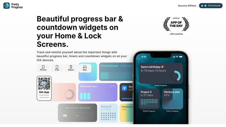
Open the first habit with a simple start and end date, or a countdown if you’re tracking a deadline. Then choose a theme that matches how your home screen already feels. Swiss Style, Minimal, Aqua, and Retro OS each push the widget toward a different visual mood, and that matters because the widget should look like part of the phone, not a sticker pasted over it.
Make the widget worth keeping on screen
Spend the extra few minutes on colors, gradients, bar size, layout, and icons. That’s the part people skip, then wonder why the widget gets deleted later. If it clashes with your wallpaper or looks too loud next to your apps, it’ll feel like visual clutter instead of support.
A good setup usually does two things at once. It tells the truth about progress, and it stays calm enough to live on the screen every day. That’s why the visual balance matters as much as the countdown itself.
If you use an iPhone or iPad, add the widget to the Home Screen first, then place the same countdown on the Lock Screen if you want the cue to appear before you even open the device. On desktop, keep the Mac version visible where your eyes naturally land during work. The setup should feel almost too simple, because complicated tracking rarely survives.
The best widget is the one you stop noticing as an app and start noticing as part of your environment.
That’s the whole trick. Once the countdown feels native to the device, it stops competing with your attention and starts doing its job.
Designing Habits That Survive Real Weeks
The strongest habit design combines a stable cue with a small action. Habit stacking does this by borrowing an existing routine, and implementation intentions do it by naming the trigger in advance. The widget helps because it turns the screen into the cue, so the next action is visible before you start negotiating with yourself.
A useful pattern looks like this. After I pour coffee, I open the reading widget and read one page. Or, when I open my phone after lunch, I check the walking countdown and head outside. The existing routine does the heavy lifting, while the widget keeps the next step obvious.
Cue design beats generic reminders
The core question isn’t “How do I remember?” It’s “What exact thing happens right before the habit?” That could be opening the laptop, setting the coffee mug down, or seeing the Lock Screen countdown after a meeting. The closer the cue is to an actual, repeated action, the less the habit depends on mood.
I’d rather see someone use one sharp cue than five vague ones. A widget near the coffee machine on a tablet stand can work better than a phone notification that arrives while you’re already in motion. The environment is doing the prompting, which is exactly what you want.
You can dig deeper into that setup in the habit tracker with widget guide, but the core idea is simple. Make the cue physical, visual, and specific enough that your brain doesn’t need a meeting about it.
Use the widget as the stack anchor
A home screen widget can act like the first domino in the stack. For a morning walk, the anchor might be the coffee maker. For a daily reading habit, it might be the countdown sitting on the Lock Screen while you wind down at night. The goal is to attach the new action to something you already do without thinking.
A few useful pairings look like this:
- Coffee anchor: After the kettle boils, check the widget and start the five-minute stretch.
- Desk anchor: After you open your laptop, glance at the countdown and begin the first focused block.
- Evening anchor: After you plug in your phone, tap into your reading habit and read a page.
- Deadline anchor: When the project widget appears on your Lock Screen, write the next tiny task.
The app is only the container. The cue is the engine. Once the cue is stable, the habit stops feeling like a promise you keep forgetting and starts feeling like a thing your day already knows how to do.
Building Your Review Routine Across Devices
A habit system falls apart when the only check-in happens during setup. The app gets opened, the widget gets placed, and then the data sits untouched long enough to stop teaching you anything. A weekly review fixes that because it turns habit tracking from a daily guilt check into a simple course correction.
I like a Sunday-night pass. Open the app, scan which widgets moved, and ask one question, what made the habit happen this week. If a habit slipped, the fix is usually to move the cue closer to an existing routine, not to make the goal bigger.
Use the other screens on purpose
Apple Watch works well when you want a wrist-level glance during a commute, walk, or workout. Mac works better when your habits are tied to desk time, because the countdown can sit where deep work already happens. The point is not to duplicate attention everywhere, it is to place the same cue in the places where your day naturally changes gears.
The built-in calculators help with planning because they remove some of the mental math. Date ranges, business days, exact age, and intermittent fasting windows give you a cleaner way to map a habit across a stretch of time without opening a spreadsheet. That matters when a routine needs to last several weeks and you want the visual timeline to match the actual calendar. For a closer look at how the app handles that setup, the habit app review page breaks down the day-to-day workflow and the trade-offs around staying visible on multiple devices.
Make the review small enough to repeat
The review should feel lighter than journaling. No essays, no scorecards, no dramatic resets. Just a quick look at what moved, what stalled, and what deserves a smaller target next week.
If a habit misses, don’t interrogate the day. Change the cue, shrink the scope, or move the check-in.
That is the whole maintenance loop. The daily widget keeps the habit present, and the weekly review keeps the system honest without making it heavy. If you need a device-specific pass, use the same review on the screen you check most, then compare it with the other devices only when the cue stops working where you placed it.
Deciding Whether PRO Is Worth the Upgrade
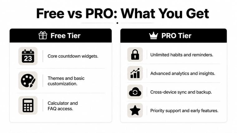
This should be a decision, not a reflex. The free tier already covers the basics casual users need, including core countdown widgets, themes and basic customization, and access to the calculator and FAQ. If your goal is to keep one or two habits visible and clean, that may be enough.
PRO makes sense when the widget itself becomes part of your style system. It gives you deeper styling controls, advanced gradients, expanded icon and layout options, and additional theme packs. That matters if you want the widget to match a Lock Screen wallpaper, place multiple countdowns side by side, or sit unobtrusively inside your setup instead of drawing attention to itself.
Who gets value from the upgrade
A casual tracker usually does fine with the free tools. One countdown, one habit, one clean widget, done. A design-conscious daily user is different, because the upgrade is less about adding features and more about making the widget worth leaving on screen.
Power users are the clearest fit. If you are managing several habit arcs at once, and you want each one to stay readable without turning the home screen into a crowded grid, the extra styling room becomes useful. The question is not how many features are in the list. It is how much screen space your routine should take up.
For a closer look at the day-to-day trade-offs, the habit app review breakdown helps compare the free setup with the version you reach after you start treating the app as part of your home screen, not just a checklist.
Buy for fit, not for feature count
I would ignore upgrades that only look impressive in a feature list. The test is whether the PRO options let you keep the widget visible without thinking about it. If the styling makes the screen calmer and easier to live with, that is a good reason to upgrade. If not, the free tier is the smarter call.
Staying Consistent on ADHD Days and Busy Weeks
Perfect streaks are a trap. Real life has disrupted mornings, late trains, exam weeks, client fires, and the kind of days where the whole point is to get through them without adding friction. A good habit building app should assume those days exist and make it easy to restart without turning the lapse into a story about failure.
That’s especially relevant for people who know procrastination and attention drift show up together. The link between procrastination and ADHD is useful background here, because it explains why the fix usually needs less friction, not more pressure. If a tracker asks for too many taps or too many decisions, it becomes one more thing to avoid.
Make recovery part of the design
The healthiest habit system treats missed days as recoverable. Keep the habit scope narrow, let the widget continue to show the goal, and avoid loading the app with analytics that mainly produce guilt. A reading streak, a fasting timer, or a workout countdown should be able to pick up again after a travel week without feeling like the entire structure collapsed.
That also means building slack into the schedule. Three sessions a week is often more realistic than seven, especially when the habit competes with work, childcare, or shifting routines. The point is not to prove you’re disciplined every day. The point is to keep the behavior alive long enough for it to become familiar.
For ADHD-friendly setup ideas, the habit tracker for ADHD page offers a practical angle, but the principle is straightforward. One visual cue, one time anchor, one action. No extra choices.
Shrink the habit until it fits the day
When a week gets chaotic, the habit should get smaller, not disappear. A five-minute version is easier to restart than a full version that only works on ideal mornings. The widget helps because it keeps the goal visible even when the action has been reduced.
Here’s the test I use. If the habit can’t survive a bad day in a tiny form, it’s too ambitious for the current season. That’s true for busy professionals, students during exams, and anyone whose schedule shifts too much for a rigid streak model to hold.
Your First 30 Days and Troubleshooting Tips
The first month should feel like a controlled rollout, not a grand transformation. Week one, install the app, build one widget, and choose one anchor habit. Week two, add the Lock Screen widget and a second habit if the first one is showing up consistently. Week three, mirror the cue to Apple Watch or Mac where it fits your day, then run the Sunday review. Week four, decide whether PRO adds enough visual flexibility, and remove anything that isn’t earning its spot on screen.
A few issues show up often, and they’re usually simple. If a widget isn’t updating, check whether the app has been opened recently enough to refresh its state. If the calendar permissions feel off, fix the access before assuming the habit data is wrong. If a theme looks glitchy, rebuild the widget with a simpler layout first, then add styling back in.
Reset without erasing the habit
The cleanest restart is not a dramatic wipe. Keep the underlying habit, adjust the start point, and let the countdown or progress bar begin again from a new date if needed. That preserves the history without pretending the lapse never happened.
If the habit keeps failing, reduce the visible scope. Remove one countdown, shorten one target, or move the cue to a more obvious place on the home screen. The problem is usually placement, timing, or overload, not motivation in the abstract.
The easiest way to start tonight is simple. Pick one habit, give it one widget, and place that widget where your eyes already go before you think about it.
Pretty Progress gives you the part most trackers miss, a visual cue that sits on your Home Screen and Lock Screen instead of asking you to remember another reminder. If you want a habit building app that turns progress into something you can glance at all day, visit Pretty Progress and set up one small habit you’ll see tomorrow morning.





