June 11, 2026
Create a Habit Tracker with Widget: Your 2026 Guide
Learn to create the perfect habit tracker with widget for iPhone, iPad, or Android. Our 2026 guide shows you how to set up, style, and optimize for consistency.
You probably already tried the obvious version of habit tracking. You downloaded an app, added a few routines, turned on reminders, and felt organized for about two days. Then the notifications blended into everything else on your phone. The habit didn’t disappear because you stopped caring. It disappeared because the cue was too easy to ignore.
A habit tracker with widget fixes a different problem than a checklist app does. It keeps the habit visible in the exact place your attention already goes. When the progress bar sits on your Home Screen or Lock Screen, you don’t have to remember to open the app first. You see the goal before your day drifts.
That’s where visual design matters more than generally expected. A widget isn’t just a smaller version of an app. It’s an environmental cue. If it’s cluttered, generic, or placed badly, your eyes skip past it. If it’s clear, specific, and visually satisfying, it becomes part of your routine.
Table of Contents
- Why Your Next Habit Needs a Widget Not a Notification
- Creating Your First Habit in Pretty Progress
- Adding Your Widget on iPhone iPad and Android
- Designing a Widget That Actually Motivates You
- Best Practices for Building Habits That Stick
- Common Questions and Quick Fixes
Why Your Next Habit Needs a Widget Not a Notification
Most failed habits don’t fail in dramatic fashion. They fade. You swipe away a meditation reminder while answering a text. You silence the “drink water” alert in a meeting. By the end of the week, the app is still installed, but the habit is gone.
Notifications are loud, but they’re easy to dismiss. A widget works differently. It doesn’t interrupt. It stays present.
Apple made this style of tracking much more normal when Home Screen widgets expanded in iOS 14 in 2020, turning persistent progress displays into a standard mobile pattern. Mainstream app coverage now treats widgets as a core part of habit tracking rather than a nice extra, and The Sweet Setup specifically highlights widgets as one of the strongest ways to see progress at a glance in its review of iOS habit apps like Streaks and other habit tools with customizable widgets.
A visible cue beats a delayed reminder
A good habit cue shows up before distraction wins. That’s why a widget often outperforms a notification for routines like stretching, reading, journaling, or language practice. When you activate your phone, you see the progress bar, and remember the next action before another app grabs you.
A widget doesn’t ask for your attention all at once. It quietly earns it over and over.
That subtlety matters. Habits depend on repeated exposure, not one dramatic burst of motivation. A small visual signal you see twenty times a day can shape behavior better than an alert you dismiss once.
Why this changes daily behavior
When people set up a habit tracker with widget support well, they stop relying on memory. The phone becomes part of the environment that prompts action. A Lock Screen widget can remind you to log a walk. A Home Screen widget near your calendar can cue a quick planning habit. A progress bar for a reading streak can nudge you before you open social media.
If you want the broader logic behind visual cues, this piece on visual goals and why visible progress changes follow-through is useful. The short version is simple. If the habit stays in view, it has a better chance of staying alive.
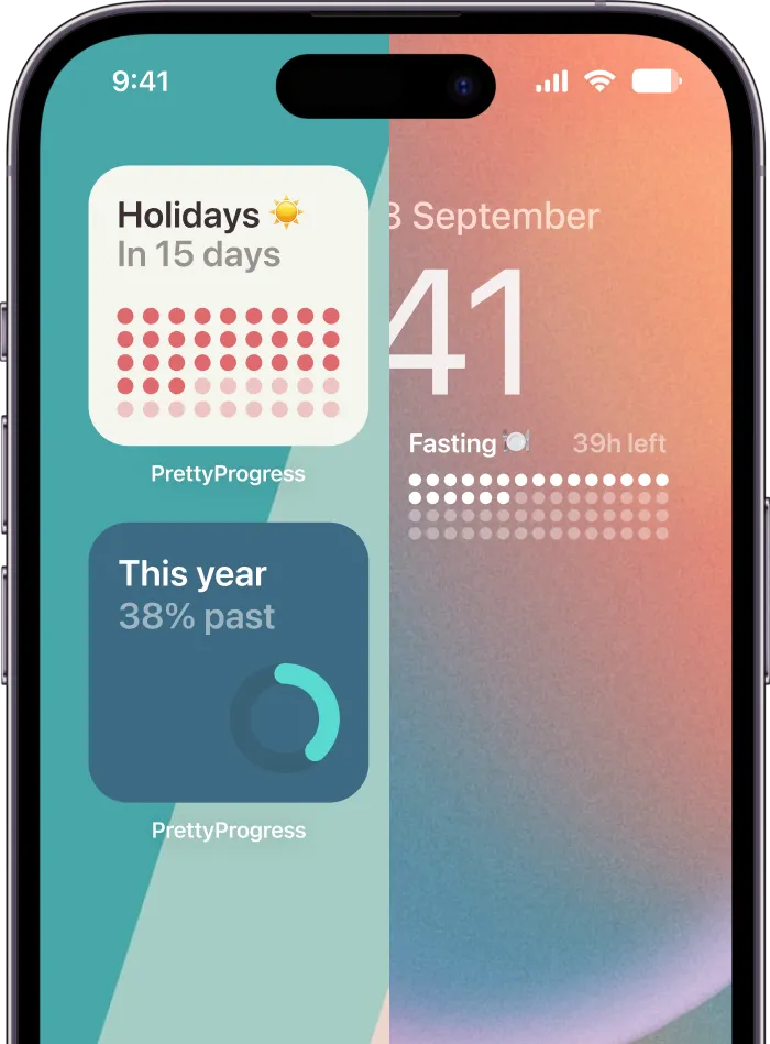
Creating Your First Habit in Pretty Progress
The hardest part of habit tracking usually isn’t the widget. It’s defining the habit clearly enough that the widget can show something meaningful.
A vague goal like “be healthier” doesn’t translate well to a progress bar. A concrete goal like “meditate 10 minutes daily” or “read 12 books this year” does. The widget needs a target, a time frame, and a label you can understand in one second.
![]()
Start with a habit name that sounds actionable
Name the habit the way you’d say it to yourself on a busy day. Short beats clever.
Good examples:
- Read before bed
- Gym 3x a week
- Practice guitar
- Meditate daily
- Drink water
Weak names tend to be abstract, too broad, or emotionally flat. “Self improvement” won’t pull you into action. “10 pages tonight” might.
Choose the right time structure
Some habits work best with a fixed span. Others need an ongoing rhythm.
Use a fixed start and end date when the habit lives inside a challenge or season:
- 30-Day Yoga Challenge
- No alcohol this month
- Study every day until exam week
Use a longer time horizon when you want the widget to represent cumulative progress:
- Books read in 2026
- Practice piano this year
- Workouts this quarter
The key is emotional clarity. If the end date feels real, the progress bar feels real too. If the date is arbitrary, the widget starts to look decorative.
Pick a unit that matches the behavior
Not every habit should be counted the same way. That sounds obvious, but it’s where many setups go wrong.
| Habit type | Better unit | Why it works |
|---|---|---|
| Reading | Books, pages, or sessions | Lets you match ambition to reality |
| Meditation | Days or sessions | Simple daily logging keeps it light |
| Fitness | Workouts or active days | Avoids overcomplicating each check-in |
| Learning | Lessons or practice sessions | Rewards repetition, not perfection |
A habit tracker with widget support works best when updates feel quick. If logging one workout requires too many micro-decisions, you’ll stall.
Build the habit so the widget can do its job
The widget should answer one question instantly. What’s my progress, and what should I do next?
That’s why it helps to avoid overloaded goals. Don’t combine “exercise, eat better, sleep earlier, and stretch” into one tracker. Split them. A clean visual cue needs a single purpose.
Practical rule: If you can’t understand the habit label and target in one glance, the widget is carrying too much.
If you want more examples of turning ideas into visible trackers, this guide to a goal progress tracker app for daily and long-term goals gives useful ways to shape the target before you put it on screen.
Adding Your Widget on iPhone iPad and Android
Once the habit exists, placement becomes strategy. The best habit tracker with widget setup isn’t just added to a screen. It’s placed where your behavior already starts.
Modern phones are constant companions. DataReportal’s 2024 digital report estimated 5.35 billion mobile phone users worldwide, which is exactly why glanceable tools matter on these devices. In product design, widget layouts also stay readable by limiting what’s shown at once. One open-source iOS Scriptable habit tracker, for example, displays up to six habits directly on the Home Screen to keep the widget clear rather than crowded, as shown in this Scriptable habit tracker widget example for iOS.
![]()
Add it to the iPhone or iPad Home Screen
This is often the most flexible placement.
- Press and hold an empty area of the Home Screen until the apps jiggle.
- Tap the plus button.
- Search for your widget app.
- Choose the widget size.
- Tap Add Widget.
- Place it on the page where your eyes naturally land first.
This location works well for habits tied to your daily flow. If you check mail, calendar, notes, or tasks every morning, place the widget beside those apps. The habit gets pulled into an existing loop instead of competing with it.
Add it to the Lock Screen
The Lock Screen is stronger when the habit needs maximum visibility. It’s harder to ignore because you see it before you do anything else.
Use this spot for:
- A morning routine habit you want to remember the moment you pick up your phone
- A sobriety or streak counter where continuity matters emotionally
- A deadline-driven habit like daily study before an exam
If a habit is your current priority, the Lock Screen usually outperforms a later Home Screen page.
Use it in StandBy mode
StandBy is useful when your iPhone spends part of the day charging on a desk or nightstand. A larger, always-visible widget turns the phone into a mini dashboard.
This works especially well for routines such as:
- evening reading
- hydration
- fasting windows
- bedtime wind-down habits
If you already use visible displays for planning, the same logic applies to home life too. People often get value from making family schedules visible at a glance, and habit widgets benefit from that same principle. Put the information where people naturally look.
Add it on Android
Android gives you a similar advantage, with slightly different steps:
- Long press an empty area of the Home Screen.
- Tap Widgets.
- Find the app in the widget list.
- Press and hold the widget you want.
- Drag it onto the Home Screen.
- Resize or configure it if needed.
Android users often have more layout flexibility, which is great, but it creates one trap. Too many widgets on one screen dilute all of them. If the habit is important, give it breathing room.
Placement matters more than people think
Where you place a widget changes what it does.
| Placement | Best for | Weakest use |
|---|---|---|
| Lock Screen | High-priority daily cues | Low-stakes goals you rarely act on |
| First Home Screen | Core routines and workday habits | Habits you only do at night |
| Secondary page | Supporting trackers | Mission-critical habits |
| StandBy view | Desk and evening routines | Habits that need quick mobile action |
One of the better ways to think about this is to match the widget to the moment. If you need the cue while you start work, keep it by your productivity tools. If you want a visual countdown near your daily workflow, this example of a home screen timer setup for visible progress shows the kind of placement logic that tends to stick.
Designing a Widget That Actually Motivates You
A plain widget can still work, but a thoughtfully designed one gets noticed longer. That’s the difference between a tracker you stop seeing after a week and one that keeps pulling your attention back in a useful way.
The visual layer isn’t cosmetic fluff. It shapes how quickly you read the habit, how you feel when you see it, and whether your brain treats it like wallpaper or a prompt.
![]()
Match the visual style to the behavior
Different habits benefit from different moods.
A calming habit like meditation, breathing, or journaling usually works better with softer colors, simpler typography, and less visual tension. A sharper goal like finishing a portfolio, shipping a project, or hitting a study target often benefits from stronger contrast and a more assertive layout.
Here’s a practical way to choose:
- Quiet habits: Use softer palettes, rounded bars, and minimal clutter.
- Urgent habits: Use higher contrast, stronger accent color, and a more direct progress style.
- Playful habits: Use icons or themes that make the routine feel lighter.
- Serious deadlines: Keep the widget stripped down so the progress itself does the talking.
If the design and the behavior clash, the widget feels off. A neon, busy layout for a bedtime habit can create friction instead of support.
Keep the widget readable in one glance
The quickest way to ruin a widget is to overfill it. Too much text, too many habits, or too many decorative choices make the cue weaker.
A readable widget usually gets three things right:
- Short labels
- Clear progress
- Strong contrast between background and content
When someone says their widget “stopped working,” I often find it’s still technically fine. They just trained themselves to ignore it because the design became visually noisy.
Design for glanceability first. Decoration comes second.
That’s why themes matter only if they preserve clarity. Minimal layouts often last longer because they age well on the screen. More stylized themes can be highly motivating too, but only when the habit name and progress state stay instantly readable.
Turn intention into a visible cue
Design meets behavior change. Research summarized by Habi reports that implementation intentions or “if-then” plans produced exercise adherence of 91% versus 35 to 38% in control groups, and that approach-framed goals succeeded at 58.9% versus 47.1% for avoidance-framed goals in the data reviewed by Habi’s habit tracker statistics summary.
The useful lesson isn’t “add a prettier bar and habits solve themselves.” It’s that cues work when they tell you what to do next.
So don’t label your widget:
- “Stop procrastinating”
- “Be healthier”
- “Less screen time”
Try:
- “Read 10 pages”
- “Walk after lunch”
- “Stretch before bed”
Approach language gives the eye somewhere to go. It creates a tiny script in your head. The widget becomes the if. The action becomes the then.
A good-looking widget should still feel functional
Aesthetic motivation is real, but it has limits. If the widget looks beautiful and still takes too much effort to update, you’ll abandon it. If it’s attractive, specific, and quick to use, it becomes part of your environment.
That’s why customization works best when each choice has a job:
- color sets emotional tone
- shape changes visual intensity
- icon choice improves recognition
- layout controls how fast you read the goal
Used well, those choices make the habit tracker with widget setup feel personal without making it precious. You don’t need a perfect design. You need one that keeps catching your eye for the right reason.
Best Practices for Building Habits That Stick
The widget can carry the cue. It can’t carry the whole system. What makes the setup effective is how tightly you connect the visual reminder to a real action.
That’s the practical answer to the question people often ask. Does a habit tracker with widget support improve adherence, or does it just look nice? It helps when it reduces friction and fits naturally into daily routines. It doesn’t help much when it becomes another thing you admire but never use. Steps puts this well in its guidance on widgets and habit tracking, noting that self-monitoring works best when it’s easy and integrated, not when it’s another app to open, as explained in this habit widget setup guidance from Steps.
![]()
Start narrower than you want to
It’s common to begin with too many habits. They create a dashboard for hydration, journaling, reading, stretching, language study, meal prep, and sleep, then wonder why none of it lasts.
Start with one or two habits that matter enough to earn premium screen space.
- Choose a lead habit: Pick the one routine that would improve your day even if the rest stayed messy.
- Let success stack later: Add another widget only after the first one feels automatic.
- Protect readability: Fewer visible goals make each cue stronger.
A smaller system feels less impressive on day one, but it survives longer.
Place the widget where the action happens
Habit stacking works better when the cue lives near the competing behavior or the supporting tool.
Examples:
- Put Drink Water on the page where social apps live, so the cue appears before the scroll.
- Put Study Session near your calendar, notes, or timer apps.
- Put Read Before Bed in a Lock Screen or StandBy position you see at night.
This is also where people with overloaded schedules often need simpler tools. If you want another perspective on choosing habit apps for busy professionals, that guide is useful because it focuses on fit and friction rather than feature lists.
The widget should appear at the decision point, not somewhere you only visit after the decision is already made.
Review the system before you blame yourself
When a habit stalls, don’t jump straight to “I lack discipline.” Check the design first.
Ask:
- Is the label clear enough?
- Is the widget placed where I see it?
- Does logging feel fast?
- Is the habit too ambitious for current life?
- Has the widget become visual wallpaper?
If the answer to any of those is yes, adjust the system. Shrink the habit. Move the widget. Simplify the look. Rename the goal so it cues action instead of guilt.
A good habit setup should feel slightly easier than your old one, not more elaborate. That’s the standard worth keeping.
Common Questions and Quick Fixes
Even a clean setup can hit small snags. Most of them are easy to fix once you know what the widget is supposed to do.
Why isn’t my widget updating right away
Widgets usually aren’t meant to behave like live dashboards every second. If the progress looks delayed, open the app once, confirm the habit entry saved, and give the system a moment to refresh. If that still doesn’t help, remove the widget and add it again.
On iPhone and iPad, restarting the device can also clear stale widget behavior. On Android, checking battery optimization settings can help if the app seems too restricted in the background.
How do I track recurring habits without a hard end date
Use a repeating structure instead of forcing an artificial deadline. Weekly workouts, daily walks, and ongoing reading habits usually work better when tracked as recurring progress rather than one giant endless goal.
If the habit still feels vague, break it into seasons or short cycles. A monthly reading target is easier to feel than “read more forever.”
Can I use the same setup across devices
That depends on the app and how it handles sync. In practice, the cleanest approach is to keep the habit name, target, and visual style consistent across your devices so the cue feels familiar.
This matters even more if you switch contexts often during the day. For students, pairing a visible study widget with focused audio can help reinforce the routine. If that’s your style, this guide to lofi music for student productivity is a useful companion resource.
Can I edit a habit after creating it
Usually yes, and you should. Editing a label, date range, color, or target isn’t cheating. It’s maintenance.
Change the setup when:
- the label no longer motivates you
- the target was unrealistic
- the widget design blends into the background
- your schedule changed and the cue now appears at the wrong time
Treat your habit tracker with widget setup like a living system. The point isn’t to preserve your first draft. The point is to make the habit easier to notice and easier to do.
If you want a cleaner visual system for habits, deadlines, and recurring routines, Pretty Progress gives you customizable Home Screen and Lock Screen widgets that keep progress visible without relying on constant alerts. It’s a practical option when you want your phone to cue action subtly instead of buzzing for attention.