June 1, 2026
Pretty Progress Habit App Review: Is It Right for You?
Our complete Pretty Progress habit app review covers features, setup, PRO, & comparisons. Is this visual countdown & goal tracker right for you in 2026?
You download a habit app on a Monday night with real optimism. You add “read 20 minutes,” “drink water,” “study after dinner,” and maybe one ambitious bonus goal. For a few days, checking boxes feels satisfying. Then life gets noisy, you miss one day, the streak looks broken, and suddenly opening the app feels like homework.
That cycle is common enough that a good habit app review has to ask a harder question than “Which app has the most features?” The better question is, “Which kind of design helps you keep going when the excitement wears off?” If your current app makes progress feel abstract, hidden, or too easy to ignore, the problem may not be your discipline. It may be the way the tool asks you to interact with your goals.
Table of Contents
- Why Your Current Habit Tracker Might Be Failing You
- The Power of Visual Progress The Pretty Progress Method
- Your First Five Minutes Setting Up Pretty Progress
- A Tour of Key Features and Customization Options
- Pretty Progress PRO Is the Upgrade Worth It
- Pretty Progress vs The Competition A Quick Comparison
- Final Verdict and Frequently Asked Questions
Why Your Current Habit Tracker Might Be Failing You
A lot of habit apps start with the same promise. Open the app, log the habit, keep the streak alive. That sounds simple, but in practice it creates a tiny daily chore. The habit itself already takes effort. The app adds another step.
That extra step matters more than often realized. If you forget to log a walk, a study session, or a glass of water, the app records nothing. Your real effort disappears. After that, the streak becomes less like encouragement and more like a fragile score you’re trying not to break.
When checklists turn into pressure
Checklist-style tracking works well for some people, especially if they already enjoy routine logging. But for many users, the moment they miss one day, the emotional tone changes. Instead of “I’m building something,” it starts to feel like “I failed again.”
A broken streak can make one missed day feel bigger than it really is.
That’s one reason habit tools are such a crowded space. The category isn’t small anymore. One industry summary says the habit-tracking app market was valued at $1.7 billion in 2024 and is projected to reach $5.5 billion by 2033, with North America holding over 35% of market share, according to this habit tracker market summary. People are actively looking for digital support. They just don’t all need the same type of support.
If you’re comparing options, it can help to look beyond classic streak apps and also explore a broader online habit tracking platform that shows how different systems present routines, reminders, and visibility. The format changes the experience more than most feature lists suggest.
The tool might be the problem
Some people need detailed logs. Others need a more visible cue. If your goal disappears inside an app icon, it’s easy to forget it exists. If your motivation depends on opening an app at exactly the right moment every day, the system is already fragile.
That’s why visual progress bars are worth a closer look in any habit app review. Instead of asking you to repeatedly prove that you care, they keep the goal in sight. You see progress without digging for it. You get a reminder without another nagging alert.
If consistency has been hard lately, this practical guide on how to stay consistent with goals is a useful next read because it focuses on reducing friction instead of blaming motivation.
The Power of Visual Progress The Pretty Progress Method
A progress bar works because your brain understands it instantly. You don’t have to interpret a chart or remember what yesterday’s checklist looked like. You glance once and know whether you’re moving forward, behind, or close to done.
Think about how a download bar feels. You don’t stare at every percentage point, but seeing it move makes the process feel real. Goal tracking works the same way. A visible bar turns an abstract intention like “study more” into something concrete that keeps changing in front of you.

Why visibility beats effortful logging
One of the strongest overlooked points in a habit app review is that many users don’t quit because they hate goals. They quit because the app asks for too much repeated attention. Recent testing content says that among many reviewed habit apps, “most were abandoned by week 2”, which highlights how friction and cognitive load can push users away, as noted in this habit app retention analysis.
That line matters. It shifts the conversation from feature count to persistence mechanics. A tool can have reminders, analytics, tags, and templates, but if using it feels like another task on your list, it won’t last.
Here’s where a visual system feels different:
- Lower effort: You don’t need to open a dashboard to remember your goal.
- Higher visibility: The cue lives on your screen instead of hiding behind an app icon.
- Less all-or-nothing pressure: Progress can feel continuous, not just “streak alive” or “streak dead.”
- Better daily context: You can connect the goal to your actual day because you see it while using your phone normally.
A softer motivation loop
Checklist apps often rely on action first, reward second. You log the habit, then the app shows you success. Visual progress bars can reverse part of that loop. You see the goal first, which nudges action before motivation fades.
Practical rule: The easier it is to notice your goal, the less mental energy it takes to return to it.
That difference sounds small, but it changes the feeling of the tool. You’re not being summoned by another notification. You’re being gently reminded by something already in view. For people who get tired of pings, menus, and streak pressure, that can make the whole experience feel lighter and more sustainable.
Your First Five Minutes Setting Up Pretty Progress
The easiest way to judge a visual tracker is to set up one goal and see whether it changes your day. Don’t begin with ten habits. Start with one thing you already care about, such as an exam date, a project deadline, or a reading streak you want to keep visible.
![]()
Start with one goal you already care about
Open the app and create a new progress bar. You’ll usually be asked for a name, a start point, and an end point. Keep the label plain and specific. “Final exams,” “Vacation savings,” or “No late-night scrolling” is better than something vague like “self-improvement.”
A simple first setup usually looks like this:
- Pick one target: Choose something with a clear timeline or a repeatable routine.
- Name it clearly: Use words you’ll recognize at a glance.
- Set the dates: Add the start and end so the bar can show movement.
- Choose a style: Pick a theme or color that stands out on your screen.
- Save it: Don’t over-edit your first version.
If you want a second opinion on how goal-based widgets work, this guide to a goal progress tracker app is helpful because it shows how countdowns and visible timelines can support day-to-day focus.
Add the widget where you’ll actually see it
The widget step is where visual tracking becomes practical. If the bar stays inside the app, you lose much of the benefit. Put it somewhere your eyes already go.
On iPhone, press and hold the Home Screen, tap to add a widget, search for the app, then choose the widget size and place it. On a Lock Screen, customize the screen, select the widget area, and add the progress display there if your device supports it. On Android, the process is similar. Long-press the home screen, open the widget gallery, pick the widget, and drag it into place.
Put your most important goal on the screen you unlock most often. Visibility matters more than perfect design.
Once the widget is live, resist the urge to keep tweaking. Use it for a few days first. You’re testing whether the bar catches your attention and changes your choices.
A quick walkthrough makes the setup easier to picture:
If you’re unsure which goal to start with, try one that already has emotional weight. A due date, fitness target, fasting window, or countdown to a trip works well because the progress bar immediately means something to you.
A Tour of Key Features and Customization Options
The most useful habit tools don’t just track. They shape attention. Customization matters because the more naturally a widget fits your screen and your routines, the more likely you are to keep noticing it.
That’s especially important for apps built around visual support. Reviews of mobile habit and weight-loss apps indicate that many products still rely heavily on self-monitoring, while including few evidence-based behavior-change features. In a clinical feasibility study of the Habit app, the design specifically aimed to automate problem-solving therapy for weight loss, which points to a bigger lesson: support becomes more powerful when the app helps carry the feedback loop instead of asking users to do all the work through manual logging, as described in this clinical study on automated behavioral support.
![]()
Customization that changes how a goal feels
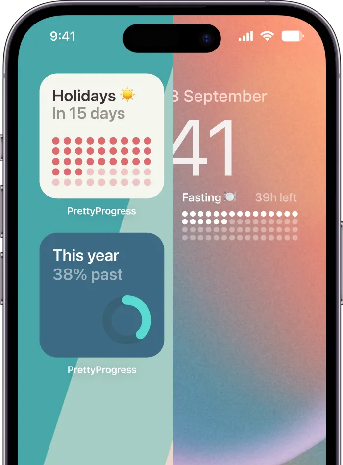
Pretty Progress distinguishes itself as a tool choice. It lets users build customizable progress widgets for Home and Lock Screens across devices, with theme styles, color adjustments, gradients, bar shapes, layout choices, and icon options. Those sound cosmetic at first, but they affect whether the goal blends into the wallpaper or keeps pulling your eye back.
Different users will care about different layers:
- Aesthetic fit: Themes such as Swiss Style, Minimal, Aqua, or Retro OS can make the widget feel like part of your phone instead of a visual interruption.
- Signal strength: Color, contrast, and bar shape change how quickly you notice the goal during a busy day.
- Personal meaning: Icons and labels can turn a generic countdown into something emotionally specific.
A widget that feels pleasant to look at has a practical benefit. You’re less likely to hide it, ignore it, or remove it after a week.
Utility tools that remove setup friction
The smaller tools matter too. Date calculators, business-day calculations, exact age tools, and fasting-related helpers reduce the annoying setup work that often slows people down before they’ve even begun.
That matters because many users drop off during the boring parts: deciding what to track, entering dates, fixing an unclear target, or rebuilding a goal after changing plans. Utility features cut through that friction.
The best support sometimes looks simple. If a tool saves you two annoying setup steps, you’re more likely to keep using it.
A good visual tracker doesn’t just make progress attractive. It makes starting easier, adjusting easier, and returning easier after a messy week.
Pretty Progress PRO Is the Upgrade Worth It
The free version makes sense for testing the method. You can see whether a visual bar on your screen changes how often you think about a goal. That’s the primary question at first. Not whether every design control is available.
The upgrade becomes relevant when you stop experimenting and start building a system around the app.

Who should stay on free
If you only want a small number of visible goals, free is probably enough to start. It’s also enough if you’re still figuring out whether progress bars motivate you more than checklists.
Free is a good fit if this sounds like you:
- You’re testing one or two goals: Maybe an exam date, reading target, or trip countdown.
- You prefer simple styling: You don’t need deep control over colors or layout.
- You want proof before paying: You’d rather build trust in the habit first.
Who will probably want PRO
PRO makes more sense when screen real estate becomes part of your planning system. If you want multiple widgets, more refined appearance control, and broader customization, the paid version solves practical limits rather than adding novelty.
The value tends to be clearer for people who think visually throughout the day:
- You track several goals at once: Work deadline, wellness target, and personal milestone.
- You care about appearance: The widget has to match your setup or you won’t keep it visible.
- You want more control: Fine-tuning themes, gradients, or layouts matters to you.
This isn’t one of those upgrades where everyone needs the premium tier immediately. If the free version changes your behavior, then PRO becomes easier to justify because you’re upgrading a system you already use.
Pretty Progress vs The Competition A Quick Comparison
A useful habit app review shouldn’t pretend all habit apps solve the same problem. They don’t. Some are built around daily streaks. Some make routines feel like a game. Others try to combine tasks, reminders, and habit logs in one place.
Independent market research projects the habit tracker app market at $8.6 billion in 2025 and $24.3 billion by 2034, a 12.2% CAGR, and ties that growth to AI-driven features like personalized goal recommendation engines, adaptive reminder scheduling, predictive relapse-risk analytics, and conversational planning interfaces, according to this habit tracker app market analysis. The broad direction is clear. Apps are moving toward more intelligent support, not just recording behavior.
That trend makes comparison more important, because “more features” still doesn’t tell you whether an app fits your motivation style. If you like seeing how AI-centered learning tools are judged by actual use case rather than hype, this AI study tool analysis offers a helpful example of how product philosophy can matter more than raw capability.
Here’s the fast version.
| App | Core Philosophy | Best For | Logging Style |
|---|---|---|---|
| Pretty Progress | Visual timelines and progress bars | Long-term goals, deadlines, and glanceable motivation | Low-interaction visual tracking through widgets |
| Streaks | Daily chain building | Routine habits you want to repeat consistently | Manual daily completion |
| Habitica | Gamification and rewards | People who want habits to feel playful | Task and habit check-ins tied to game progress |
| TickTick | Productivity plus habits | Users who want tasks and habits in one system | Checklist-based logging inside a broader planner |
The main difference isn’t which app is “better.” It’s how each one creates momentum.
If daily check-ins energize you, streak apps can work well. If you ignore apps until they’re in your face, visual widgets are often a better match.
If you want more Android-focused alternatives around goals, reminders, and visible progress, this roundup of best goal tracking apps for Android is a good companion resource.
Final Verdict and Frequently Asked Questions
If your habit systems keep collapsing after the first burst of motivation, this kind of app is worth considering. Visual progress bars change the job of the app. Instead of asking you to remember the tool, the tool stays visible enough to remind you of the goal.
That makes this approach a strong fit for visual thinkers, students with deadlines, professionals managing long projects, and anyone who gets discouraged by broken streaks. It’s less ideal for someone who wants heavy analytics, deep journaling, or a game-like reward loop. For those users, a streak tracker or gamified system may feel more natural.
If you’re still comparing options, this roundup of best habit tracking apps is useful because it shows how different tools lean toward different motivation styles rather than one universal formula.
FAQ
Can it work across different devices?
Yes. The platform is designed for iPhone, iPad, Apple Watch, Mac, and Android, with widgets as the core experience.
Is this better for habits or deadlines?
It can support both, but it’s especially intuitive for goals that benefit from a visible timeline. Deadlines, countdowns, reading plans, fasting windows, and simple daily habit cues all fit well.
Do I need the paid version to try it properly?
No. The free version is enough to test whether glanceable progress changes your behavior. Upgrade only if you want more widgets or deeper customization.
Can I use it for stopping a habit, not starting one?
Yes. You can track count-up style progress or time-based milestones, which makes it useful for “days without” goals too.
What kind of person gets the most from it?
Someone who responds to what they can see. If a hidden checklist doesn’t keep your attention, a visible progress bar probably will.
If you want a habit tool that feels less like paperwork and more like a living reminder, try Pretty Progress. Set up one meaningful goal, place the widget where you’ll see it, and give the visual method a few days to prove itself.