
August 12, 2026
Visual Project Management: A 2026 Guide for Teams
Learn visual project management with boards, timelines, and dashboards that turn scattered tasks into clear progress. A guide for pros and teams.
You’re probably looking at a screen full of tasks right now, or at least a pile of tabs, messages, and half-finished updates. One deadline is in email, another is in a chat thread, and a third only exists in someone’s head. That’s the moment where work stops feeling managed and starts feeling like a guessing game.
Visual project management is the fix for that kind of overload. It turns scattered status into something you can glance at, understand, and act on. For teams, that often means dashboards, boards, timelines, and charts that reduce the need to keep asking, “Where are we on this?”
The point isn’t decoration. It’s decision speed, shared clarity, and less mental drag. A good visual doesn’t add another layer of noise, it removes uncertainty so people can move sooner and with more confidence.
Table of Contents
- When Your Work Stops Making Sense
- What Visual Project Management Means
- The Five Core Visual Systems and When to Use Them
- Setting Up a Visual Workflow From Scratch
- Templates and Setups for Real People
- Measuring Whether Visuals Are Actually Working
- Keeping Your Visual System Honest
When Your Work Stops Making Sense
A student has three assignments due, a freelancer is toggling between five clients, and a manager is trying to reconstruct project status from scattered email threads. None of them is lazy. They’re overloaded because the work isn’t visible in one place.
The real problem is visibility
When tasks live across inboxes, spreadsheets, chat messages, and memory, the brain has to keep rebuilding the same picture over and over. That’s exhausting. It also makes simple questions feel bigger than they should, like whether a task is blocked, what’s due next, or who’s waiting on whom.
Visual project management helps because it makes the work scannable. You don’t have to hold every detail in your head if the board, timeline, or dashboard is already doing that for you. That’s why PMI defines it as presenting project-related information in a visual, often graphical form to improve clarity, visibility, and understanding of scope and operations, which fits modern project environments that are data-heavy and time-sensitive (PMI).
A good visual reduces the number of follow-up questions people need to ask.
That matters emotionally as much as operationally. When someone can glance at a screen and see what’s moving, what’s stuck, and what needs attention, the work feels lighter. It’s easier to start, easier to explain, and easier to trust.
Why this guide treats visuals as decision tools
A board that looks tidy but doesn’t help anyone decide is just wallpaper. A good visual is more like a dashboard in a car. It doesn’t tell you every internal detail, but it gives you the one or two signals you need to act safely.
That’s the lens used throughout this article. Each visual earns its place by helping a specific person make a specific decision, quickly and with less confusion. The better question isn’t “What chart should I use?” It’s “What should someone know and do after looking at this for ten seconds?”
What Visual Project Management Means
Visual project management means translating project information into a form people can understand quickly. PMI’s framing helps keep the idea grounded, because the point of a visual is to improve clarity, visibility, and understanding of scope and operations, not to make a board look busy or clever (PMI).
One visual, one decision
The strongest rule is simple. Each view should encode one decision variable. If a chart tries to answer too many questions at once, it stops being a tool and starts becoming clutter.
Microsoft’s guidance for large programs makes that logic concrete, because it pairs different visual constructs with different decision problems, such as funding selection, resource over-allocation, at-a-glance status, risk concentration, and task overlap scanning (Microsoft). That is the mental model to keep in mind. A waterline is not trying to do the job of a Gantt chart, and a risk matrix should not pretend to be a delivery timeline.
A helpful way to read a visual is this. A visual is a lens, not wallpaper. A lens narrows the picture so the right thing becomes obvious.
Why dashboards replaced spreadsheet rituals
As project governance matured, teams needed faster ways to understand what was happening across more work, more people, and more dependencies. The move from static spreadsheets to graphical controls was not a style trend. It was a response to complexity.
That shift also became easier because the software ecosystem grew around it. Industry summaries place the global online project management software market at USD 5.6 billion in 2023, with projected growth to about USD 11.4 billion by 2032, implying an 8.4% CAGR over that period (Market.us summary). Another overview places the market at $9.76 billion in 2025 and projects $23.09 billion by 2030, with a 15.42% CAGR (Market.us summary). The exact estimate depends on methodology, but the direction is clear. Digital tools made visual reporting scalable.
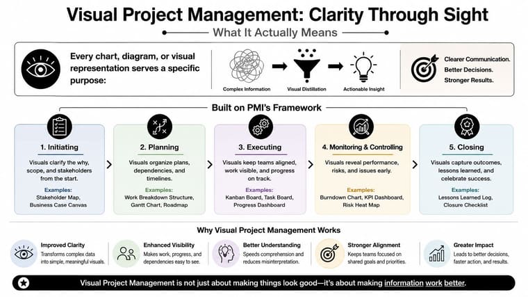
The practical takeaway is simple. Start with the decision. Then choose the visual that makes that decision faster, not harder.
The Five Core Visual Systems and When to Use Them
Different visuals solve different problems, and that’s where many teams get confused. A Kanban board, a timeline, a Gantt chart, a progress bar, and a dashboard can all be useful, but they’re not interchangeable. Each one answers a different question.
Match the visual to the question
A Kanban board answers what is in motion and what is blocked. It works best when people need to see flow, constraints, and work-in-progress at a glance. A timeline answers what happens when, which helps when the main problem is sequencing or date awareness. A Gantt chart answers what depends on what, which is why it’s so useful when tasks overlap or when one delay can move everything else.
A progress bar answers how far along we are. That makes it ideal for a single deadline, milestone, or personal goal. A dashboard answers whether the project is healthy overall, which is why executives and portfolio leads use it for broad status.
If the visual can’t tell the viewer what to do next, it needs to be simplified.
Microsoft’s portfolio-level guidance also maps well here. Their five high-value constructs include waterline, heatmap, portfolio indicators, risk matrix, and Gantt chart, because each one supports a different decision lens in larger programs (Microsoft). That’s the same principle at a bigger scale. One visual, one decision.
Matching Visual Systems to Decisions
| Visual | Core Decision | Required Data | Best Stakeholder |
|---|---|---|---|
| Kanban board | What’s blocked or moving | Task status and workflow stages | Delivery team |
| Timeline | What happens when | Dates and milestone order | Client, coordinator, manager |
| Gantt chart | What depends on what | Start and end dates, dependencies | Project manager, program lead |
| Progress bar | How far along are we | Current progress against a target | Individual owner, stakeholder |
| Dashboard | Is the project healthy overall | Summary KPIs and status signals | Executive, PMO, leadership |
The data model matters as much as the chart. A Gantt chart requires task start and end dates plus dependencies. Bullet charts need actual, target, and threshold ranges. Gauge charts need a current value against a max. Stacked bars need category subtotals. Funnel charts need stage counts or values (CleanChart). If the inputs are fuzzy, the visual will be fuzzy too.
For a broader overview of timeline choices, Madeira Remote recommends these tools, and it’s a useful way to compare options before you pick a structure. If you want a focused primer on timelines specifically, this project timeline visualization guide is a helpful companion.
Setting Up a Visual Workflow From Scratch
A workable setup doesn’t need a huge rollout. It needs a clean first pass. The fastest path is to name the project, list the tasks with start and end points, group them into workflow stages, and choose the smallest set of visuals that answers the decisions people need to make.
Start with the work, not the software
First, write the project name at the top of the page or board. That sounds obvious, but it keeps the system anchored. Then list every task in plain language, including a start point and an end point. Vague entries like “work on launch” are hard to manage, while clear entries like “draft landing page copy” or “review final deck” can move through a board without confusion.
Next, group the tasks into columns or phases that reflect reality. Use the actual path work follows, not the path you wish it followed. If approval sits between drafting and publishing, it needs a place on the board.
Build the board from the workflow that already exists, then improve it.
Keep the setup light on every screen
On a phone, focus on one glanceable view. A Lock Screen or Home Screen widget is enough for deadlines, milestones, or progress toward a single date. A tool like Pretty Progress fits here because it shows countdowns and progress toward a specific date in a widget, which is useful when you want the next deadline visible without opening an app. It can also sync and import Apple Calendar events and Reminders, then display them in Home Screen, Lock Screen, Standby, and Mac widgets.
On a tablet, use the larger screen for a team board or a split view. One side can show the main workflow, while the other shows notes, files, or a milestone tracker. On a desktop, keep the dashboard visible during the day so people can scan it between meetings. Shared boards work best when the team can update them without hunting through tabs.
The setup path can stay simple:
- Name the project.
- List tasks with clear start and end points.
- Group work into stages that match the workflow.
- Add only the visuals that answer a decision.
If your team manages multiple deadlines, this multiple project tracking guide can help you keep the setup from turning into clutter. The goal is a system you can maintain in under an hour, not a perfect architecture you’ll never finish.
Templates and Setups for Real People
One of the fastest ways to make visual project management useful is to stop treating every user the same. A student, a client-facing professional, a habit builder, and a neurodiverse user don’t need identical boards. They need layouts that fit their attention, context, and decision style.
Four practical setups
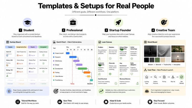
A student can use Kanban columns based on class flow, not generic status labels. Try Classes, Assignments Due, Exams, and Completed. That structure keeps the board tied to real deadlines and helps separate short-term homework from high-stakes test prep.
A professional managing client deliverables often needs a Gantt chart plus a small dashboard. The timeline handles dependency and due-date logic, while the dashboard gives a quick read on overall health. That works well when one delay can affect several people, especially in client services, agencies, or internal operations.
A habit builder usually needs something quieter. Progress bars work well for daily streaks, training plans, or long-term milestones because they keep the goal visible without asking for a full project board. This is also where a visual reminder on a Home Screen or Lock Screen can be more effective than another app you have to open.
A neurodiverse user often benefits from fewer signals, fewer colors, and fewer competing cards. Use clear color coding, strict work-in-progress limits, and generous deadlines. Low-stimulus boards reduce the chance that the system itself becomes another source of overload.
The right setup lowers the effort needed to re-orient yourself after every interruption.
The infographic below shows how different project types map to different visual formats.
For deadline-driven setups, this project deadline tracker guide is a natural fit alongside a board or timeline, especially when you want one recurring visual cue for the dates that matter most. The video below shows a related workflow in action.
Measuring Whether Visuals Are Actually Working
A visual system only matters if it improves how people work. The cleanest way to check is to look at flow metrics and decision timing, not just how tidy the board looks. If the board is busy but nothing finishes, or if the dashboard is always updated but never trusted, the system is failing.
The metrics that tell the truth
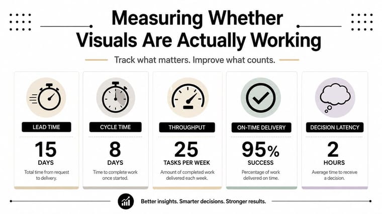
Useful measures include lead time, cycle time, throughput, on-time delivery, and decision latency. Lead time shows how long work takes from request to completion. Cycle time shows how long it takes once work is in motion. Throughput shows how much gets finished in a given period. On-time delivery shows whether commitments are being met. Decision latency is the time between a status change and stakeholder action.
The point isn’t to create a scoreboard for its own sake. It’s to see whether the visual helps people act faster. If a Kanban board makes bottlenecks visible but no one talks about the bottleneck, the board is just a mirror.
A few warning signs matter. A board can look full while nothing is moving to done. A dashboard can update so often that trust drops. And a metric can feel precise while hiding a workflow problem. That’s where visual confidence turns false.
Standardize what everyone needs, localize what teams need
A useful rule is to standardize the metrics that leadership needs for comparison, then let teams adapt the rest to their workflow. Global standards help the organization read across projects. Local flexibility helps the people doing the work keep the system useful instead of ceremonial.
The broader implementation challenge is real. Independent research on visual communication in engineering points to barriers such as lack of training, resistance to change, and high cost, which helps explain why adoption doesn’t automatically produce better execution (Businessmap). Visuals work best when teams are taught how to use them, not just handed a template.
Keeping Your Visual System Honest
The best visual systems don’t stay complicated. They stay useful. That usually means fewer views, cleaner ownership, and a steady habit of removing what no longer helps.
A short maintenance rulebook
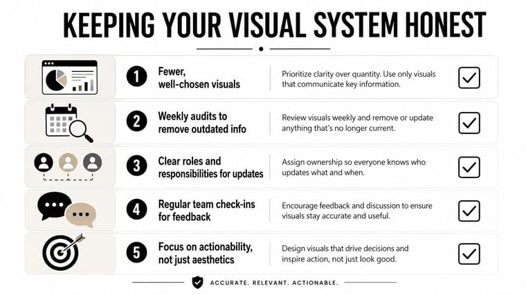
- Fewer, well-chosen visuals: Keep only the views that answer a named decision. If a chart doesn’t support action, it probably doesn’t belong.
- Weekly audits to remove outdated info: Stale cards, old dates, and dead projects reduce trust fast.
- Clear roles and responsibilities for updates: Someone needs to own each column, board, or dashboard, or it will drift.
- Regular team check-ins for feedback: Ask the people using the view what’s unclear, not just what looks nice.
- Focus on actionability, not just aesthetics: If the visual doesn’t point to a next step, it’s decoration.
That last point is often overlooked. The strongest move is often deleting a chart, not adding one. A crowded board can feel productive while making decisions slower.
Ask one question before you keep any view. What should a stakeholder be able to do in ten seconds after looking at this, and does the visual make that action obvious?
Pretty Progress turns deadlines, milestones, and progress into glanceable widgets for iPhone, iPad, Apple Watch, Mac, and Android, so your most important dates stay visible without extra app checking. If you want a simple way to keep project timelines and personal goals in sight, visit Pretty Progress and see how a clean visual reminder can fit alongside the workflow you already use.





