May 10, 2026
Project Timeline Visualization: From Gantt to Widgets
Learn project timeline visualization essentials. Compare Gantt charts, PERT, and progress bars to track professional projects and personal goals effectively.
You probably have a deadline floating in your head right now.
Maybe it’s a product launch with too many moving parts. Maybe it’s an exam date, a client handoff, or a personal goal that felt far away a month ago and suddenly feels close. The stress usually isn’t just the work itself. It’s the fog. You know there are tasks, dependencies, milestones, and risks, but they’re all scattered across notes, chats, calendars, and your memory.
That’s why project timeline visualization matters. It turns time from something abstract into something you can see. And once you can see it, you can plan it, adjust it, and act on it with less friction.
Most articles stop at enterprise tools. They explain Gantt charts, mention PERT charts, and assume your world looks like a conference room wall full of sticky notes. Real life is broader than that. The same ideas that help a team run a product launch can also help one person stay on track for an exam, a fitness goal, or a big life date. The shape changes. The principle doesn’t.
Table of Contents
- Why Visualizing Time Changes Everything
- The Four Main Types of Timeline Visualization
- How to Choose the Right Visualization for Your Goal
- Design Principles for Clean Glanceable Timelines
- From Pro Projects to Personal Progress How to Implement
- The Future Is Visual and Personal
Why Visualizing Time Changes Everything
A list tells you what exists. A timeline tells you what matters now.
That difference is huge. When work lives as bullets in a doc or cards in a backlog, you can miss sequence, overlap, and pacing. A timeline lays tasks out on a time axis, so you can spot what starts first, what depends on something else, and where the pressure points sit.
Research on project management visualization notes that organizations using visual timeline tools such as Gantt charts, burndown charts, and dashboards see measurable improvements in operational efficiency and reduced project costs through better resource allocation and error avoidance in this overview of data visualization in project management. That result makes sense. People make better decisions when the schedule is visible.
Why your brain responds better to a picture
Time is slippery when it stays verbal.
“Design ends in two weeks” sounds clear until three related tasks also need approval during that same window. “I have plenty of time before the exam” feels comforting until a simple visual shows how few study blocks remain. A timeline removes that illusion by giving time a shape.
Practical rule: If a project feels vague, don’t add more text first. Draw the sequence.
Visual timelines also create a shared reference point. A manager, designer, student, or client can all look at the same line, bar, or milestone and understand the current state faster than they can from a status paragraph. That’s one reason dashboards have become such a common layer in project work. They bring progress, risks, resource allocation, and key indicators into one visual surface.
Clarity changes behavior
Seeing time doesn’t just help with planning. It changes how people act.
When a task bar is slipping, teams discuss tradeoffs earlier. When a countdown is visible every day, people stop treating a deadline like a distant idea. A good timeline shifts work from reactive to proactive. You stop asking, “What happened?” and start asking, “What needs attention before this becomes a problem?”
That’s true in a product team. It’s also true in personal productivity. The visual might be simpler, but the effect is the same. You’re making time legible.
The Four Main Types of Timeline Visualization
Some timelines are built for execution. Others are built for explanation. Others are built for motivation.
It helps to think of them like different kinds of travel maps. One map shows the full driving route with every turn. Another shows how roads connect. Another only marks major destinations. Another just tells you how far you have left.

Gantt charts as the working schedule
A Gantt chart is often the first timeline visualized. Tasks appear as horizontal bars placed against dates. You can see start dates, end dates, overlap, and often progress inside each bar.
This format is great when you need to manage real work over a calendar. If design runs from Monday to Friday and development starts after design approval, a Gantt view makes that relationship obvious. It’s especially useful when several tasks happen at once and you need to track progress week by week.
According to Adobe’s guide to project timelines, Gantt charts focus on task timelines and progress tracking using single-point estimates, while PERT charts focus on task dependencies and overall project duration using optimistic, pessimistic, and most likely estimates. That’s the cleanest way to separate them.
PERT charts as the logic map
A PERT chart is less about calendar display and more about sequence and dependency.
Instead of bars stretched across dates, you get nodes and connecting lines. This makes it easier to answer questions like: Which task enables the next one? Where is the critical path? Which steps have no slack?
PERT is useful when uncertainty is high or when the logic of the work matters more than the weekly schedule. Think research projects, new product development, or any initiative where one blocked decision can affect everything downstream. If you need a stronger grasp of dependency-heavy planning, especially to manage complex service provider workflows, precedence thinking pairs naturally with this kind of view.
Roadmaps and milestone views as the big picture
Not every audience needs task-level detail.
A roadmap or milestone chart works when you need to communicate major phases rather than every subtask. This is the version you show stakeholders who care about direction, not daily task mechanics. It says, “Research in March, prototype in April, testing in May, launch after approval.”
These formats reduce clutter. That’s their power. They help teams talk about priorities, sequence, and outcomes without drowning in implementation details.
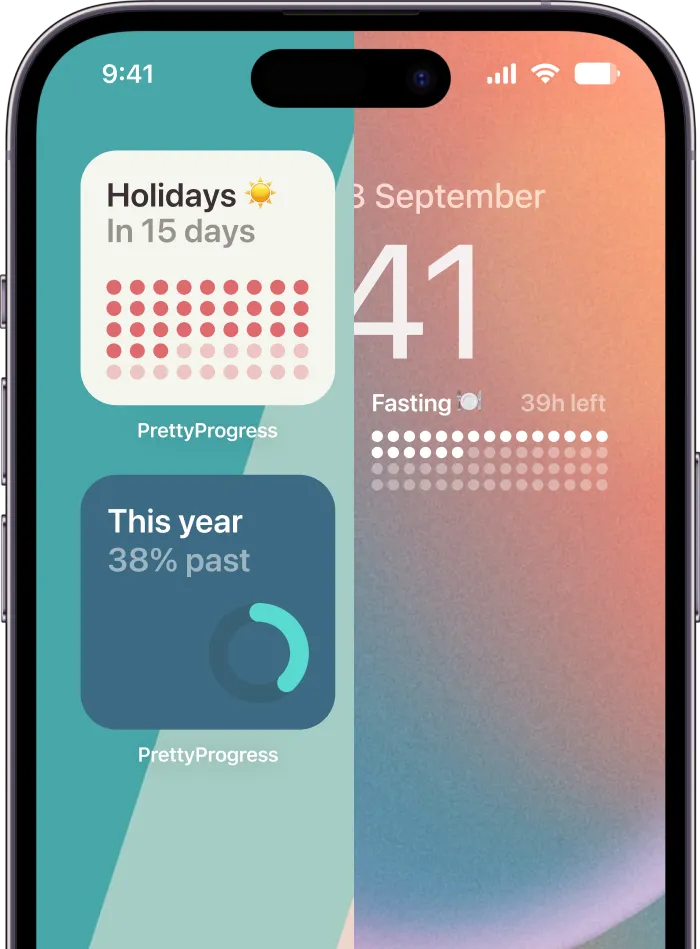
Progress bars and countdowns as personal timeline tools
For individual goals, a full project chart can be too much.
If you’re tracking exam prep, a habit streak, a trip, a fasting window, or a deadline for an application, the most useful timeline might be a progress bar or countdown. It doesn’t explain every dependency. It answers a more immediate question: “How close am I?”
That’s why these simpler visuals are so effective in personal contexts. They’re not trying to run a department. They’re trying to keep one person oriented and motivated throughout the day.
Here’s a simple comparison:
| Visualization Type | Best For | Key Feature | Complexity |
|---|---|---|---|
| Gantt Chart | Scheduling tasks across a calendar | Horizontal bars showing duration and progress | Medium |
| PERT Chart | Mapping dependencies and critical path | Nodes and arrows showing sequence | High |
| Roadmap or Milestone View | Communicating phases and key dates | Focus on major checkpoints | Low to medium |
| Progress Bar or Countdown | Personal deadlines and habits | Fast read on time remaining or completion | Low |
A good timeline doesn’t show everything. It shows the next useful truth.
How to Choose the Right Visualization for Your Goal
People often pick a timeline format too early. They choose the chart that looks professional instead of the chart that answers the actual question.
The better move is to start with the problem. Are you trying to coordinate a team? Diagnose dependencies? Report progress to stakeholders? Stay motivated for a personal deadline? Different jobs need different visuals.

Start with the kind of question you need to answer
If your main question is “When does each task happen?”, use a Gantt-style view. You need dates, overlap, and a visible schedule.
If your question is “What depends on what?”, use a PERT chart or another dependency map. That’s the right tool when sequence matters more than presentation.
If your question is “How do I show the plan?”, use a roadmap or milestone timeline. Executives, clients, and collaborators usually need fewer details than the working team.
If your question is “How do I keep this goal top of mind?”, use a progress bar or countdown. For many personal goals, that’s the most honest answer.
When simple beats detailed
A lot of timeline advice misses the motivational side of visuals. Content in this area often focuses on structure and planning, but it rarely explains why progress bars and countdowns work so well for individuals. The key idea, noted in this discussion of project timeline gaps and personal motivation, is that micromoments of visual feedback create behavioral reinforcement that traditional project tools often overlook.
That matters if you’re studying, building habits, or balancing multiple deadlines alone. A detailed chart may be accurate, but it won’t necessarily help you act. A glanceable visual often will.
A useful rule of thumb:
- Choose complexity only when the work demands it. If dependencies, resource conflicts, or multiple owners can derail delivery, use a richer project view.
- Choose visibility when consistency is the challenge. If the hard part is remembering, pacing, or staying engaged, use a simpler visual that stays in sight.
- Choose communication fit. The same project may need one timeline for the team and another for everyone else.
If you’re juggling several moving parts and want a more practical framework for organizing them, this guide on how to keep track of multiple projects is a helpful companion.
The best timeline is the one that changes what you do next.
Design Principles for Clean Glanceable Timelines
Bad timelines fail in a specific way. They make time visible, but they make meaning harder to see.
A clean timeline doesn’t need decoration. It needs hierarchy. The eye should know where to look first, what the colors mean, and which signals deserve attention. That applies whether you’re building a project dashboard or a tiny phone widget.

Use color and layout with intention
Color is one of the fastest ways to encode status. But it only works if the system stays consistent. If red means risk in one place and completion in another, users hesitate. Once they hesitate, the timeline stops being glanceable.
Empirical evaluations summarized by Office Timeline’s overview of visualizing data found that users process well-designed visual timelines with features like color-coding 20–35% faster than tabular data when identifying schedule conflicts or resource overloads. The speed comes from smart design, not from adding more elements.
Three design habits make the biggest difference:
- Limit the palette. Use a small set of purposeful colors, such as one for planned work, one for active work, and one for risk.
- Reduce label load. Put text only where it helps a decision. Repeating dates, task names, and legends everywhere creates friction.
- Strengthen contrast. If someone has to squint to decode the timeline, it won’t work at a glance.
Choose the right visual structure
Not every timeline should be a single row of tasks.
Parallel timelines help when you want to compare separate but related tracks on one shared time axis. A product team might compare marketing prep, engineering delivery, and QA readiness side by side. A student could compare revision plans for several subjects in parallel bands.
Stacked timelines are useful when multiple contributors add up to one total picture. They show both the individual parts and the cumulative effect. That works well for budget categories, workload by department, or several streams contributing to one deadline.
Overlaid timelines place multiple signals on the same axis so you can spot relationships. They’re best when correlation matters more than separation.
For cleaner visual goal tracking ideas in smaller formats, this article on visual goals shows how simple visual cues can stay readable without losing emotional pull.
Keep the signal close to the decision. If a viewer needs to decode the layout first, the design is doing too much.
A final test helps. Hide the labels for a moment and look only at shape, spacing, and color. If the timeline still tells a clear story, the structure is strong.
From Pro Projects to Personal Progress How to Implement
Most people don’t need a perfect timeline. They need one that works by tonight.
The easiest way to build that is to match the method to the scale. A team project needs structure. A personal goal needs persistence. Both rely on the same core idea: make time visible in a form you will use.

A simple professional timeline
Say you’re planning a small website launch, a course project, or an internal campaign.
Start with a short task inventory. Keep it plain: research, draft, review, build, test, publish. Then ask four questions in order.
-
What are the major milestones?
Pick the moments that define progress, such as approval, prototype complete, or launch ready. -
Which tasks depend on others?
If testing can’t begin until development finishes, mark that clearly. -
How long does each task likely take?
Use your best estimate, then sense-check it with the people doing the work. -
What should people see at a glance?
Team members may need a detailed Gantt view. Stakeholders may only need milestones.
If the project has multiple owners, one shared timeline is worth the effort because it exposes overload, idle gaps, and timing conflicts before they become expensive in time or trust.
A simple personal progress setup
Now take a different example. You’re preparing for an exam, training for a race, counting down to a move, or tracking a habit streak.
A traditional project chart often feels too rigid here. Personal goals usually involve uncertainty, changing energy, and partial completion. That’s why broader planning frameworks can be a poor fit. As discussed in this piece on planning beyond Gantt charts, there’s a real gap in visualizing personal timelines where persistent visual representation shows not just the deadline, but the psychological proximity to it.
For personal goals, try this lighter process:
- Choose one anchor date. This is the exam, event, deadline, or finish line.
- Pick your unit of progress. Days remaining, percentage complete, sessions done, or streak length.
- Make the visual persistent. Put it somewhere you’ll naturally see it often.
- Keep the message emotional as well as practical. “12 study sessions left” often works better than a dense task map because it feels immediate.
If you’re planning something with both fixed dates and lots of moving pieces, this guide to an event planning timeline shows how to keep the structure manageable.
A professional timeline answers, “How do we coordinate the work?” A personal timeline often answers, “How do I stay connected to the goal?” Both are valid. They just solve different problems.
The Future Is Visual and Personal
Project timeline visualization is moving in two directions at once.
One direction is toward smarter professional tools. Teams increasingly expect timelines to do more than sit there. They want dashboards that surface risk, clarify resource allocation, and help them compare planned versus actual progress over time. That shift makes project management less about static reporting and more about active decision support.
The other direction is smaller, quieter, and in some ways more interesting. Time tracking is becoming ambient. Instead of opening a project tool on purpose, people now rely on visuals that live around them through the day. A lock screen countdown, a watch complication, a slim progress bar on a desktop, or a simple bar tied to a habit can keep goals mentally available without demanding a full planning session.
That matters because not every timeline problem is an enterprise problem. Many are personal attention problems. You don’t always need more features. Sometimes you need a better visual cue in the right place.
The deeper idea stays the same across both worlds. Good timeline design helps people answer three questions quickly:
- Where am I now?
- What’s coming next?
- Am I on track?
When those answers are obvious, stress drops. Decisions get faster. Progress feels real.
Project timeline visualization started as a management tool, but it’s become something broader. It’s a way to make time concrete. For a large team, that might mean dependencies, milestones, and resource planning. For one person, it might mean a single clear bar that turns a distant goal into something visible every day.
If you make time visible, you make action easier.
If you want a simple way to turn deadlines, life events, and long-term goals into glanceable progress bars and countdown widgets, Pretty Progress makes that easy across iPhone, iPad, Apple Watch, Mac, and Android. It’s a clean way to keep important timelines visible all day, without the clutter of a full project management tool.