
July 25, 2026
Visual Time Management: See Your Schedule in 2026
Master visual time management with practical techniques like progress bars and time blocks to make your day visible and productive.
You’re staring at a list that looks reasonable on paper. The problem is that every item hides a time guess, and the guesses are usually wrong in the same direction. That’s why the day feels busy, the checklist keeps shrinking slowly, and the important thing you meant to finish is still sitting there at 4:30 p.m.
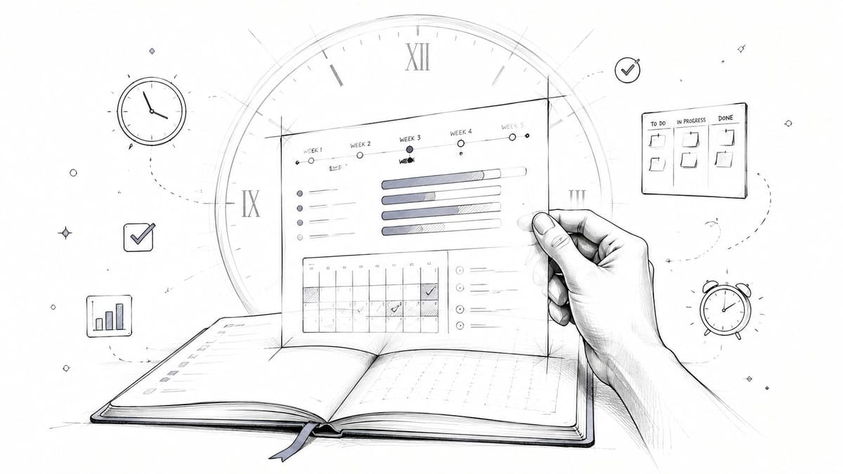
Visual time management fixes that gap by making time visible instead of assumed. A timer, a block on a calendar, a progress bar, or a board with clear status cues turns “I think I can do this today” into something you can inspect. The shift matters because you stop managing tasks from memory and start managing them against a plan you can see.
Table of Contents
- Why Your To-Do List Keeps Failing You
- The Science Behind Seeing Your Time
- Comparing the Core Visual Time Management Techniques
- Building Your Visual Time Management System Step by Step
- When More Visual Structure Becomes Too Much
- Real-World Use Cases for Pretty Progress
- Best Practices to Keep Your Visual System Working
Why Your To-Do List Keeps Failing You
You open your task list, and it looks clean enough. Reply to three clients. Finish the slide deck. Book the appointment. Buy groceries. The list is neat, but it’s missing the one thing your brain keeps asking for, how long each item will take.
That’s where text-based planning breaks down. A checklist tells you what exists, but it doesn’t show time, sequencing, or overload. If every item looks equally possible, you end up treating a ten-minute task and a two-hour task like they belong in the same mental bucket.
Time feels invisible until you make it visible
Visual time management is the habit of turning time into something you can see at a glance. That might be a calendar block, a countdown timer, a timeline, or a progress bar that moves as work moves. The point isn’t decoration, it’s clarity.
When time is visible, you can answer better questions. What fits before lunch? What needs uninterrupted focus? What’s already at risk of slipping? A plain list can’t answer those questions without extra mental work.
This is why people often feel productive while still missing deadlines. They’re finishing tasks, but they’re not comparing the actual pace of work against the time left. A visual system makes that comparison automatic.
Practical rule: if a task has a real deadline, it needs a visual signal, not just a bullet point.
If you’re trying to break the pattern of endless procrastination, a visual system works best when it’s part of a larger reset, not a standalone trick. This guide on how to stop procrastinating fits that mindset well because it treats behavior as something you can change through structure, not willpower alone.
The Science Behind Seeing Your Time
A workday gets harder to manage when time is only a feeling. You keep asking yourself how long a task has taken, whether you are still on track, and what can fit before the next interruption. Visual cues cut down that constant guessing, so your brain spends less energy on bookkeeping and more energy on the work itself.
The Pomodoro Technique became widely known because it made time concrete in a simple, repeatable way. A 25-minute work interval followed by a 5-minute break gives effort a shape you can see and repeat, which is easier to follow than an abstract intention to “focus better.” The University of Pennsylvania also recommends dividing the day into blocks and placing tasks into visible calendar slots University of Pennsylvania learning resource. That approach keeps the estimate in view, not just the task.
Why the timer matters more than the list
A timer shows remaining time, while a to-do list only shows remaining work. That difference changes pacing. A person who can see the clock is more likely to start on time, notice drift sooner, and make a cleaner decision about whether to continue, pause, or switch tasks.
Education guidance on visual timers recommends keeping the display clearly visible, beginning with short intervals, giving warnings as time runs down, and ending with a predictable next step Texas Education Agency visual timer guidance. That advice works beyond classrooms because it removes the need to keep checking time in your head. The timer becomes a shared reference point between intention and action.
The same problem shows up in busy workdays. One industry summary reports that workers spend a large share of their time checking email, waste time every day, and lose time searching for information visual planning statistics summary. Those patterns explain why invisible plans fail so often. If attention is already being split by messages, interruptions, and information search, then a plan that lives only in memory is easy to misjudge.
Visual cues lower mental friction
The main benefit is cognitive. A visible clock stops you from reconstructing the same estimate over and over. That is why countdowns, progress bars, and time blocks often feel calmer than holding the plan in your head.
Visual systems do more than show time. They reduce the effort of checking it.
They also make transitions easier. When a timer ends and the next action is already visible, you do not have to spend extra mental energy deciding what comes next. That is one reason some visual systems feel supportive while others feel noisy, especially when the display is crowded or the rules are unclear.
For people who want a lighter external cue system, visual reminders for ADHD is a useful companion idea. It keeps the focus on outside signals instead of constant self-correction, which is often the difference between a visual setup that helps and one that becomes another source of clutter.
Comparing the Core Visual Time Management Techniques
Not every visual tool solves the same problem. A progress bar is useful when you care about momentum. A countdown timer helps when the deadline is immediate. A timeline makes sequencing easier. A Kanban board helps you see work flow. A calendar is best when you need to protect time blocks.
The mistake is assuming one format can do all of it. If you’re planning a project launch, a calendar alone may hide dependencies. If you’re trying to finish a short writing sprint, a board may be too much structure for too little work. The right tool depends on what you need to see.
| Technique | Best For | Cognitive Load | Setup Effort | Ideal User |
|---|---|---|---|---|
| Progress bars | Long-term goals, habit streaks, waiting periods | Low | Low | People who want steady motivation |
| Countdown timers | Deadlines, focus sprints, transitions | Low to medium | Very low | Anyone who needs urgency without clutter |
| Timelines | Multi-step projects, sequencing, dependencies | Medium | Medium | Project planners and teams |
| Kanban boards | Task flow, work in progress, stage tracking | Medium | Medium to high | People juggling many active items |
| Visual calendars | Time blocking, appointments, weekly planning | Medium | Low to medium | Students, professionals, and schedulers |
Choose by the kind of mistake you make
If you underestimate duration, use a timer or calendar block. If you lose track of progress, use a bar. If you forget what comes next, use a timeline. If too many tasks stay “in progress” forever, use a board.
A project timeline works especially well when you need to see order, not just dates. A focused explainer like project timeline visualization can help you understand how dependencies become visible instead of buried in a list.
Rule of thumb: the more moving parts a task has, the more your visual tool should show sequence.
The safest starting point is usually the simplest one. Many people don’t need a full system on day one, they need one visible cue that matches the way they already think. If your day is driven by deadlines, a calendar is enough. If your day is driven by focus sessions, a countdown is enough.
The point isn’t to collect tools. It’s to match the tool to the decision you’re trying to make faster.
Building Your Visual Time Management System Step by Step
A visual system starts with a simple question. What kind of time are you trying to manage, a deadline, a work block, a habit window, or a project phase? Each one needs a different kind of signal. If you pick the tool before you know the target, the result looks organized but does not help you decide faster.
Start with the most visible format you can live with. A deadline can sit in a widget. A daily writing block can sit in a timer. A multi-step project can sit in a timeline. If you use a comparison resource like Simply Tech Today’s software breakdown, use it to narrow options, not to build a system with more layers than you need.
Build the feedback loop, not just the display
The useful version of visual time management happens when the display teaches you something. The government handbook on time management recommends logging activities in 24-hour increments, while recent ADHD and time-blindness guidance recommends recording actual task durations and leaving extra room before deadlines government time management handbook. That pairing matters because it turns your tracker into a comparison tool. You are not only seeing time. You are checking how your estimate held up against what happened.
Start simple.
- Identify the deadlines that matter most. Put only the items with real consequences into your first visual layer.
- Choose one visual format for each kind of task. Use a calendar for dates, a timer for focus blocks, or a progress bar for a goal that unfolds over time.
- Create the tracker. Add the widget, board, or calendar block where you will see it without opening another app.
- Review the actual duration. Compare your estimate with the actual duration of the task.
- Revise the next estimate. The system improves only when the display changes future planning.
That final step is often skipped. People build the dashboard, like the dashboard, and leave the estimate untouched. The visual part matters, but the correction part is what makes the system smarter. If you never adjust your guess, the tracker becomes a record of missed expectations instead of a tool for better planning.
Keep the review short and repeatable
A good review does not need a meeting. It needs a habit. A quick morning glance can show what is overdue, what comes next, and what needs to stay protected.
Best practice: do not ask, “What do I feel like doing?” Ask, “What does the visual say is next?”
That question matters because it shifts planning away from mood and toward evidence. Over time, the pattern becomes clearer. Some tasks take longer than expected. Some only look small on paper. Once you see that, your estimates start to change, and the system stops being a pretty dashboard and starts acting like a feedback loop.
A visual setup does not have to be expensive or complicated to work. It only has to make the next decision easier than guessing.
When More Visual Structure Becomes Too Much
It’s easy to assume that more color, more labels, and more alerts will make a system better. For some people, they do. For others, they create a second layer of work, one that’s supposed to reduce overwhelm but ends up adding it.
That’s especially important for ADHD and time-blindness users. One ADHD-focused guide recommends limiting palettes to 4–7 colors and adding only modest buffers and transition blocks ADHD visual planning guidance. That restraint matters because every extra category, icon, or notification asks the brain to do more sorting.
Minimal and rich systems solve different problems
A minimal system works when attention is already fragile. It gives you one cue to trust. A richer system works when you need to coordinate several moving parts and the extra structure reduces errors.
The risk is confusing more decoration with more usefulness. A board with too many columns can slow you down. A calendar packed with colors can become hard to read. A timer layered with too many notifications can feel like another demand instead of a support.
That’s where multimodal alerting helps. The open-source iOS app vashTimer supports four notification channels, visual, auditory, speech, and haptic, and lets users define up to three alert intervals in one session and save presets vashTimer technical note. The important idea isn’t the app itself, it’s the design principle. You can layer cues without crowding the screen.
If the system makes you check it more often than it helps you act, it’s too busy.
A useful self-test is simple. If you feel calmer when you look at your schedule, the visual load is probably right. If you feel irritated before you even start, the structure may need to be stripped back. The goal is not a prettier dashboard, it’s a usable one.
Real-World Use Cases for Pretty Progress
A student with exam dates on the calendar doesn’t usually need a full project board. They need one glanceable countdown that says how much time is left and what matters next. A progress widget on the Lock Screen can do that without forcing them to open a planning app five times a day.
A professional managing a product launch or client deadline often wants the same thing in a different place. A Home Screen widget keeps the deadline visible between messages, meetings, and documents, so the project doesn’t disappear behind the inbox. That kind of persistent cue is useful because it keeps time in the room, even when work gets fragmented.
For habit builders, the visual language changes a little. A fasting window, a workout streak, or a year-long goal becomes easier to follow when progress is visible instead of implied. A progress bar gives that goal a shape, which makes it easier to return to after interruptions.
Pretty Progress is one option in that category. It lets users create customizable countdown and progress widgets for iPhone, iPad, Apple Watch, Mac, and Android, with styles and layouts that stay readable at a glance.
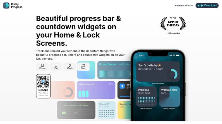
Built for glanceable reminders, not setup fatigue
That matters for people with ADHD too, because the value is in making time easier to see, not in making the interface busier. A calm widget can function like a small external cue that’s always available, which is often more useful than another app you have to remember to open.
The best use case is the one that fits into real life without demanding a new routine. A countdown for a trip. A progress bar for the remaining year. A visual reminder for an important deadline. Those are simple, but they’re effective because they keep time visible where you live.
Best Practices to Keep Your Visual System Working
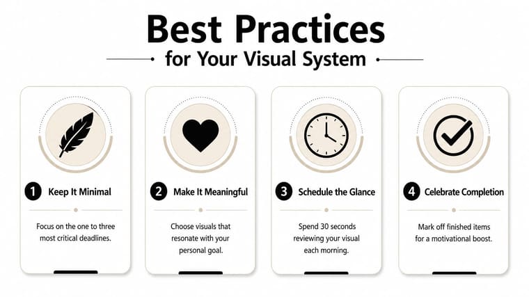
Keep the system small enough to trust. Pair every visual countdown with a quick estimate check so the display improves your planning instead of just decorating it. Use layered alerts only when they reduce misses, not when they add noise.
A weekly review keeps the whole thing honest. Remove visuals that no longer matter, adjust the ones that slipped, and keep the few cues that still change your behavior. Visual time management works when it stays tied to reality.
If you want a simpler way to keep deadlines visible, Pretty Progress gives you countdown and progress widgets you can place on your iPhone, iPad, Apple Watch, Mac, or Android home screen. Visit Pretty Progress to set up a glanceable system that keeps your time visible, your goals in view, and your estimates honest.





