

September 23, 2026
Time Management Widget Setup That Actually Works
Build a time management widget that genuinely helps you focus. Step-by-step setup, styling tips, and workflows for students, pros, and ADHD brains.
You open your phone to check one message and lose ten minutes. The deadline is still somewhere in your calendar, the task list has grown, and your home screen is crowded with reminders you’ve trained yourself to ignore. Adding another widget won’t fix that. A time management widget works only when it gives you one useful cue quickly enough to change what you do next.
My recommendation is simple: build one widget around the priority you most need to remember this week. Not five countdowns. Not a miniature dashboard. One visible anchor that tells you what matters, how much time remains, and what deserves your next action.
Table of Contents
- What a Time Management Widget Is For
- Picking the Right Widget Type in Pretty Progress
- Configuring Dates and Design for Glanceability
- Why One Widget Beats a Stack of Them
- Setup Workflows for Students, Professionals, and ADHD Brains
- PRO Moves That Make the Widget Disappear Into Your Day
- Troubleshooting Widgets You Stop Glancing At
What a Time Management Widget Is For
A time management widget isn’t a generic timer pasted onto your home screen. It’s a visual anchor for one priority. The useful question isn’t “How many things can I display?” It’s “Which single fact should influence my next glance?”
Pretty Progress makes that decision early. In the first minute, launch the app, tap Add Widget, and choose the category that matches the thing you want to track. Before you adjust colors, fonts, or sizes, name the priority. It might be a thesis deadline, a product launch, or a sober streak. If you can’t state it in one sentence, you’re not ready to configure the widget.
That naming step prevents the usual failure. People create countdowns for work, workouts, holidays, bills, books, and habits, then place them all on one screen. Each widget looks useful in isolation. Together, they become background decoration.
Practical rule: The widget should answer one question without opening an app: “What matters most right now?”
A calendar is valuable because it stores commitments and schedules interactions. It asks you to open it, interpret a day, and decide what matters. A home-screen widget does something different. It delivers a passive cue while you’re already checking the phone, tablet, watch, or desktop.
This approach fits the evidence on widget adoption. They remain meaningful but aren’t a universal habit. A 2024 TidBITS survey of widget use found that many users don’t use widgets at all, so the widget has to earn its space through immediate clarity.
The rest of the setup is about reducing friction. You’ll choose a format that matches the goal, configure dates and contrast, remove competing elements, and place the cue where your eyes naturally land.
For a broader explanation of why visual anchors help with planning, see visual time management with home-screen cues.
Picking the Right Widget Type in Pretty Progress
Match the display to the way success will feel. A hard deadline feels like time running out. A long commitment feels like accumulated progress. A habit feels like continuity. Choosing the wrong format creates a subtle mismatch, and that mismatch makes the widget easier to dismiss.
Pretty Progress offers several useful directions. Use a days-remaining display for a fixed event, a progress percentage for an ongoing plan, a streak counter for repeated behavior, and a habit grid when the visual chain itself motivates you.
| Widget Type | Best For | Example Use |
|---|---|---|
| Days remaining | Fixed deadlines | Student midterm, product launch, exam |
| Progress percentage | Ongoing commitments | A 90-day fitness plan or writing project |
| Streak counter | Repeated daily habits | Counting sober days or reading nightly |
| Habit grid | Visible consistency | Tracking completed practice sessions |
A student facing a midterm should choose the days-remaining widget. The deadline is external and fixed, so the display should create a clean sense of distance from that date.
A freelancer tracking a retainer renewal needs a different signal. A progress-style widget can show movement through the preparation period, while a dated countdown works better once the renewal meeting is confirmed. Choose the format that reflects the current phase, not the format with the most visual decoration.
Someone counting sober days should use a streak counter. Each day extends the chain, and the number reinforces continuity. A habit grid suits someone who responds more strongly to a filled pattern than to a single total.
Size changes the decision. A small widget keeps the cue discreet but leaves less room for labels and detail. Medium gives you room for a clear number and a short phrase. Large can support a richer visual treatment, but it also takes more screen real estate and invites clutter.
Pick the widget that mirrors how the goal will actually feel done. A deadline needs distance, a plan needs progress, and a habit needs continuity.
Configuring Dates and Design for Glanceability
A default widget usually contains too much ambiguity. Fix that before you worry about making it attractive. The widget should be readable from across your desk, not only when you hold the phone close to your face.
Start with the start date set to today. A running countdown feels concrete because it has already begun. Next, choose an end date that’s specific. “Sometime in spring” isn’t a useful endpoint. “Submit thesis draft” with a defined date gives the number a clear meaning.
Write a label of five words or fewer. Small widgets clip long text, and clipped labels force you to interpret the display. “Thesis draft done” works better than “Complete and submit the first full draft of my thesis.” The short version names the outcome without turning the tile into a sentence.
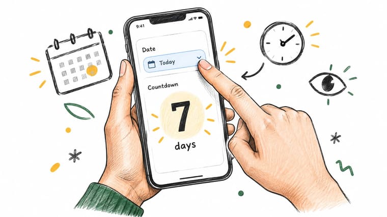
Build the visual hierarchy first
Choose a theme with strong contrast between the background and the digits. Pastel colors may look pleasant in the app’s preview, then disappear on a bright outdoor screen. Your number needs to dominate the tile.
Set the font size so the main number fills the available space without touching the edges. If the number looks timid, you’ll skip it. If the label competes with the number, shorten the label again.
Use these checks before saving:
- Distance test: Can you read the number from across the desk?
- Position test: Does the widget avoid the dock and important app icons?
- Priority test: Does the displayed goal match what matters this week?
- Meaning test: Would you know what to do after one glance?
The home-screen customization guide from Pretty Progress is useful when you want to refine placement, color, and layout without turning the screen into a decorative project.
The widget passes when the glance is effortless. If you need to lean in, decode the label, or remember which deadline the number represents, simplify it before you add anything else.
Why One Widget Beats a Stack of Them
A stacked home screen looks busy and feels busy. It gives you multiple cues to scan, compare, and ignore. One clear widget does the opposite. It cuts the decision load and makes the glance count.
The best support for that idea comes from TimeAware. In a controlled eight-week deployment, the self-monitoring widget involved 24 participants, and the group that saw feedback framed around distracting activities improved productivity. That effect faded when the feedback was removed. The TimeAware study points to the part that matters here, framing changes behavior, and short-term response does not guarantee lasting change.
A stack weakens the frame. Your eyes jump between colors, labels, and numbers, then you end up doing a tiny inventory instead of reading one clear cue. The more widgets you add, the less each one says.
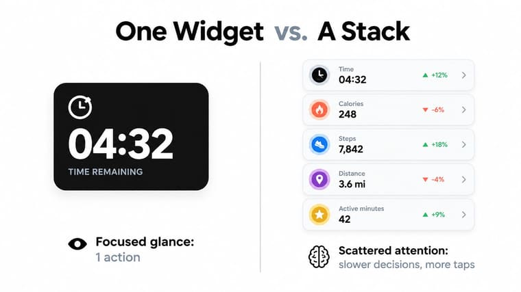
Design rules for a durable cue
Use contrast over decoration. A single bold number on a calm background survives daily use better than a busy tile that competes for attention.
Keep the content to one number plus one short word whenever possible. “12 days, Launch” is easier to read than a dashboard packed with extra stats. Fixed placement matters too. Put the widget in the same spot so your eyes learn where to find it.
Pretty Progress can carry meaning through a short label and a chosen theme instead of extra widgets. Change the priority when the project changes, then stop there. A second cue usually adds noise, not clarity.
If a glance takes longer than a second, the widget is doing too much.
For examples of layouts that stay restrained, see the guide to focused desktop widget dashboards and this guide to the best home-screen widgets. Stacking elements can block parts of the screen, slow the interface, and reduce spontaneous checking. The test is simple. The one cue has to stay visible and actionable after weeks of ordinary use.
Setup Workflows for Students, Professionals, and ADHD Brains
A good setup depends on the person using it. The same countdown that motivates a student can feel abstract to a freelancer, while someone with ADHD may need a cue tied to the next physical action rather than a distant milestone.
The student setup
A student preparing for finals should use a semester countdown tied to finals week. Choose a Date callback widget, set the start date to the day of setup, and use a concise label such as FINALS. A high-contrast blue theme makes the number easy to spot on the first home-screen page.
Place it above or beside the apps used for studying. Delete nearby entertainment shortcuts or move them to another page. The widget should meet the student before the distraction does.
The number won’t write the revision plan. It does provide a stable reminder of the horizon, which is useful when daily tasks make the larger deadline feel distant.
The professional setup
A freelancer managing a project or retainer should choose a dated deadline widget with the label Client Launch. Use a muted theme that fits a work-focused home screen, then place it on the page used for email, notes, and project tools.
Keep the widget near the apps that support the outcome, not near unrelated personal reminders. Remove duplicate calendar and task widgets from the same page. One deadline cue is enough when the calendar remains the source of detailed scheduling.
The ADHD setup
For an ADHD user, a distant goal can be too weak to trigger action. Set a smaller Today widget around the next single action, use a one-word label such as Ship it, and choose a warm color theme that stands out without requiring a search.
Put it on the leftmost home-screen page and remove the extra icons immediately above it. The cue should connect to something executable now, such as sending the draft, starting the call, or packing the bag.
Visual reminders work best when they reduce the need to hold the task in working memory. Guidance on sleep for better executive function adds useful context for people working on attention, initiation, and daily regulation. The widget can support those systems, but it shouldn’t pretend to replace rest, planning, or appropriate professional support.
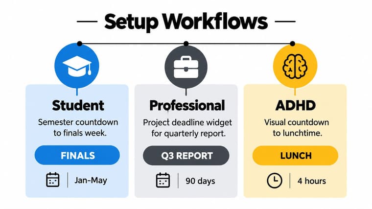
Each workflow ends with subtraction. The student removes competing study-page icons. The professional removes duplicate deadline cues. The ADHD user removes anything that competes with the next action. The setup works because the screen has one obvious message.
PRO Moves That Make the Widget Disappear Into Your Day
The paid controls matter when the default widget creates visual friction. Don’t upgrade for more information. Upgrade when you need the one cue to fit your screen so well that it stays present without shouting.
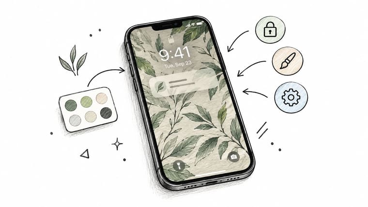
Match the theme to the wallpaper
Problem: The widget looks pasted on and becomes visual noise.
PRO move: Use custom theme colors that match or complement the wallpaper.
Result: The cue blends into the home screen while the main number remains visible.
Remove the heavy box
Problem: An opaque background makes the widget dominate the page.
PRO move: Use background transparency so the tile sits behind the app icons visually.
Result: You keep the reminder without adding another hard-edged panel.
Name each cue precisely
Problem: A generic countdown such as “Goal” has no emotional or practical force.
PRO move: Add a per-widget label that names the outcome, such as “Client Launch” or “Thesis draft.”
Result: Your brain connects the number to an action instead of interpreting a category.
A label should tell you what the number means and why you should care.
Duplicate without rebuilding
Problem: You want the same configured deadline on another page, but recreating it risks inconsistent dates or styling.
PRO move: Duplicate the configured widget across pages.
Result: The same start date, end date, and visual treatment follow the workflow without extra setup.
The video below is worth watching when you’re refining the visual treatment rather than adding more tracked items.
Protect dates across travel
Problem: A deadline appears to shift after you change location.
PRO move: Use timezone-aware date handling.
Result: The countdown stays tied to the intended calendar date instead of changing after a trip.
These controls solve presentation and reliability problems. They don’t justify filling every page with widgets. Use them to make one reminder quieter, clearer, and harder to misread.
Troubleshooting Widgets You Stop Glancing At
A widget can be technically correct and still fail. If you stop looking at it, treat that as a design problem. The cue needs tuning, not guilt.
Failure one shows too many digits
A countdown with days, hours, minutes, and seconds often looks precise but reads poorly. Your eye slides across the numbers instead of landing on a meaningful distance.
Switch to a days-only display when the deadline is far enough away that hours won’t change your decision. Once you’re past the two-week mark, rounding to the nearest week can make the remaining time easier to understand. The point isn’t to hide precision. It’s to show the precision that supports action.
Try this test: if the extra digits don’t change what you’ll do today, remove them.
Failure two uses a generic label
“Goal,” “Project,” and “Deadline” describe a category, not an outcome. They force you to remember what the widget represents, and that memory step defeats the purpose of a passive cue.
Replace the label with the result you need to produce. “Thesis draft done” is stronger than “Thesis.” “Q3 client proposal” is stronger than “Project.” A short, specific phrase gives the number a job.
Keep the wording compact enough to survive the smallest display. If the label is clipped, shorten the outcome rather than reducing the number until neither element is readable.
Failure three disappears into the screen
A widget can be visible and functionally invisible. App icons, wallpaper detail, and low contrast compete with the number until your eyes skip the entire area.
Move it to the leftmost home-screen page. Remove two rows of icons above it, then choose a theme with at least 60 percent contrast against the wallpaper. That contrast threshold comes from the setup brief, not a universal design standard, so use it as a practical target rather than a guarantee.
The visual-cue evidence also supports treating placement as functional. Independent guidance summarized in research on visual cues and mental reminders reports that fixed-position reminders can reduce working-memory demands and shorten task resumption. The actionable lesson is straightforward: keep the cue stable and visible instead of moving it around with every redesign.
The five-minute reset
You can rebuild the whole setup before your coffee cools:
- Choose one priority: Pick the deadline or milestone you most need to remember this week and write it as one short label.
- Match the format: Open Pretty Progress and choose a countdown style that fits the time horizon, whether it’s daily, weekly, or date-based.
- Set the endpoint: Add the end date, paste the label, and choose the highest-contrast theme available.
- Clear the neighborhood: Place the widget on the leftmost home-screen page and delete or hide two nearby icons.
- Run the glance test: Look at it tonight and tomorrow morning from arm’s length. If the cue doesn’t land immediately, shorten the label or simplify the design.
Don’t add a second widget during this reset. Don’t install another productivity app. Don’t create a second priority to dilute the first one. The setup succeeds when one cue reliably brings the right commitment back into view.
Pretty Progress gives you customizable countdown and progress widgets for Home and Lock Screens, Apple Watch, Mac, and Android, with themes, dates, labels, and layout controls for a focused visual reminder. Build one cue around the deadline that matters most, then visit Pretty Progress and put it where you’ll see it.





