
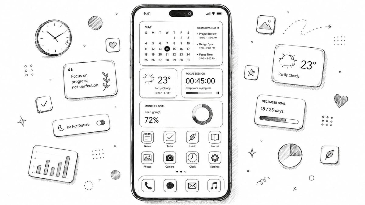
August 20, 2026
How to Customize Home Screen for Focus and Style
Learn how to customize home screen layouts, widgets, and icons on iPhone and Android. Practical tips for focus, accessibility, and beautiful daily setups.
You open your phone to check the weather, see a notification badge, and open Instagram without really deciding to. A few minutes later, you’re still scrolling, while the calendar reminder you meant to check has disappeared behind a crowded grid of apps and decorative widgets.
That’s the difference between a home screen that looks finished and one that works. Home screen customization is a focus system, not just a wallpaper and icon exercise. The useful setup is the one that makes the next right action obvious, stays readable when you’re tired, and still earns its place after the novelty wears off.
Table of Contents
- Why Your Home Screen Setup Matters More Than You Think
- Core Controls for Customizing iPhone and Android Screens
- Designing a Focused First Page Layout
- Adding Countdown and Progress Widgets That Keep You on Track
- Common Customization Mistakes and How to Fix Them
- Accessibility Tweaks for a Calmer and Clearer Home Screen
Why Your Home Screen Setup Matters More Than You Think
A cluttered first page creates too many small decisions. You scan icons, badges, widgets, folders, and wallpaper details before choosing what you came to do. Each element may seem harmless, but together they turn a simple check into an opportunity for distraction.
A focused layout behaves more like a launch panel. It presents the information you need at a glance, keeps frequent actions close to your thumb, and pushes tempting apps away from the first tap. That doesn’t mean deleting every colorful app or building a severe black-and-white grid. It means assigning each page a job.
Give each page one job
Your first page might support your morning routine. A second page could handle work, study, fitness, or creative projects. The App Library and Android app drawer can hold everything else. Apple specifically recommends arranging Home Screen pages by task, such as a morning page for news and weather or a work page, and using widget stacks when space is limited in its iPhone Home Screen customization guide.
A morning page could contain weather, calendar, notes, and tasks. A work page might prioritize email, meetings, documents, and communication. A fitness page could surface activity, workouts, music, and a timer. The arrangement works because the page answers a specific question: what am I trying to do right now?
Practical rule: If you can’t describe a page’s purpose in one short sentence, it probably contains too much.
The technology supports this approach. Apple made Home Screen customization substantially more powerful with iOS 14 in September 2020, when widgets moved from Today View into prominent Home Screen placement. Apple later added Lock Screen widget support in iOS 16 and iPadOS 17, and Notification Center widget support arrived on the Mac with macOS 12 Monterey. The response was immediate. Sensor Tower estimated that the top 20 iOS Home Screen customization apps reached 5.7 million downloads worldwide in the first four days after iOS 14 launched, followed by 13.7 million global installs in the first seven days and more than $1 million in consumer spending during that week, as reported by TidBITS’ summary of the Sensor Tower data.
The problem is that many setups optimize for the reveal, not daily use. A beautiful icon pack can still slow you down if familiar visual cues disappear. A page full of progress widgets can become background noise. A minimal layout can become frustrating if essential apps are hidden in folders. Build for the interaction you’ll perform on an ordinary weekday, not the screenshot you’ll admire once.
Core Controls for Customizing iPhone and Android Screens
Start with the platform’s built-in controls before installing a theme pack. Native tools are usually more stable after operating-system updates, and they give you a clean baseline for deciding what you need.
iPhone controls
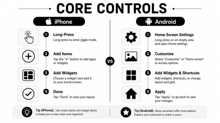
On an iPhone, touch and hold an empty area of the Home Screen until the icons jiggle. Tap Edit, then Customize to adjust the appearance of icons and widgets. Apple supports Dark, Clear, and Tinted appearances, with Tinted offering color and saturation sliders plus an eyedropper that can match the wallpaper, as documented in its official Home Screen instructions.
To add a widget, enter the same edit mode and tap Add Widget or the plus button, depending on the screen and iOS version. Swipe through available widget sizes, choose one, and tap Add Widget. Hold and drag it into position, then use Done to save the layout.
For custom app icons, open Apple’s Shortcuts app, create a shortcut that opens the chosen app, and use the shortcut’s details menu to add it to the Home Screen with a custom image. This gives you visual control, but it also creates a shortcut layer, so keep custom icons for apps where the aesthetic or recognition benefit outweighs the extra setup.
Wallpaper settings live under Settings > Wallpaper. Focus modes can also show different Home Screen pages at different times, which is more useful than manually rearranging the same page throughout the day. Start with a plain wallpaper if icon labels or widget text feel difficult to read.
Android controls
On Android, touch and hold an empty part of the Home Screen to open the launcher menu. From there, you can usually access Widgets, Wallpaper and style, and Home settings. The exact labels vary across Pixel Launcher, Samsung One UI, and third-party launchers such as Nova Launcher.
Use Home settings to change the grid, icon labels, app suggestions, and page behavior. Pixel devices can use system color theming through Wallpaper and style. Samsung phones offer their own icon and theme controls through Galaxy Themes, while Nova Launcher provides deeper control over grid spacing, gestures, and drawer organization.
Android widgets are often more flexible than iPhone widgets, especially when resizing. Touch and hold a widget, then drag its handles when the launcher supports resizing. Test the result on your actual device, because widget dimensions and spacing can vary between manufacturers and launchers.
For a curated starting point, compare practical options in this guide to the best home screen widgets. The goal isn’t to collect widgets. It’s to identify which glanceable information deserves a permanent place.
Here’s a short walkthrough that can help you recognize the editing gestures and menus in practice:
Designing a Focused First Page Layout
The first page should answer one question quickly. For a morning setup, that question might be, “What’s happening today, and what do I need to do first?” For a work page, it could be, “What deserves my attention before I open a distracting app?”
Choose the purpose before choosing colors. Then build from the largest information element down.
Start with one focal widget
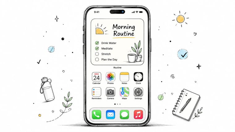
Use one large widget as the visual anchor. A calendar, weather panel, task list, habit tracker, or progress display can occupy the top or center of the page. One focal element is easier to parse than several competing blocks, especially when you access the phone in a hurry.
Build the rest around the actions that support that widget:
- Morning page: Place weather near the top, calendar beneath it, then keep Notes, Mail, and your task app within easy reach.
- Work page: Use a calendar or task widget as the anchor, with email, documents, messaging, and meeting tools nearby.
- Fitness page: Put activity or workout progress first, followed by music, timer, health, and the app you use to log sessions.
- Creative page: Lead with a project, notes, or inspiration widget, then place camera, files, editing, and publishing tools around it.
You don’t need to fill every open space. Empty space gives the focal widget room to register and makes the page easier to scan. If you keep reaching for an app that isn’t visible, add it. If you keep skipping a widget, remove it instead of defending the original design.
Treat the dock as infrastructure
The dock should hold actions you use across contexts, not apps associated with only one page. Phone, messages, browser, and music may belong there for one person, while a task manager or notes app may be more useful for someone else. Avoid putting a distracting app in the dock because it’s familiar. Permanent placement makes impulsive access effortless.
Folders work best for occasional categories, such as travel, shopping, banking, or utilities. They’re less effective for apps you open repeatedly because the folder adds a tap and a visual search step. For aesthetic layouts, consider using the App Library or Android app drawer to store rarely used apps instead of shrinking the usability of page one.
For more design ideas that still keep widgets functional, browse these examples of iPhone aesthetic widgets. Borrow the visual treatment, then remove anything that doesn’t help you act.
Adding Countdown and Progress Widgets That Keep You on Track
A countdown widget earns its space when it connects the phone to a real deadline. That could be an exam, a trip, a launch, a recurring event, or a personal milestone. The widget shouldn’t merely decorate the page. It should make the remaining time understandable without requiring another app opening.
On iPhone, begin by creating the event or countdown in an app that supports a Home Screen widget. Add the widget through Home Screen edit mode, then choose the size that provides enough context without displacing the apps you need. A small widget can show a title and remaining time, while a larger one may provide room for a progress bar, date, or supporting label.
On Android, long-press an empty area, select Widgets, and find the relevant app. Place the widget, resize it if the launcher allows, and edit the displayed event. Android’s flexibility is useful here because a progress bar can often sit above a row of apps rather than consuming the entire page.
A practical goal setup
For a certification exam, create a start date and an exam date, then choose a countdown that shows both the remaining time and the overall progress. Keep the title specific, such as “Security exam” or “Portfolio review,” rather than using a vague label like “Goal.” A specific label tells you what action the countdown supports.
Use a progress-ring widget for a repeatable target, such as daily water intake, steps, reading, or practice. If the widget connects to Apple Health or Google Fit, review permissions carefully and confirm that the displayed source matches the behavior you’re tracking. Manual logging can be better when the goal is reflective rather than automatic.
iOS widget stacks let you rotate several trackers through one space, but don’t stack unrelated information. A deadline, habit, and weather panel may look efficient, yet the rotation can hide the item you intended to see. Android’s resizable widgets offer a similar trade-off. More flexibility can produce a better fit, but it also makes it easier to squeeze too much information above the app row.
If your tracker lives on a wearable as well, the visual language should remain consistent. For example, someone adjusting a Garmin device may also want to review how to change Garmin display so the watch and phone present related information without competing styles.
Pretty Progress is one option for creating customizable countdowns and progress bars, then placing them on iPhone, iPad, Apple Watch, Mac, or Android surfaces. Its Home Screen timer guide covers the setup flow, including choosing a widget size and selecting which event appears.
Place goal widgets where you’ll see them naturally, usually on the first or second page. The reminder should be persistent but quiet. If you start checking the widget compulsively without taking action, simplify the display and pair it with one concrete next step.
Common Customization Mistakes and How to Fix Them
Most failed layouts don’t fail because the user lacks taste. They fail because the design introduces friction or creates too much visual competition.
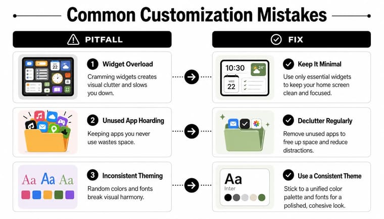
Widget overload is the most obvious problem. Several widgets can make a page feel useful during setup, but each one demands scanning time. The independent survey summarized by Android Authority’s widget poll results reported that 19.2% of users had exactly two widgets across all Home Screens, while nearly 16% reported using none. Those results suggest that a restrained setup is common, even among people interested in customization.
A widget that isn’t noticed or acted on is occupying space without doing its job.
Try a simple audit:
- Crowded widgets: Keep only the information that changes your next action. Move secondary data to another page.
- Decorative app hiding: Don’t bury an app you open every day just to preserve an empty grid. A fast tap matters more than a perfectly minimal screenshot.
- Mixed visual systems: Use native icon theming or one dependable icon source instead of combining unrelated packs, shortcut icons, and launcher styles.
- Fragile shortcuts: Custom shortcut icons can require maintenance after system changes. Keep backups of the images and remove custom layers that become annoying to repair.
- Unused placeholders: Delete apps and widgets that remain because they once matched the theme but no longer support your routine.
Use a one-week test cycle
Set the layout at the start of the week. Through the next few days, note every moment when you search, swipe unnecessarily, open the wrong app, or ignore a widget. At the end of the week, prune first, then rearrange. Don’t keep adding elements to solve a problem caused by too many elements.
Screen Time on iPhone and Digital Wellbeing on Android can show which apps receive attention. Use that information as evidence, not as a command. A frequently opened app may deserve a visible place, while a rarely used app can move into a folder or the app drawer.
Accessibility Tweaks for a Calmer and Clearer Home Screen
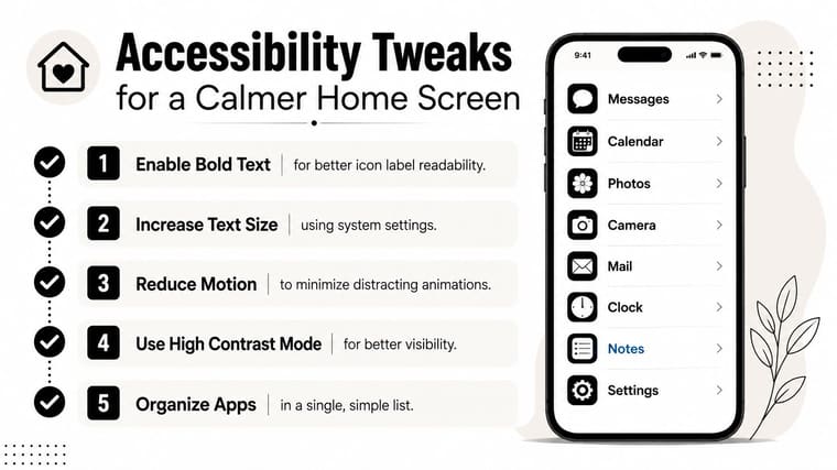
A useful Home Screen must remain usable when your eyes are tired, your hands are occupied, or motion effects make the interface uncomfortable. Accessibility settings aren’t a final polish step. They can determine whether the layout reduces effort or adds to it.
On iPhone, try Bold Text and Larger Text under Accessibility settings, then check whether your chosen widgets still fit comfortably. Reduce Motion can limit distracting animations and parallax effects. You can also use Apple’s per-app visual settings for the Home Screen and App Library, including color, text size, and motion adjustments. Apple documents quick accessibility controls through shortcuts such as triple-click and back-tap in its guide to making iPhone your own.
Android users can adjust Display size and Font size under display settings. These controls change the overall scale, so review app labels, widget spacing, and touch targets after making an adjustment. Some devices also offer animation controls through accessibility settings, while developer options may provide additional motion controls.
Reduce visual strain
Choose a high-contrast wallpaper with a simple image, solid color, or restrained gradient. Busy photography behind translucent widgets makes labels harder to distinguish. If you have low vision, prioritize readable text and strong separation between icons and the background over a tightly matched color palette.
For ADHD or motor challenges, reduce scanning demands. A short app list, a simple one-column or two-column arrangement where supported, and larger touch targets can make the Home Screen easier to use. Keep VoiceOver or TalkBack, AssistiveTouch, or an Accessibility Button easy to activate through a shortcut rather than hiding those tools in settings.
Pretty Progress lets you build countdown and progress widgets for the goals that deserve a visible place on your Home Screen, with customizable dates, colors, layouts, and progress bars. Visit Pretty Progress to create a calmer, more purposeful reminder system that supports your routine without filling the screen with noise.





