
November 11, 2026
Aesthetic Timer App Guide: Make Time Easier to Track
Learn what makes an aesthetic timer app visually appealing and how customizable countdowns and progress bars make time easier to track.
You’re sitting with notes open, a deadline somewhere in your calendar, and a phone you keep checking just to see how much time is left. The number answers the question, but it doesn’t settle your attention. An aesthetic timer app can help when its display makes time easy to read in one glance, so you check less often and understand faster when you do.
Table of Contents
- Timer Display Styles at a Glance
- Why Good Design Changes How Time Feels
- Customization Settings That Change the Feel
- How to Set Up a Countdown Step by Step
- Ambient Visibility Beats Constant Alerts
- Real-World Timers and a One-Week Test
Timer Display Styles at a Glance
A student before an exam doesn’t need six calculations. She needs one clear answer: how many days remain, and how much of the term is already gone. A plain date forces her to do that maths each time. A well-chosen display does it for her, and the shape she picks changes what she notices first.
Three modes cover most needs. A Countdown shows the time remaining until a date or deadline. A Count up shows the time elapsed since a date. A Timer lets you set a specific duration and then run a countdown or stopwatch from it, including durations set to 0 days with hours or minutes chosen on devices that allow it.
| Display Style | What It Shows | Best For | Trade-Off |
|---|---|---|---|
| Countdown | Time remaining until a date | Exams, launches, deadlines | Can feel urgent as the number shrinks |
| Count up | Time elapsed since a date | Habits, streaks, days since an event | No natural finish line |
| Timer | A set duration, counted down or up | Study sprints, focus blocks, fasting windows | Needs a start action each time |
| Progress bar | Share of the period completed | Long goals, year progress | Bar and ring can change how a short interval feels |
| Ring | Same percentage shown as a circle | Quick glances on a Lock Screen | Reproduced durations differed from bars in the 15-second test |
| Dot grid (Pattern theme) | One dot per day left | Days left in a term or project | Needs more memory than simpler themes |
Shape is not neutral. In the 2023 study of 33 participants who viewed six different progress-bar presentations, changing the interface expression could increase or decrease perceived time while the actual duration stayed constant. Separate work in that research found participants reproduced a 15-second interval as significantly shorter after viewing a bar than after viewing a ring, and a larger displayed completion percentage led to longer reproduced durations for both 3-second and 15-second conditions.
If you’re mapping a whole year rather than one deadline, the Life Calendar app overview shows a wider calendar view that pairs well with a single goal widget.
Simple rule: Use countdowns for fixed deadlines, count up for habits and streaks, timers for focus sprints, and progress bars for long goals.
Why Good Design Changes How Time Feels
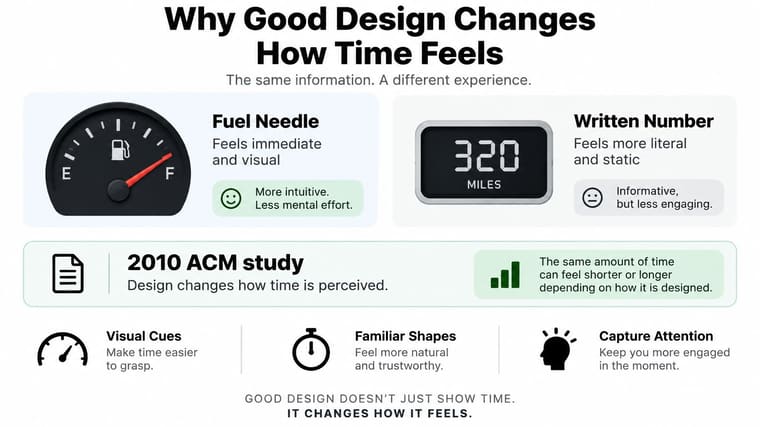
A fuel needle dropping toward empty and a written number showing litres left report the same fact on a car dashboard. You do not read them the same way. The needle gives you position and direction at a glance, while the number makes you work out what it means. Timer displays follow the same principle. Your eyes judge length, fullness, and movement before you ever read the digits, which is why a timer’s shape works as an attention tool, not decoration.
What the Experiments Found
In a 2010 ACM study of animated progress bars, bars with backward-moving, decelerating ribbing reduced participants’ perceived duration by 11% compared with conventional progress-bar designs. The actual wait had not changed. The visual rhythm had, and that was enough to change how long the wait felt.
Related work on progress indicators points the same way. Displays broken into many small visual steps tend to make progression look faster, and people judging them often underestimate how much time has passed. Displays with fewer, larger steps leave the impression that time is moving slowly. Frequent small changes give your brain more signs of movement, so the interval feels busy and shorter.
What This Means for Your Timer
A countdown is never just a number on a screen. Shape, segmentation, animation, and visual rhythm all shape whether a deadline feels distant, steady, or pressing. A bar divided into clear segments can make a long exam block feel like it is moving. A single unbroken block that barely changes can make the same block feel stuck, even though both displays are accurate.
Which feel you want depends on the job. During a fasting window, you might want progress to feel fast, so a segmented bar helps. During final revision, you might want honest urgency, so a shrinking countdown number serves better. The useful question is not which design looks nicest in a screenshot. It is which design makes the time left easiest to judge without extra thought, a point explored further in this guide to choosing a visual timer display.
A well-designed display can make waiting feel less burdensome. A poorly chosen one can make the same interval feel longer and heavier to carry.
Good design has limits. It cannot add hours to your week, and it cannot make an unrealistic deadline realistic. What it can do is remove friction from each check. You glance, you understand, you return to the task. A quiet display that reads clearly at a glance keeps each check cheap, and a calm check is easier to walk away from than an anxious one. If you have to decode the layout, squint at low contrast text, or work out which date the percentage refers to, the timer has added work instead of removing it.
A Short Self-Test
Do not settle this by guessing. Pick one style, keep it for a full week, and write down three things at the end of each day.
- Closeness: Does the deadline feel nearer or farther than it did with a plain number?
- Calm: Do you check the widget calmly, or do you open it because you are anxious?
- Action: Does seeing it help you start the next task sooner?
If the display makes time feel clearer and you act sooner, keep it. If it only makes you check more often, change the shape before you change anything else. That small test tells you more than any theme gallery can.
Customization Settings That Change the Feel
Start with a finished look, then adjust. Curated themes such as Swiss Style, Minimal, Aqua, and Retro OS give you a complete design in one tap, with colours, type, and spacing already balanced. Fine-tuning makes sense after you’ve lived with that starting point, because you’ll know what bothers you at a glance.
| Setting | Options | What It Changes |
|---|---|---|
| Colours and gradients | Solid fills and gradient blends | Contrast against the wallpaper and Lock Screen |
| Bar size and shape | Thickness and end caps | How easily the bar reads from a distance |
| Layout | Position of title, dates and percentage | Which number the eye reads first |
| Icons | Symbols attached to each timer | Telling several timers apart |
| Curated themes | Swiss Style, Minimal, Aqua, Retro OS and more | A quick starting look before fine-tuning |
Colours and Bar Shape
Colour decides whether the widget survives your wallpaper. A soft gradient can look calm in the app and vanish against a busy photo on your Home Screen. Pick a solid fill with strong contrast for anything you read outdoors or on a Lock Screen, and save gentler blends for long goals you check indoors at your desk.
Bar size works with distance. A thick bar with rounded ends and high contrast reads from across a room and suits a dark Lock Screen you glance at between tasks. A thin, square bar suits a crowded Home Screen with several widgets, where a chunky bar would shout over everything else. Neither is better in general. The right choice depends on how far your eyes are from the screen when you check.
Layout and Icons
Layout controls reading order. Put the title above the dates and you’ll read the goal first, then the numbers. Put the percentage first and you’ll judge progress before you recall what it’s for. For a single exam countdown, days remaining usually deserves the top spot. For a year-long goal, the percentage carries more meaning, so let it lead.
Icons earn their place when timers multiply. Three countdowns with similar titles blur together during a quick glance. A book for study, a plane for a trip, and a flag for a launch let you find the right one by shape before you read a word. This guide to widget design choices walks through pairing layout with placement if you’re building a full screen of them.
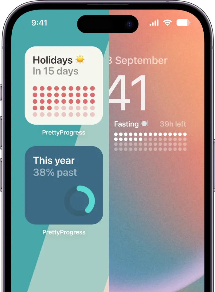
The same logic travels across devices, since Pretty Progress offers progress bar and countdown widgets for iPhone, iPad, Apple Watch and Mac, with Countdown widgets also available on Android. A design that reads well on your phone usually needs higher contrast and fewer labels on a watch face, so check each surface rather than assuming one setting fits all.
Two checks before you finish: Test each design against your real wallpaper in daylight and at night, and change one setting at a time so you can see what actually helped.
If you change colour, shape, and layout in one sitting, you won’t know which change made the widget easier to read. Adjust one control, live with it for a day, then decide.
How to Set Up a Countdown Step by Step
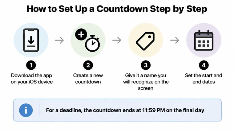
Setup takes a few minutes if you do it in order. Most problems come from skipping the save step or setting a start date that doesn’t match the period you want the bar to show.
The Setup Sequence
- Download the app on your iOS device. Setup starts there, because you create and customise the countdown by setting start and end dates, a name, a design and colors before any widget can show it.
- Create a new countdown and name it clearly. Use a name you’ll recognise at a glance, such as the exam, launch, or trip itself, not a vague label you’ll puzzle over later.
- Set the start and end dates. For a deadline, the start date can be today. Don’t skip this step, because the start date sets the percentage bar, so a wrong start makes the bar look off even when the days remaining are right.
- Choose a theme, then adjust the details. Pick a curated theme first, then change colours, gradients, bar size and shape only where the default doesn’t suit your wallpaper.
- Save the countdown, then add the widget. Save before placing it on your Home Screen or Lock Screen. Placing the widget first is the common slip, because the default look stays and your design never appears.
- On the Lock Screen, open the editor, tap the widget, and choose which event appears. This step matters when you’ve created several countdowns, since the widget needs to know which one to display.
- Check the next morning that the widget has updated. The days remaining should match your calendar, and the bar fill should match the share of time gone since your start date.
Countdown widgets can be added to the home screen or lock screen on iPhone, iPad, Apple Watch, Mac and Android. For Apple Watch, the app must be installed on the iPhone and you need watchOS 9.0 or later, so install on the phone first and let the watch follow.
Why a Widget Can Lag
A widget that updates a little late isn’t usually broken. Apple’s WidgetKit timeline documentation states that frequently viewed widgets commonly receive approximately 40 to 70 refreshes per 24-hour period, roughly one update every 15 to 60 minutes, and recommends timeline entries spaced at least about five minutes apart. iOS controls that schedule to protect battery life, so no aesthetic timer app can refresh every second on your Home Screen.
Because the system can delay an update past its planned time, a well-built widget calculates the exact remaining time from the current date whenever it’s displayed, and uses scheduled entries for bigger changes such as day boundaries, hour boundaries, and completion. That’s why the display usually looks right when you wake your phone even if it didn’t refresh on the minute.
If a countdown widget gets stuck, opening and closing the app or restarting the device usually gets it updating again.
A correct setup is easy to recognise. The name is clear, the days remaining match your calendar, and the filled portion of the bar matches how much of the period has passed. If the days are right but the bar looks wrong, recheck the start date before you touch anything else.
Ambient Visibility Beats Constant Alerts
A wall clock and a phone that beeps every half hour both tell you time is passing. The clock waits until you choose to look. The phone interrupts whatever you’re doing. One supports focus, the other competes with it, and your timer makes the same choice every time it decides whether to nudge you or be visible.
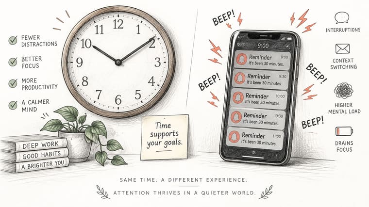
The case for constant reminders is weaker than it sounds. A preregistered randomized controlled trial involving 205 participants found that disabling smartphone notifications for one week did not change checking frequency, screen time, perceived control, productivity, or distraction. Turning alerts off didn’t make people less productive, which challenges the assumption that more reminders automatically mean better follow-through.
| Option | Interrupts you | Best use | Trade-off |
|---|---|---|---|
| Silent widget | Only when you look | Default for deadlines and long goals | Easy to miss without a nudge |
| Scheduled alert | Yes, at set times | Milestones that need action | Adds interruptions to focused work |
| End-of-session sound | Yes, once at the end | Study sprints that need a clear stop | Breaks flow at the moment you stop |
| Notification-free focus mode | Blocks alerts | Deep work sessions | Timer is hidden unless a widget is visible |
Choosing Your Default
Make the silent widget your default for deadlines and long goals. It answers the question when you ask it and stays quiet the rest of the day. Add a scheduled alert only at a milestone that needs action, such as the morning a submission opens. Reserve an end-of-session sound for short sprints where stopping on time matters more than protecting flow.
Beauty has a trade-off here too. A highly decorative widget can compete with the deadline itself, drawing your eye to artwork instead of the number. A minimal design is easier to scan during a busy workflow, even if it looks plainer in the theme gallery.
Keep contrast adjustable and visual noise low, so the timer supports the work rather than becoming part of it.
If you notice a widget pulling your attention several times an hour, simplify it before you remove it. Reduce colours, drop extra labels, or move it to a screen you visit less often. Ambient visibility works because it’s available, not because it’s demanding.
Real-World Timers and a One-Week Test
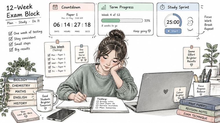
A student facing a twelve-week exam block rarely needs one timer trying to do everything. She sets a Countdown to the first paper so the finish line stays concrete, a progress bar for the whole term so she can watch the block shrink, and a Timer for each 25-minute study sprint so daily work has edges. Each display answers a different question, and none of them interrupts her.
Three More Setups That Work
A fasting window works well as a Timer set to the length of the fast. The bar fills as the window progresses, so you judge how far you have come instead of counting the hours left. A habit streak suits a Count up since your last missed day, set in a calm colour, because a growing number rewards consistency without inventing a deadline.
For project planning, events from Calendar and tasks from Reminders can be imported and turned into countdown widgets, and those countdowns stay in sync with the plans managed in those apps. Dates get typed once, in one place. Phones already carry small, single-purpose tools people check in passing, from a study widget to the mobile tools for guitar practice musicians keep on hand for short daily sessions, and a quiet countdown sits comfortably in that company.
Reviewers praise this kind of simplicity. Edgar wrote, “Was looking for a great app to add personal goals and deadlines. Really nice solution and great usability!” Dogend called the widgets “Easily the most beautifully designed countdown widgets I could find on the App Store!”
Run the One-Week Test
A short walkthrough can help you picture widget placement before you commit to a layout.
- Pick one goal and match it to a display style from the first table, instead of building a screen of timers on day one.
- Choose a curated theme and change one setting at a time, testing each version on your real wallpaper. The same start-small approach appears in this guide to building a focus timer app setup.
- Add one widget to your Home Screen or Lock Screen, and leave it there alone so you can tell whether that single display changes your behaviour.
- Set one milestone alert only if the goal needs a prompt. Otherwise keep the widget silent and let glances do the work.
- Note the result after seven days. Record whether you started work sooner, checked the timer less anxiously, or felt the goal was closer and more manageable.
If none of that happened, change the display style before adding alerts. A countdown that feels pressing may work better as a progress bar. A count up that feels aimless may need a target date beside it.
One setup can feel motivating to one person and pressing to another. Judge the test by whether it makes you act sooner; appearance alone settles nothing.
That limit is worth keeping in mind. No display can make a goal matter to you, and no theme can rescue a plan that is too crowded. What a good widget can do is keep one clear answer in view all day without noise. Pick the style that does that for your goal, give it a week, and keep only what earns its place on your screen.
Start with one goal, one widget, and one week. Pretty Progress gives you customizable countdown, count up, timer, and progress bar widgets with curated themes and fine controls for colours, gradients, bar shape, layout, and icons, ready for your Home Screen and Lock Screen. Set up your first countdown today, run the one-week test, and keep the display that helps you act sooner.