August 11, 2026
8 Creative Progress Bar Examples for 2026
Explore 8 creative progress bar examples, from linear to radial. Get design tips to create stunning countdown widgets with Pretty Progress.
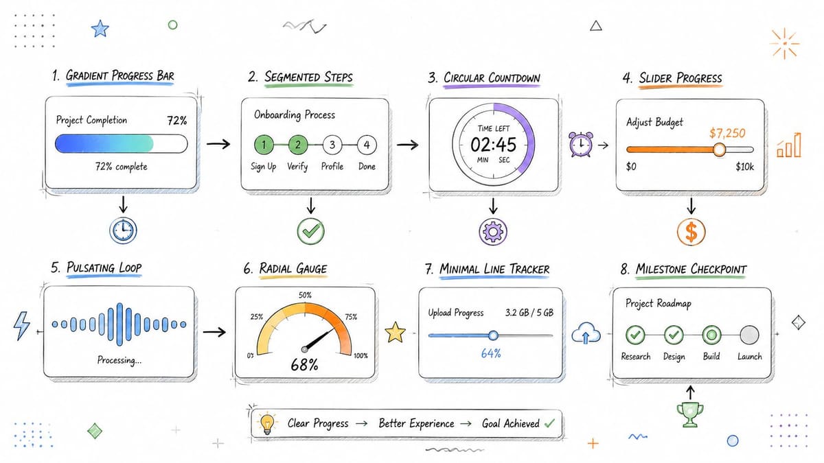
You set a goal, pin a deadline, and then the problem starts. Motivation slips when the target stays abstract, but it gets easier to stay consistent when you can glance at a widget and see progress taking shape. That’s why the best progress bar examples do more than fill space, they turn a vague intention into a visible, living signal on your screen.
For personal goal tracking, that matters. A good progress bar can show how far you’ve come on a launch, a fast, a workout streak, a reading challenge, or a year-end countdown. In a design app like Pretty Progress, the same universal UI patterns used in software, onboarding, and dashboards can become quiet daily reminders that keep your plans in view.
What works best depends on the goal. Some tasks need exact completion, others need milestones, and some work better when they show time remaining instead of raw percentage. The examples below focus on practical patterns you can use, not just pretty visuals.
Table of Contents
- 1. Linear Determinate Progress Bar
- 1. Linear Determinate Progress Bar
- 2. Circular/Radial Progress Indicator
- 3. Segmented/Step Progress Bar
- 4. Gradient Fill Progress Bar
- 6. Color-Coded Status Progress
- 7. Micro-Animation and Animated Progress Bars
- 8. Multi-Layer/Stacked Progress Tracking
- 8. Multi-Layer/Stacked Progress Tracking
- 8 Progress Bar Types Compared
- Start Tracking Your Goals Beautifully Today
1. Linear Determinate Progress Bar
A deadline feels different once progress is visible. A linear determinate bar gives that visibility in the clearest way possible, because it fills from left to right and shows a fixed endpoint, which makes it a strong fit for a countdown, a project timeline, or a workout plan. That direct read is why this format remains one of the most practical progress bar examples for a widget. Users understand it quickly, even if they only glance for a moment.
For personal goal tracking, that clarity has real value. A month-long challenge, a semester deadline, or a product launch countdown becomes easier to keep in mind when the bar changes every time you open your phone. Apple’s native download indicators and tools like Asana follow the same pattern, so the shape feels familiar before you read a single label.
Make the fill easy to read in real use
On a lock screen, contrast matters more than decoration. If the bar gets lost against the wallpaper, the design stops doing its job, so the fill color should stand out clearly against both light and dark backgrounds. In Pretty Progress, a strong bar color paired with a quiet background usually works well, and a short label helps the widget stay readable as the phone moves between sunlight and indoor light.
A few practical choices make the difference:
- Use a visible fill color. Keep the bar readable without relying on tiny text.
- Animate the movement smoothly. A gentle fill feels natural and makes progress easier to follow.
- Leave enough empty space. A bar that is too thin can disappear in a busy widget.
- Pair the bar with a label. Short text such as a goal name or completion state gives context at a glance.
The trade-off is simple. A minimal bar is easier to scan, while a richer layout can communicate more context. In a personal goal widget, the right choice depends on whether you want the bar to act as a quick reminder or a fuller status display.
1. Linear Determinate Progress Bar
The linear bar is the cleanest place to start because it tells the truth fast. It fills from left to right, gives a clear sense of completion, and works especially well when you know the start and end points, like a countdown, project timeline, or workout plan. That same clarity is why many people still treat it as the default progress bar example for a widget, because nothing is faster to understand at a glance.
In a personal tracking app, this pattern shines when the goal has a firm endpoint. A month-long challenge, a semester deadline, or a product launch countdown all feel more concrete when the bar makes progress visible every time you open your phone. Apple’s native download indicators and tools like Asana use the same logic, which makes the pattern feel familiar before you even read the label.
Make the fill easy to read in real use
On a lock screen, contrast matters more than decoration. If the bar blends into the wallpaper, the design stops working, so pick a fill color that stands out cleanly against both light and dark backgrounds. In Pretty Progress, that usually means choosing a strong bar color and a quiet background, then adding a short label so the widget still reads clearly when the phone is moving in and out of sunlight.
A few practical choices make a difference:
- Use a visible fill color. Keep the bar readable without leaning on tiny text.
- Animate the movement smoothly. A gentle fill feels alive without becoming distracting.
- Add a percentage or remaining time label. Numbers help when the goal is deadline-based.
- Reserve accent colors for the final stretch. A small celebration near the end makes the finish line feel real.
- Pair the bar with an icon. A work icon, health icon, or goal icon helps you scan the widget faster.
Practical rule: if the goal is precise, the bar should be precise too. Don’t hide the number behind decoration.
The reason this pattern works is simple. It lowers uncertainty. That matches broader UX guidance that progress indicators are useful when a wait is long enough to feel uncertain, and that clearer completion signals reduce anxiety (Nielsen Norman Group on progress indicators). For personal goals, that same principle helps you stay with a plan instead of mentally rewriting it every day.
2. Circular/Radial Progress Indicator
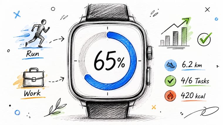
A circular ring works well in compact spaces because it wraps progress around a center point instead of stretching it across a line. That makes it a practical fit for watch faces, square widgets, and tight home screen layouts where a long bar would feel crowded. It also gives the goal a stronger sense of movement, which helps with things you check often, like an activity streak or a deadline countdown.
The pattern is familiar from Apple Watch activity rings, so users understand it fast. That familiarity matters in a small widget, because the design has to communicate at a glance without relying on much text. Pretty Progress can use that same visual language well when the widget needs to feel polished, not purely utilitarian.
Keep the ring readable, not crowded
The strongest radial layouts leave space for the number in the middle. That center label can show the percentage complete, the time left, or the next milestone, and it should stay readable even when the ring uses a bold color. A thin ring can look refined on a watch, but it can disappear against a busy wallpaper, so the thickness should match the widget size instead of being copied from a generic template.
A ring also works better with a clear start and end point. A small gap in the circumference helps the eye see where completion begins, especially when the ring is only partly filled. For goal tracking, that cue keeps the widget from feeling like a decorative loop with no purpose.
Keep the center text simple. One ring, one message, one purpose.
For a Pretty Progress widget, the ring is strongest when it matches the kind of goal being tracked. Fitness streaks, habit runs, and personal deadlines all benefit from this format because the viewer can read progress instantly without extra clutter. If you want a broader set of layout ideas for this style, see this visual habit tracker guide.
3. Segmented/Step Progress Bar
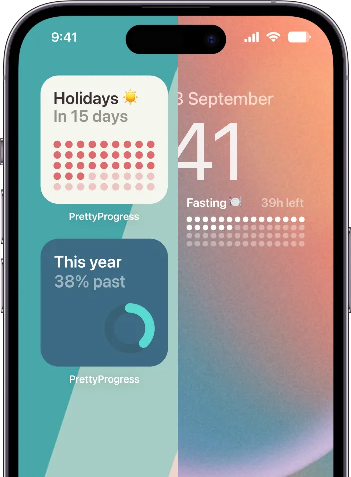
Some goals don’t feel continuous. They feel like a chain of steps, and a segmented bar handles that better than a smooth fill. Each block can represent a day, phase, milestone, or checkpoint, which makes the progress feel more concrete and less abstract. That’s especially useful for fasting windows, multi-day challenges, course completion, or any habit that benefits from visible wins.
This is also one of the best progress bar examples for people who respond well to discrete milestones. Instead of staring at one long bar and wondering whether anything is changing, they can see exactly which pieces are done and which ones remain. Progress bars can communicate status, time remaining, and phase, while segmented designs make that structure easier to read in personal tracking.
Use checkpoints to make streaks feel attainable
A segmented layout can reduce the mental weight of a long goal. If seven days of fasting, studying, or journaling are split into obvious blocks, the next win feels closer than the final finish line. That’s why challenge apps and habit trackers often lean on this pattern, even when the underlying task is still technically continuous.
For Pretty Progress, the key is to keep the labels short and the blocks visually distinct. Completed segments should feel finished, pending segments should still look active, and the transition between them should be obvious enough that you can read the widget while walking past it. If you like the idea of turning a goal into visible milestones, the Pretty Progress visual habit tracker guide is a useful companion for this style.
A few styling choices help a lot:
- Differentiate complete and pending segments clearly. Don’t rely on tiny color shifts.
- Add a milestone label underneath. “Day 3,” “Phase 2,” or “Week 4” gives structure.
- Celebrate completion gently. A small animation at each finished block makes progress feel earned.
- Consider gradient progression. A subtle shift across segments can suggest movement without losing the checkpoint feel.
This design is practical because it tells the truth about how people work. Most long goals are made of short wins, and segmented bars make those wins visible.
4. Gradient Fill Progress Bar
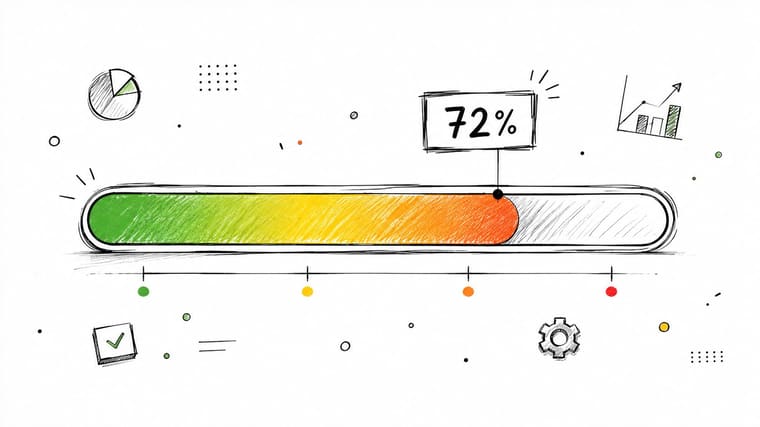
A gradient fill bar looks modern because color itself appears to move. Instead of a flat block, the bar shifts through tones as it advances, so the widget feels more designed and less utilitarian. That works well for users who want a progress indicator that fits a polished home screen instead of reading like a dashboard strip.
Gradient bars also carry mood. A cool palette can feel calm for reading, meditation, or study goals. A warmer palette can feel more urgent for deadlines or launch prep. The practical trade-off is simple. The gradient has to stay readable first and decorative second, because the bar still needs to communicate status at a glance.
Treat color as a tool, not decoration alone
Pretty Progress theme choices like Swiss Style, Aqua, and Retro OS make the most sense when they support the goal instead of competing with it. If the wallpaper is busy, a gradient can still work, but it needs enough contrast to stay visible. Color should support readability, and if the shade is the only way to tell progress, the design becomes fragile.
Accessibility matters here too. Don’t let color carry the entire meaning by itself. Pair the gradient with a number, date, or short label so the widget still makes sense during a quick glance or for someone who cannot perceive the color shift clearly.
A useful rule is to match the palette to the category. A learning goal can use a calmer purple, a health goal can use green, and a high-priority deadline can use a more urgent tone. That keeps the widget intentional without turning it into decoration for decoration’s sake.
For a practical example, the Pretty Progress countdown inspiration list shows how color and layout can work together in countdown-style widgets.
Gradient bars also fit modern app ecosystems because they feel current without chasing trends too aggressively. They are easy to customize, easy to theme, and easy to recognize as a goal indicator rather than a generic ornament.
6. Color-Coded Status Progress
A color-coded progress bar does more than measure completion, it shows state at a glance. Green can mean on track, yellow can signal attention, and red can mean urgent or overdue. That makes this pattern useful anywhere the user needs a quick read on status more than an exact percentage.
Project dashboards, task systems, and calendar apps use this kind of signaling because it cuts down on reading. A glance gives the answer. In a goal-tracking widget, that is powerful, but only if the color system stays consistent enough to learn. If the colors change randomly, the bar stops acting like a status indicator and starts feeling like decoration with anxiety attached.
Make the status system easy to trust
The main trade-off is clarity versus complexity. More colors can add nuance, but they can also create confusion if the meaning shifts from one widget to the next. A simple rule set usually works better than a complicated one, especially for personal goals that should feel encouraging rather than managerial.
Colorblind-safe palettes matter here too. Red and green alone can be a problem, so pair color with an icon or text label. A small “On track” or “Due soon” label turns the bar into a reliable communication tool instead of a visual guess.
Use the color system with restraint in Pretty Progress. A health goal can use green, a learning goal can use a calmer tone, and a deadline that needs attention can use a stronger warning color. That keeps the widget intentional while still leaving room for the user’s own style.
For a practical setup, start with a single status rule, keep the thresholds stable, and make sure the label and color say the same thing. If a goal is behind schedule, the widget should show that clearly without making the screen feel hostile. The value here is not decoration, it is fast recognition.
Use these choices to keep the display useful:
- Use color, icon, and text together. That gives you redundancy without clutter.
- Keep the thresholds stable. A user should learn what each state means.
- Allow custom palettes, but limit the options. Too many choices make the system harder to read.
- Reserve the strongest color for the clearest warning. If everything is urgent, nothing stands out.
A color-coded bar works best when the meaning is obvious before the user reads the label.
7. Micro-Animation and Animated Progress Bars
A static bar shows status. A subtle animation shows movement. That difference matters on a home screen that stays visible all day, because motion draws attention without asking for it. A quick fill, a small pulse when a goal completes, or a restrained celebratory effect can make the goal feel active instead of parked.
The best animated progress bars do not try to entertain. They reinforce progress. Habit apps often use a small celebration at a milestone because completion deserves a response, and that response helps users remember the win. Apple Watch activity rings use motion well for the same reason, the movement feels tied to the action itself, not pasted on afterward. The same principle also applies when a widget pairs motion with real-world activity data, as in how watches monitor your workout.
Practical rule: animate the moment of change, not the entire widget all day.
For goal tracking, that keeps the interface calm and readable. A progress bar that glows, fills, or bounces every second becomes tiring fast. A bar that animates only when the value changes feels responsive without turning the screen into noise.
Keep movement restrained and optional
Good animation respects attention and user settings. If someone prefers reduced motion, the widget should back off. If the goal is serious, like an exam countdown or a fasting timer, a playful effect can feel out of place. In Pretty Progress, the safer pattern is to keep motion short, meaningful, and tied to the change itself, so the widget still feels personal without becoming distracting. For more ideas on turning motion into a clear goal signal, see the visual goals guide.
The trade-off is simple. More motion can make progress feel alive, but it can also distract from the number or label the user needs to read. That is why the strongest approach is to reserve animation for milestones, completion, or a meaningful state change, then let the bar stay still the rest of the time.
Use these choices to keep animation useful:
- Animate on state change. A fill or pulse works best when something changes.
- Keep effects short and light. The point is feedback, not spectacle.
- Respect reduced-motion settings. Users should be able to opt out cleanly.
- Match the motion to the goal. A study goal needs a different feel than a fitness streak.
A small motion cue can make a widget feel responsive, but only if it supports the goal instead of competing with it.
8. Multi-Layer/Stacked Progress Tracking
Some goals work best in layers. A user might be tracking workouts, reading, sleep, and a daily routine at the same time, and a stacked progress layout shows those signals in one place without forcing them into a single bar. In Pretty Progress, that makes the widget feel more like a personal dashboard than a simple meter.
The practical value is clarity at a glance. Separate bars or rings let each goal keep its own color, label, and pace, so the user can tell which area is moving and which one needs attention. That is the same principle behind how watches monitor your workout, where multiple signals stay visible together instead of being flattened into one number.
Keep the layers purposeful, not crowded
Once the layout starts collecting too many trackers, the widget loses the point. The screen becomes harder to scan, and the user has to work to understand what matters first. A clean multi-layer design keeps the visible set small, groups related goals together, and gives priority to the most active or most important items.
That trade-off matters in personal goal tracking. A person who wants to see everything at once does not usually need every goal displayed at the same weight. A study stack can put focus hours first, then habits underneath it, while a fitness stack can keep activity and recovery distinct without mixing their meanings. In practice, three to five visible layers usually feels easier to read than a crowded wall of indicators, especially in a compact widget.
For a broader look at how to shape those layers into a useful personal dashboard, the visual goals guide gives a helpful framing. Pretty Progress fits this pattern well because it supports a curated, dashboard-like presentation without asking the user to open a full app every time they want a quick check.
8. Multi-Layer/Stacked Progress Tracking
Some people don’t have one goal. They have several, and they need to see how those goals move together. A stacked or multi-layer progress layout handles that by showing multiple bars or rings in one place, each with its own color and meaning. This is a strong fit for power users who want one glance to cover health, work, study, and personal routines at the same time.
Apple Watch activity rings are the most obvious example of this pattern because they let a user track multiple dimensions without opening separate screens. For app design, that makes the interface feel compact but not cramped. It also gives you room to group related goals without forcing them into one flat metric.
Keep the system legible when the layers multiply
The biggest risk is visual overload. Once too many trackers compete for attention, the widget stops helping and starts looking busy. That’s why the cleanest multi-layer designs keep the number of visible elements small and sort them by priority or category. In practice, three to five concurrent trackers is usually enough for a clean widget, and anything beyond that should probably live in a separate view.
Pretty Progress is a good match for this pattern because it supports a more curated, dashboard-like style without requiring a full app open. If you want a broader framing for multi-goal layouts, the Pretty Progress visual goals guide is a useful companion. For workout-style tracking, it also helps to understand how sensor-based systems track movement, which is why this external explainer on how watches monitor your workout is a useful reference point for the broader category.
Use these rules to keep stacked tracking useful:
- Limit the number of visible goals. Too many layers make the widget hard to scan.
- Use distinct colors for each layer. Similar shades blur together fast.
- Label each tracker clearly. A ring without context is just decoration.
- Let users hide less important layers. Not every goal needs equal weight every day.
This pattern is ideal for people who like a complete overview, but it works only when the hierarchy is clear. When used well, it turns a phone screen into a quiet command center for daily momentum.
8 Progress Bar Types Compared
| Pattern | 🔄 Implementation complexity | ⚡ Resource requirements | ⭐ Expected outcomes | 📊 Ideal use cases | 💡 Key advantages / tips |
|---|---|---|---|---|---|
| Linear Determinate Progress Bar | 🔄 Low, simple fill & percentage math | ⚡ Very low, minimal rendering/battery | ⭐⭐⭐, precise, instantly understood | 📊 Deadlines, countdowns, compact widgets, project milestones | 💡 Highly recognizable; use contrast, smooth fill, add %/time labels |
| Circular / Radial Progress Indicator | 🔄 Medium, angle math, center label handling | ⚡ Low–Medium, slightly heavier rendering | ⭐⭐⭐, engaging, modern but less precise at glance | 📊 Watch faces, square widgets, fitness rings, always-on displays | 💡 Keep ring width proportional; show center %; use gap to mark start |
| Segmented / Step Progress Bar | 🔄 Medium, segment state & labeling | ⚡ Low, simple shapes; needs horizontal space | ⭐⭐, motivating via milestones, phase clarity | 📊 Multi-phase projects, habit stacking, fasting windows, challenges | 💡 Use contrast per segment; add celebration animations and labels |
| Gradient Fill Progress Bar | 🔄 Medium, gradient stops + accessibility checks | ⚡ Low–Medium, gradient rendering cost | ⭐⭐⭐, premium aesthetic; can convey urgency with color shifts | 📊 Branded/themed trackers, lock screen widgets, aesthetic-focused apps | 💡 Ensure sufficient contrast; use color psychology; provide themes |
| Time-Based Visual Progress (Remaining Time) | 🔄 Medium, time calc, dynamic text updates | ⚡ Medium, frequent updates near deadlines | ⭐⭐⭐, actionable, reduces ambiguity about remaining time | 📊 Countdown timers, exams, launches, deadline-driven workflows | 💡 Highlight remaining time; adjust update frequency by urgency |
| Color-Coded Status Progress | 🔄 Low–Medium, threshold logic & state mapping | ⚡ Very low, simple color/state changes | ⭐⭐⭐, instant status recognition without reading numbers | 📊 Status dashboards, project health, urgency visualization, ADHD-friendly UIs | 💡 Pair color with icons/text; define clear thresholds; offer colorblind-safe palettes |
| Micro-Animation & Animated Progress Bars | 🔄 Medium–High, animation choreography & fallbacks | ⚡ Medium–High, can impact battery/CPU if overused | ⭐⭐⭐, high engagement and feedback when subtle | 📊 Milestone celebrations, watch interactions, motivational/habit apps | 💡 Respect system motion prefs; keep animations subtle & <500ms; offer toggle |
| Multi-Layer / Stacked Progress Tracking | 🔄 High, layout, layering & data management | ⚡ Medium–High, multiple renders and data sources | ⭐⭐⭐, comprehensive overview; risk of clutter | 📊 Power-user dashboards, multi-goal/habit stacking, complex project tracking | 💡 Limit to 3–5 layers; use distinct colors; provide show/hide controls and clear labels |
Start Tracking Your Goals Beautifully Today
The best progress bar designs don’t just measure time or completion, they make your goals feel real enough to act on. A linear bar works when you need clarity, a circular ring fits small spaces, segmented steps make milestones feel reachable, and multi-layer tracking helps you manage several priorities without losing focus. The right choice depends on the kind of motivation you need, not just the look you like.
For personal use, that distinction matters. A widget that shows the wrong kind of progress can feel decorative but not useful, while a well-chosen bar can make your plan easier to remember and easier to follow through on. That’s why the strongest progress bar examples are the ones that match the task, the screen, and the user’s actual behavior.
Pretty Progress fits this use case because it turns countdowns, deadlines, and goals into customizable widgets across iPhone, iPad, Apple Watch, Mac, and Android. If you want to build a more motivating home screen, use these patterns as your starting point and shape them around the goals you’re already tracking.
Pretty Progress turns countdowns and goal timelines into customizable widgets for Home Screen, Lock Screen, Apple Watch, Mac, iPhone, iPad, and Android. If you want to try these progress bar examples in a real app, visit Pretty Progress and build a widget that matches your goals, your style, and your daily routine.