
May 15, 2026
A Better Timer for Presentation: The Pretty Progress Guide
Master your delivery with the perfect timer for presentation. This guide shows how to use Pretty Progress on iPhone, iPad, Watch, and Mac to stay on track.
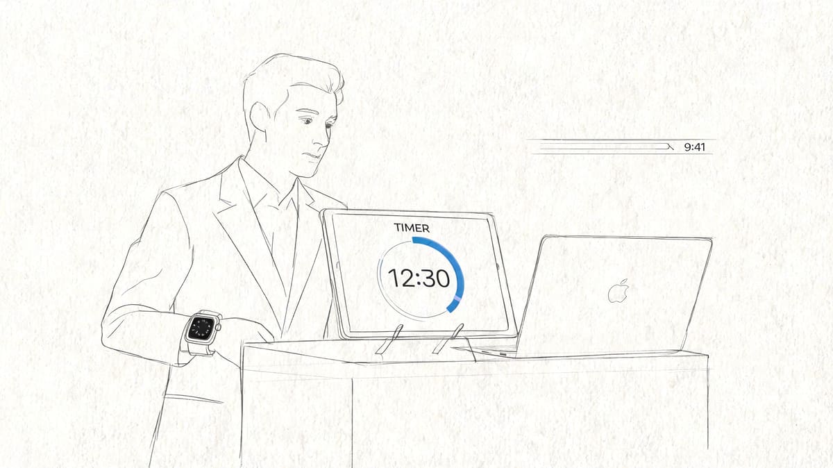
You’re probably preparing a talk right now and wondering about the same thing most presenters wonder a few minutes before they start: am I on pace, or am I about to run long without noticing it?
That anxiety shows up in every format. A team update in a conference room. A webinar on a laptop. A classroom lecture. A polished keynote with slides on a big display. The problem usually isn’t knowing your material. It’s knowing your timing without breaking eye contact, fumbling for your phone, or glancing at a wall clock that might as well be in another building.
A good timer for presentation work fixes that. Not with a giant distracting countdown slapped onto your slides, but with a private, glanceable system you can trust. If you already use Apple devices, that system can live across your iPhone, iPad, Apple Watch, and Mac, which makes timing feel less like a separate task and more like part of your delivery.
Table of Contents
- Never Lose Your Pace Again
- Creating Your Core Presentation Countdown
- Displaying Your Timer for At-a-Glance Cues
- Advanced Timing With Mac and Segmented Cues
- Best Practices for Flawless Presentation Timing
- Troubleshooting Common Presentation Timer Hiccups
Never Lose Your Pace Again
The hardest moment in a presentation often comes halfway through. You’re speaking smoothly, the audience seems engaged, and then a bad thought interrupts everything: I have no idea whether I’m ahead or behind.
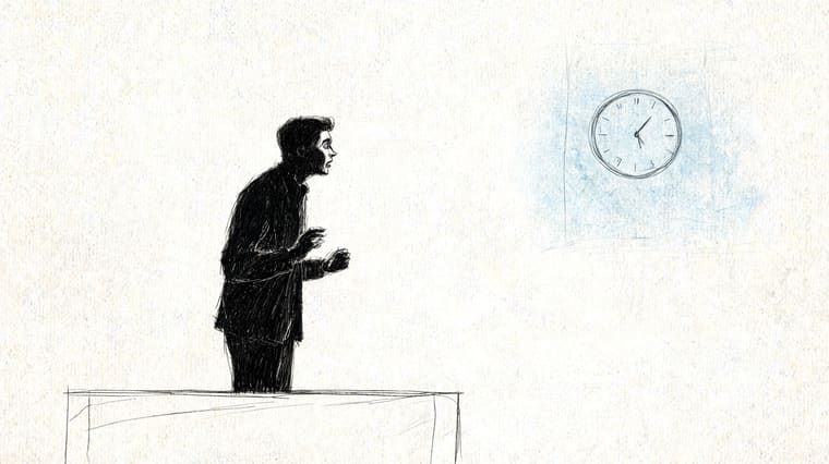
Wall clocks are rarely in the right place. Checking your phone looks like you’re reading messages. Looking back at your laptop can pull your body and voice away from the room. That’s why so many speakers need a dedicated timer for presentation delivery, not just a generic stopwatch.
Dedicated presentation timer apps are already a mature category on mobile, with native options available on both iOS and Android, which reflects real demand for on-device timing tools that fit into the presentation workflow rather than living as throwaway browser tabs, as shown in the App Store listing for Presentation Clock TimeKeeper.
What works is simple. You need a timer you can read in less than a second, on a device you already trust, positioned where you can glance without performing that obvious “time check” the audience notices.
Practical rule: If checking your timer changes your posture, it’s in the wrong place.
That’s why an Apple-device workflow is so effective. An iPhone can sit low and discreet on a stand. An iPad can become a confidence monitor. An Apple Watch can handle the most discreet checks of all. A Mac can keep a persistent countdown visible while you present.
The benefit isn’t just staying on time. It’s mental calm. When the timing system disappears into the background, your attention comes back to pacing, emphasis, and eye contact. That’s when a timer stops feeling like a safety net and starts acting like part of your craft.
Creating Your Core Presentation Countdown
A presentation timer only helps if you set it up in a way your future speaking self can understand instantly. Keep the first setup plain, specific, and tied to a real talk.
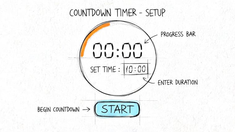
Start with one real speaking scenario
Create a timer for an actual event, not a vague label like “work talk.” A name such as 20-Minute Q2 Update is better because it tells you the duration and the context in one glance.
Use this setup:
- Set the exact duration. If your speaking slot is twenty minutes, enter twenty minutes. Don’t round up “just in case.” Padding the timer trains you to run long.
- Name the timer clearly. Include the talk title or segment name.
- Choose a visual style you’ll recognize fast. This matters more than people think.
- Save it before rehearsal. Don’t build your timing system in the hallway outside the meeting room.
Modern talks often aren’t one uninterrupted block. They’re split into segments, each with its own countdown, and presentation timing tools increasingly support that kind of agenda-based workflow instead of acting like simple stopwatches, as shown in Stagetimer’s presentation timing workflow.
That shift matters even if your own talk is short. Once you start thinking in parts, your timing gets sharper. You stop asking “How much time is left?” and start asking “Am I where I should be in the talk?”
Build the timer so it reads fast
Visual design isn’t cosmetic here. It’s operational.
If your timer blends into your wallpaper, uses a tiny font, or looks too similar to your other widgets, you’ll waste precious attention deciphering it. Pick a high-contrast theme. Use a bold color combination. Choose an icon or visual style that stands apart from your calendar and task widgets.
A clean setup usually includes:
- Short title text so the timer name isn’t truncated
- Large remaining time display so your eyes don’t need to focus hard
- Strong contrast so you can read it in bright rooms and dim stages
- Minimal clutter so the countdown is the first thing you notice
That’s the whole job of the timer. Fast recognition.
Here’s a walkthrough format that matches this kind of setup in practice:
A good presentation timer should answer one question instantly: “How much room do I have to finish this thought?”
One tool that fits this workflow is Pretty Progress, which lets you create countdowns and display them through widgets across Apple devices. For presentation use, the practical value is the same as any strong timer setup: clear naming, readable design, and glanceable placement.
If you only make one improvement before your next talk, make it this one. Build a single countdown that looks unmistakable and rehearse with that exact version. Familiarity is part of timing.
Displaying Your Timer for At-a-Glance Cues
The right timer setup depends less on the app and more on where your eyes naturally go while speaking. If the timer lives in the wrong place, even a beautiful countdown becomes dead weight.
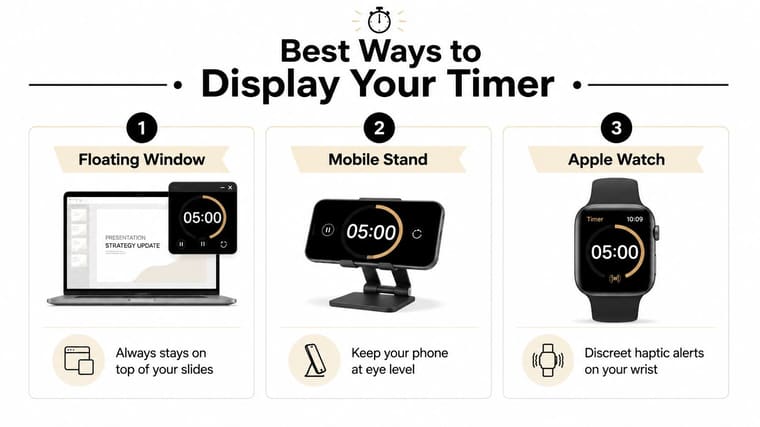
A useful way to choose your setup is to match it to the room:
| Speaking situation | Best display method | Why it works |
|---|---|---|
| Boardroom or classroom | Full-screen on iPad or spare phone | Large, readable, easy to place near eye line |
| Webinar or hybrid call | Phone widget or Mac-adjacent display | Quiet reference without crowding your slides |
| Stage or formal event | Apple Watch or secondary screen | Minimal audience distraction |
Full-screen on a second device
This is the most dependable option for many speakers.
Set an iPad or spare iPhone beside your laptop, or just below the camera if you’re on a video call. Use a full-screen countdown with large text. You don’t need fancy controls during the talk. You need visibility.
What works well:
- Place the device near eye level so glances look natural
- Angle it slightly toward you to avoid audience visibility
- Keep only the timer on screen so there’s no temptation to multitask
- Test brightness in the actual room because dim screens disappear under venue lights
This setup feels especially natural in conference rooms. You can glance down and to the side without visibly breaking your flow.
Widgets for quiet private checks
Widgets are useful when you want the timer available without turning your phone into a second monitor. A lock screen or home screen widget can sit ready for quick checks before you begin, during discussion periods, or while another speaker has the floor.
For people who already use widgets heavily, this can be the least disruptive option. The timer becomes part of the same glance pattern you already use during the day. If you want examples of how timer widgets behave in everyday use, the Pretty Progress guide to home screen timer widgets shows the basic widget approach clearly.
Widget-based timing is not ideal for every room. If the talk is formal and you’ll need frequent checks, a visible secondary device usually beats a phone you have to touch or wake. But for smaller meetings, coaching sessions, workshops, and online presentations, widgets can be exactly enough.
Keep the timer private unless the audience also needs the countdown. Most speakers perform better when they control the clock without inviting the room to stare at it.
Apple Watch for the invisible timer approach
The watch is the discreet option.
You don’t need to pull out a device. You don’t need to turn your head much. A small wrist check can look like a natural speaking gesture if you use it sparingly. This is the closest thing to a private stage monitor you can wear.
The limitation is obvious. A watch face is small. That means the timer display must be simple, and you should know in advance whether you’re checking for exact minutes remaining or just whether you’ve entered the final stretch.
The watch works best when:
- you already wear it regularly
- your speaking style includes subtle hand movement
- you don’t want a second screen visible on stage
- you’ve practiced enough that you only need occasional confirmation
A lot of speakers overcomplicate this choice. They try to use every screen they own. Don’t. Pick one primary display and one fallback. That’s enough for most presentation environments.
Advanced Timing With Mac and Segmented Cues
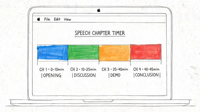
Strong pacing comes from structure, not heroics. If your talk has an introduction, a demo, a story, and Q&A, you’ll usually speak better when each part has its own boundary.
Use your Mac as the anchor clock
When the Mac is your presentation machine, a timer that stays visible without taking over the whole screen can be the cleanest option. A menu bar countdown is especially useful because it stays present but doesn’t compete with your slides.
If you want to put countdowns directly into your Mac desktop workflow, the Pretty Progress Mac countdown widget guide shows the basic setup path.
This approach is practical for:
- presenters running slides from their own laptop
- trainers who switch between slides, browser tabs, and demos
- webinar hosts who need one stable timing reference on the main machine
A Mac-based timer isn’t ideal if you’ll be far from the screen or if the display is mirrored in a way that makes the timer awkward to monitor. In those cases, a side device is easier.
Time the talk in chapters not one block
Research shows that breaking presentations into 20 to 25 minute segments can reduce audience cognitive fatigue by approximately 20%, which supports better retention and engagement, according to this PMC article on segmented presentation design.
That finding matches what experienced speakers already feel in the room. Audiences stop processing long before they stop looking at you.
A segmented timer for presentation work looks like this:
- Intro for your opening context and promise
- Main section for the core argument or walkthrough
- Interactive break for questions, quick reflection, or discussion
- Close for recap and next steps
You don’t need a complicated production tool to use this idea. You just need multiple timers with names that match the chapters of your talk. For example:
| Segment | Suggested timer label |
|---|---|
| Opening | Intro |
| Core explanation | Main walkthrough |
| Demo or example | Live example |
| Audience interaction | Q&A |
| Close | Final recap |
When a speaker says “I ran out of time,” the real problem is usually “I never timed the middle.”
This chapter-based method also helps with accessibility. High-contrast themes and larger layouts make each segment easier to read quickly. That matters if you present in bright rooms, wear multifocal glasses, or want fewer visual errors when your attention is already split between slides, audience reaction, and your next point.
Best Practices for Flawless Presentation Timing
Having a timer isn’t the same as using one well. Good timing comes from where you place it, how often you consult it, and whether you’ve trained your eyes and delivery to work with it.
Place the timer where your eyes can reach it
Professional presentation research shows that speakers who can’t see their timer tend to overrun by 15% to 25%, while speakers using a strategically positioned timer maintain a ±2% to 3% variance from target duration. That same guidance recommends a 45-degree sightline for timer placement, which keeps the display visible without making the audience feel you’re staring offstage, as detailed in this presentation timer placement guide from Event Timer.
That’s the invisible timer method in practice. Put the timer just off your natural forward focus. Not on the floor. Not behind your laptop. Not on a back wall.
A simple placement checklist helps:
- Use the side angle. Slightly off-center is easier than directly below your notes.
- Keep it close to your speaking line. The farther your eyes travel, the more obvious the glance.
- Test from the actual podium or chair. A setup that looks fine on the desk can fail once you’re standing.
Rehearse with the same cues you will use live
Many people rehearse the content and ignore the timing system until the event. That’s backwards. The timer is part of the performance setup.
Use the exact same countdown names, colors, and device positions in rehearsal. If you’re practicing a TED-style talk, study examples of how tightly that format depends on controlled pacing. The Silicon Valley Speakers TED Talk guide is a useful reference for understanding how disciplined structure supports a stronger talk.
Two rehearsal habits matter most:
- Check at planned moments, not constantly. For example, after the opening, before the transition, and near the close.
- Trim by section, not by panicking. If you’re behind, shorten an example or compress a transition. Don’t sprint through every remaining slide.
Use color changes as nonverbal prompts
A timer should speak to you without words. Color is one of the cleanest ways to do that.
Set your visual cues so the display changes as time gets tight. Green can mean comfortable pace. Yellow can signal that you need to start landing the current section. Red can mean finish the point and move to the close. If you use interval-based timing in other parts of your work, the Pretty Progress interval timer article is a useful model for thinking about cues as stages rather than one alarm at the end.
A final-minute alert should never surprise you. It should confirm what you already felt from the pace of the talk.
Used this way, a timer for presentation delivery becomes more than a countdown. It becomes a silent coach.
Troubleshooting Common Presentation Timer Hiccups
Even clean setups fail in small ways. Most problems are fixable in under a minute if you know where to look.
The screen locks at the worst time
If your phone or tablet sleeps during the presentation, don’t rely on touching it every few minutes. Use a display mode that stays visible for the duration of the talk, and check your screen auto-lock settings before you start.
If you’re using a bedside-style or stand-based setup, StandBy-style viewing can work well because the device remains glanceable at a distance. Full-screen display also helps because it removes visual clutter and makes accidental navigation less likely.
Your watch or widget is not updating
When widgets lag or a watch face shows stale data, the issue is usually sync related or the app hasn’t refreshed recently.
Try this short reset sequence:
- Open the app on the phone first so the timer state refreshes
- Check the same account and sync settings across devices
- Remove and re-add the widget or watch complication if it still shows old data
- Restart the device before the event if you’ve changed multiple settings
Don’t discover sync problems in front of an audience. Verify the whole chain before you walk into the room.
Battery and room setup issues
Long events expose weak setups fast. A bright screen, constant wireless syncing, and video conferencing can drain a device much faster than a normal day of use.
A few habits prevent most trouble:
- Start fully charged and bring a cable if you’ll be near power
- Lower brightness only as much as readability allows
- Silence notifications so banners don’t cover your countdown
- Do one full dry run in the actual orientation you’ll use live
The timer should reduce stress, not create a new category of it. Once the device setup is dependable, timing becomes one less thing to think about.
If you want a clean timer system that can live across your Apple devices, Pretty Progress is worth trying for countdowns, widgets, and glanceable timing cues that fit naturally into an iPhone, iPad, Apple Watch, and Mac workflow.





