June 17, 2026
Pretty Progress: Your Simple Countdown App Guide
Master Pretty Progress, the simple countdown app. Quickly set up widgets for Home/Lock Screen, customize, & sync across devices.
You probably have a few dates living rent-free in your head right now. A deadline next week. A trip next month. A birthday you absolutely can’t forget. Maybe a bigger goal too, like finishing a semester, sticking to a fasting schedule, or getting through a project sprint without losing momentum.
Those dates are often scattered across calendar alerts, notes apps, screenshots, and memory. That works, sort of. But it doesn’t feel calm. A simple countdown app does something better. It turns an abstract future date into something visible, steady, and emotionally real. Instead of wondering how close something is, you can see it.
That’s why countdowns feel so satisfying when they’re done well. They don’t just remind you. They create a small visual anchor in your day. The time left becomes part of your environment, not another task to manage. If you’re trying to build better routines around deadlines and goals, these time management best practices pair nicely with a visual countdown that stays in sight.
Table of Contents
- Why a Simple Countdown App Is Your Best Productivity Tool
- Creating Your First Countdown in Minutes
- Making Your Countdown Beautiful with Customization
- Adding Widgets to Your Home and Lock Screen
- Syncing Countdowns Across Your Apple and Android Devices
- Advanced Use Cases and PRO Features
- Frequently Asked Questions
Why a Simple Countdown App Is Your Best Productivity Tool
A good countdown earns its place because it reduces mental clutter. You stop carrying dates in your head and start seeing them in a format your brain can process instantly. That’s the core appeal. Not more alerts, but less background stress.
Countdown apps are built around a familiar structure. They count toward an event in years, months, days, hours, minutes, and seconds, and one app listing even mentions counting in “Heartbeats”, which shows how the category has moved from plain day counters to more glanceable time displays on Google Play. That shift matters because visualizing time changes how a date feels.
A vacation isn’t just “sometime in July” anymore. It’s a bar that’s moving. A launch date isn’t just a calendar square. It’s getting closer every time you check your phone.
A countdown works best when it stays visible enough to guide your decisions, but quiet enough that it doesn’t feel like another app demanding attention.
That’s why this kind of tool often beats a packed calendar for personal goals. Calendars are great for appointments. Countdown widgets are better for motivation. They turn progress into something you can glance at and feel.
Creating Your First Countdown in Minutes
The nicest thing about this app category is that it doesn’t ask for a complicated setup. Countdown apps grew alongside mobile app stores as free, easy-to-use reminder tools, and that’s still the standard people expect on the Apple App Store. If an app feels heavy, it’s missing the point.
Start with one date that already matters to you. Don’t begin with a giant system. Pick something emotionally clear, like a holiday, a move, exam week, or concert night. You’ll get a better result when the countdown means something at first glance.
Pick one event that has energy
Say you’ve got a long weekend trip coming up. Create a countdown with a simple title like “Beach Getaway” or “Flight to Lisbon.” Then choose the end date, which is the event you’re counting toward.
If your app supports progress bars, add a start date too. That changes the experience from “time remaining” to “progress through a journey,” which feels very different. For a semester, training block, or savings goal, that progress view is often more motivating than a raw countdown.
A practical setup usually looks like this:
- Title: Keep it short enough to read instantly on a widget.
- End date: Use the exact moment that matters. Departure, deadline, launch, or celebration.
- Start date: Add this when the journey matters as much as the finish line.
- Display style: Choose the time units you care about, not every possible one.
Keep the first version simple
Users often overbuild their first countdown. They add too many labels, too many units, too many events at once. A better move is to make one clean countdown, place it somewhere visible, and live with it for a day.
Practical rule: Your first countdown should answer one question instantly. “How long until this matters?”
If the answer isn’t obvious at a glance, simplify it. Shorten the title. Reduce visual noise. Remove units you don’t need.
That first success matters because it teaches you what this tool is for. Not tracking everything. Tracking the few things you want to feel connected to every day.
Making Your Countdown Beautiful with Customization
Once the setup is done, the enjoyable part is turning a countdown into something you want to keep on your screen.

A plain timer gives you information. A polished countdown does more than that. It keeps the goal emotionally present.
That matters more than many people expect. If a countdown looks good beside your wallpaper and icons, you notice it more often. If you notice it more often, the finish line feels closer and the work around it feels less abstract. Good design does not replace discipline, but it does make attention easier to keep.
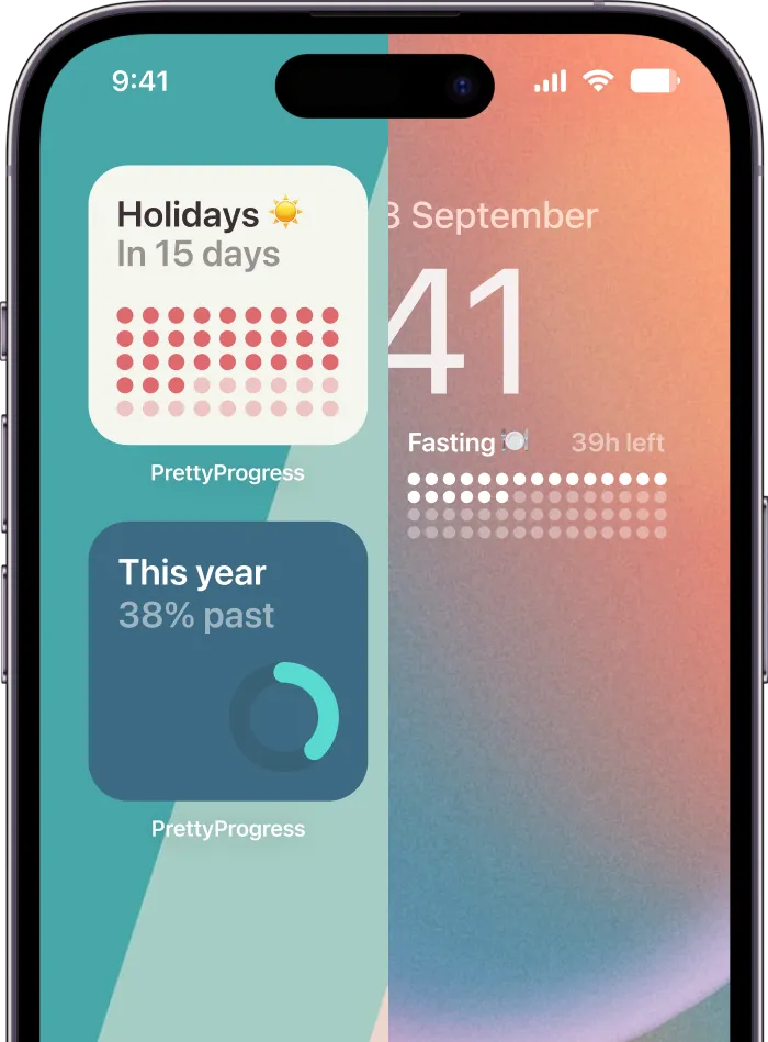
Pretty Progress includes curated themes such as Swiss Style, Minimal, Aqua, and Retro OS, along with controls for colors, gradients, bar size, shape, layout, and icons. That range is useful because different goals carry different moods. A launch date should feel different from a vacation, and a study deadline should not look like a party reminder.
Start with a theme, then shape the mood
The fastest way to get a good result is to start from a theme and adjust from there. A strong preset usually gets the typography, spacing, and contrast right, which saves time and avoids the overdesigned look that happens when every setting gets changed at once.
Then make a few deliberate choices:
- Color palette: Muted colors feel calm and steady. High contrast feels active and urgent.
- Gradient use: A light gradient adds depth. Too much can make the countdown harder to read at a glance.
- Icon choice: A suitcase, book, moon, or target gives the event context before your brain reads the title.
- Bar shape: Rounded bars feel softer. Squared edges feel more structured and focused.
If you enjoy matching small visual details across your phone, these developer insights for custom app icons are helpful. Coordinating the widget and app icon can make the whole setup feel intentional instead of pieced together.
Design for the feeling you want every day
This is the part people often skip. They customize for novelty instead of for repeat viewing.
A countdown for a stressful deadline should reduce friction, not add it. That usually means cleaner type, fewer colors, and less decoration. A countdown for a trip or celebration can carry more personality because part of its job is to build anticipation. The best style depends on what you want to feel each time you glance at the screen.
Try these combinations:
| Style goal | What to change |
|---|---|
| Calm and minimal | Use fewer time units, muted tones, simple iconography |
| Bold and motivating | Increase contrast, use a stronger gradient, keep the bar prominent |
| Playful and personal | Pick a more expressive theme and match the icon to the event |
For visual ideas that work well on actual phones, these aesthetic widget ideas for iPhone are worth browsing before you settle on a final design.
Once the base design is in place, live with it for a day. If the countdown feels pleasant to see ten times a day, you picked the right style. If it feels noisy or cluttered, simplify it.
A good countdown should do two things at once. It should make your screen look better, and make your goal feel a little more real every time you see it.
Adding Widgets to Your Home and Lock Screen
A countdown becomes much more useful when it leaves the app and lands where you’ll see it.

Home Screen widgets are good for richer context. Lock Screen widgets are good for instant awareness. You don’t need the same information in both places, and the best setups usually don’t try.
What to place on the Home Screen
Use the Home Screen for the countdowns you want to interact with mentally. Here, a larger widget can earn its space.
A larger widget works well for:
- Project deadlines: You can show a title and a more detailed progress view.
- Long-range goals: Semester timelines, fitness blocks, and savings windows benefit from more visual room.
- Travel plans: A larger card makes the anticipation more fun.
Smaller widgets are better when you already know the context and only need the number to stay visible. If you need ideas for arrangement and placement, this guide to a home screen timer setup is a useful reference.
What works best on the Lock Screen
The Lock Screen is different. It’s not for detail. It’s for frictionless reassurance.
A compact countdown there should answer one quick question before you even open the phone. How long until the exam? Is the trip close now? How much time is left in the fasting window?
That’s also where update efficiency matters. Frequent timer updates can waste power and create unnecessary UI work. A better implementation recalculates the remaining time from a stored target at a fixed interval, such as 1000ms, instead of constantly subtracting from the last shown value, which helps avoid drift and extra render work in this timer implementation explanation.
Battery-friendly countdowns don’t fake accuracy by updating more often than people can meaningfully read.
So when you set up widgets, don’t chase maximum detail everywhere. Put the rich version where you browse. Put the compact version where you glance.
Syncing Countdowns Across Your Apple and Android Devices
A countdown stops feeling simple the moment you have to rebuild it on every device you own.

That’s one of the most overlooked problems in this category. Public guides often show how to add a widget to one screen, but they rarely deal with whether a countdown’s state, formatting, and notifications stay aligned across platforms, even though that’s a real need noted in this discussion of countdown displays and editing across devices from OptiSigns support.
Why cross-device consistency matters
If you change the date on your laptop but your phone still shows the old one, the countdown becomes less trustworthy. If the color theme differs between devices, it feels messy. If one screen updates and another lags behind, the whole point of an always-visible reminder starts to break.
Cross-device consistency matters most when the countdown is tied to daily decisions. A project end date, a sprint, a class deadline, or a recurring routine needs to follow you without extra admin.
The ideal countdown feels like one object that appears everywhere you are, not five separate versions you have to babysit.
How to think about each device
Each screen has its own job. Don’t treat them all the same.
- Phone: Your default glance point during the day.
- Tablet: Better for larger visual progress bars and planning views.
- Watch: Best for a quick pulse check when you’re away from your desk.
- Desktop or laptop: Useful when a long-running goal should stay in the background while you work.
That ecosystem view is what turns a countdown from a novelty into part of your routine. When the same goal appears consistently across your devices, it stays emotionally present without needing another notification.
Advanced Use Cases and PRO Features
Once you’ve used a countdown for one personal event, you start noticing how many parts of life are easier to manage when progress is visible.

Birthdays and vacations are the obvious use cases. They’re not the most interesting ones.
Countdown ideas that go beyond birthdays
A simple countdown app gets more valuable when you use it for rhythms, not just events.
Try it for things like:
- Semester progress: Track the path from first class to final exam.
- Project sprints: Show the time left in the current cycle so scope decisions stay grounded.
- Savings goals: Add a start and end date so the bar reflects steady progress.
- Golden hour planning: Keep a visual reference for a photography session.
- Fasting windows: A countdown can make start and end points easier to follow.
- Subscription reminders: Put renewals and bill dates somewhere visible before they surprise you.
Some people also use countdowns for habits that benefit from anticipation. Not just “when is this due,” but “how close am I getting?”
When deeper controls are worth it
Free or basic functionality is enough when you only need one or two countdowns. But advanced controls start to matter when the countdown is part of your environment every day.
PRO-style upgrades tend to make sense when you want:
- More styling control: Helpful if you care about matching widgets to different screens or contexts.
- More countdown flexibility: Useful when you track several active goals at once.
- A cleaner visual system: Important when multiple widgets need to feel coordinated instead of cluttered.
The practical test is simple. If the countdown is becoming part of how you manage work, routines, or long-term goals, better customization and expanded limits can move it from “nice to have” to “worth setting up properly.”
A beautiful countdown isn’t fluff. It changes compliance. People keep tools on their screens when those tools feel good to look at.
Frequently Asked Questions
Is a countdown the same as a progress bar
Not quite. A countdown focuses on the time remaining until an end point. A progress bar shows movement between a start and end point. If you’re tracking a journey, the bar often feels more motivating. If you only care about the deadline, a plain countdown is enough.
What happens when a countdown reaches zero
That depends on the app’s design. Some stop at zero. Others shift into a completed state or let you repurpose the event. For personal goals, it’s helpful when completion feels visually distinct so you can celebrate it, archive it, or roll it into the next milestone.
Will a countdown widget drain my battery
A well-built one shouldn’t feel heavy in normal use. The main thing to avoid is an app that updates too aggressively or handles refreshes inefficiently. If the countdown feels lightweight and stable on your screen, that’s usually a sign the update logic is being handled sensibly.
Should I track lots of events at once
Only if they all matter. A short list of meaningful countdowns is more effective than a dashboard full of dates. One to three visible goals usually creates clarity. Too many turns the screen into another list to ignore.
Can I use a countdown for habits and routines
Yes, especially when the habit has a clear interval or finish point. Fasting windows, study blocks, recovery periods, and recurring reminders all work well because the time frame itself is motivating.
Is sharing countdowns useful
It can be, but only for shared contexts. Trips, launches, events, and household deadlines are good examples. For personal focus, private widgets are usually better because they keep the screen calm and reduce extra coordination.
If you want a countdown to do more than count days, Pretty Progress is worth a look. It lets you turn goals, events, and routines into customizable progress widgets that stay visible across your devices, which makes the whole experience feel less like tracking time and more like watching something meaningful move closer.