May 31, 2026
Lock Screen Wallpaper Time: A Complete Customization Guide
Learn how to customize your lock screen wallpaper time on iOS and Android. This guide covers fonts, widgets, countdowns, and design tips for a perfect look.
You check your phone for the time dozens of times a day. If the lock screen is the part of your phone you see most, it should do more than show a generic clock on top of a nice photo.
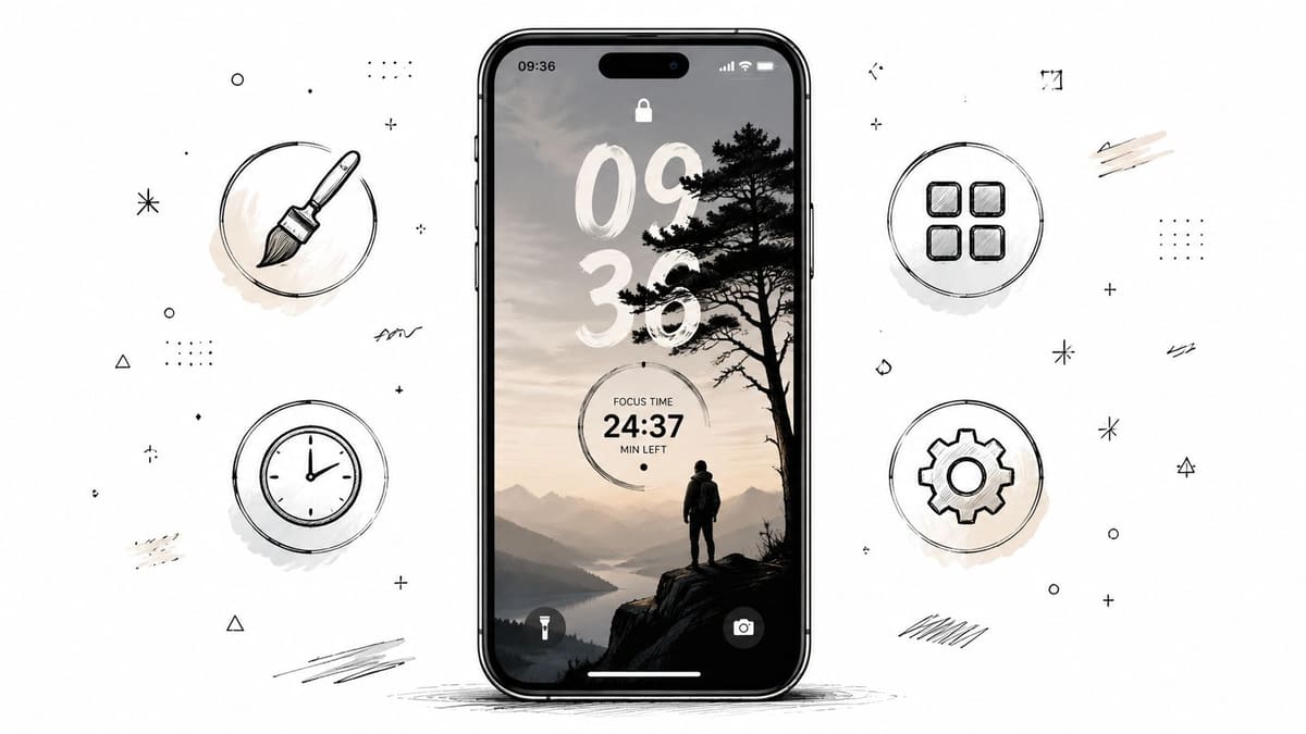
Lock screen wallpaper time has turned into a real customization project for a reason. People are no longer choosing a wallpaper and calling it done. They are adjusting type, spacing, depth, contrast, and glanceable information so the screen works better in real life. The best setups do three things well. They keep the time easy to read, make the wallpaper and clock feel like one design, and put something useful in front of you every time you wake the phone.
That last part is where the lock screen gets interesting.
A static clock is fine for checking the hour. A well-built lock screen can also show progress. For some people, that means a cleaner date and weather layout. For others, it means a countdown to a trip, a deadline, or a personal goal. Tools like Pretty Progress push this further by turning the lock screen from a passive background into a small progress dashboard you do notice.
That shift was significant. Users stopped thinking only about wallpaper and started thinking about time as part of the design and part of the workflow. The trade-off is simple. A dramatic layout can look great and still be harder to read, while a practical layout can feel boring if the wallpaper, font weight, and widgets do not work together. The sweet spot is a lock screen that looks intentional and gives you useful information in one glance.
Table of Contents
- Your Lock Screen Is More Than Just a Clock
- Mastering Time on Your iPhone and iPad Lock Screen
- Android Lock Screen Time Customization
- Go Beyond the Clock with Countdown Widgets
- Design Tips for a Readable and Beautiful Lock Screen
- Common Problems and Quick Fixes
Your Lock Screen Is More Than Just a Clock
Many users start customizing their lock screen for aesthetic reasons. They’re tired of seeing a generic clock over a wallpaper that could belong to anyone. Then they realize the ultimate payoff isn’t just style. It’s reducing friction in tiny moments that repeat all day.
A lock screen gets more attention than most apps. You don’t have to open anything. You don’t have to swipe through menus. The information is already there, waiting for a half-second glance while you’re between meetings, leaving class, or checking whether you still have time before the next task.
That changes how lock screen wallpaper time should be treated. It isn’t decoration pasted behind a clock. It’s interface design.
A lock screen works best when it answers one question instantly: what do I need to know right now?
For some people, that answer is a bold readable clock over a minimal photo. For others, it’s a layered portrait where the time feels embedded into the image. And for people who live by deadlines, it often means turning the lock screen into a progress surface instead of a passive display.
Apple pushed that idea forward when it redesigned the Lock Screen in iOS 16. The update made the space feel less fixed and more intentional. That shift matters because users stopped thinking only about wallpaper and started thinking about layout, depth, and glanceable information.
Three lock screen goals usually compete with each other:
- Style: You want the screen to feel like your phone, not the factory default.
- Clarity: You need to read the time immediately, in any lighting condition.
- Usefulness: You want something beyond the clock, such as alarms, world time, or countdowns.
If you ignore style, the phone feels dull. If you ignore clarity, the screen becomes annoying. If you ignore usefulness, you miss the chance to make this space helpful.
The sweet spot is simple. Make the time easy to read, make the wallpaper support the clock, and only add extra information that earns its place.
Mastering Time on Your iPhone and iPad Lock Screen
You notice the difference the first time you set up your lock screen with intent. A good layout lets you read the time in a split second, spot the one detail that matters, and put the phone away again. A bad one looks nice in screenshots and gets annoying by day two.
On iPhone and iPad, Apple gives you enough control to build a lock screen that feels personal without breaking usability. The clock itself stays fixed as a system element, but the font, color, wallpaper interaction, and widget area give you plenty of room to shape how time appears and what it means at a glance. That matters if you want more than a decorative clock. It also sets up a useful next step, where countdown tools such as Pretty Progress can turn that same space into a visual progress dashboard.
Start with the system tools first. They solve the core layout problems better than most shortcuts and theme workarounds.
Start with the system tools Apple gives you
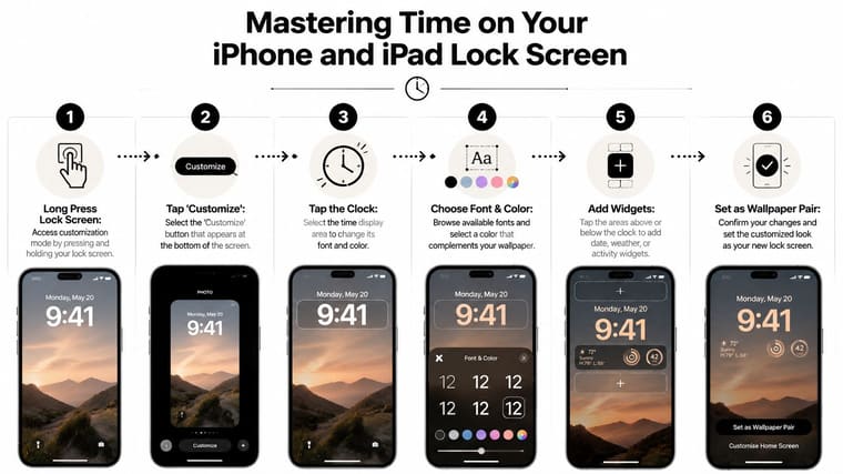
The setup is simple:
- Long press your Lock Screen until the customization view appears.
- Tap Customize on the wallpaper you want to edit.
- Tap the clock to open font and color options.
- Choose a font that matches the wallpaper and stays readable in bright and dim light.
- Set the color for contrast first. Style comes after legibility.
- Add widgets above or below the time only if they help you make faster decisions.
If you like seeing the process in motion, this walkthrough helps:
The easiest mistake is picking the clock style before picking the photo. In practice, the wallpaper does most of the work. It controls contrast, visual weight, and whether the time feels clean or cramped.
Practical rule: Choose the wallpaper first, then tune the clock to it.
I usually test three things before I keep a setup: lock the phone in a bright room, check it again in low light, and glance at it from arm’s length. If the time is not instantly clear in all three cases, the design needs work no matter how polished it looked during editing.
If you spend time fine-tuning fonts, colors, and widget spacing, it helps to adjust iPhone screen timeout so the display stays on long enough to compare options without repeating the process.
If you want more ideas for showing time information cleanly, this guide to digital clock and date layouts gives a few useful patterns.
Make the Depth Effect work on purpose
Depth Effect looks great when the photo cooperates. It fails when the image asks too much from the system.
The feature works best when iOS can clearly separate a foreground subject from the background and let part of that subject overlap the clock area. Photos with weak subject separation, messy edges, or too much visual noise often block the effect entirely. That is normal behavior.
Choose images with these traits:
- A clear subject: People, pets, objects, or statues with a defined outline.
- Clean overlap near the clock: Hair, shoulders, hats, or other edges that pass through the upper part of the frame.
- Open space around the subject: The clock needs room to stay readable.
These choices usually disappoint:
- Busy travel shots: Nice wallpaper, weak clock separation.
- Soft or blurry portraits: Harder for iOS to segment cleanly.
- Collages and layered graphics: Too many competing shapes.
The trade-off is simple. Strong depth usually means a more dramatic look, but it can reduce readability if the subject crosses too much of the clock. If clarity matters more than style for your daily use, skip the effect and keep the time fully unobstructed.
Use widgets without overcrowding the screen
Widgets are where the lock screen becomes useful instead of merely attractive. They can also ruin a clean design fast.
A good lock screen usually has one job. Maybe it shows your next alarm. Maybe it shows another city if you work across time zones. Maybe it leaves the widget area nearly empty so the clock stays dominant. Each of those can work.
Here is the practical version:
| Need | Better widget choice | Why it works |
|---|---|---|
| Time zones | World Clock | Helpful for remote work and travel |
| Daily timing | Next Alarm | Reduces morning guesswork |
| Clean look | One small widget | Keeps visual focus on the time |
| Quick awareness | Compact city clock | Adds context without crowding the screen |
The limit is not technical. It is visual. Once the lock screen starts competing for attention, it stops being glanceable.
That is also why third-party countdown tools are interesting. The built-in setup handles standard time well, but it does not turn time into visible progress toward a deadline, event, or habit milestone. If you want the lock screen to answer “how long is left?” instead of only “what time is it?”, that calls for a different layer of customization.
Android Lock Screen Time Customization
Android gives you more variation, but also more inconsistency. What you can change depends on whether you’re using a Pixel, a Samsung phone with One UI, or a device from another manufacturer that adds its own lock screen layer.
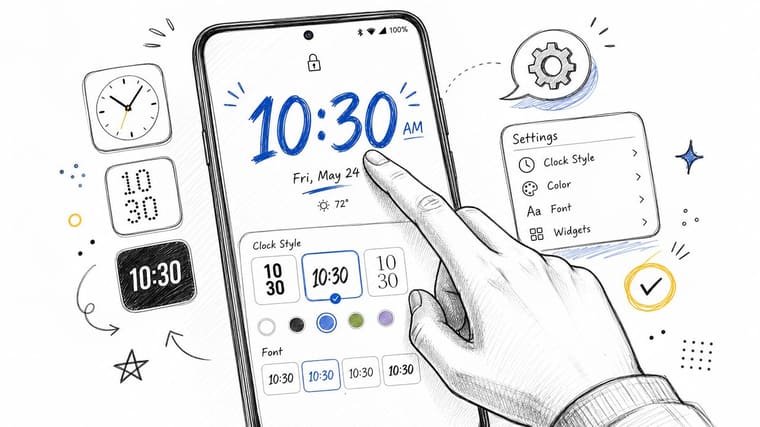
Where to change the clock on Android
On many Android phones, the usual places to check are:
- Wallpaper and style settings: Common on Pixel devices.
- Lock screen settings: Often where Samsung groups clock style options.
- Always On Display controls: Useful if you want a different clock behavior when the screen is idle.
The easiest approach is to search your Settings app for clock, lock screen, or Always On Display. Manufacturers label these menus differently, but the pattern is similar. You’ll usually find a small set of clock styles, color options, and layout choices.
If you want lock screen countdown behavior instead of only a standard clock, this guide on adding countdown widgets on Android lock screen covers the widget route.
Why depth-style clocks fail on Android
Android depth effects depend heavily on image quality. The clock only looks like it’s sitting behind the foreground when the wallpaper has a clearly isolated subject. Tutorials on Android depth setups repeatedly highlight the same constraint: the foreground needs to be sharp and distinct, with enough contrast for the system to mask the clock behind it convincingly (Android depth effect tutorial reference).
That means a good Android depth wallpaper usually has:
- A sharp foreground subject
- Strong contrast from background to subject
- Enough empty space for the clock to overlap the edge
And these often fail:
- Bouquet blur or soft focus
- Low-contrast subjects
- Crowded scenes with too many competing edges
If the depth effect looks fake, don’t force it. A clean clock over a simpler wallpaper usually looks better than a broken layered effect.
On Android, that judgment call matters more because results vary from phone to phone. What looks polished on one device can look awkward on another, even with the same image.
Go Beyond the Clock with Countdown Widgets
You check your phone at 8:12 AM before walking into class or opening Slack. A standard clock confirms the hour. A countdown widget tells you something more useful: three days until the exam, twelve days until the trip, or one week left before a launch.
That difference matters because lock screen time can either be passive or directional. The default clock reports the moment. A countdown or progress widget adds context, which makes the lock screen more useful during the small glance moments that shape a day.
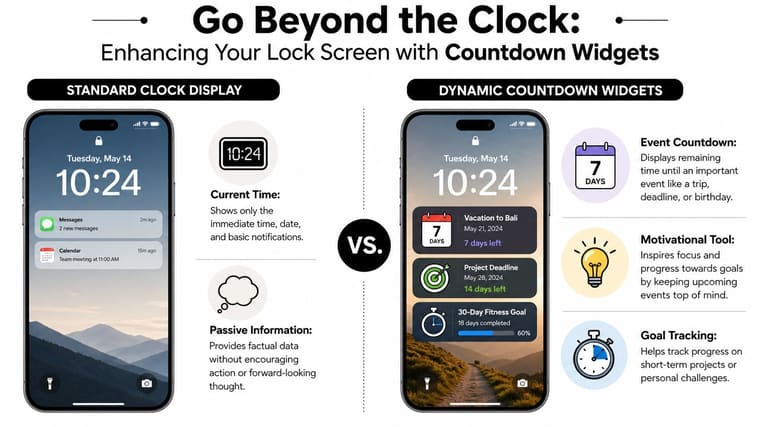
That is the gap many basic customization guides miss. They focus on fonts, colors, and wallpaper placement. Those details matter, but they do not change behavior much on their own. A visible deadline or progress bar can.
When a clock stops being enough
A plain clock answers one question. Time-based widgets answer a second question that often matters more: what should get your attention today?
Used well, they help in a few practical ways:
- Deadlines stay visible without opening Calendar or Reminders.
- Milestones feel closer because progress is always on screen.
- Long projects feel less abstract when you can see time passing instead of vaguely feeling behind.
That is why countdown widgets work especially well for students, busy professionals, and anyone who tends to notice a deadline late. Seeing “4 days left” has a different effect than seeing “9:41.”
If you want to set one up on iPhone, this guide to adding a countdown widget on your iPhone’s lock screen walks through the setup. Pretty Progress lets users place countdown and progress-based widgets on the lock screen and home screen, so the phone shows more than the default clock.
Good uses for time-based widgets
The best countdowns are not the most dramatic ones. They are the ones you need to see often.
These tend to work well:
- Deadlines: exams, launch dates, application cutoffs, billing dates
- Personal events: trips, birthdays, moving day, race day
- Long-range progress: time left in the year, habit windows, life-in-weeks style reminders
Format matters too. A hard countdown creates urgency, which can help if procrastination is the problem. A progress bar feels calmer and often works better for longer goals because it shows movement, not just time disappearing.
I usually recommend being selective. If the lock screen shows five urgent things, none of them will feel urgent for long. One or two high-value widgets is usually the sweet spot.
The upgrade is not merely visual polish. It is turning lock screen wallpaper time into a lightweight progress dashboard that keeps the right date, goal, or deadline in view every time you wake the phone.
Design Tips for a Readable and Beautiful Lock Screen
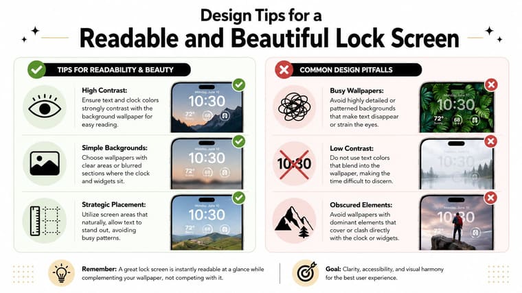
A stylish lock screen that hides the time is a failed design. This sounds obvious, but it’s where most setups go wrong.
The common problem isn’t that people lack customization options. It’s that they optimize for the screenshot instead of daily use. That’s why readability deserves more attention. Apple community discussions include many complaints about the date and time becoming semi-transparent and hard to read after iOS updates, which points to a real usability gap rather than a purely cosmetic issue (Apple Community discussion on semi-transparent lock screen time).
Build around contrast first
The fastest test is simple. Lock your phone, put it at arm’s length, and check whether you can read the time instantly. If you hesitate, the design needs work.
Focus on these basics:
- Dark clock over light area, or light clock over dark area
- Avoid patterned wallpaper directly behind the clock
- Use color accents sparingly if readability drops
A lot of attractive wallpapers fail because they place detail exactly where the clock sits. Clouds, tree branches, facial features, city lights, and text-heavy graphics all tend to cause trouble.
Choose wallpapers that help the clock
The best wallpaper for lock screen wallpaper time usually has a built-in quiet zone. That can be open sky, a blurred background, negative space, or a subject positioned lower or to one side.
If you create your own wallpapers, learning some AI photo generation techniques can help you produce images with cleaner composition and stronger separation between subject and background. That makes customization easier, especially when you want the clock to sit clearly without fighting the image.
A quick checklist helps:
| Good sign | Why it matters |
|---|---|
| Empty area near the clock position | Improves legibility |
| Strong foreground/background separation | Helps depth effects and clarity |
| Limited color noise | Makes text easier to parse |
| Simple subject placement | Prevents overlap conflicts |
One more thing matters: restraint. If you add widgets, don’t also use a wallpaper that demands all the attention. Let one element lead, and let the others support it.
Common Problems and Quick Fixes
A lock screen can look perfect while you set it up, then fall apart the next morning when the clock overlaps a face, fades into the wallpaper, or starts competing with too many widgets. That usually points to one of three causes: the image does not suit the layout, the system changed how it renders the screen, or the design is trying to do too much at once.
If the clock won’t sit behind the wallpaper subject
On iPhone, the subject-over-clock effect only works under specific conditions. Some photos have edges that the phone can separate cleanly. Others do not. Font choice can also affect whether the effect stays available.
Start with the photo, not the clock settings.
- Try a different image: Clear outlines around a person, pet, plant, or object work better than busy backgrounds or soft edges.
- Switch back to a simpler clock style: If the layered look disappears, the current font or script may be the reason.
- Crop with intention: A small shift in subject placement often fixes overlap issues faster than repeated styling changes.
- Accept the flat version when it looks better: Depth is nice, but a standard clock in front can be cleaner and easier to read.
I usually treat this as a design choice, not a feature to force. If the photo fights the clock, the photo loses.
If your lock screen suddenly looks wrong
Software updates can change contrast, transparency, widget spacing, or how wallpapers render. The result is a lock screen that looked balanced before and now feels off.
Run through the quick fixes in this order:
- Restart the phone.
- Check for system updates.
- Delete and rebuild the lock screen setup instead of trying to repair a glitchy one piece by piece.
- Test with a different wallpaper to confirm whether the problem is the image or the system.
This saves time. If a clean wallpaper still looks broken, stop tweaking colors and layouts. You are probably dealing with a software issue, not a bad design decision.
If widgets or layouts feel messy
Clutter is usually a priority problem. The lock screen has limited space, and every extra element asks for attention during the half-second glance when you check the time.
Cut back in this order:
- Remove the widget you use least.
- Reduce visual detail in the wallpaper.
- Return the clock to a higher-contrast color.
- Check the screen outdoors or in daylight, where weak contrast shows up fast.
Good lock screens are edited, not stuffed.
If you want more than a static time display, keep the extra information focused. Pretty Progress works well here because it turns that glance into something more useful: a countdown, milestone, or progress view tied to a deadline that matters to you. That approach works better than piling on random widgets, because it gives the clock area a job instead of just decorating it.