May 17, 2026
Your Digital Clock and Date: A Complete Setup Guide
Create a custom digital clock and date widget for your Home & Lock Screen. Step-by-step guide for iOS, Android, and the powerful Pretty Progress app.
Your phone already shows the time. That’s not the problem. The problem is that the default clock usually wastes one of the most valuable spaces on your screen.
A popular preference is a digital clock and date setup that does more than sit there. You want something easy to read, matched to your wallpaper, useful at a glance, and reliable when your day gets busy. You might also want something that feels more personal than the same stock widget everyone else has.
That’s where a better setup helps. Native widgets are a solid starting point because they’re fast and built in. Custom widget apps take it further when you want more control over layout, style, and what the widget does for you.
Table of Contents
- Beyond the Default Your Screen Deserves Better
- Adding Your First Clock Widget with Native Tools
- Unlocking Total Control with Pretty Progress Widgets
- Styling Your Digital Clock for Clarity and Impact
- Syncing Widgets and Troubleshooting Common Issues
- Frequently Asked Questions
- Can I get a good digital clock and date setup without installing anything?
- Why does my widget look good in setup but bad on the Home Screen?
- Is bigger always better for readability?
- Should I use 12-hour or 24-hour format?
- Why is my date wrong after traveling?
- Do custom widgets slow down my phone?
- Is it worth customizing the widget if I only use it for time?
Beyond the Default Your Screen Deserves Better
A default clock widget is fine until you notice how little it adds. It tells you the time, maybe the date, and that’s it. It doesn’t help your screen feel intentional, and it rarely fits the rest of your setup.
Customizing a digital clock and date widget solves two problems at once. It improves glanceability and gives your screen some personality. That matters whether you want a calm minimalist layout, a bold productivity dashboard, or a lock screen that shows exactly what you need without opening an app.
There’s also a nice bit of history behind the idea. A major milestone came in 1883, when Austrian engineer Josef Pallweber invented the “jump-hour” mechanism, widely cited as the first digital pocket watch, using number windows instead of traditional hands, as described in this digital clock history overview. Digital time display has been around much longer than is commonly assumed.
If you like the broader style conversation around analog versus digital watches, the ECI Jewelers luxury watch guide is a useful companion read because it shows how display style affects both function and feel.
A good widget earns its space. If it doesn’t improve how quickly you read your screen, it’s decoration first and tool second.
For iPhone users, it also helps to browse a few widget ideas before you commit to one layout. This roundup of free widget apps for iPhone gives you a quick sense of what native tools can do and where third-party options open things up.
Adding Your First Clock Widget with Native Tools
The fastest path is the one your phone already gives you. Native widgets are simple, stable, and good enough for many people.

On iPhone
On iPhone, the process is clean but a bit constrained.
- Press and hold on the Home Screen until the icons start to jiggle.
- Tap the add button in the corner.
- Search for Clock or browse Apple’s widget list.
- Swipe through available widget sizes.
- Tap Add Widget, then drag it where you want it.
- For Lock Screen placement, press and hold the Lock Screen, tap Customize, then add a clock-related widget in the available slots.
What usually works best on iPhone is choosing the size based on your reading distance. Small widgets can look elegant, but they’re not always useful if you’re trying to glance from across a desk or room.
On Android
Android usually gives you more placement freedom right away.
- Long-press the Home Screen and choose Widgets.
- Find the Clock category from your launcher or system apps.
- Drag the widget onto the screen.
- Resize it if your launcher allows it.
- Open the widget settings if available to choose style, timezone, or transparency.
Different Android phones handle this a little differently. Samsung, Pixel, and other launchers often have their own visual style and widget behavior, but the basic flow stays similar.
What native widgets do well and where they stop
Native widgets are good at the basics. They’re quick to add, they match the operating system, and they usually stay consistent after updates.
Their limits show up when you want specifics:
- Layout control: You usually can’t freely rearrange time, date, and extra information.
- Styling freedom: Fonts, color treatments, spacing, and visual themes are often fixed.
- Functional depth: Native clock widgets don’t always let you turn a date display into something more purposeful.
One useful rule from large-display digital clock design also applies surprisingly well to phones. Commercial guidance treats viewing distance as the first decision, then maps that to display size, while common baseline needs include 12/24-hour format support and time/date alternation, as noted in this digital clock deployment guide. On a phone, the same thinking helps. Decide where and how you’ll read the widget first, then choose size and format.
A short walkthrough can help if you want to see the basic flow in motion:
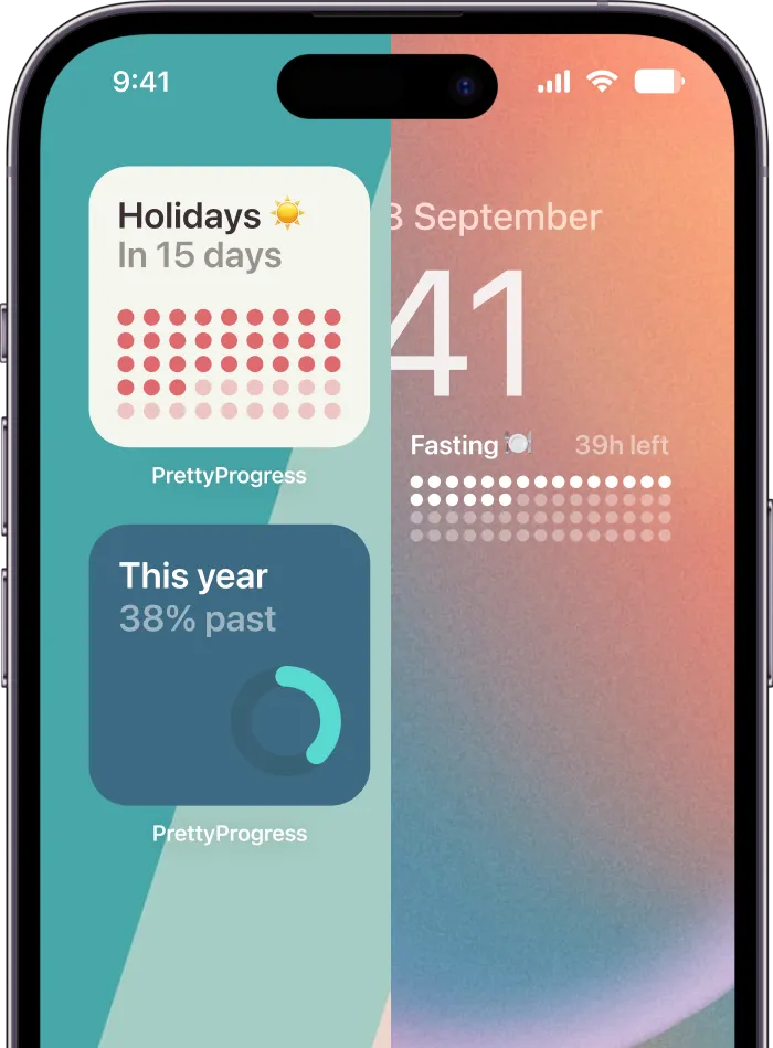
Unlocking Total Control with Pretty Progress Widgets
Native widgets are good when “good enough” is enough. They stop feeling good when you want your digital clock and date to match a theme, highlight an important date, or work as part of a more expressive home screen.
Why custom widgets feel different
The difference is control. Instead of picking from a few preset clock blocks, you can shape how the widget looks and what role it plays on the screen.
That’s where Pretty Progress fits naturally for people who want a widget that can combine date-based information with stronger visual customization. It supports countdown and progress-based widgets across Apple devices and Android, which means a clock-and-date setup can also become a visual reminder for deadlines, events, or milestones instead of just a passive display.

Practical rule: If you check a widget many times a day, spend the extra few minutes making it feel intentional.
A practical setup flow
A custom setup works best when you choose function before decoration.
Start with the job:
- Simple daily reference: Show time and date cleanly, with minimal extras.
- Motivation: Pair the date with a countdown or progress element for an exam, trip, launch, or deadline.
- Theme matching: Build around your wallpaper, app icon colors, or a specific aesthetic like Swiss Style or Retro OS.
Then shape the display:
- Pick the widget size based on how prominent you want it to feel.
- Choose the visual theme that matches your screen rather than fighting it.
- Set the date logic so the widget reflects a current or future moment you care about.
- Adjust color and type until the time reads clearly without visual clutter.
- Test it on the actual screen you’ll use, not just inside the editor.
Custom widgets tend to beat native ones on this front. You can make a digital clock and date setup that feels calm, playful, technical, or high-contrast without waiting for the operating system to add one exact style you happen to want.
Native Widgets vs. Pretty Progress
| Feature | Native Widgets | Pretty Progress |
|---|---|---|
| Setup speed | Fast, built into the OS | Fast, but requires app setup |
| Design flexibility | Limited preset styles | More control over theme, layout, color, and visual treatment |
| Clock and date role | Mainly informational | Informational plus countdown or progress-oriented use cases |
| Matching your wallpaper | Sometimes difficult | Easier to tune visually |
| Creative range | Bound by system options | Broader styling options |
For many users, the smartest path is simple. Start native. If the widget still feels generic, cramped, or disconnected from the rest of your screen, move to a custom builder.
Styling Your Digital Clock for Clarity and Impact
A widget can be beautiful and still be annoying to read. That usually happens when style wins every decision.

Make readability the first design choice
The strongest digital clock and date layouts usually do less. They use fewer visual elements, stronger contrast, and a clearer hierarchy between the main time and the supporting date.
Accessibility guidance and product research consistently point to contrast, viewing angle, and simplified layouts as key factors for legibility, not just bigger numbers. Low-vision clock designs sometimes split information into clearer zones or quadrants to make time and date easier to parse, as discussed in this accessibility-focused clock review.
That principle transfers well to widgets:
- Use contrast on purpose: Light digits on a busy pastel wallpaper often look worse than darker text on a calmer background.
- Separate roles: Time should usually be dominant. Date should support it, not compete with it.
- Reduce decoration: Heavy shadows, too many accent colors, and novelty fonts tend to lower scan speed.
Clean beats clever when you’re reading a screen half-awake or mid-task.
If you’ve ever customized a wearable screen, the same logic applies. This guide to easy Garmin watch face changes is a nice reminder that small screens reward simple choices more than flashy ones.
Build a layout your eyes can scan fast
When I adjust a widget, I use a quick test. Can I read it in one glance from the angle I usually see it? If not, the design isn’t finished.
Try these layout moves:
| Choice | What usually works | What often fails |
|---|---|---|
| Font weight | Medium or bold for time | Thin text over a detailed wallpaper |
| Date placement | Below or beside the time with smaller emphasis | Same size as the time |
| Color count | One main text color and one accent | Several competing highlight colors |
| Spacing | Clear separation between time and date | Crowded stacked text |
A smart design doesn’t need to be plain. It just needs a clear reading order. Your eyes should land on the time first, then the date, then any secondary detail.
Syncing Widgets and Troubleshooting Common Issues
Once your widget looks right, the next job is accuracy. A stylish digital clock and date widget becomes useless fast if it stops updating or shows the wrong date after travel.
Keep time and date correct across devices
If you use more than one device, consistency matters. Your iPhone, iPad, Mac, and watch should all agree on time settings, date format, and timezone behavior.
Use this checklist:
- Turn on automatic date and time: Manual settings are the first thing I check when a widget looks wrong.
- Confirm timezone settings: This matters most after flights, VPN use, or region changes.
- Match system preferences: A widget often follows the device’s system format for time and date presentation.
- Check app permissions and refresh behavior: If the system limits background activity, the widget may lag behind.
If you also use a desktop setup, this guide to adding a countdown widget on Mac desktop is useful because desktop widgets often expose sync issues more clearly than phone screens do.
Fix widgets that stop updating
When a widget freezes, the cause is usually boring. That’s good news, because boring problems are easier to fix.
Try these in order:
- Tap into the source app and confirm the underlying data is current.
- Remove and re-add the widget to force a refresh.
- Restart the device if the widget engine seems stuck.
- Check low power settings because they can reduce background updates.
- Update the app and OS if the issue started after a system change.
If a widget is wrong, assume a sync or refresh problem before assuming the design is broken.
Travel and DST checks that matter
For travel, hybrid work, and distributed teams, reliability matters more than extra visual flourishes. The practical question isn’t just whether a widget shows the date. It’s whether it stays correct after a timezone change or daylight saving transition, which makes automatic adjustment a key feature for power users, as noted in this digital clock and date product overview.
If you actively manage multiple regions, the wristwatch world has useful habits worth borrowing. This article on managing multiple time zones on your wrist is a good example of how people reduce confusion by choosing one clear reference time and labeling the rest carefully.
For larger synchronized clock systems, time-source design becomes even more serious. Railway-grade specifications require GPS synchronization for platform clocks and also call for stand-alone operation during outages, highlighting how important the underlying time source is when date correctness matters across displays, according to the revised digital clock specification PDF. You won’t build your phone widget like a railway platform, but the lesson holds. Reliable time starts with a reliable source.
Frequently Asked Questions
Can I get a good digital clock and date setup without installing anything?
Yes. Native iPhone and Android widgets are perfectly fine if you want a clean, basic clock and date display. They’re the right first move for the majority of users.
Why does my widget look good in setup but bad on the Home Screen?
Usually because of wallpaper interference, low contrast, or spacing that felt fine in the editor but not on the actual screen. Test with your real wallpaper and your normal viewing angle.
Is bigger always better for readability?
No. Bigger helps, but it isn’t the whole story. Contrast, information order, and a simplified layout often matter more than just making digits huge.
Should I use 12-hour or 24-hour format?
Use the one you read fastest without thinking. A digital clock and date widget should reduce friction, not make you mentally convert formats every time you glance at it.
Why is my date wrong after traveling?
Most of the time, your device or app didn’t switch timezone settings the way you expected. Check automatic time, timezone, and region settings first.
Do custom widgets slow down my phone?
In normal use, individuals rarely notice delays if the widget is well built and the phone is current. If you do notice delays, simplify the setup, reduce the number of active widgets, and check battery-saving restrictions.
Is it worth customizing the widget if I only use it for time?
Yes, if readability or aesthetics matter to you. Even small changes like cleaner spacing, better contrast, and a more useful date line can make the screen feel much better every day.
If you want a digital clock and date setup that goes beyond the stock look, Pretty Progress is worth trying for its customizable date-based widgets, countdowns, and cleaner screen styling options across Apple devices and Android.