June 6, 2026
Flip Clock Screensaver: Classic Look for 2026
Get the perfect flip clock screensaver for Mac, Windows, iPhone, Android & Apple Watch. Install & customize the classic look.
You’re probably here because one of your screens feels too busy, too bland, or both. You want that old-school split-flap clock look on your desk, nightstand, or lock screen. Big digits. Dark background. Zero clutter.
That’s still a great instinct. A good flip clock screensaver doesn’t try to do everything. It just makes time look good, stays readable from across the room, and gives an idle device a purpose again.
Table of Contents
- The Timeless Appeal of the Flip Clock Aesthetic
- Get the Classic Flip Clock Screensaver on Mac and Windows
- Modern Flip Clocks for Your iPhone and iPad Lock Screen
- Customizing Your Perfect Flip Clock Look
- Flip Clock Options for Android and Apple Watch
- Tips for Battery Life and Always-On Displays
The Timeless Appeal of the Flip Clock Aesthetic
The flip clock look has survived for one simple reason. It makes a digital device feel calmer. Instead of tiny icons, bright badges, and moving wallpaper, you get one job done well: showing the time in a way that feels intentional.

What people usually respond to isn’t just nostalgia. It’s the combination of oversized digits, high contrast, and that familiar page-flip animation. On a desk, that reads better than most decorative clocks. On a bedside table, it looks cleaner than most alarm apps. On a lock screen, it gives you the same retro mood without turning your phone into visual noise.
Why it still works
A flip clock screensaver looks mechanical even when it’s purely digital. That’s the charm. It feels a little warmer than a plain system clock and a lot less distracting than animated widgets that try too hard.
A few design choices do most of the work:
- Large numerals make the display readable at a distance.
- Dark backgrounds help the clock blend into a room instead of glowing like signage.
- Simple motion adds character without pulling your attention every second.
A good desk clock should fade into your setup until the moment you need it.
That’s why this aesthetic keeps showing up in new places. It started as a desktop thing, but the same visual language now makes sense on phones, tablets, and wearable screens.
The appeal goes beyond nostalgia
If you care about phone and desktop styling, the flip clock style fits right into a cleaner setup. It pairs well with monochrome wallpapers, minimalist widgets, and retro-inspired themes. If you like curating that look across your devices, ideas like these aesthetic iPhone widgets usually point in the same direction: fewer visual elements, stronger hierarchy, better glanceability.
The biggest mistake is treating the flip clock as a novelty. It works best when you use it as part of a system. Your Mac can become an ambient desk clock. Your iPhone can become a StandBy display. Your Apple Watch can show a timer or countdown in a cleaner way. That’s where the aesthetic starts feeling useful, not just cool.
Get the Classic Flip Clock Screensaver on Mac and Windows
You finish work, the room gets quiet, and the monitor across the desk becomes a large, readable clock. That is still the best use case for a flip clock screensaver. On desktop, the effect feels natural because the screen already spends long stretches idle.

Why the desktop version still matters
Mac and Windows are where the classic version makes the most sense. A screensaver appears automatically, fills a larger display, and can be read from across a room in a way a phone widget usually cannot.
There is also a real trade-off here. Desktop screensavers are great for ambience, but they are passive. If you want countdowns, progress, or lock screen utility, that belongs in a widget setup instead. For Mac, I like pairing the idle clock look with an active desktop that stays just as clean. This guide on adding a countdown widget on your Mac is a good example of how to match the two.
How to set it up on Mac
Mac installation is usually quick if you stick to the official installer and system settings:
- Download the screensaver from the official source.
- Install the screensaver file so it appears in System Settings.
- Open System Settings and go to Screen Saver.
- Choose the flip clock screensaver.
- Adjust the size or time format if those options are available.
The visual result depends on more than the screensaver itself. A busy wallpaper, bright accent colors, and a dock that never hides can make the clock feel less intentional. If the goal is a clean desk-clock look, use a dark wallpaper, reduce desktop clutter, and test the screensaver from your normal viewing distance before you leave it there.
How to set it up on Windows
Windows usually takes one extra check. After installation, confirm that the file appears in Screen Saver Settings and preview it once before saving. That catches most scaling issues on ultrawide and high-resolution displays.
A few settings matter more than the rest:
- Clock size affects readability across the room.
- 12-hour or 24-hour format changes the overall feel.
- Wait time decides whether the clock feels decorative or useful during short breaks.
For most desk setups, a shorter wait time works better than the default. If you step away often, setting it to a minute or two makes the display feel intentional instead of accidental.
| Setup choice | Best use |
|---|---|
| Large clock size | Far-away desk viewing |
| Short wait time | Office or study setups |
| 24-hour format | Cleaner, more modern feel |
| 12-hour format | More classic bedside clock vibe |
The main mistake on Windows and Mac is trying to make a screensaver do the job of a dashboard. Flip clocks look best when they stay simple. Desktop handles the classic idle-screen version well. Mobile is better for the modern version, where the same aesthetic lives on the Lock Screen, StandBy, widgets, and watch faces.
Modern Flip Clocks for Your iPhone and iPad Lock Screen
Set an iPhone on a charger across the room and the old desktop idea stops making sense fast. What works on mobile is a clock-first layout that shows up on the Lock Screen, in StandBy, or as a widget you see throughout the day.

Why widgets work better on iPhone and iPad
Phones and tablets are glance devices. You check them for a second, set them down, and check again. A mobile flip clock has to fit that rhythm.
That makes widgets, Lock Screen layouts, and StandBy mode a better match than trying to copy a desktop screensaver exactly.
A good setup gives you a few practical advantages:
- The clock is visible during normal use, not only after idle time.
- The Lock Screen becomes part of the design, which is where the time already has visual priority.
- StandBy can turn an iPhone into a bedside or desk clock without extra setup every time.
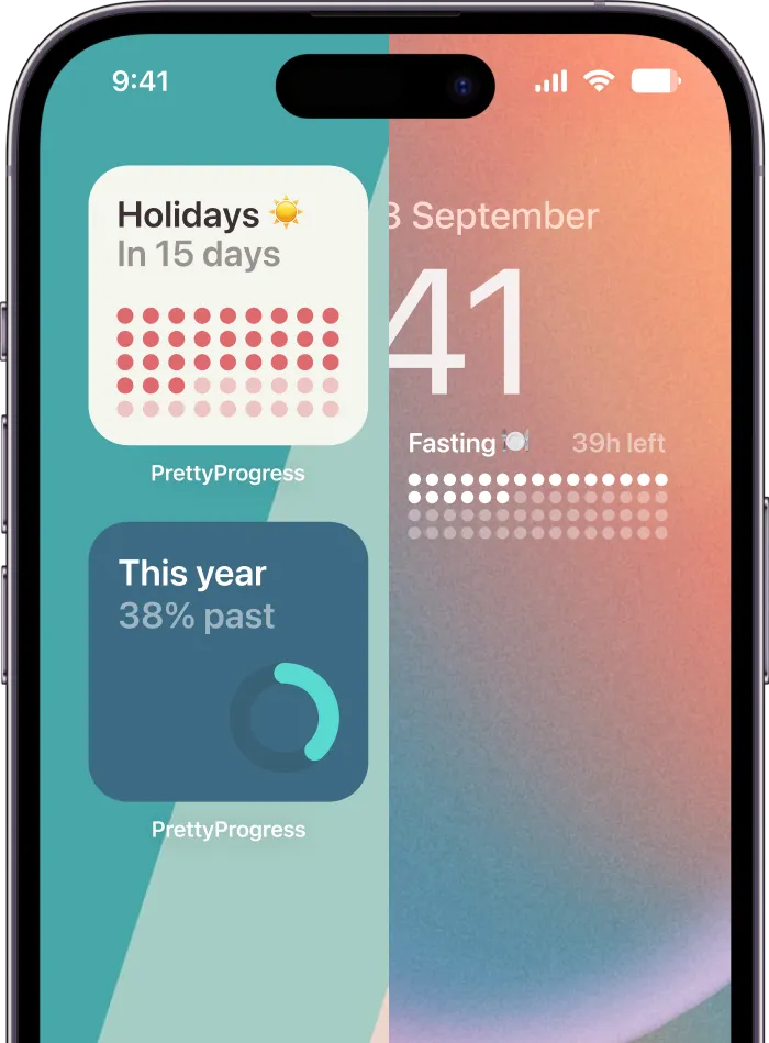
- You can add useful context, like a countdown or progress view, without losing the clean retro look.
That last part matters more on mobile than on desktop. A Mac or Windows machine sells the pure flip-clock fantasy. An iPhone or iPad does better when the same aesthetic also helps you track something.
How to build the look on iPhone and iPad
Start with the screen, not the app. The best results usually come from treating the phone like a small display object instead of a dumping ground for widgets.
Use these design rules:
-
Keep the background dark
Black or near-black wallpaper gives the digits room to stand out and keeps the screen from looking busy. -
Choose one large time element
Small widgets weaken the effect. Big blocks of time or progress feel closer to a real flip display. -
Limit supporting information
Weather, reminders, battery, calendar, and shortcuts can all live elsewhere. If the goal is flip clock style, one main element should dominate. -
Stay restrained with color
White on black still looks best. Soft gray, muted cream, or low-saturation amber can work if you want a warmer setup.
For Lock Screen layouts, I get the best look by keeping the area under the time simple and avoiding decorative wallpaper details behind the widget. If you want a practical setup guide, this walkthrough for adding a countdown widget on your iPhone’s Lock Screen shows the process clearly.
Where the flip clock style works best on mobile
Each Apple device handles the look a little differently.
iPhone Lock Screen works best for quick readability. Keep it clean. One strong widget, dark wallpaper, minimal extras.
iPhone StandBy is the closest Apple gets to a modern flip clock screensaver. Put the phone horizontally on a charger, lower the room lighting, and avoid layouts that split attention across too many panels.
iPad works well as a desk display, especially if it stays on a stand. The larger screen gives the clock more presence, but it also makes clutter more obvious, so simple layouts matter even more.
The trade-off is straightforward. Desktop still wins if you want the most faithful screensaver feel. Mobile wins on frequency of use. For a cross-device setup, that usually means using the classic flip clock look on Mac or Windows, then switching to a widget-first approach on iPhone and iPad. Pretty Progress fits that newer role well because the Lock Screen and widget experience matters more on mobile than a traditional screensaver ever did.
Customizing Your Perfect Flip Clock Look
A flip clock only looks right when it fits the screen it lives on. The same setup that feels crisp on a Mac can look oversized on an iPhone or too busy on an iPad stand. Good customization is less about adding personality and more about removing anything that competes with the time.

Start with the three visual essentials
The flip clock style has very little tolerance for decoration. Small changes in type, spacing, or background can shift it from classic to gimmicky fast.
These three choices do most of the work:
-
Digit shape
Use blocky, plain numerals. Stylized fonts weaken the mechanical look that makes a flip clock feel convincing. -
Contrast
A black background with light digits is still the safest setup. It stays readable in dim rooms, looks clean on desktop displays, and usually works best with OLED phones too. -
Motion
If the clock flips, let that be the only moving part. Extra effects, glowing transitions, or animated backgrounds pull attention away from the time.
On phones and tablets, the wallpaper should support the clock, not fight it. If the background has texture, faces, bright highlights, or detailed patterns, the whole setup starts to feel like a theme instead of a clock.
Settings that change the feel fast
The fastest improvements usually come from the plain settings people skip. Time format, scale, spacing, and whether to show extra information all change the mood more than novelty effects do.
A simple tuning checklist helps:
| Setting | Best if you want classic | Best if you want modern |
|---|---|---|
| Time format | 12-hour | 24-hour |
| Clock size | Slightly oversized | Very large and bold |
| Background | Pure black | Black or dark gray |
| Extra info | None | Seconds or date, if subtle |
A few practical rules hold up across devices:
- Use 12-hour format for a bedside or vintage desk-clock feel.
- Use 24-hour format for a sharper, more minimal look.
- Increase size until it feels obvious, then back off slightly if the numerals crowd the edges.
- Add seconds carefully because they make the display feel more active, which is great on a desk and less great at night.
- Skip date, weather, or other extras unless you have enough screen space to keep the layout balanced.
Readability decides everything. If you cannot read it clearly from the chair, bed, or desk position where the device sits, the design needs work.
Match the setup to the device
Desktop and mobile need different judgment. On Mac or Windows, a little more scale usually helps because the screen is viewed from farther away and the clock has room to breathe. On iPhone or iPad, oversized numerals can feel dramatic at first but cramped after a day of use, especially if widgets or Lock Screen elements share the space.
Apple Watch is stricter still. A flip clock inspired look works better than a literal recreation there. Clean numerals, strong contrast, and minimal complications fit the screen. Trying to force a full retro clock aesthetic onto a watch face usually makes it harder to glance at.
That same trade-off is why mobile customization often matters more than the old idea of a screensaver. On phones and tablets, you are really designing a Lock Screen, widget, or StandBy view that you see constantly. Apps like Pretty Progress make more sense in that context because the goal is not just idle animation. The goal is a clock that feels good to live with every day.
The cleanest setups are usually the most restrained. Flip animation, textured wallpaper, fake wood trim, heavy shadows, and warm filters all at once create visual noise. Pick one retro cue, keep the rest quiet, and the whole display looks better.
Flip Clock Options for Android and Apple Watch
Android and Apple Watch approach this idea from opposite directions. Android gives you room to experiment. Apple Watch rewards restraint.
Android gives you more surface area
Android users can recreate a flip clock look in a few ways. The most common are home screen widgets, lock screen clock customizations, and live wallpapers.
Widgets are usually the best place to start because they’re practical. They stay visible, don’t need full-screen idle behavior, and fit the flip clock idea better than flashy moving wallpapers.
When searching the Play Store, look for app descriptions or previews that emphasize:
- Large numerals
- Minimal background
- Clock-only layouts
- Optional seconds or calendar
- Standby or lock screen support, if your device allows it
Live wallpapers can look cool for a day, but they often feel busier than a proper flip clock screensaver. If the animation becomes the point, the time stops being easy to read. That’s a bad trade.
A good Android setup usually looks like this: black wallpaper, one large widget, no crowded icon rows around it, and a home screen grid that leaves breathing room.
Apple Watch works best as a glance device
Apple Watch isn’t a screensaver platform, so the goal is different. You’re building a clock-focused watch face or using complications that keep time-related info front and center.
The best results usually come from:
- a clean digital watch face
- one or two complications at most
- high-contrast colors
- timer or countdown information that can be read instantly
What doesn’t translate well is trying to mimic the full desktop flip clock aesthetic too closely. The screen is too small. You’ll get better results by borrowing the principles instead: bold numerals, dark space, minimal distractions.
If your goal is to mirror the same visual language across phone, tablet, desktop, and watch, keep the watch as the simplest version. Let it be the quick-glance device, not the decorative showpiece.
Tips for Battery Life and Always-On Displays
A flip clock looks simple, but the power cost depends on how you use it. A desktop screensaver that appears only when the computer is idle is one thing. A phone sitting on an always-on display or in StandBy mode is another.
What helps battery and what doesn’t
Some choices are worth making right away:
- Use black backgrounds on OLED screens when possible. They fit the flip clock style and usually make more sense for always-on visuals.
- Lower brightness indoors. A clock should be readable, not flood the room.
- Avoid over-animated alternatives if battery matters more than novelty.
- Let devices sleep when you don’t need a visible clock. A clock display is for convenience, not for every hour of the day.
On phones and tablets, the cleanest setup is often the most efficient anyway. Dark background, minimal motion, no extra layers.
Privacy checks worth doing before you install
Privacy is the part most flip clock guides skip. That’s a real gap. Most content around these apps focuses on setup or appearance, while common questions about telemetry, sign-in, and offline use often go unanswered, as discussed in this video about flip clock setup and usage gaps.
Before installing any clock app or widget tool, check these basics:
-
Permissions
If a clock wants access unrelated to its function, pause and review it. -
Account requirement
A simple display app should feel simple to use. -
Offline behavior
If you want a desk clock, it should stay useful even when your connection doesn’t. -
Developer clarity
If the app page explains visuals but says little about data handling, be cautious.
That doesn’t mean every flip clock tool is risky. It means you should evaluate them like software, not like decoration.
If you want the flip clock mood with more flexibility across iPhone, iPad, Apple Watch, Mac, and Android, Pretty Progress is a modern way to build that always-on look. You can create polished countdown and progress widgets for Lock Screen, Home Screen, desktop, and watch surfaces, then tune the theme, colors, layout, and spacing until it feels like part of your setup instead of a generic utility.