July 28, 2026
Assignment Tracker for Students: A System That Works
Learn how to build an effective assignment tracker for students. Organize deadlines, manage workloads, and stay on top of every course.
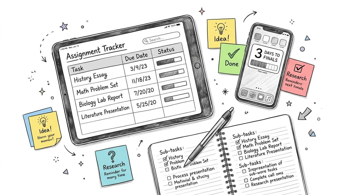
You know the feeling. It’s late in the semester, you’ve got three classes with overlapping deadlines, and somewhere between your notes app, a syllabus PDF, and a half-forgotten spreadsheet tab, one assignment is about to slip away. A good assignment tracker for students is supposed to prevent that, but only if it does more than list tasks. It needs to hold the whole semester in one visible place, so your brain doesn’t have to keep rehearsing every due date on repeat.
Table of Contents
- Why Most Student Planners Fail
- Designing Your Core Tracking Structure
- Breaking Down Large Projects into Milestones
- Visualizing Deadlines with Home Screen Widgets
- ADHD-Friendly Hacks and Accessibility Features
- The Weekly Review Routine
Why Most Student Planners Fail
The planner that gets abandoned halfway through October usually didn’t fail because the student was lazy. It failed because it asked for too much memory and too much maintenance. A paper planner, a sticky-note system, or a buried spreadsheet can’t keep every assignment visible at once, and that’s exactly where deadlines start disappearing.
A better system works like a workflow tool, not a notebook. The key design principle is simple, it centralizes every task in one place and pairs each item with a due date, priority, and status (Monday.com’s assignment tracker template). That structure matters because students aren’t just collecting reminders, they’re trying to see what needs action today, what can wait, and what is already done.
Why visibility matters more than memory
Students often keep assignments in separate places because that feels faster in the moment. One homework item sits in a course app, another lives in a Notes document, and a third is written on a sticky note that falls behind a laptop. The problem isn’t the individual note. It’s the absence of a single screen that shows the whole week at once.
Practical rule: If you have to search for a deadline, the system is already too hidden.
A strong tracker turns the syllabus into a visible schedule. Instead of relying on recall, you can glance at a list or widget and instantly see what’s overdue, what’s in progress, and what still needs a plan. That shift lowers the mental burden because you stop carrying the task list in your head and let the system carry it for you.
Designing Your Core Tracking Structure
A reliable assignment tracker for students starts with a narrow, consistent set of fields. The minimum schema is Task Title, Course, Due Date, and Status, because those are the fields that let you identify what the work is, where it belongs, when it’s due, and whether it’s moving forward (YouCanEdit’s assignment tracker guide). If a tracker gets cluttered before those basics are in place, it becomes harder to update and easier to ignore.
Build the columns first
Think of the tracker as a small database, not a freeform checklist. Give each assignment one row, then keep the columns stable so you’re not rethinking the structure every time a professor posts homework. A clean layout also makes it easier to sort, filter, and scan during a busy week.
| Field Name | Purpose | Example Entry |
|---|---|---|
| Task Title | Names the assignment clearly | Lab Report 2 |
| Course/Subject | Shows where the work belongs | Biology 101 |
| Due Date | Marks the deadline | Friday, September 13 |
| Status | Shows progress stage | In Progress |
Dropdowns reduce friction here. If your status options are always the same, like Not Started, In Progress, Review, and Done, you spend less time typing and more time updating. You can apply the same idea to priority fields, using a low, medium, or high dropdown so the tracker stays tidy.
Sort for urgency, not convenience
One common mistake is sorting by subject first. That makes the list look organized, but it hides the assignment due tomorrow if it happens to sit below a less urgent task in the same class. Sort by Due Date first, then use color or conditional formatting to flag the most urgent items, especially anything due soon.
If you want a useful model for progress visibility and tracker logic, the practical guide from Learniverse is a helpful companion read. The reason it fits this topic is simple, a tracker only helps when it keeps status easy to interpret at a glance.
Keep the update path short. If changing one status takes more than a few seconds, students stop doing it consistently.
The goal is not to build a giant dashboard. The goal is to create a structure that makes overdue work obvious and makes the next action visible without effort.
Breaking Down Large Projects into Milestones
A ten-page paper feels impossible when it’s stored as one blunt item in a list. It feels much smaller when it becomes a series of visible steps. That’s why the strongest student workflows use decomposition, not just task capture, and why trackers work better when they support subtasks, calendar-style planning, and reminders instead of acting like a flat list (Proofed’s assignment tracker template for students).
Turn one deadline into several checkpoints
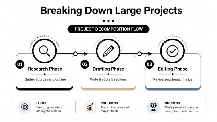
A project should not live as a single due date with no interior structure. Break it into phases such as research, drafting, editing, and final submission, then give each phase its own target date. That way, the tracker shows momentum instead of only pressure.
One useful way to think about this is to map a paper or presentation backward from the final due date. If the final version is due Friday, then the research step needs its own deadline earlier in the week, the draft needs another one after that, and the review stage needs a clear finish point before submission. The assignment still has one end date, but the tracker now reveals the work required to reach it.
A long assignment becomes manageable when the next step is concrete enough to start without negotiation.
Use progress to keep the work moving
Visual progress matters because it makes unfinished work feel measurable. A progress bar is more useful than a blank checkbox when the task spans days or weeks, since it lets you see how much of the project has already been completed. For students who procrastinate on long papers, that visibility can keep the project from disappearing until the night before it’s due.
A timeline view helps even more when assignments overlap. If you have a lab write-up, a reading quiz, and a group slide deck all in the same week, a calendar-style layout shows where the bottlenecks live. You can also use a short review note under each milestone so you remember what “done” means.
For a deeper model of visual planning, the project timeline visualization guide is a practical reference. It fits especially well when you want to connect milestones to a timeline instead of treating every task as isolated.
The point of decomposition is not to make the assignment feel smaller by pretending it isn’t hard. It’s to make the work visible enough that you can start early, adjust sooner, and stop guessing.
Visualizing Deadlines with Home Screen Widgets
A tracker only helps if you see it. That’s why widgets and lock-screen progress bars are so useful for students who keep forgetting to open apps during the day. A glanceable system puts the deadline on the screen you already check, so the reminder happens passively instead of depending on perfect memory.
Compare active checking with passive visibility
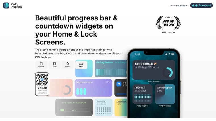
A calendar notification is easy to dismiss and easy to forget. A home screen widget behaves differently, because the countdown or progress bar stays in view even when you’re not thinking about school. That makes it a steady background cue for students who lose track of time between classes, work, and study blocks.
Visual reminders become more than decoration. A circle that fills up toward a deadline, or a simple bar that shows progress, externalizes the remaining time so you do not need to estimate it over and over. If you’re managing multiple courses, that kind of constant visibility can reduce the feeling that everything is due at once.
Use one screen as the deadline surface
The best setup is usually simple. Put the most urgent deadlines on your home screen, keep the labels short, and choose visuals you can read quickly. If you prefer a countdown to a due date, use that. If you prefer progress bars for long projects, use those instead.
Pretty Progress is one option that turns deadlines into countdowns and progress bars on iPhone, iPad, Apple Watch, Mac, and Android, with widgets for the Home and Lock Screens. It fits this use case because the assignment stays visible without requiring you to open a separate app every time you want a status check. For setup ideas, the home screen timer guide shows how a visual reminder can stay present throughout the day.
The value of a widget is not novelty, it’s repetition without effort.
When students can see the deadline at a glance, they’re less likely to let assignments drift into the background. That makes the tracker part of the environment, not just another app to remember.
ADHD-Friendly Hacks and Accessibility Features
Many students don’t need more structure, they need less friction. That’s especially true for students with ADHD, low vision, dyslexia, or other learning differences, where a dense spreadsheet or a visually busy planner can increase overload instead of reducing it (Veroniiiica’s accessibility-focused assignment tracking guide). The tracker should lower cognitive load, not add another place to manage clutter.
Make capture immediate
If a task takes too long to log, students often delay it, then forget it. Voice input helps when typing feels annoying or slow, and cross-device access helps when the phone is closer than the laptop. The point is to make capture so easy that the assignment gets recorded the moment it’s assigned.
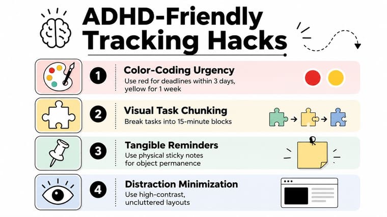
Color also helps, but only when it stays disciplined. Use red for urgent deadlines, yellow for tasks that need attention soon, and simpler high-contrast layouts so the screen doesn’t become noisy. A busy interface can be just as hard to use as a blank one.
Reduce object permanence problems
Some students need physical reminders in addition to digital ones. A sticky note on a desk, a widget on the lock screen, and a tracker row with a status label can work together so the task stays present even when one system gets ignored. That layered approach matters because not every brain responds to the same cue.
This is also where task chunking helps. A paper due next week feels easier to approach when the first step is just “open sources,” not “write final draft.” Breaking tasks into smaller pieces makes the tracker more usable for students who freeze when they see one large item staring back at them.
For more on visual cues, the visual reminders for ADHD guide is a useful complement. It aligns well with the idea that reminders should be seen, not hunted for.
Favor layouts you’ll actually keep using
The most accessible tracker is the one you can read, update, and trust. That may mean fewer columns, bigger text, screen-reader support, or a widget instead of a dense dashboard. It may also mean keeping the tracker in one place across phone, tablet, and computer so the same information follows you through the day.
The test is simple. If the system makes you think harder every time you use it, it’s probably too much. If it helps you capture work quickly and return to it without friction, it’s doing its job.
The Weekly Review Routine
A tracker turns stale when nobody updates it. That’s why a short weekly reset matters more than a perfect setup. A regular review keeps the system aligned with the actual semester, and it stops the abandoned-spreadsheet problem before it starts.
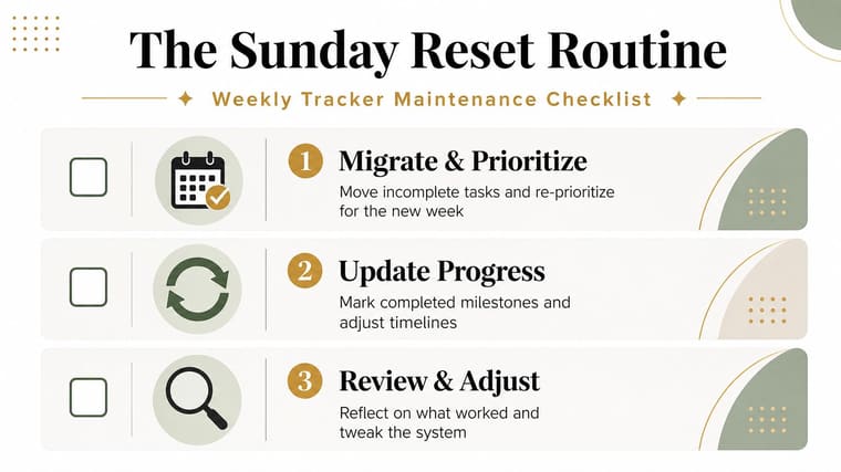
Run the same three checks every week
Start by moving unfinished tasks into the new week and sorting them by urgency. Then update status labels so finished work doesn’t stay marked as active, and adjust milestone dates if a paper or project has changed shape. The tracker should reflect reality, not the version of reality you had on Monday.
That kind of upkeep is part of how assignment tracking evolved. Spreadsheet-based lists gave students a place to log deadlines, but more structured digital systems made it easier to measure workload, forecast remaining effort, and review completion trends in real time (YouTube assignment tracker tutorial).
Keep the archive
Do not erase completed work too quickly. Finished tasks form a record you can use later when exam prep gets messy or when you need to remember how you handled a similar assignment. A completed archive also helps you see patterns in how long certain classes take.
What got finished is just as informative as what still needs attention.
A weekly reset does not need to take long. It just needs to happen often enough that the tracker stays current, the widgets stay meaningful, and the semester stops feeling like one long pile of unfinished work.
If you want a visual assignment tracker that keeps deadlines in front of you without adding noise, try Pretty Progress. It turns due dates into calm, glanceable widgets and progress bars that stay visible on your devices throughout the day. That kind of setup can make a student planner feel less like another task and more like a dependable part of your routine.