
May 21, 2026
Apple Watch Reminder App: A Better Countdown Guide (2026)
Tired of basic alerts? Turn your device into the ultimate Apple Watch reminder app with this guide to creating beautiful, glanceable countdowns for any goal.
You glance at your wrist, clear one notification, and promise yourself you’ll deal with that deadline later. Then later gets buried under meetings, messages, errands, and the dozen tiny things that feel urgent right now. A standard reminder buzz helps, but it often disappears the second you dismiss it.
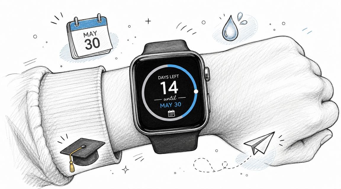
That’s why the Apple Watch works better when it becomes more than a tap-on-the-wrist device. A strong apple watch reminder app should help you see time passing, not just alert you once and vanish. When your watch face shows a live countdown for an exam, a fasting window, or a project due date, the reminder stays present without demanding constant effort.
Table of Contents
- Your Apple Watch Can Do More Than Just Buzz
- Getting Started with a Dedicated Reminder App
- Creating Your First Visual Countdown
- Adding Countdown Complications to Your Watch Face
- Fine-Tuning Notifications and Pro Tips
- Common Questions and Quick Fixes
Your Apple Watch Can Do More Than Just Buzz
A common way to use an Apple Watch is for notifications, workouts, and quick message replies. That’s useful, but it leaves a lot of value on the table. The watch is at its best when it becomes a glanceable decision tool.
A normal reminder says, “Don’t forget this.” A visual countdown says, “You’ve got this much time left.” That difference matters. It turns an abstract future task into something visible every time you check the time.
If you want a broader hardware and usability perspective, these details about Apple Watch are a useful companion read because they frame why the device works so well for quick interactions instead of deep planning. That’s the key trade-off. Your watch is excellent for fast awareness, but it’s not ideal for managing long lists.
Why the native reminder model feels limited
Apple’s built-in Reminders app is solid for list management. It handles tasks, checklists, and quick completion well. But a list is still a list. If your real problem is procrastination, time blindness, or losing track of a major deadline, a list item can be too easy to ignore.
A reminder that disappears after one tap isn’t always a reminder. Sometimes it’s just a brief interruption.
That’s where a visual system changes the experience. Instead of storing another task in another app, you place one important countdown where it stays visible. For many people, that works especially well for school deadlines, health routines, travel dates, and “leave by” moments.
What a better watch setup looks like
A better setup uses the watch for constant light pressure, not constant noise. One countdown on the watch face often beats ten buried tasks in a list.
That’s also why visual systems help people who struggle with hidden reminders or mental overload. If that sounds familiar, this guide on visual reminders for ADHD on Apple devices is worth reading because it focuses on keeping the right prompt visible in places you already check.
Getting Started with a Dedicated Reminder App
The setup is straightforward, but a few choices at the start decide whether your watch experience feels smooth or flaky.
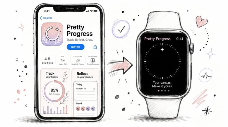
The first move is simple. Install your countdown app on iPhone, then make sure the watch companion is also installed through the Watch app if it doesn’t appear automatically. Many users assume the iPhone app alone is enough. Sometimes it is, sometimes it isn’t. It’s worth checking.
Permissions that matter
When the app asks for permissions, the important one is usually notifications. Without that, your watch can still show visual elements, but timely alerts and background updates may feel inconsistent.
Here’s the practical way to think about permissions:
- Notifications help the app alert you at useful moments instead of forcing you to open it manually.
- Background refresh helps complications stay current without requiring constant interaction.
- Calendar or reminders access, if supported by the app you choose, can make existing dates easier to surface visually.
You don’t need to approve everything blindly. You do need to approve the pieces that support the behavior you want on the watch face.
Why syncing feels natural on Apple devices
Apple’s own Reminders system gives a good model for how this should work. Apple confirms that Apple Watch reminders are built on iCloud synchronization, so reminders created on the watch update across paired devices signed into the same Apple Account, and scheduled reminders can also appear in the Calendar app on iOS 18 and later according to Apple’s Apple Watch Reminders guide.
That’s useful context even if you’re using a more visual app. Apple users already expect their task data to follow them across iPhone, Apple Watch, iPad, and Mac. A dedicated countdown app should fit into that habit, not fight it.
Practical rule: If your countdown looks right on iPhone but not on Apple Watch, check installation, notification permission, and background refresh before changing anything else.
One clean setup path
A simple first-run checklist keeps things smooth:
- Install on iPhone first so you can create and edit reminders on the larger screen.
- Confirm the watch app is present in the Watch app on iPhone.
- Allow notifications if you want alert-based nudges.
- Open the watch app once after setup so the first sync has a chance to complete.
- Create one test countdown before building a full system.
That last step matters more than people think. Don’t start with ten reminders. Start with one and make sure it appears where you expect.
Creating Your First Visual Countdown
Here, a basic apple watch reminder app becomes something more useful. Instead of building another task list, you create a visible timer for one thing that matters.
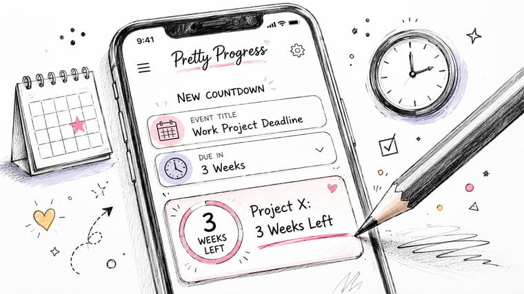
Apple’s native Reminders app has become much more capable over time, with features like subtasks and location-based alerts, but its core job is still list management, as reflected in Apple’s Reminders feature overview. A dedicated visual app handles a different job. It keeps one deadline or window visible in a way that feels motivating, not administrative.
Pretty Progress is one example of that approach. It creates customizable countdowns and progress bars that can be designed on iPhone and surfaced on Apple Watch.
Example one, a work deadline
Start with a deadline that has real stakes but doesn’t need a full project board on your wrist. A client presentation, a launch review, or an internal submission works well.
Set the start date, set the due date, and choose a professional theme such as Swiss Style. That cleaner look fits work tasks because it keeps the visual signal crisp instead of decorative.
A strong setup for this kind of reminder usually includes:
- A plain title like “Project Review”
- A calm icon such as a briefcase, document, or checkmark
- A restrained color palette so the countdown feels serious, not noisy
On the watch, this works best as a persistent “time left” cue. You don’t need the entire task breakdown there. You just need the pressure of the approaching date.
Example two, a health routine
A countdown doesn’t have to end on a calendar date. It can represent a daily window too. Fasting periods, hydration routines, and medication timing all benefit from visual progress.
For a fasting example, set the start and end times of the window and use an Aqua style or another theme that feels lighter and easier to read at a glance. The point isn’t to create drama. It’s to make the passage of time visible.
The best health reminders on a watch answer one question fast. “Am I still in the window, or not?”
This is a good place for softer colors and simpler labels because you’re likely to see it repeatedly throughout the day.
Example three, an exam or personal milestone
Students often have the same problem professionals do. The date is known, but it doesn’t feel real until it’s too close. A countdown fixes that by keeping the exam visible long before panic sets in.
For a final exam or certification date, a Minimal theme works well. Less visual clutter can reduce stress while still keeping the deadline in view. You add the title, the date, and maybe a simple academic icon such as a book or pencil.
If you also want a larger visual outside the watch, this guide to a home screen timer setup pairs well with a watch complication because it gives the same countdown more presence on iPhone.
What works and what doesn’t
Some reminder designs look good in the editor but fail on the wrist. Tiny labels, overloaded color choices, and vague names like “Important Thing” don’t survive the small screen.
A better pattern looks like this:
| Setup choice | Works well | Usually fails |
|---|---|---|
| Title | Short, specific labels | Long sentences |
| Theme | High contrast, simple layout | Decorative clutter |
| Purpose | One key date or window | Mixed tasks in one tracker |
| Watch use | Glanceable status | Deep editing |
The best countdowns feel obvious in half a second. If you have to interpret them, simplify them.
Adding Countdown Complications to Your Watch Face
A countdown matters most when it’s visible before you open anything. That’s why complications are the ultimate advantage on Apple Watch.
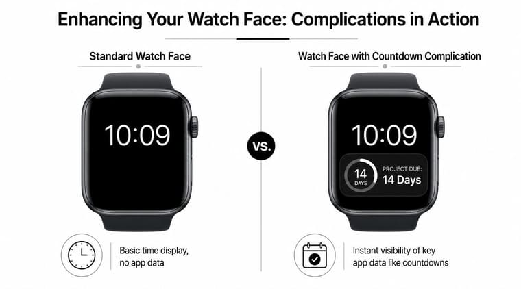
Complications are the small app surfaces that live directly on a watch face. They can show text, symbols, rings, or compact bits of live information. For reminders, they turn your watch from a reactive device into a proactive one.
How to add one without overthinking it
On Apple Watch, press and hold the watch face, tap Edit, and move to the complication slots. On iPhone, you can also customize many faces through the Watch app. Pick the slot you want, choose the app, then choose the complication style if multiple options appear.
If you want a more detailed walkthrough for a countdown-specific setup, this guide to adding a countdown widget on Apple Watch shows the process in a practical way.
A common mistake is trying to fill every slot. Don’t. One or two useful complications usually outperform a crowded face.
Matching complication style to the job
Different reminder types need different visual treatments. A “leave in 20 minutes” reminder needs speed and clarity. A long project deadline can use a slower, more graphical style.
Here’s a simple comparison:
| Complication Type | Visual Style | Best For | Supported Watch Faces |
|---|---|---|---|
| Corner or circular | Ring or compact icon | Daily routines, short countdowns | Infograph-style faces and similar layouts |
| Text-based small slot | Short line like time left | Deadlines, timers, leave-by prompts | Utility and modular-style faces |
| Large graphic | Bigger countdown display | Main priority of the week | Modular-style faces |
| Subtle inline option | Minimal text presence | Users who want less visual pressure | Faces with inline complication support |
Good pairings for common watch faces
Infograph works well if you like dense information and don’t mind a busier face. A circular countdown can sit naturally alongside weather or activity.
Modular is often the easiest choice for reminder-heavy setups. It gives more room to a deadline or progress display, which helps if the countdown is the thing you care about most.
Meridian and cleaner analog faces work better for users who want one elegant cue rather than a dashboard. In that case, a smaller text or circular complication tends to feel balanced.
If you check your watch mostly in motion, choose the complication you can understand fastest, not the one that looks most impressive in a screenshot.
A simple selection method
Use this quick filter when choosing your layout:
- For urgent transitions, use a text complication with plain time remaining.
- For long deadlines, use a circular or larger progress-oriented display.
- For low-stress visibility, choose a minimal slot on a cleaner face.
- For all-day focus, give the countdown the most prominent slot and demote less important apps.
The strongest setups are selective. Your watch face should support attention, not compete for it.
Fine-Tuning Notifications and Pro Tips
A reminder system breaks down when every alert feels equally urgent. The watch is too close to your body for noisy settings. Good notification tuning matters more here than on the phone.
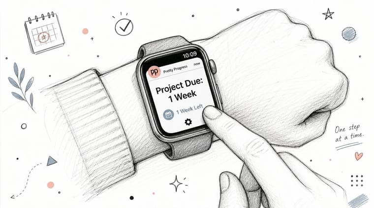
The cleanest setup uses notifications for moments that require action, while the complication handles passive awareness. That means you don’t need a buzz every time you glance at progress. You need a buzz when something changes, or when it’s time to act.
Set fewer alerts than you think
A lot of users recreate their entire task system on the watch and then wonder why they start ignoring it. The better approach is to alert on milestones.
Useful examples include:
- Halfway markers for long projects when you need a check-in
- Day-before alerts for deadlines that need preparation
- Short final reminders for leave-by times, appointments, or routines
- Completion windows for habits like fasting or focus blocks
If your app supports dynamic or progress-based notifications, that can work well for people who want the reminder to evolve as the timeline changes. Just keep it narrow. More logic isn’t always more helpful.
Use Siri for capture, not planning
Apple Watch has one major edge for reminders. Voice capture is fast. Apple’s ecosystem guidance highlights that users can invoke Siri by raising the wrist and speaking a command such as “remind me to take my medication at noon,” which makes the watch an effective capture layer for tasks that then sync across devices without opening the iPhone, as described in this Apple Watch Siri reminder walkthrough.
That’s where the watch shines. Not long editing sessions. Not sorting categories. Just capture the thought before it disappears.
A practical split that works
Think of the system in three layers:
- Capture on the watch when an idea appears in the middle of life.
- Refine on the phone if the reminder needs dates, visuals, or a stronger layout.
- Surface on the watch face if it deserves daily visibility.
A good Apple Watch reminder setup should feel present, not pushy.
That split keeps the watch lightweight. It also reduces the temptation to force complex planning onto a tiny screen.
Common Questions and Quick Fixes
The most common problem isn’t that the app is broken. It’s that one setting is blocking the experience you expect.
Why isn’t my complication updating
Three things usually cause this. Background App Refresh may be off. Low Power Mode may be limiting updates. Or the watch and phone may need a moment to sync after you edited the countdown.
Try this short checklist:
- Check Background App Refresh in Watch settings and iPhone settings.
- Disable Low Power Mode temporarily if you’re testing live updates.
- Open the app on both devices once to force a refresh after changes.
The app isn’t showing up on my watch
Open the Watch app on iPhone and look under installed apps. If the companion app isn’t installed, add it there. If it still doesn’t appear, restart both devices and check again.
This is more common right after installation than later on.
Will this drain battery
In normal use, a well-designed complication-based reminder setup should be lightweight. The practical issue isn’t usually battery drain from one countdown. It’s stacking too many active features, too many bright watch face elements, and too many notifications at the same time.
If battery feels worse after setup, remove extra alerts first. That’s usually a better fix than removing the complication itself.
If you want your reminders to stay visible instead of disappearing into a list, Pretty Progress gives you a design-focused way to turn deadlines, routines, and personal goals into countdowns and progress bars across your Apple devices.





