

June 27, 2026
Create a Monthly Countdown Timer with Pretty Progress
Learn how to create a beautiful monthly countdown timer on your iPhone, Mac, or Android with Pretty Progress. A step-by-step guide to tracking your goals.
You probably have a goal that lives in the background of your day right now. Maybe it’s a 30-day fitness reset, a month-end work deadline, a writing challenge, or a vacation you’re counting down to. The hard part usually isn’t choosing the goal. It’s keeping it visible after the first burst of motivation fades.
That’s where a monthly countdown timer helps. A good one turns “sometime this month” into something you can see. Instead of a vague deadline sitting inside your calendar, you get a clear visual reminder of time passing and progress building. When that countdown also looks good on your screen, you’re more likely to notice it, and more likely to stay connected to what you’re working toward.
Table of Contents
- Why Visualizing Your Monthly Goals Matters
- Your First Monthly Countdown in Minutes
- Designing Your Perfect Countdown Widget
- Ideas and Inspiration for Monthly Countdowns
- Unlocking Power Features with Pretty Progress PRO
- Frequently Asked Questions
Why Visualizing Your Monthly Goals Matters
It is the middle of the month. Your goal still matters, but it no longer feels close. The deadline sits somewhere in the back of your mind, and that is usually when good intentions start to drift.
A monthly countdown changes that by giving time a shape you can see. Instead of holding a date in your head, you get a clear visual marker on your screen. One glance tells you whether the month feels wide open or whether it is time to act today.
That shift matters because the brain responds better to what is visible than to what is vague. A date in a calendar is easy to ignore. A beautifully designed countdown in Pretty Progress works more like a progress bar for your month. It turns an abstract plan into something concrete, motivating, and hard to forget.
Pretty Progress is especially useful here because the experience is built around visibility, not just timing. Generic timer apps often feel plain or disposable. Pretty Progress lets you create countdowns that look good on your Home Screen or Lock Screen, match the mood of the goal, and stay updated across your devices. That design polish is not just nice to have. It makes you more likely to keep looking at the goal you set.
A relatable example
Take a 30 day fitness goal. You might want to walk daily, complete a few strength sessions each week, or stick to a better sleep routine. The goal itself is reasonable. The hard part is keeping it present on busy days, quiet days, and the awkward middle of the month when motivation dips.
If you want help shaping the goal itself before you track it, this guidance on setting fitness goals is a useful place to start. Once the goal is clear, a monthly countdown timer gives it a visible place in your day.
A good visual countdown also corrects two common mental traps. One trap says, “I still have plenty of time.” The other says, “I am not making progress.” Seeing the month move, day by day, helps you judge reality more accurately.
Practical rule: Goals stay active when they stay visible.
That is why a well designed countdown can feel surprisingly encouraging. It does not nag you. It keeps your goal in sight, like leaving a note on the fridge except cleaner, prettier, and always with you. If you also want a simple way to review what changed over the month, this monthly progress report guide is a helpful companion.
Your First Monthly Countdown in Minutes
The best first setup is simple. Pick one thing that ends this month, give it a name, set the dates, and place it somewhere you’ll see often. That’s enough to make the countdown useful from day one.
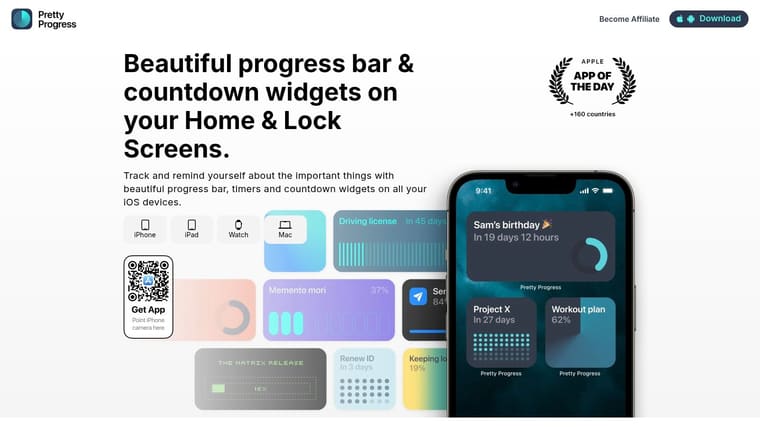
Choose one goal, not five
People often get stuck before they begin because they try to track everything at once. A better first move is to choose one deadline with a clear ending point.
Good examples include:
- A month-end project: “Client proposal due”
- A personal challenge: “30 days of walking”
- An academic target: “Final exam countdown”
- A routine reset: “Sleep schedule reboot”
If you’re balancing classes or deep work, use your countdown to track the monthly deadline and a separate timer for daily focus sessions. Choose one task for each session so you know what to work on next.
The title matters more than people expect. “Goal” is vague. “Finish portfolio draft” is specific. When the name is specific, the countdown feels connected to an outcome, not just a date.
Set the dates so the timer feels real
A monthly countdown timer works best when the start and end dates match a real window. If your challenge starts today and ends on the last day of the month, set those exact dates. If your event ends at a specific hour, use that too.
This is also where people get confused. They wonder whether to count down to midnight, to the start of the event, or to the true deadline. Use the exact finish point. If something is due at 5 PM on the last Friday of the month, set it to 5 PM. The more honest the timer is, the more useful it becomes.
Email timer guidance from Litmus notes that countdown timers work best when tied to genuine, non-recurring events, and that clear labels like days, hours, minutes, and seconds reduce confusion for viewers in different places and contexts. You can read that in Litmus’s article on using countdown timers to boost engagement. That advice applies to personal countdowns too. A real deadline is motivating. A fuzzy one is easy to ignore.
Place the timer where you’ll actually see it
Once the countdown exists, make it visible. A monthly countdown timer only helps if it gets seen during ordinary moments, such as when you engage with your phone, checking your tablet, or glancing at your desktop.
A good setup usually looks like this:
- Create the countdown with a clear title and end date.
- Preview the widget so the text is readable at a glance.
- Add it to a high-traffic screen you already look at often.
- Leave it alone for a few days before tweaking the style.
Many people over-edit the first version. Don’t. Get the timer live first.
For a closer look at how a clean, low-friction timer can fit into everyday planning, this simple countdown app guide is worth a read.
A quick walkthrough can make the setup process feel much easier:
If your timer doesn’t feel motivating yet, the problem usually isn’t the concept. It’s often the title, the placement, or the date range.
Designing Your Perfect Countdown Widget
A countdown becomes more motivating when it matches the mood of the goal. That’s why design isn’t just decoration. It’s part of how the timer keeps earning your attention.
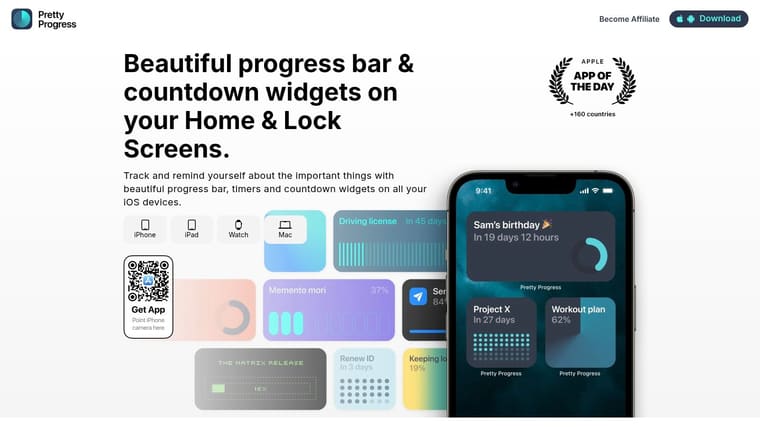
Match the style to the goal
A serious project deadline usually looks better with a clean, restrained layout. A vacation countdown can handle more personality. A fitness goal might feel strongest with bold contrast and a simple progress bar.
Here’s an easy way to understand this:
| Goal type | Style that usually fits | Why it works |
|---|---|---|
| Work deadline | Minimal or Swiss-style look | Reduces clutter and feels focused |
| Personal habit | Soft gradients or calm colors | Feels supportive, not stressful |
| Event countdown | Brighter theme with an icon | Builds anticipation |
| Study sprint | High-contrast layout | Makes the time easy to read fast |
If you want examples of visually clear timer layouts, this countdown clock graphic guide can help you spot what makes a design readable.
Use color to create the right feeling
Color changes the emotional tone of a widget more than most users expect. A countdown for taxes, exams, or a launch date might benefit from crisp contrast. A wellness or fasting timer may feel better with quieter tones.
Try thinking in terms of mood:
- Calm colors work well for habits you want to stick with gently.
- High-energy colors suit launches, events, or short intense challenges.
- Neutral palettes help if you’re placing the widget on a busy screen.
- Gradients can make the widget feel more alive without adding clutter.
Avoid one common mistake. Don’t make the widget so stylish that it becomes hard to read. A monthly countdown timer should still communicate instantly.
Keep the layout easy to read
Microsoft’s SharePoint countdown timer guidance highlights practical features like customizable titles, overlay colors, and opacity to improve text readability on pages with different backgrounds. That same principle matters for personal widgets too, as shown in Microsoft’s page about the SharePoint Countdown Timer web part.
Design check: If you can’t read the timer in one quick glance, simplify the layout.
A strong layout usually gets three things right:
- The title is short. Long titles wrap awkwardly and weaken the visual impact.
- The numbers have room. Crowded countdown digits feel tense in the wrong way.
- The background supports contrast. Pretty and readable should happen together.
Some users want every detail to stand out. Others want the widget to blend into a carefully designed home screen. Both approaches can work. The test is simple. When you look at your device for one second, do you immediately know what the countdown is for and how close it is to ending?
Ideas and Inspiration for Monthly Countdowns
A monthly countdown becomes more useful after the first one. Once you see a clear, attractive timer on your screen each day, new ideas tend to appear quickly.
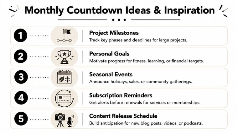
Pretty Progress works especially well here because the countdown is not just functional. It feels pleasant to look at. That small design difference can shape whether you keep the goal visible for a full month or swipe past it after three days.
Personal goals that benefit from daily visibility
Monthly countdowns are excellent for goals that need gentle pressure, not harsh pressure. A 30 day habit challenge is a strong example. Walking, stretching, journaling, meal planning, meditation, language practice, and reading all become easier to stick with when the finish line stays in sight.
A vacation countdown also fits naturally into a monthly view. It gives the month a direction. Instead of holding a fuzzy idea in your head, you can watch the days narrow in a simple, satisfying way.
A countdown works like a progress marker on a trail. You always know where you are, and today feels connected to the larger goal.
With Pretty Progress, these personal countdowns can also match the mood of the goal. A calm reading challenge can use soft colors. A trip countdown can feel brighter and more playful. That visual match sounds small, but it helps the widget feel like part of your routine instead of another plain utility.
Work and creative projects with a clear finish line
Monthly countdowns are also useful for focused project windows. Writers can track a draft deadline. Content teams can count down to a release date. Freelancers can set one for invoice week, portfolio updates, or a launch they want to keep front and center.
The main benefit is clarity. A visible deadline reduces the drift that often happens in the middle of the month, when there is still “plenty of time” until suddenly there is not.
Here are a few strong monthly use cases:
- Writing challenge: Track the final day of a draft month.
- Content launch: Count down to a podcast, video, or newsletter series release.
- Client project: Keep a visible reminder of a delivery date.
- Sales target month: Use the timer as a pacing cue for outreach and follow-up.
Pretty Progress adds another advantage for work goals. If you switch between devices during the day, your countdown can stay consistent instead of living on only one screen. That makes it easier to keep the same deadline in view wherever you plan, write, or review.
Life admin and recurring reminders
Some of the best monthly countdowns are the least glamorous.
Bills, subscription renewals, medication refills, housing paperwork, and visa deadlines all fit this format well. These are tasks that rarely need excitement. They need a clear visual cue before they become urgent.
A monthly countdown gives these responsibilities a visible place in your day. It turns “I need to remember that later” into something concrete and hard to miss.
You can also use the month as a frame for reflection. “Days left to finish my reading list” feels more specific than “I should read more.” “Days until my budget check-in” feels easier to act on than a vague intention to get organized. Pretty Progress makes these practical countdowns feel polished, which helps even routine tasks feel more manageable.
Unlocking Power Features with Pretty Progress PRO
Basic countdowns are enough for many people. But some users want tighter control over how their widgets look, where they appear, and how consistently they stay in sync across devices. That’s where a PRO setup starts to make sense.
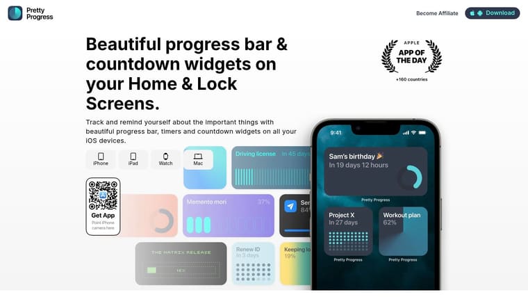
When basic setup stops being enough
The first sign you may want more is when you start creating timers for different parts of life. One for work. One for a health routine. One for a trip. One for a content deadline. At that point, deeper styling controls become useful because each countdown can carry its own visual identity.
PRO features are also valuable if design matters to you. Premium themes, finer control over colors and gradients, and more layout options help your widgets feel polished instead of improvised. That may sound small, but it affects whether you keep the countdown on your screen long term.
Why sync and customization matter more over time
The second sign is device switching. A countdown is much more effective when it follows you naturally from phone to tablet to desktop, instead of living in one place and disappearing everywhere else. Multi-device syncing removes that friction.
Technical guidance for countdown timers also points to the importance of accurate synchronization, local time adjustment, and persistent state across devices when timers run over longer periods, as discussed by Innovation Wireless in its page on countdown timer technical specifications. You don’t need to think about the engineering every day. You do notice when a timer feels dependable.
If you love fine-tuning your setup, PRO feels less like an upgrade and more like removing limits. The countdown stays useful, but it also starts to feel personal.
Frequently Asked Questions
How do I add a countdown widget to my Home Screen or Lock Screen
Create the countdown first, then open your device’s widget picker and select the widget style you want. After that, choose the countdown you’ve already made. If the title looks cramped, shorten it before placing the widget.
Can I make a countdown longer than one month
Yes. A monthly countdown timer is just one use case. You can also track longer deadlines, seasonal events, launch dates, or habits that stretch well beyond a single month. Many people start with a 30-day goal because it’s easy to understand, then expand to larger timelines once the habit of checking the widget feels natural.
What happens when the countdown reaches zero
That depends on how you want to use it. Some people let the finished countdown sit for a moment as a small reward. Others replace it immediately with the next target. If the month represented a challenge or sprint, it’s often helpful to pause and review what worked before starting the next one.
Does it work across different devices
Yes, that matters a lot for visibility. If your countdown only exists on one screen, it’s easier to forget. When it appears across the devices you already use during the day, the reminder feels consistent instead of occasional.
Keep your first setup simple. Most frustration comes from trying to perfect the widget before you’ve lived with it for a few days.
If you’re ready to turn your next deadline or personal goal into something clear, motivating, and good-looking, Pretty Progress makes it easy to build a monthly countdown timer you’ll want to keep on your screen.





