

May 28, 2026
Your Perfect Game Release Countdown with Pretty Progress
Build a beautiful game release countdown on your iPhone, iPad & Watch with Pretty Progress. This guide shows you how to style widgets and never miss a launch.
You’ve probably got a messy mental list right now. One big release you refuse to miss. A smaller indie you want to support on day one. Maybe a beta, a trailer drop, a DLC update, or a preload date that matters almost as much as launch itself.
That works for a while, until the list stops being exciting and starts becoming noise. Dates move. Store pages update discretely. One countdown is on your phone, another is in a notes app, and a third is something you vaguely remember from a trailer comment thread. Hype turns abstract fast.
A good game release countdown fixes that by making anticipation visible. Not just as a number, but as something you enjoy seeing every day across your phone, tablet, watch, and desktop. When it’s designed well, it stops feeling like admin and starts feeling like part of the ritual.
Table of Contents
- From Wishlist to Watchlist
- Creating Your First Game Countdown
- Designing a Countdown Worthy of the Hype
- Putting Your Countdown Everywhere You Look
- Mastering Advanced Countdown Features
- Managing Delays and Celebrating Launches
- Frequently Asked Questions
From Wishlist to Watchlist
The old way of tracking releases was simple because there were fewer dates competing for attention. That’s not the environment players live in anymore. SteamDB release data shows 18,536 games released on Steam in 2024, 21,464 in 2025, and over 131,985 total releases on the platform by 2026, which is exactly why a personal tracking system matters more than it used to.
That scale changes the feel of game discovery. You’re not just waiting for one massive holiday launch. You’re juggling wishlist alerts, showcase reveals, early access milestones, console ports, and patch-driven returns to games you already own.
I see the same pattern every time someone says they “don’t need a countdown.” What they usually mean is they don’t need another ugly timer. They do need a way to turn scattered dates into a watchlist they can trust at a glance.
What a useful countdown actually does
A real game release countdown should help you do three things:
- Separate signal from noise by keeping only the dates you care about visible.
- Make anticipation persistent so the release doesn’t disappear under notifications and app clutter.
- Give each event a visual identity so one launch doesn’t blur into the next.
That last part matters more than people think. If every widget looks the same, your eye stops noticing it. If one countdown feels like a moody sci-fi panel and another looks clean and minimal for an indie puzzle game, they stay distinct.
Practical rule: If your countdown only works when you open an app and look for it, it’s not doing enough.
A watchlist works better when it lives on surfaces you already check constantly. Home Screen. Lock Screen. Watch face. Tablet dock. That’s where countdowns stop being passive and start shaping attention.
Why visual polish matters
Players already build little rituals around launch day. Wallpaper changes. Wishlist checks. Preload reminders. A polished countdown fits that behavior naturally because it makes the wait feel tangible.
A tool like Pretty Progress makes sense as one option. It lets you build customizable countdown and progress widgets across Apple devices and Android, with themes, colors, gradients, icons, and layout controls that make the countdown feel like part of your setup instead of a generic utility.
A plain timer tells you a date is coming. A well-designed dashboard makes that date feel real every time you access your screen.
Creating Your First Game Countdown
The fastest way to ruin a countdown is to set up the wrong event. That sounds obvious, but it happens constantly. A reveal gets mistaken for a release. A beta gets treated like launch day. A preload becomes the headline event when the real focus is midnight availability.
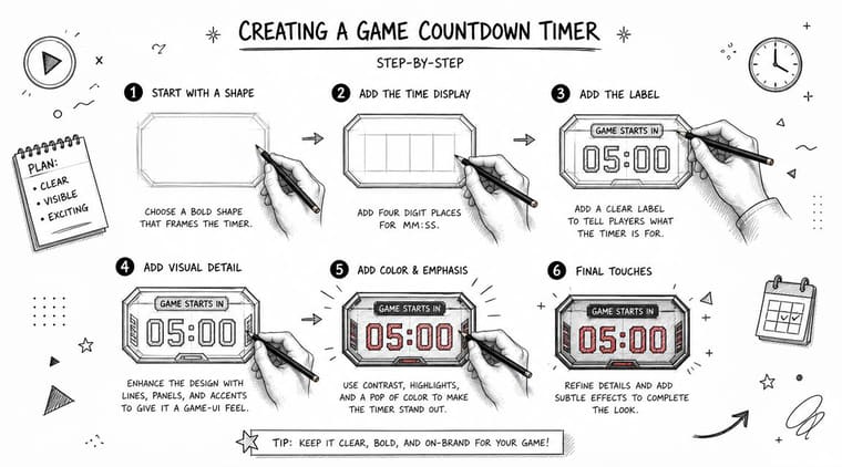
Name the event correctly
A clean setup starts with the title. Be literal.
Bad title: “GTA VI”
Better title: “GTA VI First Trailer”
Best title: “GTA VI First Trailer Reveal” or “GTA VI Launch”
That sounds small, but it prevents disappointment later. Instant Gaming’s coverage of the ARC Raiders countdown describes how many players assumed the timer pointed to a release-related moment, while it instead led to a trailer, and the publisher later apologized for “mismanaging the hype.”
If the countdown doesn’t say what kind of event it is, players will fill in the blank themselves.
Build the first version in a few minutes
Use this workflow:
- Create a new countdown and enter the game title exactly as you want it to appear on widgets.
- Pick the event type in your own wording. Release, trailer, beta, preload, review embargo, expansion launch.
- Set the date and time as precisely as you can. If the exact hour isn’t confirmed, use the best official timing you have and keep the title broad enough to avoid overpromising.
- Choose a simple starting layout before you style anything fully.
- Preview the widget size you’re most likely to use, because text length and spacing can look very different across compact and wide formats.
If you want a walkthrough for widget placement right after setup, this guide on adding a countdown widget on your iPhone is a helpful reference.
Keep one countdown equal to one moment
A lot of people try to stuff an entire release plan into one timer. That gets confusing fast. Instead, treat each meaningful milestone as its own object.
- Use one countdown for the launch date when that’s the event you care about most.
- Create a separate one for early access or preload if those affect your real plans.
- Skip filler moments that don’t matter to your routine.
That mindset is close to how launch teams think about milestones. If you like structured prep, this comprehensive product launch resource is useful for seeing how people break a launch into distinct checkpoints instead of one vague date blob.
Start plain, then refine
Your first version doesn’t need to look perfect. It needs to be unambiguous. Once the title, date, and event type are right, the design work becomes fun instead of risky.
That order matters. A gorgeous widget with the wrong event attached to it is still the wrong countdown.
Designing a Countdown Worthy of the Hype
Once the date is correct, the visual part becomes the payoff. A game release countdown then stops looking like a generic productivity widget and starts feeling like a piece of fan art that happens to be functional.
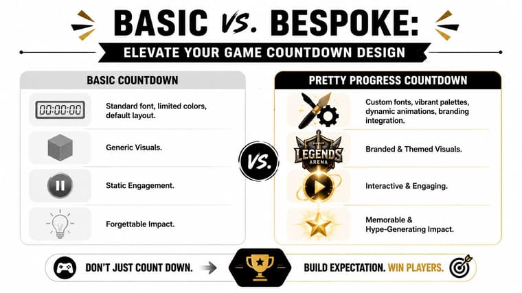
A polished design also matches how modern releases gather attention. WN Hub’s Q1 2025 games market report notes that Monster Hunter Wilds, released on February 28, 2025, led key performance metrics by the end of the quarter, within a global games market of about $188.8 billion in 2025 and roughly 3.6 billion gamers worldwide. Big dates pull communities into a shared moment. A strong countdown visual helps your own setup reflect that energy.
Match the game’s mood, not just its logo
The easiest design mistake is copying the box art colors and calling it done. Sometimes that works. Often it doesn’t.
A better approach is to ask what the game feels like:
- Swiss Style works well for clean UI-heavy games, strategy titles, or anyone who wants a restrained dashboard.
- Retro OS fits throwback releases, pixel art indies, and anything with a techy nostalgic vibe.
- Minimal is ideal when the date matters more than decoration and you want the countdown to blend into a tidy Home Screen.
- Aqua can suit brighter, playful games or setups that already lean colorful.
Tweak the parts that affect glanceability
Good customization isn’t only cosmetic. Some choices make the widget easier to read dozens of times a day.
Try adjusting these in order:
| Element | What to optimize |
|---|---|
| Text hierarchy | Keep the game name readable before the number detail |
| Color contrast | Make sure the countdown stands out against your wallpaper |
| Bar shape | Rounded bars feel softer, sharper edges feel more technical |
| Icon choice | Use one that signals the event without clutter |
| Gradient strength | Subtle gradients age better on always-visible widgets |
If you want visual inspiration before you fine-tune your own layout, this gallery of countdown clock graphic ideas is a useful place to compare styles.
A countdown you enjoy looking at will stay on your screen longer. That alone makes it more effective.
Design for the device, not just the concept
A lock screen widget needs instant readability. A tablet widget can carry more texture. A watch complication has to be brutally simple. Don’t force one design to do every job perfectly.
I usually recommend making one “hero” version for your main screen and one stripped-down variant for smaller surfaces. Same event, different presentation. That keeps the hype intact without sacrificing usability.
Putting Your Countdown Everywhere You Look
A countdown hidden inside an app gets forgotten. A countdown placed on your most-used surfaces becomes part of your day automatically.
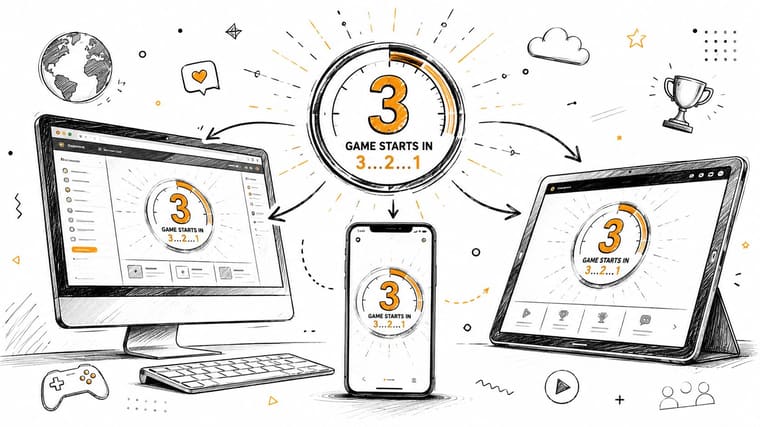
The goal isn’t maximum exposure everywhere. It’s smart repetition. You want the release visible often enough that you stay oriented, but not so aggressively that the widget turns into background furniture.
Home Screen placement
Your Home Screen is the anchor point. Put your main game release countdown where your eye lands naturally after accessing your device.
A few placements work especially well:
- Top half for urgency if it’s a near-term launch and you want frequent reinforcement.
- Mid-screen for balance when you’re combining the countdown with weather, calendar, or task widgets.
- Dedicated stack or panel if you track multiple entertainment dates and want one themed area.
If you want examples for building that layout cleanly, this guide on a Home Screen timer setup is worth a look.
Lock Screen visibility
Lock Screen widgets are different. They’re not for admiration. They’re for frictionless awareness.
Use the Lock Screen version when you want to know one of these instantly:
- How many days are left
- Whether launch week has started
- Which event is now the next one
That’s especially useful when release season gets crowded. You shouldn’t need to wake your phone and hunt around just to answer “wait, is that this week or next week?”
Keep your Lock Screen variant simpler than your Home Screen version. Fewer words, stronger contrast, no decorative extras.
Watch and tablet habits
Watches shine when you want tiny, frequent reminders. Tablets work when you want the countdown to feel cinematic.
On a watch, use a minimal treatment with short titles and a clean indicator. On a tablet, give the widget room. That’s where richer themes, stronger gradients, and more expressive layouts can work without feeling cramped.
If you also like coordinating announcement timing, posts, or shared reminders around a release, MicroPoster’s social media tool review is a useful side read for thinking about how scheduled communication fits around hype cycles.
A good multi-device setup doesn’t duplicate the same widget everywhere. It gives each device a role. Phone for daily visibility, Lock Screen for instant checks, watch for ambient reminders, tablet for the full visual treatment.
Mastering Advanced Countdown Features
The difference between a casual countdown and a power-user setup is what happens around the date. The timer itself is only one layer. Reminders, sharing, and maintenance habits are what make it reliable when launch week gets busy.
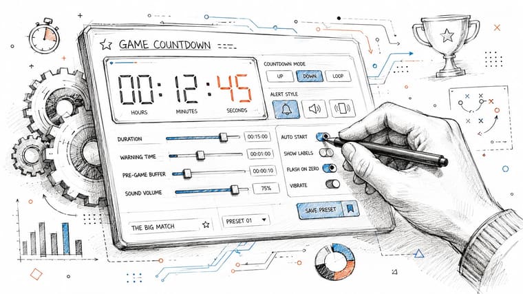
That “prepare ahead” mindset mirrors how studios treat major launches. AWS Countdown Premium for game launches is built around pre-event planning, rehearsals, escalation paths, and real-time support to reduce failure risk. Players don’t need an operations team, but the mindset translates well.
Build a reminder rhythm
One reminder at the moment of release is usually not enough. You also need setup reminders that support real behavior.
A practical rhythm looks like this:
- A one-week reminder for preorders, storage cleanup, or deciding what you’ll play first.
- A one-day reminder for preload checks, controller charging, or making sure the date hasn’t moved.
- A launch-moment reminder for game access.
These aren’t complicated, but they solve the most common failure. Knowing a release is close without being prepared when it arrives.
Share without creating confusion
Sharing a countdown can be fun, especially for friend groups planning a co-op launch night. But the title discipline from earlier matters even more once the countdown leaves your device.
If you share a timer labeled only with the game name, people may assume it tracks launch. If it tracks a trailer or a beta signup, confusion spreads fast. That’s why specific event names aren’t just tidy. They’re social-proofing for your own dashboard.
Small but important: Shared countdowns should answer “counting down to what?” without any extra explanation.
Use it like a launch checklist
The strongest workflow treats the countdown as the center of a tiny launch ritual. Around it, add the practical things that usually get forgotten:
| Countdown phase | Useful action |
|---|---|
| A week out | Confirm the date still looks stable |
| A day out | Check install space and launch timing |
| Day of | Keep your main widget front and center |
| After launch | Decide whether to archive or convert it |
That last step matters because some countdowns don’t need to die at zero. You might turn a launch timer into a progress tracker for finishing the campaign or completing a season pass.
Advanced use isn’t about adding clutter. It’s about reducing surprises.
Managing Delays and Celebrating Launches
A game release countdown should be treated like a living dashboard, not a screenshot of your hopes. Dates move. Marketing plans shift. The useful tracker is the one you’re willing to update quickly.
Commentary on the recent release calendar has pointed out that many high-profile games have slipped into later windows or into the following year, which is why stale countdowns become misleading fast. The practical takeaway from that broader discussion is simple. If the date changes, your widget should change the same day, or it stops being trustworthy.
Treat dates as editable
The wrong reaction to a delay is abandoning the countdown. The better move is editing it immediately and keeping the visual system intact.
Use a simple rule set:
- If the publisher gives a firm new date, update the countdown right away.
- If the window becomes vague, rename the event so the widget stays honest.
- If the announcement is too uncertain, archive it until the date becomes real again.
That keeps your dashboard accurate without forcing you to delete everything every time a schedule changes.
Some countdowns fail not because the design is weak, but because nobody maintains them after the first setup.
Archive the moment cleanly
Launch day should feel satisfying, not messy. Once the countdown hits zero, decide what it becomes.
You’ve got three good options:
- Archive it if the event is complete and you want a cleaner screen.
- Duplicate and repurpose it for a related milestone, such as expansion launch or co-op night.
- Keep it briefly as a memory marker before clearing it out.
This small cleanup habit does two things. It protects your main screens from clutter, and it makes each active countdown feel current. That’s the difference between a dashboard and a pile.
Frequently Asked Questions
A few questions come up every time someone starts using a game release countdown seriously, especially once they want it across multiple devices.
Quick Answers on Pretty Progress
| Question | Answer |
|---|---|
| Can I use it only for game launches? | No. The same setup works for trailers, betas, DLC, preload dates, events, and non-gaming deadlines too. |
| Does it work across Apple devices? | Yes, it’s designed for iPhone, iPad, Apple Watch, and Mac surfaces where glanceable countdowns are useful. |
| What about Android? | It also supports Android, which is helpful if your personal device mix isn’t all Apple. |
| Should I make one countdown or several? | Make one per meaningful event. Launch, trailer, beta, and expansion should usually be separate. |
| Do I need the exact release hour? | Not always. If the hour isn’t official, keep the title broad enough that the countdown stays accurate. |
| What does PRO help with? | PRO is useful if you want deeper styling control and a more tailored visual result. |
| Will time zones matter? | Yes, especially for global launches. It’s worth checking whether the event is tied to a local midnight, a platform-wide unlock, or a showcase stream time. |
| Can I use a countdown after launch? | Yes. You can archive it, repurpose it for a post-launch goal, or keep it briefly as a record of the event. |
A few practical decisions that help
If you’re deciding how much effort to put into the design, start with the event’s emotional weight. Big personal launches deserve more polish. Smaller dates can stay simple.
If you’re unsure whether to place the widget on the Home Screen or Lock Screen, use this rule. Home Screen for appreciation. Lock Screen for utility.
If you track more than one game at once, avoid equal visual priority for all of them. Pick one primary countdown and let the others be quieter. That keeps the whole setup readable.
A polished countdown doesn’t just answer “how long.” It answers “what matters next” every time you see it.
If you want a cleaner way to turn game hype into something visible every day, Pretty Progress gives you customizable countdown and progress widgets across Apple devices and Android, with enough design control to make each release feel distinct instead of generic.





