August 7, 2026
Time PowerPoint Slides Like a Pro: A Practical Guide
Learn how to time PowerPoint slides for any presentation. Step-by-step methods for rehearsals, transitions, and pacing that keep your audience engaged.
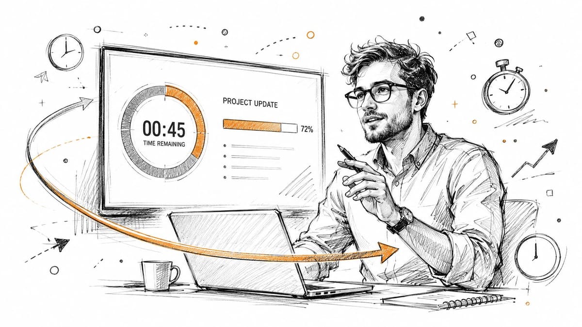
You’re staring at the same deck you’ve already revised three times, the room is booked, and the clock says you’ve got exactly the wrong amount of time. Too much content for the slot makes you rush, skip your best points, and talk over the audience. Too little content makes the room go quiet in the worst way, with questions arriving after your slides are gone and nothing left to anchor the conversation.
That’s why time PowerPoint slides is never just a technical setup task. It’s part pacing, part audience management, part self-defense against the moment your rehearsed flow collapses under real-world pressure. If you want to understand why design quality alone doesn’t save a presentation, DesignGuru on presentation psychology is a useful reminder that the audience judges the whole experience, not just the slides.
Table of Contents
- Why Timing Makes or Breaks Your Presentation
- Setting Up Rehearse Timings and Auto-Advance
- Choosing Between Manual and Automatic Advance
- Estimating Total Runtime Before You Rehearse
- Pacing for Attention and Interaction
- Adding Visual Time Cues to Your Slides
- Troubleshooting Common Timing Pitfalls
Why Timing Makes or Breaks Your Presentation
The worst timing failures don’t look dramatic at first. A presenter opens strong, the first few slides land well, then the pace drifts, a dense chart takes longer than expected, and the final section gets compressed into a breathless sprint. That’s how a clean deck starts feeling unreliable.
Timing matters because it changes how the audience experiences the same content. PowerPoint is still widely used, with one source estimating 23.29% market share even 37 years after release, and another saying 89% of people still use it to create presentations. That same source says more than 35 million presentations are delivered every day to more than 500 million audiences, which works out to over 350 presentations per second worldwide, so the competition for attention is constant. Those numbers make the point plainly, timing isn’t a side detail, it’s part of whether your message survives contact with the room. PowerPoint statistics and usage data
Practical rule: if the audience starts checking the clock, your slide pace is already working against you.
Bad timing also signals poor preparation. When slides move too slowly, the deck feels padded. When they move too quickly, the speaker sounds like they’re trying to escape the room. In both cases, the audience stops trusting the flow, and once that happens, even good content feels harder to follow.
Setting Up Rehearse Timings and Auto-Advance
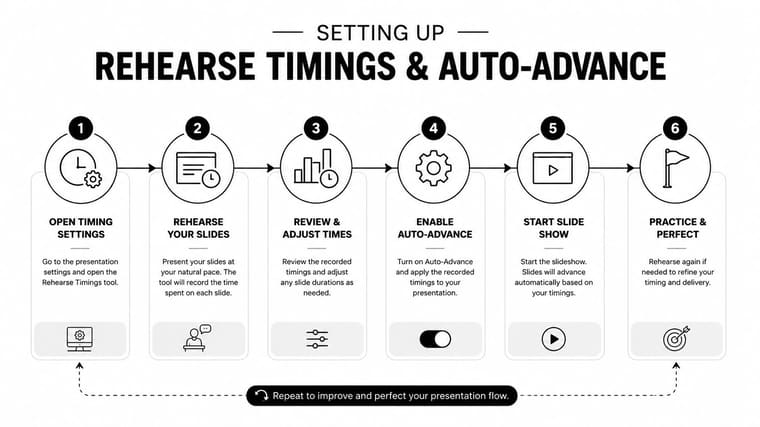
A timed deck starts with Rehearse Timings. Open the Slide Show tab, launch Rehearse Timings, then advance through the slides with the Next key or the arrow keys while you speak at the pace you plan to use in the room. PowerPoint records the time spent on each slide, and saving those timings lets the deck auto-advance during playback. Microsoft’s support materials also show that the recorded slide durations appear in Slide Sorter view, which gives you a practical way to check the rhythm before anyone sees the presentation. Microsoft support for Rehearse Timings
Rehearsal only works if you treat it like an actual event. If you pause to collect your thoughts, repeat a sentence, or take extra time on a chart, that time gets written into the deck unless you record again. A timing pass measures the exact performance you are willing to ship.
If rehearsal included hesitation, the hesitation becomes the schedule.
The next step is to decide how strict the timing should be. The Transitions tab lets you set After durations on individual slides without recording a full rehearsal, which is useful for kiosks, loops, and slides that need to stay visible for a fixed interval. That gives you control when the content has a fixed rhythm, but it also removes the flexibility you get from a live presenter. If the audience needs time to absorb a dense chart, answer a question, or finish a conversation, a rigid interval can work against comprehension.
Use timing as a pacing tool, not just a clock. The best slide durations usually match how long the audience needs to read, process, and react, which means a slide that supports discussion often needs more breathing room than a slide that only introduces a simple point. A short on-screen count can help you stay honest about the remaining time, and a practical example is the timer setup described at Pretty Progress timer for presentation.
Choosing Between Manual and Automatic Advance
Auto-advance is useful when the deck is supposed to behave like a loop, not a conversation. Trade fair displays, booth screens, unattended demos, and self-running training kiosks are all natural fits, because nobody is standing there to click through slides. In those settings, a timed deck reduces friction and keeps the experience moving even when no presenter is present.
Manual advance is the better default for live meetings, especially when the room can interrupt you. Client pitches, training sessions, board updates, and internal reviews all benefit from a human deciding when to move on. That flexibility lets you linger on a slide that sparks discussion, skip a digression when time runs short, or pause when someone asks a question that matters more than the next bullet.
Keep the timer visible, not exposed
Presenter View gives you the pacing cue without turning the audience into timekeepers. Use it to watch your own rhythm while the room sees only the content. If a deck is set to auto-advance but you still need local control, you can disable auto-advance on individual slides and keep the rest of the sequence timed.
That hybrid approach works well for live delivery. It gives you structure without trapping you inside it. For events where the visible countdown itself matters, such as workshops or launch sessions, a dedicated countdown display can help you stay honest about the remaining time, and Pretty Progress conference countdown timer is one example of that kind of setup.
Estimating Total Runtime Before You Rehearse
The common mistake is building the deck first and timing it later. That usually ends with too many slides, too little space, or both. Microsoft’s guidance points toward a slide-count × speaking-rate model, which is the right way to think about runtime because the essential question is how long your content takes at your pace, not how many slides you happened to create. Microsoft guidance on how many slides your presentation needs
Start with the content density, not the slide count
A short slide with one clear idea moves quickly. A dense slide with a chart, a caption, a caveat, and a takeaway needs more time. The same is true for video clips, live demos, and slides that invite discussion, because the slide doesn’t end when the image appears, it ends when the audience has absorbed it.
A simple planning worksheet helps before you build anything. List each major point, estimate how long you’d naturally need to explain it, then add a buffer for transitions, audience reactions, and any Q&A you expect. That buffer is where most decks get rescued, because the first estimate is usually too optimistic.
Don’t ask how many slides you want. Ask how long each idea deserves.
For pacing heuristics, pacing tips for presentations can be useful as a comparison point, but staying honest about your own speaking speed is the key win. Dense technical decks usually need more breathing room than simple status updates, and one-size-fits-all timing rarely survives the first live run.
Pacing for Attention and Interaction
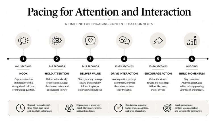
A timed deck isn’t successful just because it finishes on time. It has to give the audience a reason to stay mentally present. Research on presentation failures and attention patterns points to periodic shifts in focus, not endless automatic progression, and one source notes that attention should cycle every 15 minutes or so during longer presentations. That’s the gap in most timing guides, because the audience doesn’t experience your slides as a stopwatch, they experience them as a sequence of comprehension challenges. Research on slide design and presentation failures
Build attention resets into the deck
The most reliable pattern is to break a presentation into segments with a clear reset between them. That reset can be a summary slide, a change in visual style, a question prompt, or a short interaction that forces the room to re-engage. Dense content belongs inside the segment, not at the opening of the segment, because people need a few moments to settle before they can process heavy material.
The same logic helps with Q&A. If you wait until the end to invite every question, the audience often holds back until the final minute, then rushes in with too many concerns. Put checkpoints at natural breakpoints instead, so the room can absorb one idea before you move to the next.
Story structure helps here too. Storytelling frameworks that build trust are useful because they prevent the presentation from becoming a flat list of claims. When the audience can follow a clear arc, timing becomes easier to manage because each section has a purpose.
Adding Visual Time Cues to Your Slides
Sometimes the audience needs to see time passing. That’s especially true in workshops, quizzes, launch countdowns, and any session where the next action depends on the clock. A visible cue removes uncertainty, and uncertainty is what makes timed exercises feel chaotic.
Use the simplest cue that fits the room
A basic countdown timer can be built inside PowerPoint with shapes and animation triggers, but that’s usually the least flexible option. An embedded video loop is smoother if you want a polished visual timer that keeps moving without much babysitting. A dedicated countdown widget on a second screen or device is the most reliable when the presentation itself should stay uncluttered.
Progress bars work well when the audience needs a sense of completion. Fill them section by section so people can see where they are in the sequence, not just hear about it. That visual structure helps in training sessions and timed exercises because it answers the question everyone asks in the back of the room, how much is left?
For a clean visual reference on this kind of setup, Pretty Progress countdown clock graphic shows the kind of glanceable timer that maps well to live sessions. Pretty Progress itself can also be used as one option for a countdown or progress display when you need a separate visual timer on a device rather than inside the slide deck.
Troubleshooting Common Timing Pitfalls
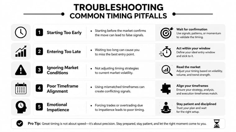
A common timing mistake is treating rehearsal like a throwaway run. The moment you pause, backtrack, or explain too much during Rehearse Timings, those pauses become part of the saved playback. If the rehearsal no longer matches how you will present, throw it out and record a clean timing pass. That is the part people resist, because it feels wasteful, but a messy rehearsal can distort an otherwise solid deck.
Watch for media drift and hybrid delay
Audio and video can drift out of sync when slide durations are too tight or the file was built without enough room for playback. If a clip matters, give it its own space in the timing plan and do not make the rest of the deck absorb that pressure. In hybrid meetings, the pacing that felt fine on your laptop can land differently over Zoom or Teams once network conditions enter the picture.
Slides also misbehave when a question lands mid-transition. If auto-advance keeps moving while someone is speaking, the deck is running the meeting instead of supporting it. Keep manual control available even in decks that are otherwise timed, because live discussion always creates exceptions.
Keep a one-page timing checklist
- Estimate runtime first. Write down the slot length, then plan the slide count around the actual pace of the content.
- Mark attention resets. Add a breakpoint for summary, discussion, or Q&A before the room drifts.
- Run one full rehearsal. Time the deck in the same style you’ll use live.
- Audit Slide Sorter durations. Check the per-slide timings before the presentation leaves your desk.
- Choose control mode deliberately. Use auto-advance only when the presentation needs it.
- Add a visible timer when needed. Put the clock where you can glance at it without breaking eye contact.
The best timing systems are revisable. The more decks you time, the faster you spot where your assumptions were too optimistic and where the audience needed more room to think.
If you want a cleaner way to keep presentation timing visible outside PowerPoint, Pretty Progress gives you customizable countdown and progress widgets that can sit on your devices as a live reminder. It fits timed talks, rehearsals, launch moments, and workshop pacing, especially when you need a separate visual timer you can trust at a glance.