June 21, 2026
Your Screen Time Reduction App Action Plan for 2026
Ready to reclaim your focus? This guide provides a practical plan for using a screen time reduction app, widgets, and habit strategies to cut down on phone use.
You open your phone to check one message. A few taps later, you’re in short videos, then comments, then a shopping app, then back to social media because your brain wants one more hit before bed. When you finally lock the screen, the feeling is familiar. You weren’t resting. You weren’t working. You just disappeared into the phone again.
That cycle doesn’t mean you’re weak. It means your phone is full of products designed to win tiny moments of attention over and over. A good screen time reduction app can help, but the app alone isn’t the whole answer. The setup matters. The friction matters. And the visual cues you see all day matter more than often realized.
The most durable approach I’ve tested combines active restriction with passive reinforcement. Put real limits in place for the apps that hijack your attention, then add a glanceable visual reminder on your Home Screen so you can see your daily budget before you drift. That mix is a lot more realistic than trying to power through on discipline alone.
Table of Contents
- Beyond Willpower Why You Need a Digital Strategy
- Choosing Your Screen Time Reduction Toolkit
- Configuring App Limits and Downtime Schedules
- Using Pretty Progress for Glanceable Motivation
- Strategies for Students and ADHD Users
- Building Habits That Stick and Avoiding Relapse
Beyond Willpower Why You Need a Digital Strategy
The common mistake is treating screen overuse like a character flaw. It’s usually a systems problem. If the most distracting apps live on your first screen, send constant notifications, and open with no resistance, your brain will choose them when you’re tired, bored, stressed, or avoiding something hard.
A lot of people also aim too broadly. They tell themselves they’ll “use the phone less,” but that goal is too vague to guide behavior in the moment. You need a narrower target, like reducing social media before dinner, blocking video apps during work hours, or keeping the bedroom phone-free at night.

Start with what your day already looks like
A useful benchmark helps. A Georgetown summary notes that a RescueTime sample of 11,000 users found average phone use of 3 hours 15 minutes per day, and the same Georgetown summary reports that partial digital detoxes improved at least one major outcome for 91% of participants and increased sleep by about 20 minutes per night on average in one intervention study. That matters because it shows targeted cuts can work without requiring a total shutdown of your digital life (Georgetown digital detox findings).
That’s why I don’t push all-or-nothing rules first. Many find they get farther with a partial reset than with a dramatic purge they can’t sustain for a week.
Practical rule: Don’t try to beat your entire phone at once. Identify the one category that reliably steals time from sleep, focus, or relationships.
If you want extra ideas for behavior changes beyond app settings, this roundup of strategies for digital wellness is a solid companion read.
Why a plan beats a promise
A promise depends on mood. A plan survives mood.
When your phone setup does part of the work for you, you stop negotiating with yourself every time you feel an urge. That’s the core value of a screen time reduction app. It doesn’t make temptation vanish. It reduces the number of moments where you have to make a perfect decision while distracted.
Choosing Your Screen Time Reduction Toolkit
Not all screen time tools solve the same problem. Some show you where the time went. Some interrupt the habit loop. Some make it harder to override your own limits. If you pick a tool based only on popularity or interface, you’ll miss the bigger question: what behavior is this tool changing?

Built-in features versus dedicated apps
Built-in tools like Apple Screen Time and Android Digital Wellbeing are the obvious first step. They’re already on the device, they don’t cost anything extra, and they make usage visible. For many people, that first layer of visibility is enough to expose a pattern they’ve been underestimating.
Dedicated apps usually matter when awareness alone hasn’t changed behavior. They add friction. They interrupt app launches, create delay, lock categories more aggressively, or push you to pause before opening a high-risk app.
Here’s the simplest comparison:
| Tool type | Good for | Main weakness |
|---|---|---|
| Built-in settings | Fast setup, basic limits, category tracking | Easy to ignore or override |
| Dedicated blockers | Stronger interruption, more control, tighter rules | More setup and more resistance |
| Visual timer widgets | Gentle reminders, ongoing awareness, motivation | Not enough on their own for compulsive loops |
What actually works in product design
The strongest pattern in the research isn’t “find the strictest blocker.” It’s more specific than that. A research review of 13 apps designed to reduce mobile phone use found that only 4 apps (31%) showed effectiveness, and the strongest-supported interventions were iOS Screen Time, AntiSocial, grayscale mode, app limits, and mixed interventions. The practical lesson is that effective tools combine measurement, friction, and enforceable limits, while simple reminders often aren’t enough (research review on mobile phone reduction apps).
That matches what I’ve seen in practice. Reminders feel productive because they’re polite. But polite tools rarely beat strong habits.
A good screen time reduction app doesn’t just inform you. It changes the cost of acting on impulse.
How to choose without overcomplicating it
If you need a quick filter, use this:
- Need awareness first: Start with built-in Screen Time or Digital Wellbeing and look for your biggest time sink.
- Need interruption: Add a blocker or app-limit tool that forces a pause before launch.
- Need motivation during the day: Add a visual countdown or progress widget so the goal stays visible.
If visual timers help you stay oriented, it’s worth seeing how people use a countdown interface in daily routines. This guide to a timer interval app setup shows the broader logic well, even outside strict screen-time use.
Configuring App Limits and Downtime Schedules
Downloading a screen time reduction app is easy. Setting it up well is where behavior starts to change.
Most weak setups fail for two reasons. The limit is too vague, or the timing is wrong. If you only set a single daily cap with no attention to when you’re most vulnerable, you’ll still burn your best hours and then feel annoyed when the block finally appears.
Find the apps that deserve limits
Start with your recent usage and be blunt. Which apps produce the “how was that half an hour?” feeling? It’s usually not your maps app or calendar. It’s social feeds, video, messaging spirals, browser wandering, or mobile games.
Then group them by risk:
- Red apps are the ones you open reflexively.
- Yellow apps are useful but easy to overuse.
- Green apps support real tasks and usually don’t need hard caps.
Don’t set hard limits on everything. Put your energy where the drift starts.
Build limits around moments, not ideals
Use your existing pattern as the base. If you usually scroll heavily in the morning, lunch break, and late evening, schedule around those windows instead of pretending you’ll become a different person tomorrow.
A practical setup might look like this:
- Morning protection: Block social media until after your first work block or first class.
- Midday guardrail: Allow limited access during lunch, then shut it again.
- Evening slowdown: Start downtime before bed so the phone doesn’t become your wind-down ritual.
That structure works better than a single daily ceiling because it catches the moments when attention is easiest to lose.
Coach’s note: Protect the first hour of the day and the last hour before sleep first. Those two windows shape more behavior than people expect.
Use downtime for context shifts
App limits handle quantity. Downtime handles context.
When it’s time to work, study, be with family, or get ready for sleep, a downtime schedule tells your phone that the context has changed. That matters psychologically. You stop deciding app by app and start operating under a different mode.
Try these examples:
- Work block setup: Allow only communication, calendar, notes, and music.
- Study setup: Keep course tools, browser access for assignments, and one communication app if needed.
- Evening setup: Remove social apps, video apps, and shopping apps from the hours before bed.
If you want another example of time-based routines, this guide on programmable timers over seven days is useful for thinking through repeating schedules.
Make it slightly annoying to cheat
Many setups collapse if bypassing the limit takes one tap. You haven’t changed much. You’ve added a speed bump, not a boundary.
Use whatever your device and chosen apps allow to increase friction:
- Hide the tempting apps: Move them off the first screen.
- Silence non-essential notifications: Especially badges and attention-grabbing alerts.
- Rename the goal: “No social before noon” is clearer than “Use less.”
- Add a pause cue: A lock screen note or widget can interrupt autopilot.
The right setup should feel a little inconvenient. That’s not a flaw. That inconvenience is the intervention.
Using Pretty Progress for Glanceable Motivation
Hard blocks are useful, but they create a negative interaction. You reach for the app, and the system says no. Sometimes that’s exactly what you need. Other times, especially during habit change, a softer visual cue works better because it catches you before the impulse turns into action.
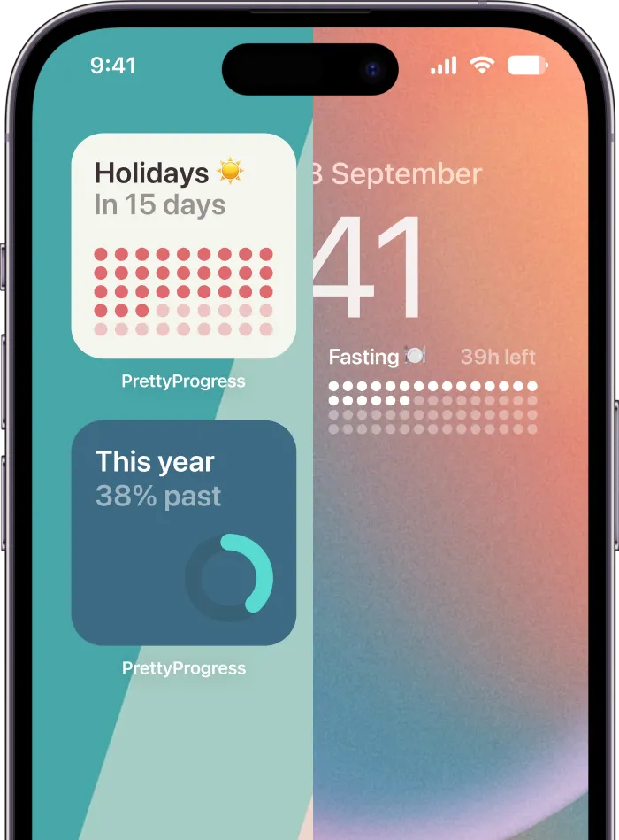
That’s where a glanceable progress widget helps. Instead of waiting to get blocked, you see your daily screen-time budget throughout the day. The reminder sits on your Home Screen doing its job. It doesn’t scold you. It keeps the goal visible.

Why visual cues change behavior
A lot of overuse happens because time on a phone doesn’t feel like time. Minutes blur. App switching hides the total. By the time you notice what happened, the session is already over.
A visual countdown fixes part of that problem by making the budget tangible. You don’t have to open settings and review a report. You just glance at the screen and see whether you’re close to your personal limit.
I like this method because it adds positive reinforcement to a system that usually relies on restriction alone. You’re not only avoiding bad behavior. You’re watching yourself stay within a target.
A simple setup that works
Use one daily budget tied to intentional leisure use, not total phone use. You still need your phone for ordinary life. The point is to visualize the category that tends to expand without permission.
Set it up like this:
- Choose one category goal: Social media, video, or general entertainment.
- Create a daily countdown: Match it to the amount of discretionary screen time you want to allow yourself.
- Reset it every day: The clean reset matters. It prevents yesterday’s miss from becoming today’s excuse.
- Place the widget where you’ll see it often: First Home Screen or Lock Screen works best.
One tool that fits this approach is Pretty Progress, which lets you create countdown and progress widgets that stay visible on iPhone, iPad, Apple Watch, Mac, and Android. In this context, you’d use it as a visual budget rather than a blocker.
The most useful reminder is the one you see before you drift, not after.
Pair the widget with one hard boundary
Don’t make the visual cue carry the whole system. It works best as a companion to a real restriction.
A clean pairing looks like this:
| If your weakness is | Use this hard boundary | Use this visual cue |
|---|---|---|
| Endless social checking | App limit before evening | Daily social budget widget |
| Late-night video loops | Downtime before bed | Countdown showing remaining leisure time |
| Frequent unlocking with no purpose | Focus mode during work | Progress bar tied to a no-scroll goal |
That combination changes the emotional tone of the system. The blocker says, “stop here.” The widget says, “you’re still on track.”
Strategies for Students and ADHD Users
Students and people with ADHD often need more than generic app limits. The challenge isn’t only distraction. It’s task switching, time blindness, hyperfocus in the wrong direction, and the friction of starting something mentally demanding.

For students who keep breaking their study blocks
The phone usually becomes a study escape hatch. The assignment gets difficult, your brain wants relief, and the quickest relief is already in your pocket.
A better system is to decide the phone’s role before the session starts:
- During deep study: Put social, video, and shopping apps behind a block.
- During breaks: Allow limited access if you know you won’t lose the whole break.
- After the session: Let the reward be intentional, not automatic.
This works especially well with short, repeatable cycles. If you study in rounds, your brain stops expecting unlimited stimulation and starts trusting that a break is coming.
For ADHD users dealing with time blindness
Many ADHD users don’t need harsher rules first. They need time to become visible. A visual timer, a progress bar, or a countdown widget helps because it externalizes the passage of time instead of asking working memory to track it internally.
Keep the phone simpler than you think it needs to be:
- Strip the first screen down: Only essentials.
- Use one focus mode per context: Work, home, study, sleep.
- Make cues obvious: Visible timers beat hidden settings.
Support can matter too, especially when attention challenges connect with broader developmental or mental health needs. Families looking for more structured help may find resources like specialized autism care in Vernon useful when they’re building routines around regulation, transitions, and daily functioning.
This walkthrough is worth watching if you want a practical example of focused study structure and attention management:
Keep the system forgiving
Students and ADHD users often abandon tools because one bad day feels like proof the method failed. That’s the wrong standard.
Missing a limit doesn’t mean the system is broken. It means the system needs less shame and better visibility.
If you tend to binge after a long day, lower the setup burden. Automate focus modes. Put the charger outside the bedroom. Reduce the number of decisions between you and the behavior you want.
Building Habits That Stick and Avoiding Relapse
The app changes access. Your environment changes follow-through.
If you want lower screen time to last, give yourself replacement behaviors before the old habit starts screaming for attention. A phone often fills tiny empty spaces. Waiting, winding down, avoiding discomfort, delaying a hard task. If you remove the scroll without replacing the function, relapse gets much more likely.
Small changes that prevent backsliding
Use a few support moves consistently:
- Charge the phone outside the bedroom: This cuts off late-night drift and weakens the morning autopilot check.
- Link the new rule to an existing habit: For example, no social apps until after breakfast or after your first completed work block.
- Prepare low-friction alternatives: A book on the table, music ready, a notes app open for capture, a walk route you already use.
Watch for trigger patterns
Most setbacks come from predictable moments. Fatigue after work. Stress before a deadline. Loneliness at night. If you know the trigger, you can redesign the response.
That’s why the strongest screen time reduction app setup is never just software. It’s software plus placement, routine, and awareness. The block protects your attention. The visual cue keeps the goal alive. The habit around it makes the change stick.
If you want a gentle visual layer to support your limits, Pretty Progress can help you keep a daily screen-time budget visible with countdown and progress widgets. Used alongside app limits or downtime, it gives you a simple way to notice your pattern earlier and stay intentional without adding more noise.